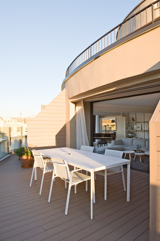
The clients, a Norwegian couple with a very big family of children and grandchildren, were searching for a property, a second residence in Barcelona. They wanted us to find it and transform it into a “wow flat”. After weeks of research we have found these offices that lacked of charm but had an great potential as for position, views and the huge, neglected terrace filled of air conditioning machines and bad finishes. They bought the property and entrusted us its complete transformation.
Concept
Brief · After complete demolition of the space we had to come up with a layout to host four bedrooms and four bathrooms (possibly en-suite), one big living space and take advantage of the great terrace.
Beams · The property had a big limit we had to overcome: low ceilings and big beams hanging below them. This implied a difficulty in passing ducts and installations and in how to divide the layout. In the end the rooms have been distributed by placing the walls along the existing beams, exposed. We opted to incorporate the beams, exposed, into the project and make them part of it.
Circulation · One of the key points of the project was that the entrance is at one end of the apartment, and the desirable space for the living area (with the greatest views and the curved wall on Paseo de Gracia) is at the other end. To avoid having to pass through the bedrooms area to reach the living area, we created a closed box for the private night area (that includes a corridor) and a second day area circulation by opening a doorway to the terrace that leads directly to the day area.
Night Area Box · This night area box is visually placed below the thick and heavy beams that cross the apartment. Different heights were used to emphasize the feeling of a box below the beams and bring natural light into the corridor. Two lines of light are placed in the corridor: one is hidden in the volumes
Mirrors · The property only has windows on one side, being the other side the boundary wall with the next building. The corridor and living mirrors have been designed to fool the eyes and open up spaces and windows on the boundary side too.
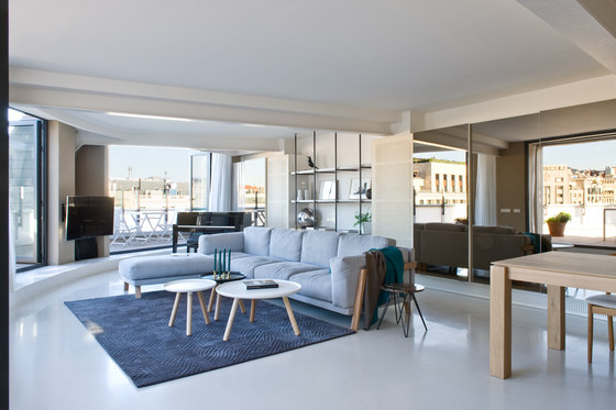
Curve · The project restores the building’s curve facade by getting rid of roller shutters that cluttered the facade. This newly discovered curve becomes one of the guidelines of the project. To emphasise it on the inside, a white step covered in white Pandomo continuous coating is built around the living space, matched on the ceiling with it a curved line of curtains. The curtains pass from inside to outside, in the area of the outside dining table, visually blurring the limit between indoor and outdoor. The same curve motif appears in the slot line drawn on the doors closing the “bedroom box” in the shape of the corridor towards the entrance, and in the rounded corner of the marble kitchen island.
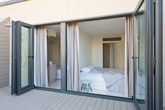
Interior-Exterior Relation · The project wants to maximize the incredible views on the city and the boulevard. The new windows open up completely to unify indoor and outdoor spaces.
Colours and Materials · The materials and colours of the project are inspired from the materials and colours of the views of Paseo de Gracia. This allows to visually connecting interiors and exteriors. The aim was to make feel that the apartment is on Paseo de Gracia. The white terrazzo floors bounce the light on the inside and give a solid feel of white stone. The details of marble cladding in kitchen and bathrooms have the same objective.
The porcelain of bathrooms and terrace deck is chosen in colours reminiscent of the stone building on the outside, as well as the kitchen unit doors. The graphite metal details of library, kitchen island, windows and railing are inspired by the slate roof of the of La Unión y El Fénix building, right in front.
Rooms
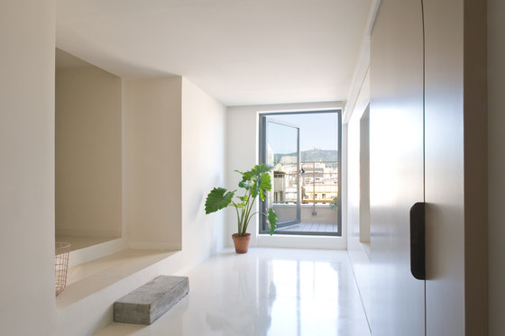
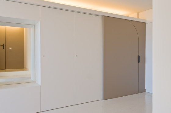
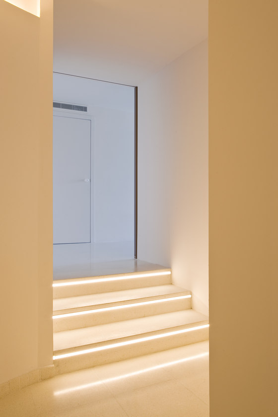
The entrance is raised, and three steps down you find the hallway, where a wide glazed door opens to enter the great terrace. A Line of storage units hidden behind white panels incorporates all the machines for hot water and air cooling and heating. In the middle of these units there’s a seat to take off shoes (a habit of the Norwegian clients), with a square mirror. The double-height of the entrance wall can be overcome by stepping on the concrete step. A big sliding door with leads to the “bedrooms box”.
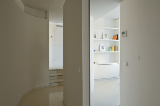
The corridor is accessed through big doors at the extremes, one sliding on the entrance side and one big pivoting one on the living side. It widens as you move through it and it’s pointing straight at one of the big windows of the living space. To avoid the space feeling like a tube, the corridor widens in two points where the entrances to the bedrooms are facing. Two big mirrors also enlarge visually the space. A lower ceiling area between corridor and bedrooms allows natural light to enter the corridor space. Indirect lights illuminate the ceiling from above the volumes placed on the boundary walls.
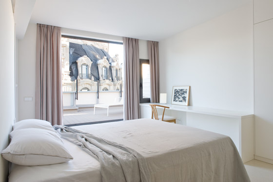
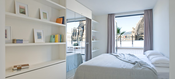
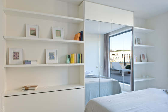
The same volumes are pierced in their lower part by a line of LED spotlights by Viabizzuno, pointing at the floor. This light source allows to light the corridor without interfering with the bedrooms (at night, i.e.), as placed far from the line of windows between corridor and bedrooms. Four bedrooms are aligned between the corridor and the terrace. Entrance to bedrooms is through a pivoting door, floor to ceiling and wall-to-wall, no doorframe and painted in the project colour. All bedrooms have closets hidden behind mirrors that multiply the low ceiling entrance and hidden curtain rails on the whole glazed wall with indirect line of lights.
The first one will use the entrance bathroom, the other three have each one its own. The first bedroom has a curved wall and wide library shelves. By will of the client, the second one has a very small bathroom unit complete with shower, hand washbasin and storage and a separated toilet. The third bedroom has a bigger bathroom set into a niche, that takes natural light through the shower box, placed in the room. The fourth is the master bedroom, hosts a bigger closet and a desk.
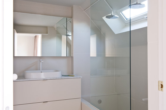
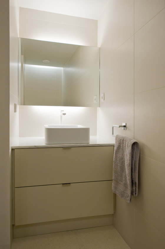
A special bathroom was designed to incorporate one of the sloped volumes;it has a large masonry bathtub with double shower-heads; the shower has special view on the Fenix building dome across the street, through its light-well. A small courtesy bathroom is located close to the living area. A large living space of 84 square metres opens up behind the wide pivoting door. Its elongated shape terminates in the newly discovered curved shape of the building as it faces the corner of Paseo de Gracia.
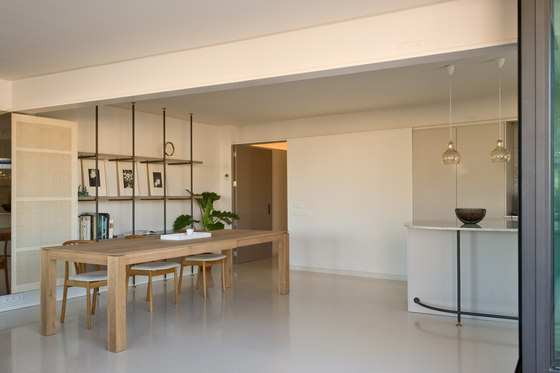
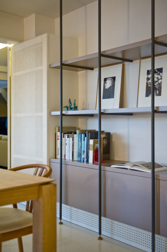
Storage units and library cover almost completely the boundary wall. This capacious custom made furniture has 90cm wide sliding doors, some covered in wicker and others in mirror with a golden tone. Wicker softens the room, while the mirrors “open” windows and unexpected views, providing the space with sights all around and new perspectives on the city, while warming up the light.
The library has a black metal tubular structure detailed with brass feet and bolts, and its thick cylinders bear broad shelves as they cage the low units that disguise the air conditioning devices. The skirting board in the lower part of the units is perforated to allow the machines to ventilate; it has the same high as the curved Pandomo step that projects from the terrace. Works of art by Spanish artist Sito Mújica have been chosen for this space, his watercolours are displayed on the library shelves (courtesy of 3Punts Gallery).
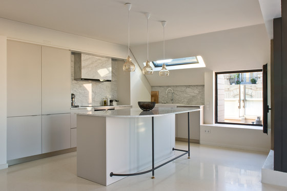
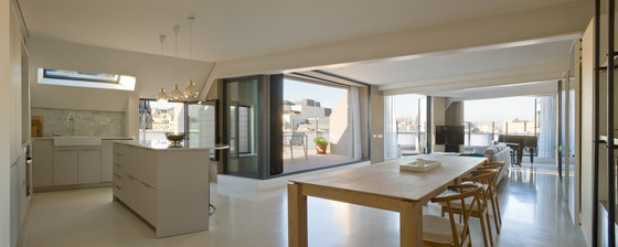
The kitchen occupies a corner of the living space. The units are split on two walls. On the first are placed two fridges, hidden behind doors and the electric fires. The kitchen hood has been completely clad in white marble, just like all tops and dashboards. On the second wall, the sink is placed strategically under the light well to allow views of the dome in the facing building. A line of lights is hidden behind the sloping roof. The central island completes the kitchen allowing extra storage and creating a breakfast table where its white marble slab has been cut with a curved shape. A special seat is placed on the window sill of the square window cut in the sloped volume.
Next to the kitchen sink, a square window opens up and special seat is placed on the window-sill, the perfect place to contemplate the skyline. The terrace is over one hundred square meters in surface and it embraces the entire apartment while it curves around the building. Its level is higher on the entrance side, where the access is, from where its whole length can be appreciated. Every bedroom can be opened completely and the existing sloping volumes of the facade create more private spaces in front of each room.
The outdoor space has been widened in front of the living area, creating a glass box next to the kitchen and in front of the living room that opens up completely. This wider area allows to place comfortably an outdoor dining area, with the big table by Kettal, of streamlined shapes, slight curves and white marble top. The curtains that follow the curve of the living space on the inside, suddenly appear in outside space, as if they were going through the thick facade pillar; they multiply the chances for screening and adding privacy, while softly swinging in the breeze.
Their fabric is an outdoor textile that has been carefully chosen by Gancedo for its lightness and resistance. The terrace can be lit through two lines of LED, one place hidden in the existing part of the railing; the second on the top part of the facade, underlining the curved shape of the building. An outdoor shower has been placed on the terrace, for the hottest days of summer.
The upper part of the terrace hosts a laundry area, to wash and dry clothes away from sight. This part is screened by a partition, a fence cut at an angle and clad in the same material as the deck. The same material is used to clad the structural volumes protruding on the terrace, visually integrating their sloped shape into the solarium.
CaSA - Colombo and Serboli Architecture: Andrea Serboli, Matteo Colombo


