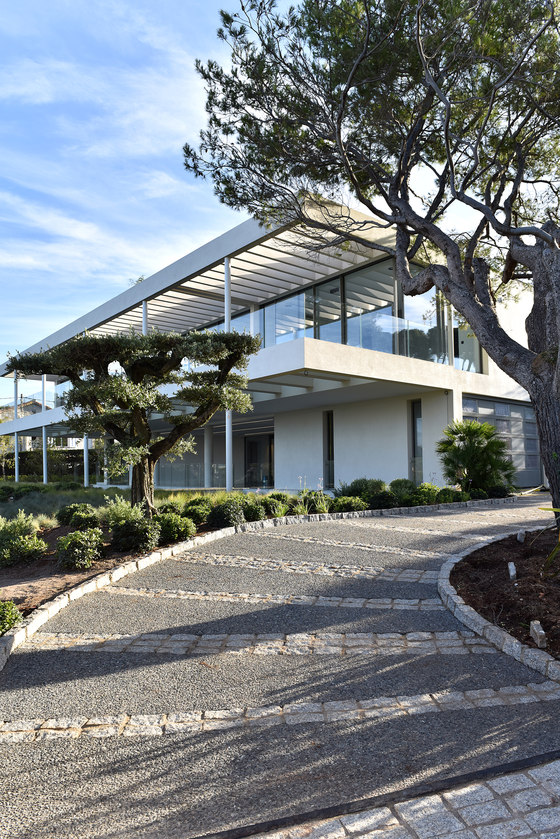
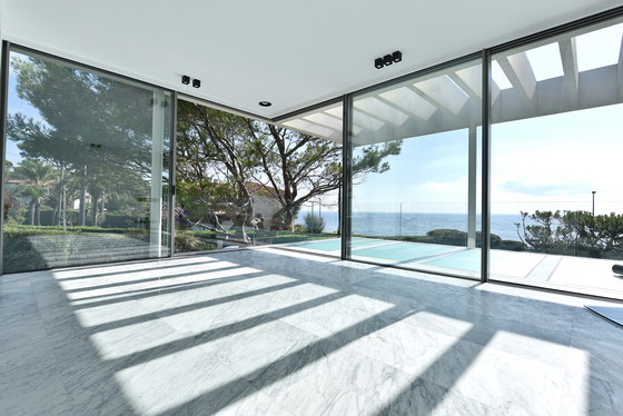
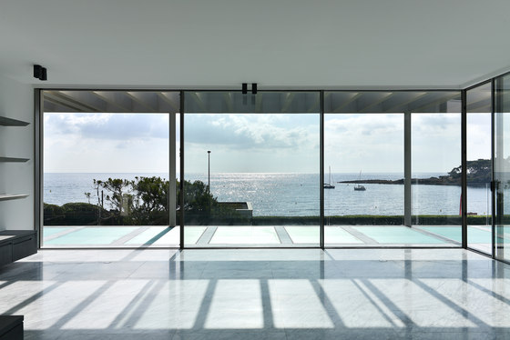
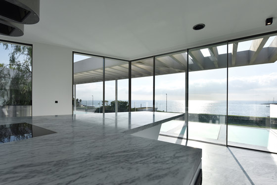
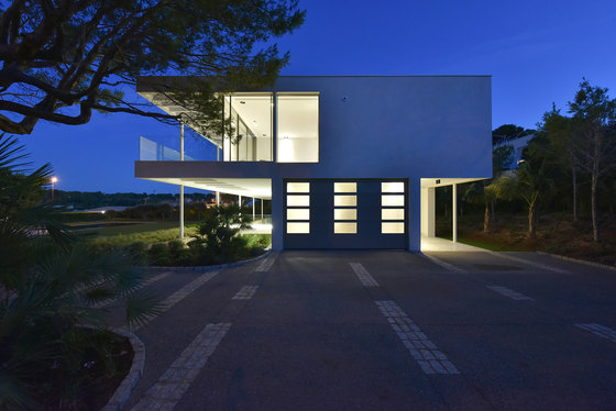
British designer David Price, who works out of offices in Provence and on the Côte d’Azur, together with his Anglo-French-American team, has completed a show-stopping ‘Glass House’ for a British client on the Cap d’Antibes. The plot is a rarity in the area; not only facing the sea-front, but also east-facing and on an almost-flat piece of land, covering 2,000 sq m. The views from the new property extend from the snow-capped southern Alps alongside Nice to the coast towards Monaco and Italy, as well as, in the near foreground, the bay and headland of La Garoupe.
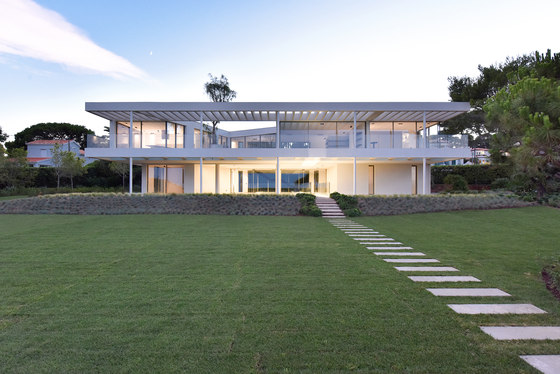
‘Right at the beginning of the project, the client purchased the site and, with it, an existing, rather ugly 1950s house’, David Price explained. ‘He initially asked us for a major remodel, but his vision was so complex and ambitious that it made vastly more sense to us to demolish and start again, extending the vision further. Happily, the client agreed.’ The east-facing house, designed to be in harmony with its site and wider location, is located towards the western boundary of the plot to take advantage of a gentle slope, which lifts the house, measuring 7m above ground level, as high up as possible. It was designed with a concrete structure and then glazed, louvred and terraced as much as possible to ensure a light and airy feel. From the client’s basic brief to create a ‘show-stopping design’, David Price Design proposed a layout of six en suite bedrooms and a variety of living spaces, mostly located on the top storey, along with the master suite, to maximise the light and views in and from this incredibly-positioned property, but still providing enough shade to cope with the hottest peaks of summer.
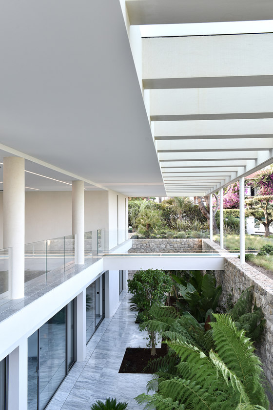
The 600 sq m villa is arranged over three storeys, with an ingenious ‘invisible’ indented basement, designed to work around planning restraints. The design respects the limited footprint allowed by local regulations, whilst still answering the client’s request for enough bedrooms and service rooms through the incorporation of the lower-ground level. The scheme got through planning on the basis that the balconies above both overhung and concealed the lower-ground level from all angles, bar those directly in front of the building. To ensure good light ingress to the new level, which certainly couldn’t feel like a basement for the client and his family, a generous courtyard lightwell was designed, set back by a full 5m and featuring a stone wall surround, dramatic planting, the noise of water from a small fountain and a terraced area in Carrera marble, with the overall feel of an outdoor garden or ‘cour anglais’. The terraces directly above are glazed, to allow plenty of light into this cool haven.
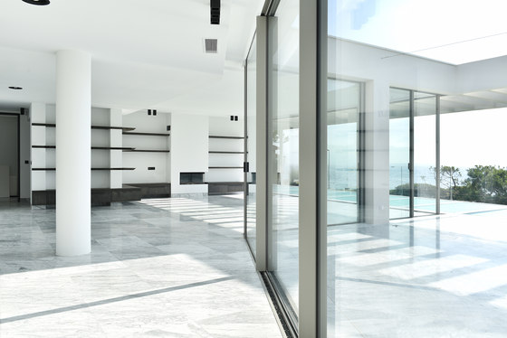
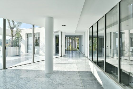
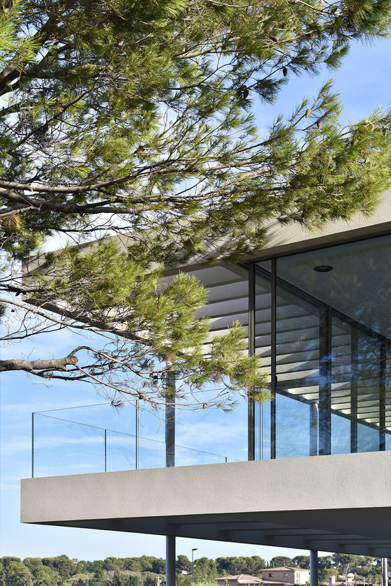
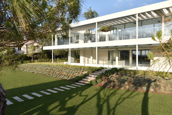
‘We worked on the design for a long time to balance the heat and shade requirements, so that the final house has both a certain delicacy and elegance, as well as a clean, simple and almost floating structure’, David Price commented. ‘This was achieved via five, slim structural columns in steel at the front of the house to support the balconies, with the upper floor boasting a full-fascia, 3m-deep glass terrace and balustrade. The windows here and throughout have a particularly thin framework, maximising views out and through.’
The first-floor terrace runs all along the east façade and indents into the building to create another courtyard between the kitchen and living room, breaking up the linearity of the building with its deliberately uneven rhomboid shape. A 5m-high false pepper tree planted in a circular stainless-steel planter set within the open terrace creates further punctuation. The long terrace is over hung by a concrete slatted roof, protecting it perfectly from the sun in the middle of the day. In the afternoon, the sun is at the back of the house and so the building itself provides shade. Motorised, vertical aluminium slats on the south and west facades offer further solar shade.
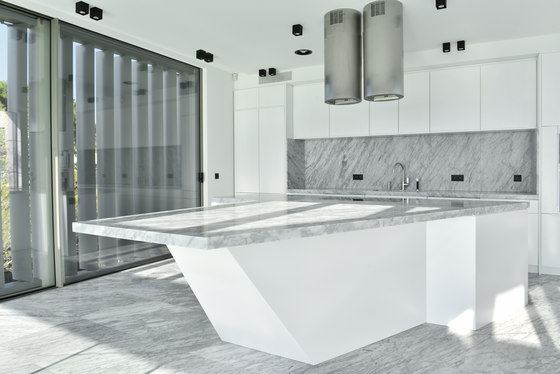
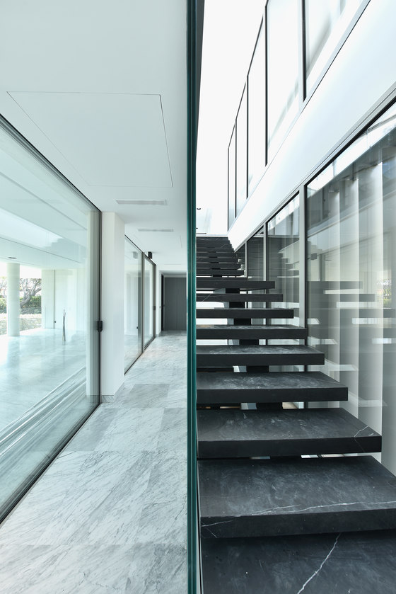
The internal upper storey spaces are arranged in a U-shape with, from left to right (facing the house): a kitchen with a marble-topped unit that directly echoes and replicates the shape of the actual room, inset to accommodate stool seating; a dining room; a transition space, where the continuous three-storey staircase, located at the centre rear of the design, emerges; a living room and the master suite. The staircase is in black marble, providing a dramatic contrast with the Carrera marble flooring used throughout. The staircase has a steel spine with LED lighting down its centre on the underside and, behind the stair, a two-storey glass wall with louvres keeps the sun at bay. The main entrance on the ground floor - next to a garage, which also had to be incorporated into the footprint - leads into a long hall and stairwell. At the far, southern end is a bedroom suite, whilst a large, covered terrace features a glass bridge, slightly offset, leading out over the courtyard to the garden and pool.
The lower ground floor contains four bedrooms with en suite bathrooms and has its own private planted garden space with planting in beds with insets along its length. The surrounding stone-faced wall has strong horizontal lines, thanks to joints that help reduce the feeling of height. A fountain feature is slightly offset to the left. The planting for the landscaping was created together with François Chassigneux of Corporandy.
A bank down to the garden is planted with variegated grasses, whilst the central lawn was kept open and plain for playing football. Local planning rules stipulated the planting of a good number of pines and so new pines were part of the landscape design, whilst several existing trees, already mature and blown into wonderful twisted, sculptural shapes by the easterly winds, were retained. Existing olive trees were replanted towards the southern end of the garden and then added to with lots of smaller planting, using plants known to thrive in the local heat and soil.
There is an existing pool at the bottom of the garden, which was reconditioned and remodelled to be shallower and also re-filtered and re-plumbed to improve water quality. The pool interior was re-tiled with new mosaic and a new pool house designed with white columns and a pergola on three sides, echoing the slats of the main house in its design.
David Price Design
