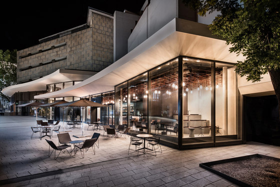
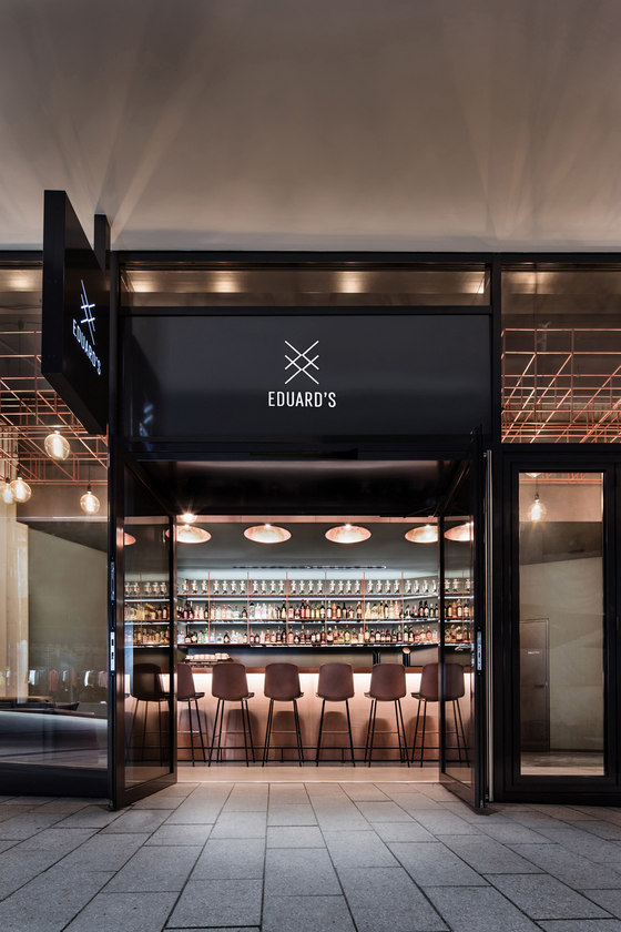
DIA – Dittel Architekten is responsible for developing the restaurant’s design concept, the name Eduard’s, its corporate design, and also for the construction of the bar in Stuttgart’s Dorotheen Quarter. Named after the founder of the Breuninger department store, this new lifestyle bar is making a bold statement in the new quarter. The striking design provides a fresh perspective on a piece of history, making the counters the focal point of where it’s at, much like the early days of bar culture.
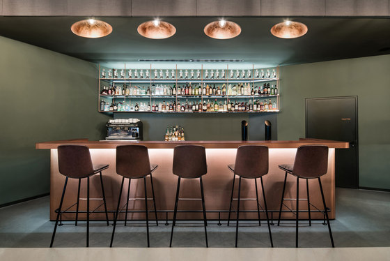
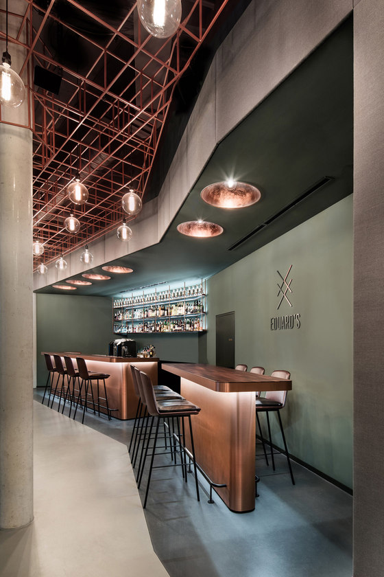
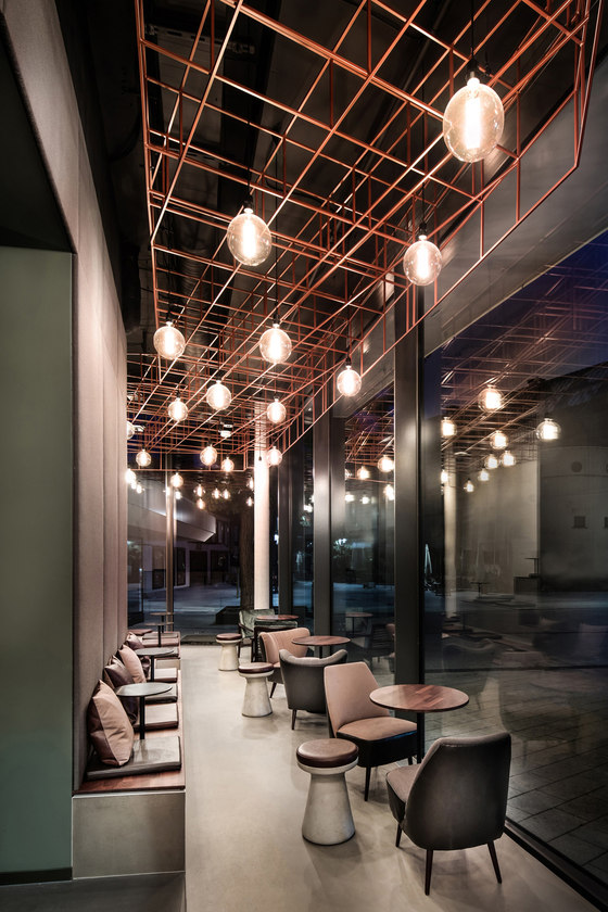
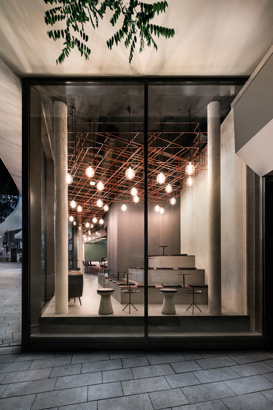
Even from the outside, the bar is unrecognizable as such: as bold and elegant as a tumbler of Bulleit Bourbon, the modern, solid wood bar is located right at the entrance to the space. Once inside, patrons immediately find themselves within the bartender’s field of vision, their first glass in hand. The narrow, five-meter high space is a defining feature at Eduard’s. Surrounded by a glass façade opposite a brick façade, the bar is divided into a brighter area in the front and a darker area at the back – designed to be welcoming by day and night. By day, spots along the glass façade are hugely popular, thanks to the natural light and a first-class view. When it gets dark outside, the bar becomes the focal point.
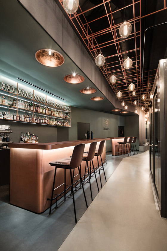
When night falls, the defining copper tones, highlighted by shades of patina and the reflection of lights, create a one-of-kind ambience that glows invitingly when seen from outside. The bar becomes a welcoming, stand-alone feature. The rust-brown shelving accentuates the luminescent bottles of spirits and the hand-crafted iron lamps in the suspended ceiling become stylish overhead lights. The striking ceiling installation, consisting of delicate, angular rods and eye-catching bulbs, completes the picture.
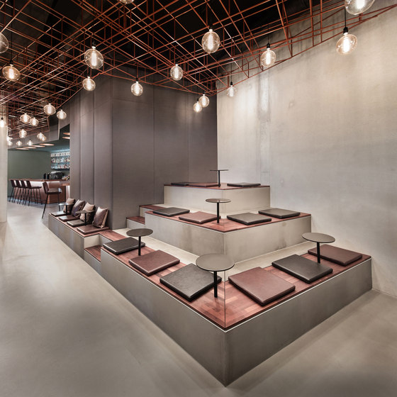
With a compact inside area of 100 m2 and another 70 m2 outside, Eduard’s offers seating arrangements to suit everyone’s needs: traditional raised stools at the bar or at the convivial side tables, which diffuse the original purpose of the bar as barrier and allow patrons to be seated alongside the barkeeper. Those wishing longer conversations can either sit in the comfortable vintage armchairs or gather in groups on the sofas and chairs, all of which look out onto the outdoor patio. The benches, conveniently surrounded by acoustic panels, become casual lounge areas that overlook the bar. The perfect spot to sit if you want to see what’s going on.
The elegant character of the metal serves as a contrast to the raw industrial floor and the exposed concrete walls. Wall design elements and textiles in muted green tones, dark wood and rustic leather upholstery complement the colour and material concept. The corporate design infuses every detail. The name and logo unite tradition with the modern age and are indicative of the timelessness of elegance, which is realized across the different eras. The geometric design reflects the structure of the ceiling installation and is emphasized by a bold and streamlined typeface: Welcome to Eduard’s!
DIA - Dittel Architekten
