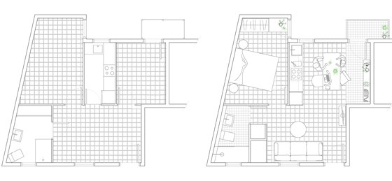
This project presents the renovation of an apartment located in a building of 1940 in the district of Gracia, Barcelona.
Originally, there was en excessive of subdivided rooms which made the space feel undersized and dim. The living room did not receive any natural light, the few openings in the facade were in the two small bed rooms and the kitchen. On the other hand, we found different layers of materials and installations that had been overlapped over time and that had blurred the original architecture.
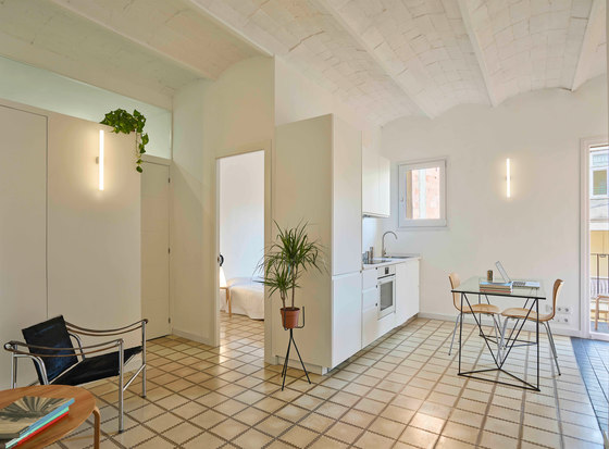
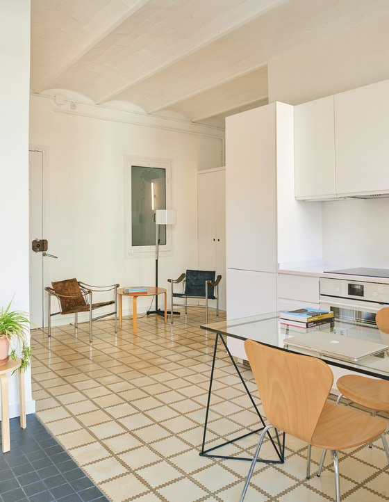
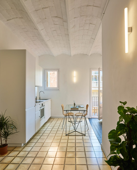
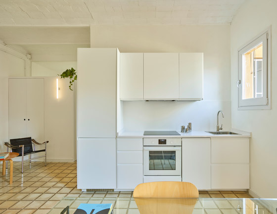
The goal of the project has been, with a reduced budget, to achieve feeling of spaciousness and natural light in a small apartment and with few openings. As a strategy, we simplified the distribution to obtain a large and open space that multiplied the light. It concentrates the different activities of the house: living room, dining room, kitchen, studio, meeting place, etc; Being a flexible space with different atmospheres, that allows freedom in the distribution of the furniture according to the preferences of the user.
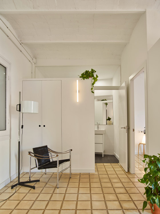
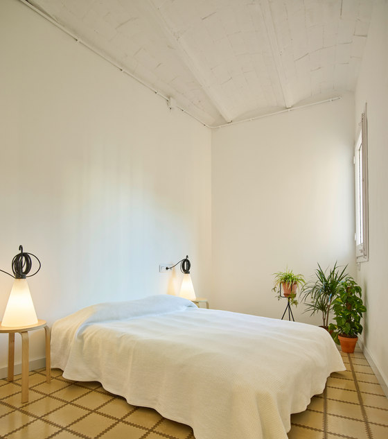
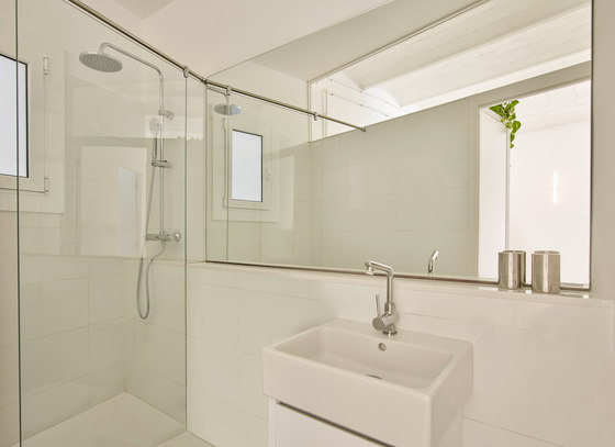
The bedroom remains in its original position and maintains its surface, without demolitions, to save costs. And the bathroom is separated from the central space with a closet that does not reach the ceiling in order to give visual amplitude. The glass placed on the top of the cabinet and the large mirror facing it give us this sense of spaciousness.
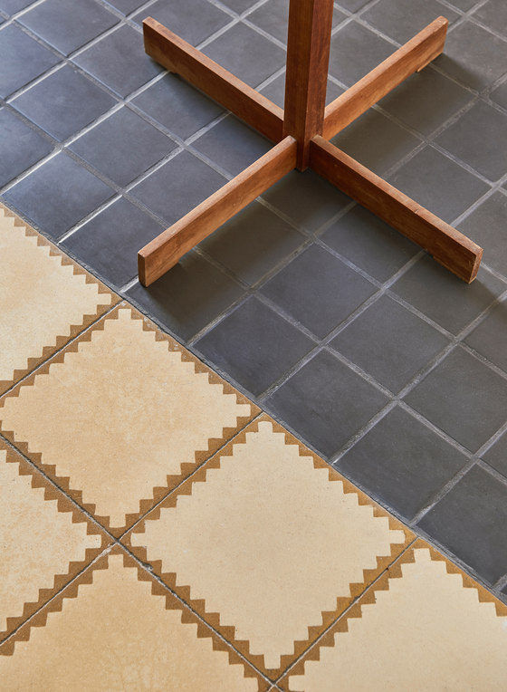
It is also worth mentioning the actions of preservation and restoration of all the original elements as the hydraulic tile pavement, metalic beams and vaulted ceramic ceilings and the old wooden carpentry. Those pieces that were in very bad condition were replaced with new materials. One of them, the black porcelain stoneware floor highlights and contrasts the existing hydraulic floor.
The white, lacquered wood and paint, floods the house with natural light and achieves harmony between the existing and the new elements introduced, which generate a contemporary atmosphere. For the artificial illumination the “linestra” has been used as wall sconces, due to its warm light and formal simplicity.
Design team:
Estudio CO–A
