Placing form on wilderness is a radical act. The challenge was to design a house in one of the most spectacular natural settings on the Pacific Coast that would both respect and transform the land.
"I placed a jar in Tennessee,
And round it was, upon a hill.
It made the slovenly wilderness
Surround that hill.
The wilderness rose up to it,
And sprawled around, no longer wild.
The jar was round upon the ground
And tall and of a port in air.
It took dominion every where.
The jar was gray and bare.
It did not give of bird or bush,
Like nothing else in Tennessee.
- Wallace Stevens, “Anecdote of the Jar”
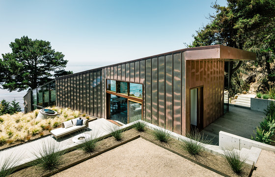
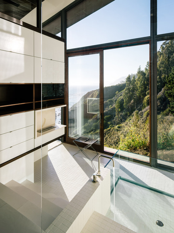
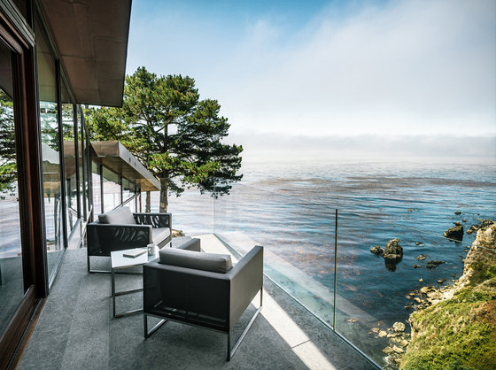
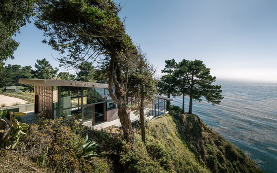
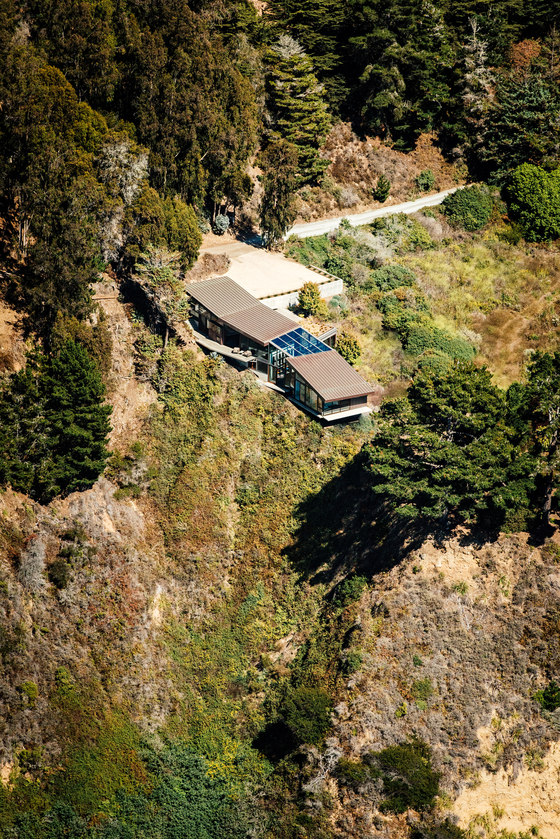
This three-bedroom home, on Big Sur’s spectacular south coast, is anchored in the natural beauty and power of this California landscape. Our design strategy embeds the building within the land, creating a structure inseparable from its context. The site offers dramatic views: a 250-foot drop to the Pacific Ocean both along the bluff and the western exposure. Yet it demands a form more complex than a giant picture window.
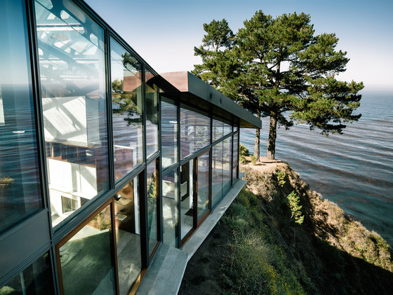
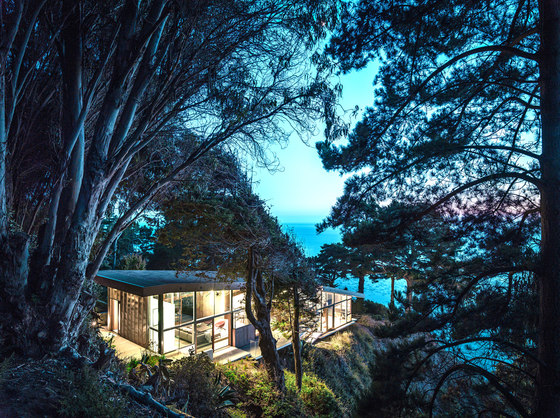
The long, thin volume conforms and deforms to the natural contours of the land and the geometries of the bluff, much like the banana slug native to the region’s seaside forests. In this way, the complex structural system applies and defies natural forms to accommodate the siting. The house is cantilevered 12 feet back from the bluff, both to protect the cliff’s delicate ecosystem and to ensure the structure’s integrity and safety. The interior is a shelter, a refuge in contrast with the roughness and immense scale of the ocean and cliff. The house also shields the southern outdoor spaces from the powerful winds that blow from the northwest.
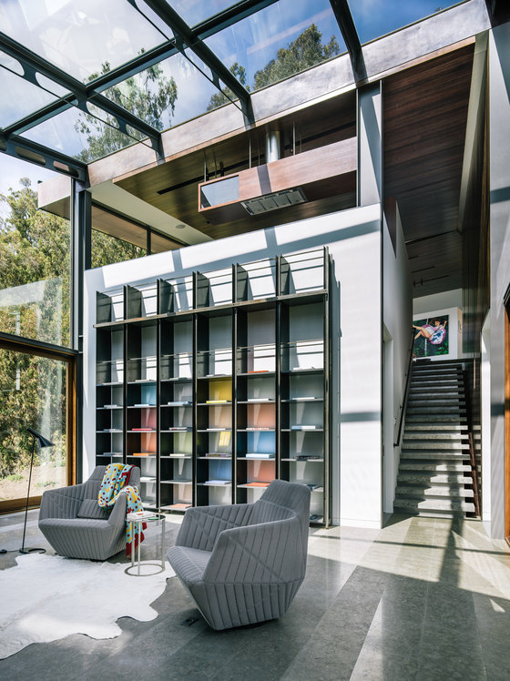
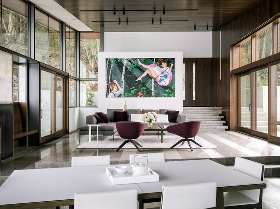
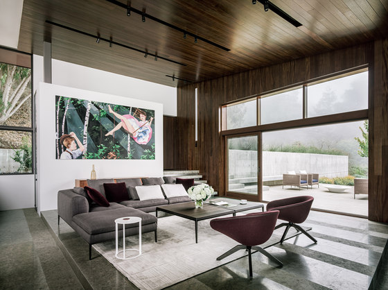
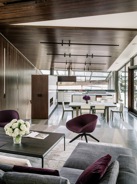
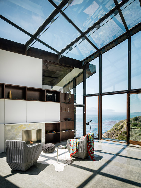
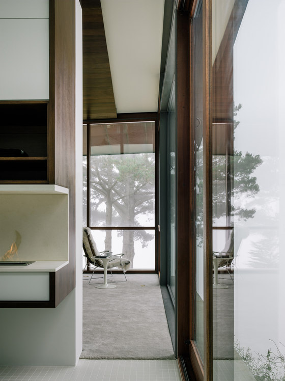
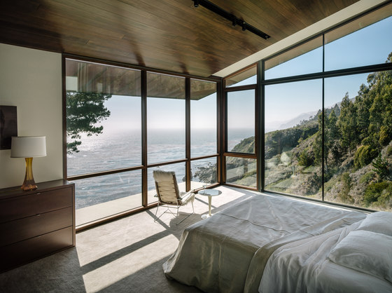
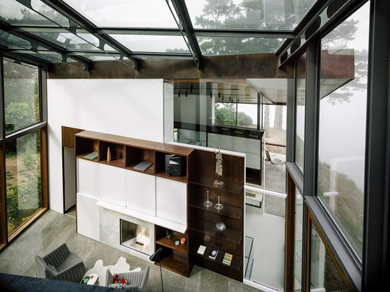
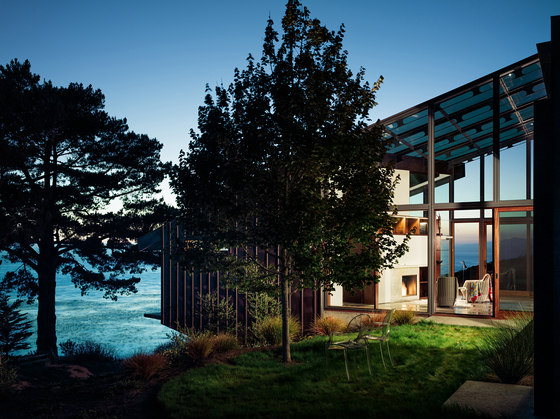
The main body of the house is composed of two rectangular boxes connected by an all-glass library/den. The main entry is located at the top of the upper volume with the living spaces unfolding from the most public to the most private. The living room kitchen and dining room are an open plan with subtle changes in levels and roof planes to differentiate the various functions. The lower volume, a double-cantilevered master bedroom suite, acts as a promontory above the ocean, offering breath-taking views from its floor-to-ceiling windows. The link between these two volumes is the glass library/den; it is the hearth of the house, a room that unites the house inside and out both with its geometry and its transparency.
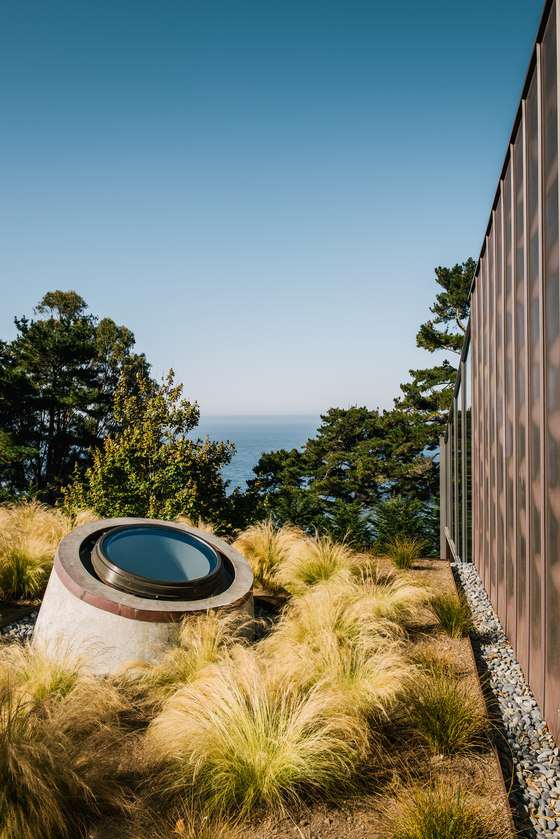
A one-story concrete wing perpendicular to the house includes a ground-floor bedroom, building services and a green roof; it is the boulder locking the house to the land. The house has two main facades, the south one is clad in copper which wraps up the wall and over on the roof. Copper clad roof overhangs protect windows and the front door from the sun and the wind of the ocean. The façade to the north is made all glass; clear expanses of glass open the house to the view
Materials
• Standing seam copper façade
• Poured in place fly ash concrete
• Steel structure
• High performance, insulated, low E glazing
• Living roof
• French limestone radiant floors
• Sustainably harvested interior wood finishes
• Copper roof
• Wood windows
• High fire hazard materials chosen to reduce risk of fire
• Reduce window e south elevation to reduce solar heat
Sustainable Design Strategies
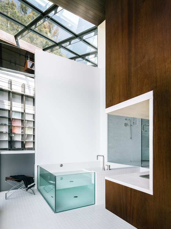
• Natural daylight in all rooms including bathrooms is tailored to solar orientation and reduces power loads from artificial lighting. Primary daylight is indirect and comes from the north while southern light limited and mitigated by automatic shading system
• Low E, solar control glazing is insulated and set into a thermally broken custom steel frame. This high performance glazing reduces solar gain, improves winter comfort, and offers superior thermal performance without sacrificing views.
• Radiant hydronic heat eliminates ductwork and allows lower operating temperatures and higher occupant comfort levels. Energy usage is significantly lower and more efficient than traditional forced air systems.
• Stack ventilation is naturally facilitated by the building layout. The open floor plan is connected on multiple levels from the lower master bedroom suite to the entry at a higher elevation. Automatically controlled operable glazing at the lowest level is coordinated with an exhaust transfer grille at the highest elevation. The pressure and height differential allows the exhaustion of hot air and intake of cool fresh air.
• Drought resistant and native vegetation is specifically intended reduce soil erosion and facilitates new habitats for local wildlife. A vegetated roof reduces the aerial visual footprint of the building and provides added thermal mass / insulation for the occupied space below.
• On-site wastewater treatment through a septic system paired with efficient plumbing fixtures reduces loads to municipal sewer systems and differentiates black and grey water. Conversely, fresh water is garnered from an on-site stream that is also not dependent on municipal systems.
• Low VOC & sustainable finishes were primary considerations to ensure the highest interior air quality and responsible use of finish materials. The interior paint and other interior finishes are all low VOC. Wall and ceiling insulation is formaldehyde free denim
David Colburn
Fougeron Architecture
Interior designer: Fougeron Architecture
Engineer: Paul Endres, Endres Ware Architects Engineers
Civil / Geotechnical Engineer: Grice Engineering and Geology, Inc
Landscape: Eric Blasen, Blasen Landscape Architects
General contractor: Tom George
