Located in the suburb of Taipei city, the house of this project has green window view, with plenty of natural light. The quiet and undisturbed environment inspires the designer to design this project.
Advantages
It’s a great squared space. There are not so many marginal spaces, so it’s easier to do spatial planning. The large window on the right side provides enough natural lighting.
Disadvantages
There are too many partition walls in the original layout, so the common area looks too small and the sunlight cannot light up the inner house.
Clients' Attitude toward Life
The host is an engineer and the hostess is a lawyer, kind of work under high tension high pressure, so they hope to have a serene space to calm their hearts after all-day work. They expect their house to have Japanese Zen style. Besides, they hope to have their antique collection can be blended into their lives, rather than merely an object displayed on the shelf.
Concept of Interior Spatial Arrangement
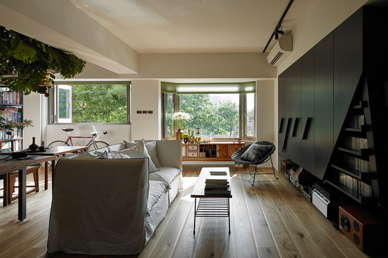
Living room is not the center of this family’s life, so it is narrowed. The oblique corner on the cabinet is designed to store the house owners’ CD collection. In this project, the living room is no longer a place to watch TV, but a comfortable to enjoy the music or reading books.
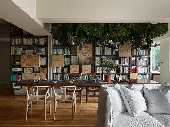
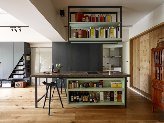
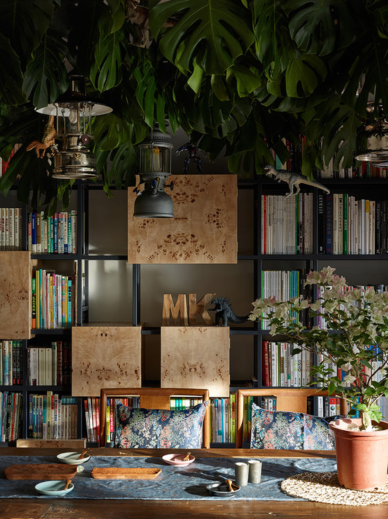
Dining room plays an important role in the family’s daily life. Friends gather and dine here; children also do their homework here. The iron pieces above the dining table not only extend the visual feeling, but it also can be used as a shelf to put some plant and the oil lighting to decorate the common area. Besides, the bar is combined with a kitchen island so that visitors can take the desserts and drinks by their own. At the same time, the tea pots and tea caddies on the shelf themselves are the best decoration in kitchen area.
Bedrooms and Bathrooms
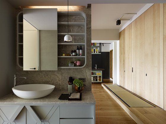
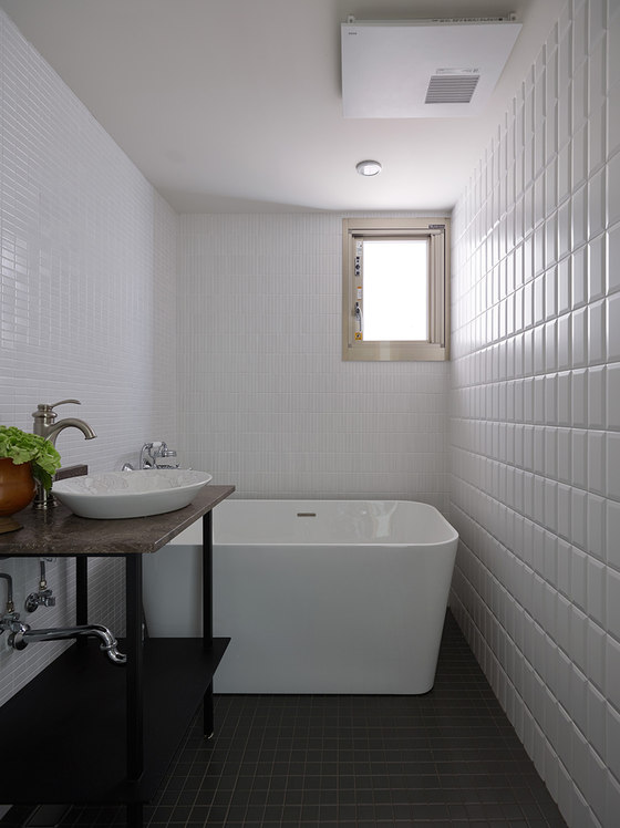
Three rooms were designed. Washitsu (Japanese style room) is multi-functional: it can be used as a playground of the children and as a guest house if there’re visitors. As for the bathroom, the design of the bathroom, compared to other space, is simpler but elegant. The white wall in the bathroom contains three different kinds of tiles, which enrich the texture in the space. A separate washstand enables the visitors to use simultaneously.
Arrangement of Traffic Line and Space
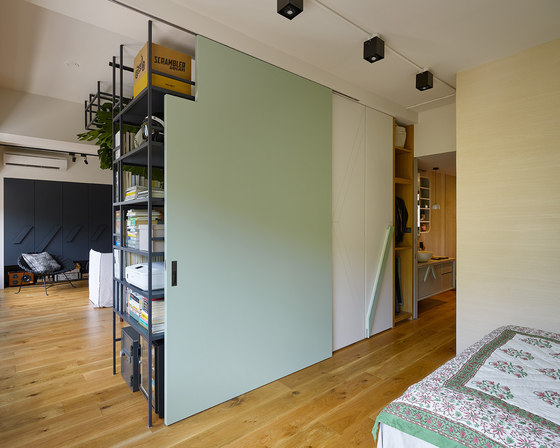
There were too many partitions in the original house. Because the original layout does not match their lifestyle and the personality of the house owner, the designers redesign the room arrangement. Private rooms are arranged in the rear section and common areas are put in the front of the house. The common areas including the living room and dining room are large enough so that this hospitable family can invite many friends at weekends. Round shape traffic line is designed to enlarge the spatial perception. The sliding door helps the sun light to reach every corner of the house.
Main materials used
In accordance with the owner's collection of antique wood furniture and the hostess’ interest of tea ceremony, main material adopted in the house is full of “zen” style. Besides, marble with natural pattern and wood also increase the sense of comfort in this space.
Color Configuration Design and Adoption of Soft Decorative Assembly
Wood color, a warm color that presents soft and elegance, is the main color tone of this house. The light green on the sliding door reduces the heavy feeling brought by timber. As for soft decorative assembly, the owner’s collection of antique wood furniture plays an important role.
Adoptions to Reduce the Expense
The house owner has no budget issue.
Design Concept Description
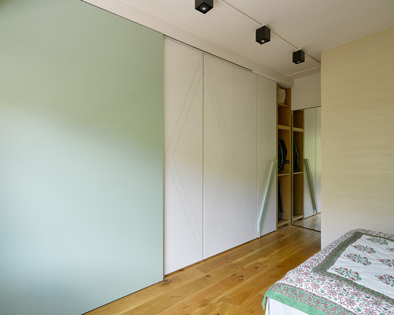
The greenery outside the window and the antique collection owned by the house owner generate the concept of the overall design. Based on the lighting condition and in accordance with the family’s lifestyle, the layout of the house is redesigned. Bedrooms and bathrooms are put in the back of the house. The larger front area is reserved for the common areas. The partition with a sliding wall separates the common area and the bedrooms. Besides, it is multifunctional: one side faces the bedroom can be used as a wardrobe and the other side faces the living room is a bookcase. Not only does the partition cabinet retains plenty of natural light for inner house, but also creates a coherent moving line between common areas and private areas.
A large dining table anchors the center of this house. Beside the kitchen, a kitchen island is used as a bar, a place to taste tea or a table for reading. In one conversation, the houses owners mention that they like go camping in their leisure time. Therefore, we set up an iron shelf on top of the dining table, so the house owner can hang their oil lamps collection or put some houseplants on it. The iron pieces help to extend the visual feeling, making a fun of tenting. The hostess likes Japanese tea ceremony and flowers, so we choose wooden flooring and veneer to make her home more close to natural.
Bedroom design continues the simple elegance of the public space, with white color motif, and is assisted with classic wooden cabinet space to strengthen its style. The two sets of the bathroom are planned in the middle to make the traffic line more smoothly. On the left side of the restaurant is a washitsu (Japanese style room), which can be used as a guest room. We think comfort is an attitude towards life. Surrounded by green and tranquility, the family enjoys the great comfort every day. Even in this bustling city, they can feel like camping at home.
Ganna design
Shin-Jie Lin
Ting-Liang Chen
