Photographer: Giulia Venanzi
Fluid spaces that combine vision and organisation
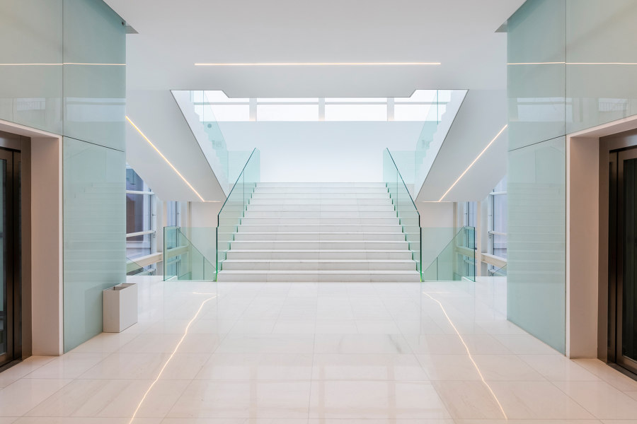
In a historic palazzo in Rome, the work spaces of an Italian holding company boast remarkable design choices that seamlessly bring together interior architectures and decorative wallcoverings in the name of perfect formal unity. Created by Il Prisma design studio, the concept is a brilliant expression of company specifications and a range of wallcoverings from collections by Glamora.
Cristian Solito, Associate & Team Leader of Communication - Visual for Il Prisma, told us how the project was conceived and developed.
What was the design brief and how did you develop the project?
The client’s main aim was to bring out the Group’s dual identity in their new work spaces and team their strong roots with their innovative forward-thinking approach. We wanted to create fluid, dynam-ic spaces which flow visually together and communicate the three core values of the company’s phi-losophy, i.e. innovation, internationalism and sustainability. These values are most effectively ex-pressed in the spaces where people come together (the social areas, the waiting areas, the discussion areas) as the guest is guided through the past, present and future of the company.
What kind of atmosphere did you want to recreate within the work spaces?
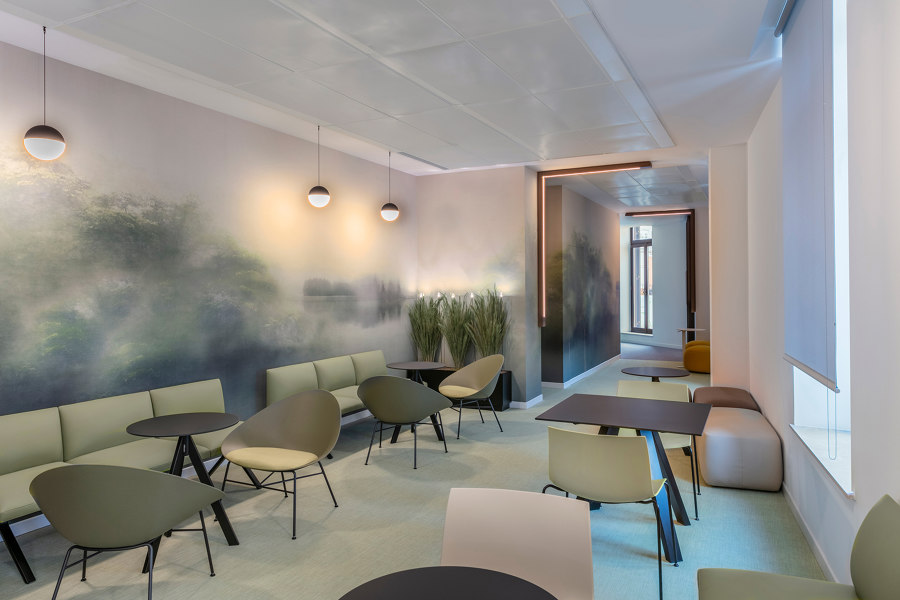
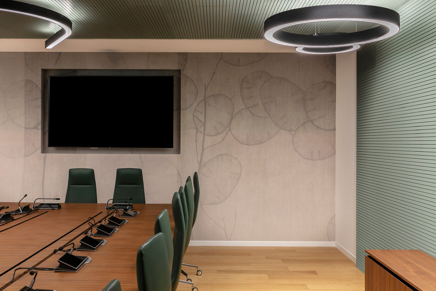
We wanted to recreate a warm, elegant atmosphere through the use of natural materials such as wood, and to develop this diffuse luminous quality by pairing pale colours with soft decorative patterns. We also focused on the theme of well-being, with wallcoverings in a range of greens (the Mangrove de-sign for instance) and natural elements such as plants.
How important was the choice of wallcovering?
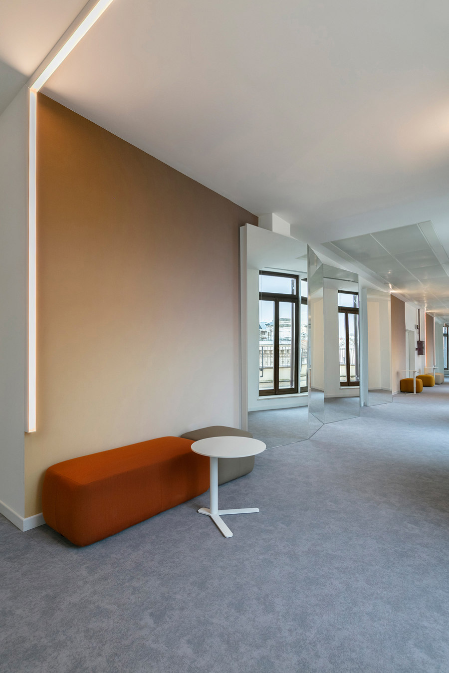
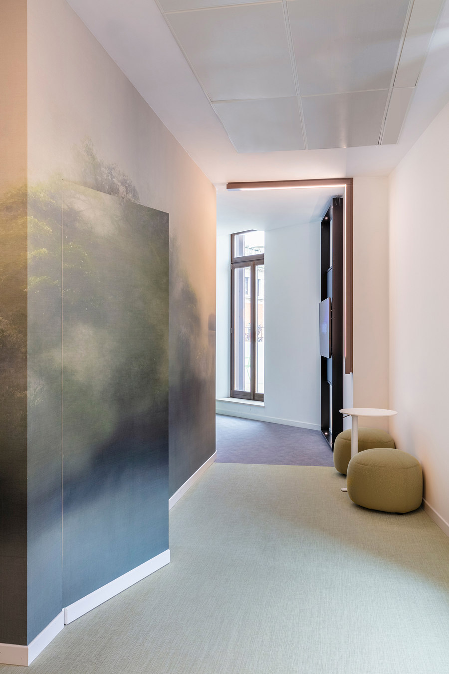
Right away we saw this decorative solution as the perfect choice for highlighting the themes I’ve just mentioned. The collections chosen effectively convey an understated elegance and a distinct sense of texture and feel, which are the guiding principles of the concept. The wallcovering flows seamlessly throughout the different areas and was also used on flush-mounted doors so it really is the focal point in every space. Walls are flooded with natural light from the vast glass surfaces and this combines with the natural detail and the earthy browns and greens to create a sense of peace and mental and physical well-being throughout.
What Glamora designs did you use and for what purpose?
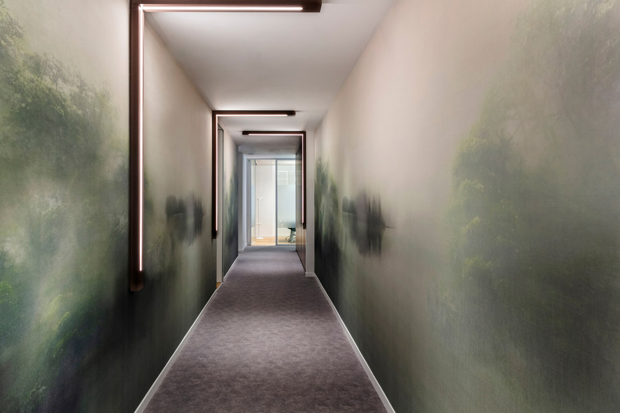
In the open-space offices, which feature glass walls to create a wonderful visual flow, we used Man-grove, Pure and You in warm, earthy shades (beige and browns) that evoke travertine and terracotta, the typical colours of the Eternal City. For the break-out areas and the passageways we went for Mat-inée in soft hues of grey and green to highlight the importance that the company places on sustainabil-ity. The furnishings and light fittings are in coordinating shades too. In the meeting room, the large central wooden table pairs naturally with the green of the armchairs and the hues of the Mangrove wallcovering.
In your experience, what are the key elements of a contemporary, people-centric work space?
A contemporary office needs to be flexible and you should be able to arrange it and use it as you need to. It should be an innovative space in which technology joins forces with architecture, and there should be a strong focus on sustainability and physical and mental well-being.
Architect
Il Prisma design studio

Photographer: Giulia Venanzi

Photographer: Giulia Venanzi

Photographer: Giulia Venanzi

Photographer: Giulia Venanzi

Photographer: Giulia Venanzi

