Luxury interiors specialists Goddard Littlefair have completed the design of a £15 m+ boundary-changing health and wellness clinic for innovative healthcare practitioners One Stop Doctors. The first One Stop Doctors clinic, in Hemel Hempstead, will set a new standard of excellence in the private healthcare sector, offering patients on-demand medical expertise, along with outpatient diagnostics (from blood, biopsy and health assessments to MRI, CT, digital X-ray and ultrasound), physiotherapy, dentistry and aesthetics - all located within a single ‘one stop’ clinic and available from early morning to late evenings and weekends, to fit with patients’ busy working lives.
Goddard Littlefair was commissioned for the project because of the consultancy’s expertise in designing high-end spas and wellness centres and creating the peaceful and reassuring atmosphere these require. The brief for the first One Stop Doctors clinic was to create an environment that embodied the instant premium touchpoints you might expect from a high-end service environment, whilst communicating the calm, soothing and welcoming feel of an obviously patient-centric experience, so that there is as little stress as possible at every stage of the patient journey through the space.
‘We were not looking for the usual clinical healthcare design’, One Stop Doctors CEO Ella Tracey commented, ‘but wanted a designer who could share our vision for creating an ambience that was relaxed, reassuring and tranquil, very comfortable and also aesthetically beautiful, but which still felt professional and reassuring to patients, so they know they are in the best possible care.’
The clinic is set within a two-storey purpose-built building and is a light-filled, airy space, arranged around an open, central courtyard. The interior layout, look and feel were all created as part of an intense consultation process between Goddard Littlefair and One Stop Doctors, aimed at creating a highly-differentiated leader brand within this marketplace for the first of a planned series of eight clinics to be located around the M25 corridor area.
‘We began the project by researching the private sector healthcare market in terms of look and feel’, Goddard Littlefair Director and Co-founder Martin Goddard explained. ‘We found that most clinics so far had followed the American model, with a very cool and clinical treatment throughout. Our emphasis was different – for patients to experience a much higher level of design values, maximising the contribution of the environment towards promoting a sense of well-being and creating confidence in the clinical excellence they will experience.’
The outpatient clinic has invested over £15 million in becoming a centre of medical excellence, offering same-day appointments and direct access to top consultants, GPs, diagnostic tests, dentists and physiotherapists, alongside a wide range of other specialist services. These include minor injuries, orthopaedics, cardiology, gastroenterology, neurology, endocrinology, well-woman clinics, men’s health services and advanced aesthetics treatments. The centre has 20 consultation rooms and features state-of-the-art scanning, X-ray and ultrasound equipment for fast, accurate diagnosis.
Design Walk-through
The One Stop Doctors experience begins outside the clinic, where patients get their first impression of the new offer. Clean lines of planting and structure ensure the approach to the main entrance is effortless and full of interest, with arrival framed by a row of silver birch trees, creating a rhythm along the length of the site, with the trees lit at night to soften the profile of the building and clipped hedges of variegated holly set between to add texture. A curved sign in textured stone and metal at the corner of the main road announces the brand and is lit at night-time. The sign is repeated at a smaller scale at the car arrival point and again at the pedestrian entry point.
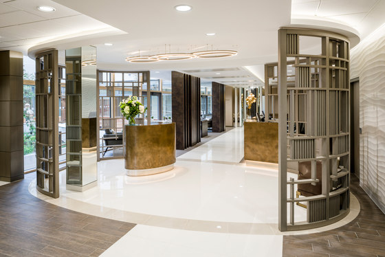
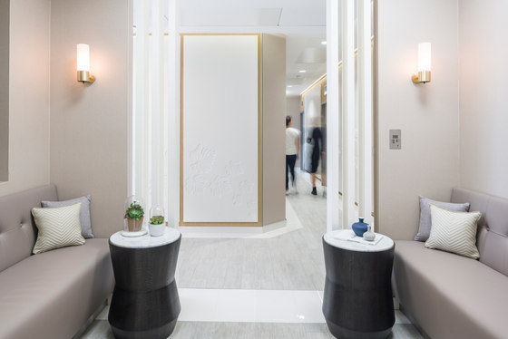
There is clear sense of arrival at the building itself via wide, automatic glass doors leading into the welcoming entry lobby area, which is more akin to a hotel or spa reception than anything clinical in feel and features a sophisticated design treatment using art, texture and drama to give a real sense of arrival. The mood is welcoming and warm with respect for the architecture and full advantage taken of the natural light coming in from the courtyard. The colour palette is also warm, with natural, darker colours. Semi-private areas beyond such as waiting areas or corridors feature a natural palette with softer colours, whilst the private areas – the consultation, treatment, dentistry and scanning rooms - have a lighter palette still. This series of colour transitions subliminally signals the patient’s movement from the welcome of arrival to a cooler feel for consultation and cooler feel still for clinical treatments.
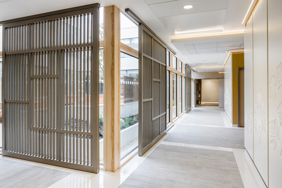
Flooring and shaping create an instinctive journey through the lobby space, with cream porcelain tiling for the main circulation areas, demarcated with a slightly darker porcelain tile ‘skirt’ and darker, timber-effect flooring to either side. Later in the scheme, for the corridor flooring, a different treatment is introduced, with cream porcelain tiling used for the outer edges and a pale grey, slate-effect tile laid in rectangular zoned areas, demarcating decision points.
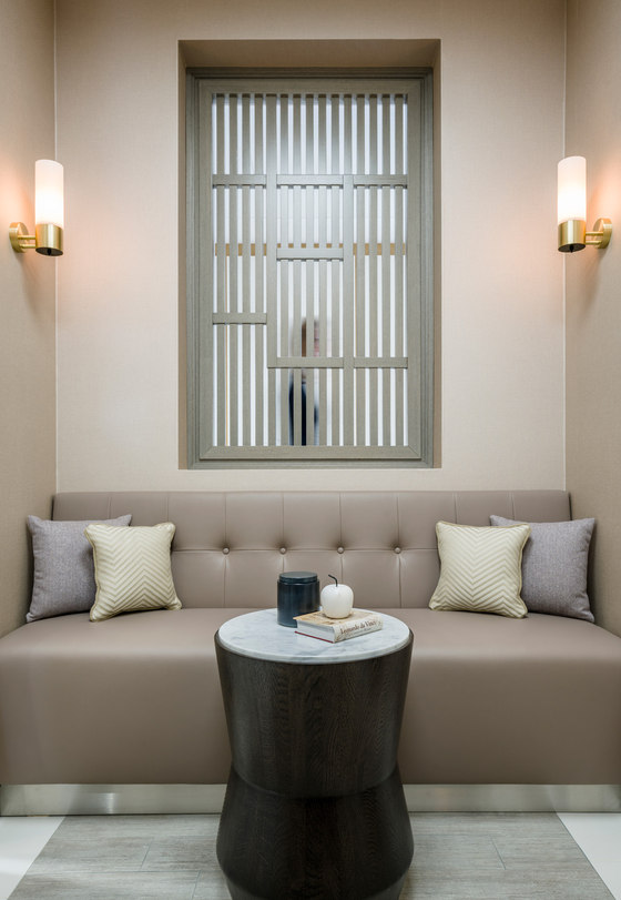
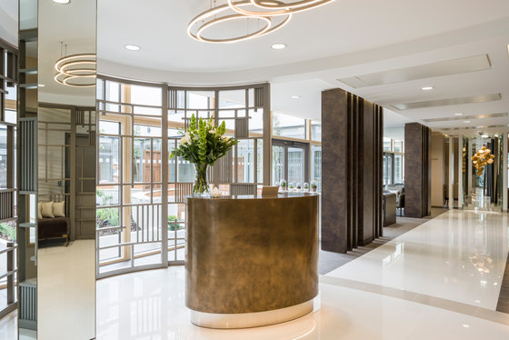
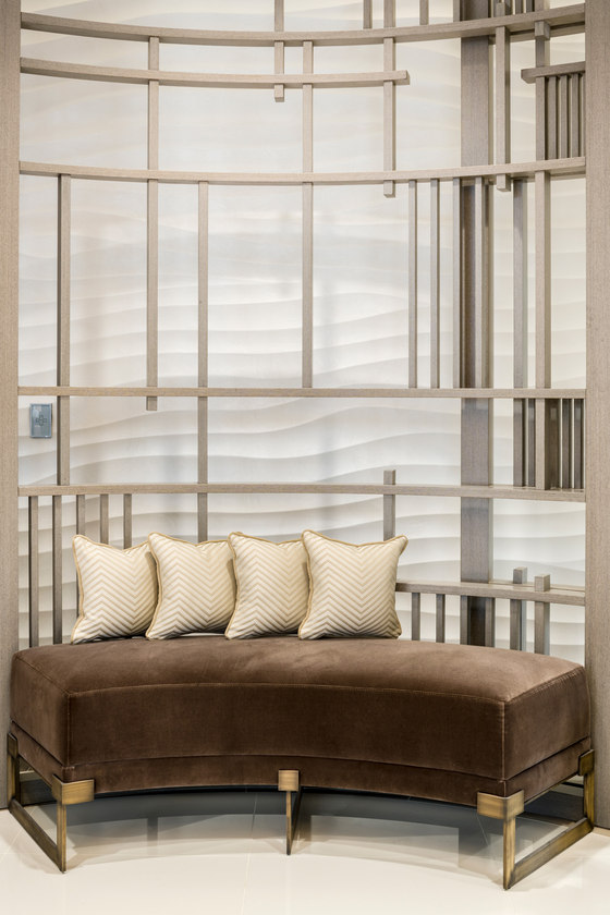
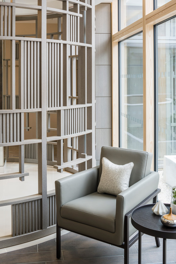
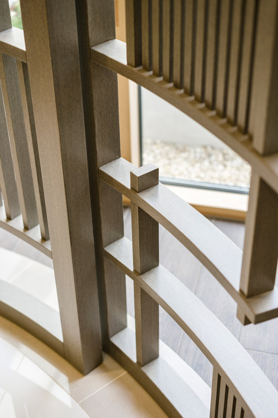
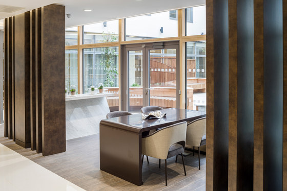
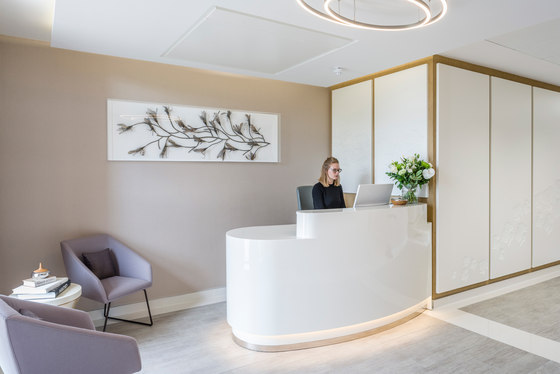
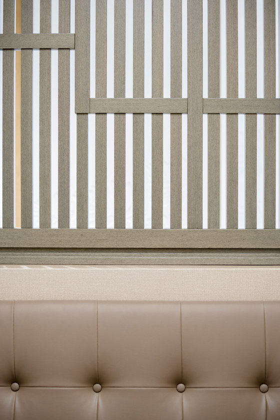
The introduction of a clinic concierge was key to the new approach of how patients are treated and one of the main points of difference from the competition. The concierge point is both informal and informative, making the check-in process quicker and more intuitive and is set within an ellipse-shaped area, reflected in the ceiling raft, which also features a series of feature LED lights in interlinking ovals. Timber-effect grey screens with an open, geometric design partly encircle the space, with the same material used throughout the scheme for all joinery.
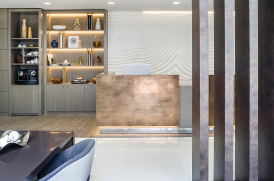
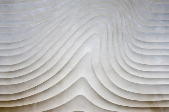
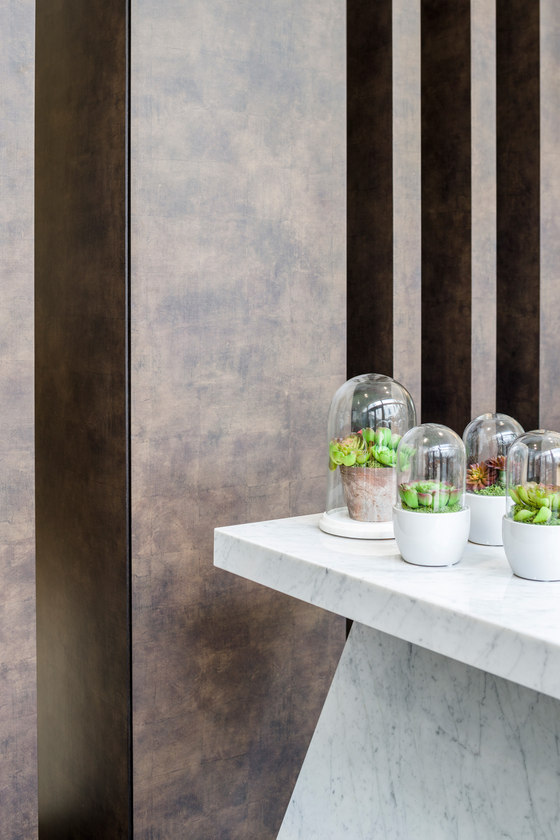
The concierge station features an antiqued, pitted bronze patina front, with random areas of shading, a treatment also used for the reception desk beyond to the right, where patients make further appointments and settle accounts. A 3D wave-effect wall treatment along the right-hand wall adds interest and underlines the bespoke, interesting and non-institutional feel of the space.
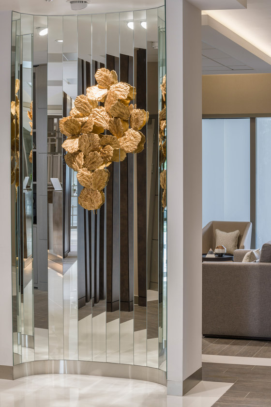
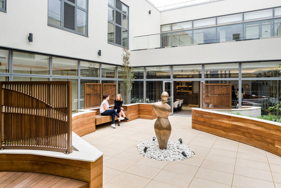
Columns are variously clad in a dark variegated paint effect, which ties in with the concierge and reception desk treatment, or in mirrored glass, with a front-facing curved column at the end of the lobby featuring a series of angled, vertical glass strips and a nature-inspired artwork, where light and reflectiveness help draws the eye through the space. The courtyard space is immediately visible through the glass to the left of the lobby area and is the breathing heart of the clinic, offering private space for contemplation or for those accompanying patients on their appointments. The design here is controlled, with clean lines following through the lines of the building itself. The view from one side to the other from the corridors is shielded and softened by landscaping, protecting the semi-private status of those in transit or taking a moment in the garden.
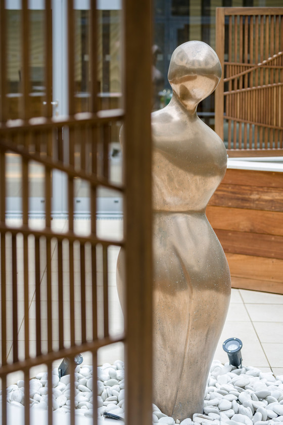
The outside edge is heavily planted and lit, creating immediate focus in front of the windows, which is especially important in winter or in the evening, when glazing can risk turning into dark, cold mirrored surfaces without anything to focus on outside. Planting underlines the direct link between Nature and wellbeing and was directly inspired by plants from medical science, including plants with known health benefits. The courtyard also features curved timber screens, benches and an eye-catching art piece, in the form of a bespoke sculpture of a human figure. This sculpture, at the centre of the whole space, reminds everyone – staff and patients alike - that the patient is always at the heart of the clinic’s work.
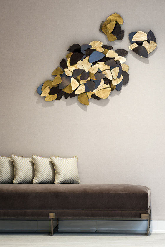
‘Art’s ability to communicate and transport people’s thoughts and emotions plays a major and proven role in healthcare and we were very aware of that in our commissions for the space’, explained Martin Goddard. Curated art here includes bespoke pieces and sculptures sourced to fit the particular brief for the space, with additional works by local artist Cecilie Enos. Natural shapes and textures ensure that the art is integrated into the design and not just an add-on.
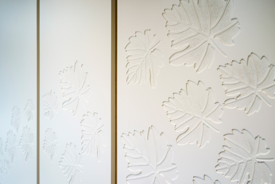
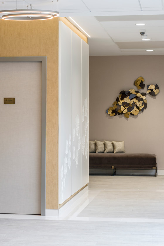
The idea is that the art will be very much curated per individual clinic so that each location has a strong and individual sense of place. Strong, bespoke, focal elements of feature design compliment the art and add to the feeling of a crafted and considered environment, from the lighting and use of screens to the etched wall panelling throughout, with its carved leaf motif.
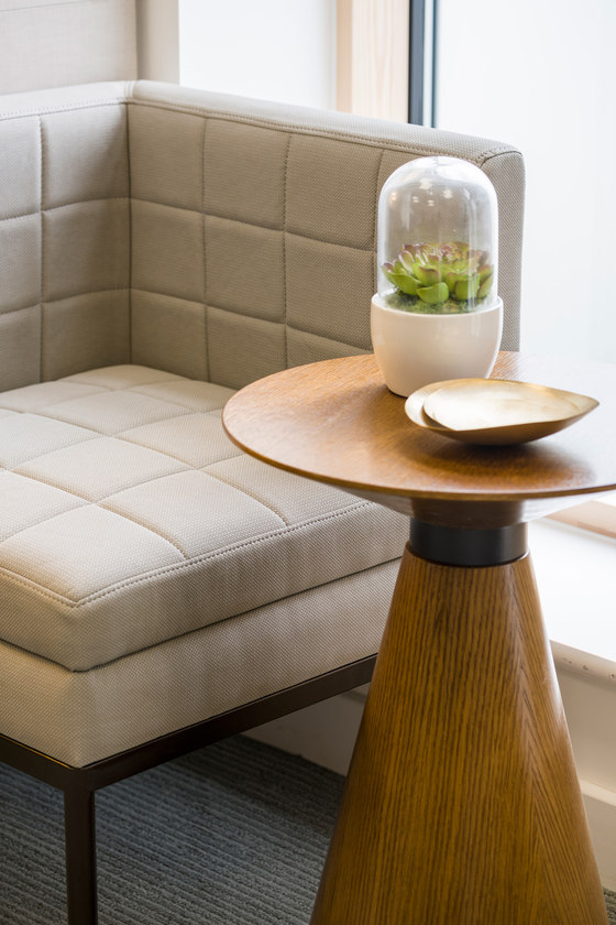
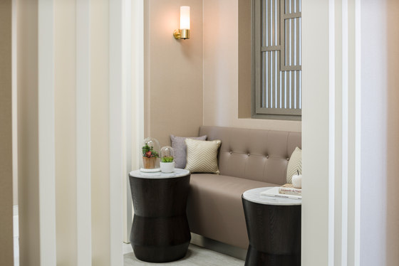
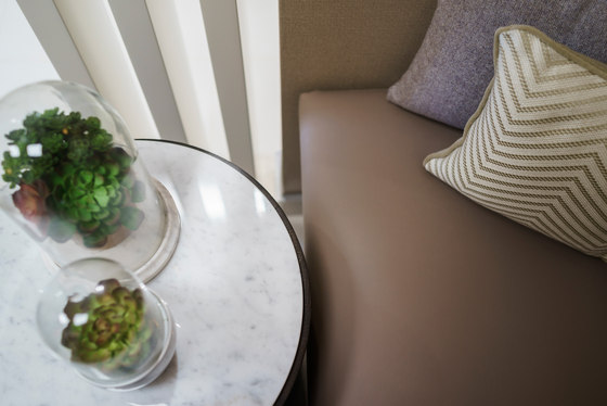
Furniture throughout is bespoke, which is a Goddard Littlefair design signature element and takes form in a range of high-end materials, including velvet, linen, leather and suede in a spectrum of browns, mushrooms, slates, taupes, blues, purples and greys. Lighting was also a very important part of the mix, creating features with natural and artificial light. Reflected and diffuse light help break away from typical down-lit spaces and create moments of drama and art.
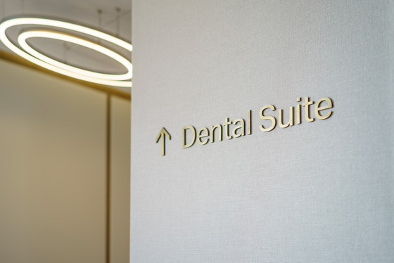
The journey through the clinic is intended to be as intuitive as possible, especially for the circulation spaces, making the routes clear and without the need for assistance or the excessive wayfinding sometimes found in other facilities. Portal moments at each of the main decision points and entries to different areas clearly define transition areas.
The medical and complementary services offers are arranged with aesthetic treatments immediately on entry to the right of the lobby area and scanning facilities also on the ground floor, as well as GP and Consultant referral rooms, with dentistry and physiotherapy on the first floor, served by a separate reception area for the first floor spaces - as well as back-of-house office areas on this floor, as the building will also serve as the One Stop Doctors head office.
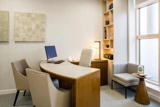
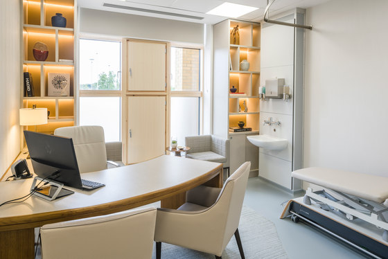
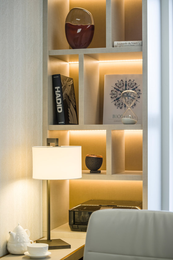
In the consultation rooms, the experience is professional but welcoming, maintaining the consultant and patient relationship, whilst putting both at ease. Warm light colours, an ergonomic, curved desk and a choice of both formal and informal seating creates a change in the way the patient is addressed. A residential tone is struck by the use of timber floors, wall coverings, soft furnishing and decorative task lighting, whilst the clinical and scientific nature of the experience is also preserved. Display bookcases allow for literature relevant to patient needs to be easily to hand.
‘We are absolutely delighted with the finished product’, Ella Tracey commented. ‘Staff, visitors and patients alike are so impressed with the elegance of the design and the attention to detail, but also appreciate the feeling of warmth and comfort that it creates.’
One Stop Doctors
Goddard Littlefair
