Multi-award-winning interior design studio Goddard Littlefair has just completed a £25m, top-to-toe transformation of The Principal Edinburgh Charlotte Square, formerly The Roxburghe Hotel. The new hotel joins the PRINCIPAL family of stand-out, city-centre hotels, each with its own unique treatment and personality, entirely appropriate to its historic building envelope and location. Other hotels in the collection include Principal Edinburgh George Street and Principal York (recently voted ‘Hotel Interior of the Year’ at the LateRoom.com awards, as well as ‘Hotel of the Year’ for the second-year-running at the Visit York Awards). Both hotels were also designed by Goddard Littlefair.
The remit for Grade II*-listed The Principal Edinburgh Charlotte Square covered a complete revamp of all the hotel’s public spaces, including the reception, lounge areas, ballroom and meeting rooms, plus the stunning central ‘Garden’ all-day dining area. All of the hotel’s 181 rooms and 18 suites, plus linking lobbies and corridors, were also completely redesigned.
The final element of the scheme was the creation of an exciting new bar and restaurant offer - BABA, a new destination hotspot for Edinburgh, masterminded by the culinary team behind hit Glasgow restaurant Ox and Finch and featuring a Levantine-inspired design feel and menu.
Goddard Littlefair Director and Co-founder Jo Littlefair commented on the overall design approach: ‘Like a cosmopolitan clubhouse, the scheme for The Principal Edinburgh Charlotte Square is eclectic, intriguing and full of references to travel, from set-dressing with vintage suitcases, hats and canes to The Map Room, where the walls are lined with historic maps from around the world. The interior feel is plush and elegant, with interesting and varied furniture and tactile, high-quality fabrics, such as richly-coloured velvets and leathers, all set within a series of stand-out individual spaces.’
History of the Hotel:
The property had long been a hotel, previously trading as The Roxburghe and, before that, as Crowne Plaza Edinburgh. It is made up of seven classic Georgian townhouses, originally designed by leading 18th-century architect Robert Adam. Townhouse ‘front doors’ still form part of the hotel’s façade, which fronts onto both George Street and Charlotte Square in central Edinburgh. Much of the building’s fabric is listed, aside from a relatively modern bedroom wing extension, which was built to increase the hotel’s capacity in the 1990s.
The hotel stayed open for trading throughout this current refurbishment, which was completed in phases, with the first set of bedrooms completed in 2016 and the new public areas in stages across late summer and autumn 2017. The listed, heritage aspects of the project were handled by architects 3DReid, with whom Goddard Littlefair has collaborated on all previous PRINCIPAL projects.
The Lobby:
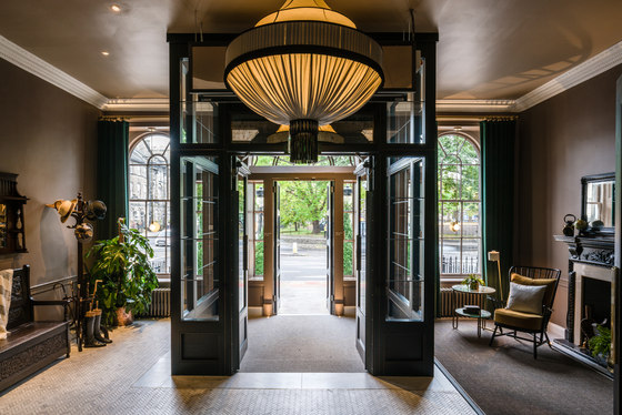
Guests enter the hotel via a classic original arched entranceway, refurbished with a smart, black-painted door set into a white-painted, glazed arch. The sense of being welcomed into a grand old Georgian townhouse prevails. Once inside, a spacious, glazed vestibule provides an area to wait or lounge in, with, to the right, an antique bench and bent-wood hat-stand and multiple hooks for hats and bags. Vintage walking sticks, hats, bags and suitcases immediately de-formalise the space and reinforce the subliminal sense of entering a private residence. Over to the left, an original fireplace, floor lamps, small tables and Ercol chairs upholstered in a rich mustard velvet, along with a sisal carpet runner, provide a sense of warmth.
‘To underline the sense of arriving at a hotel that communicates an instantly relaxed, pre-established feel, we chose to include a number of great vintage items in the scheme, with newer items often finished with an antique look or treatment, such as deliberately worn wood, so that the furnishings tell a unified story’, Will Hutchings, Senior Designer at Goddard Littlefair explained.
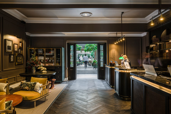
The vestibule space is freshened and contemporised by white marble, herringbone mosaic flooring, which cedes to an ebony timber parquet floor, as guests move into the reception area through a second set of glazed timber and bronze doors. Immediately beyond hangs an opulent, 1.1m-diameter, bespoke pendant light, designed by Goddard Littlefair and produced by A Shade Above in pale, coffee-coloured silk with elaborate black trimming.
The walls here are painted a soft milk-chocolate colour, creating an immediate feeling of warmth and intimacy. The space is further softened via the use of full-length deep green velvet curtains, which cleverly subdivide the space and provide a sense of privacy and exclusivity. The reception area has been reconfigured so that there is no traditional concierge station, although a valet will be present at a plinth in the vestibule to greet and help direct guests. The reception features a series of smaller welcome stations, which sit in front of a fully-stocked bookcase. With their aged black timber frames, black marble tops and woven leather front-inset panels with antique bronze detailing, the welcome stations provide a luxurious first ‘touchpoint’ for guests.
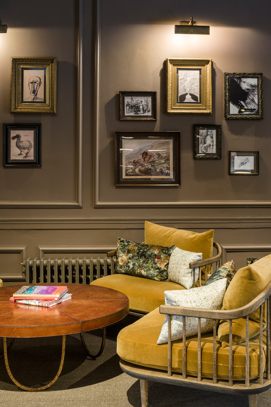
Opposite, a seating area features a fawn sisal carpet with chocolate-brown and cream edging, plus supremely comfortable lounge chairs from &tradition in the same mustard velvet. The chairs are dressed with flamboyant cushions in antiqued floral velvet, along with smaller cushions in a black and white print, introducing a monochrome sub-theme used through many of the ground floor spaces to offset the scheme’s more vibrant tones.
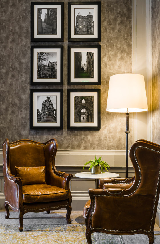
This seating area also sees the first iteration of the hotel’s new art collection, curated by leading art consultants ARTIQ. A broad range of prints and original art throughout the hotel suggests the collection of a well-travelled individual who has returned home to Edinburgh after many years away and relays, through a vintage lens, a narrative about global travel and Edinburgh itself. The lobby area features a ‘salon hang’ treatment, made up of vintage etchings, 18th century political illustration, original abstract paintings and drawings, contemporary prints and sketches. Frames are also a deliberately eclectic mix, from slim contemporary mouldings and roughened wood to genuine vintage guilt and carved frames.
The Garden:
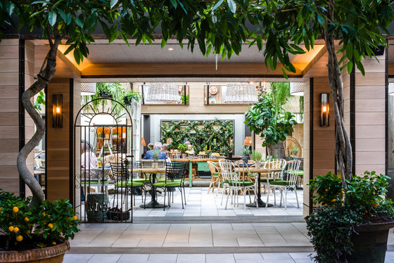
A strong visual axis has been created by Goddard Littlefair to ensure that the new ‘Garden’ space is immediately visible from the moment you enter the hotel. Located in a space previously used for pre-function drinks or as a breakout area, The Garden will serve as a destination all-day food and beverage space (with the menu ranging from sumptuous olive oil sponge cake at tea-time to spritzers and mouth-watering Scottish cocktails at night), creating an oasis for local Edinburgh residents, as well as hosting breakfast service for hotel guests.
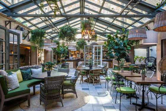
Originally open to the elements, the central courtyard space has now been reclaimed as part of the hotel’s interior space with the addition of a new glazed roof. With open views of the sky, the light-filled space provides the hotel with a much-needed heart and allows comfortable all-year-round usage. Electronically-operated Pinoleum blinds ensure the light is not overwhelming on bright summer days and soften the fenestration. The introduction of timber-clad columns and surrounding bulkhead both encloses and compartmentalises the space, providing a number of intimate nooks and cosy corners. Cantilevered mirrors have been added to the bulkhead to maximise the sense of light and space and to encourage glimpsed views and people-watching.
The design for the space was inspired by the great hothouses, orangeries and nurseries of grand, historic country estates. Art Nouveau peacock chairs provide a sense of exoticism and romance, for example, whilst the fabric palette of vibrant greens and yellows, grounded by the ever-present monochrome sub-theme, reinforces a stylish ‘al fresco’ feel. Planting, including trees, hanging baskets, pods and vines were supplied by Bright Green and local landscapers Fleurtations. Ladders laid across the roof transoms provide an anchor for paint-dipped wicker lampshades, antique chandeliers and the occasional watering can.
The space has been skilfully sub-divided to provide guests with a sense of privacy and intimacy, using reclaimed glazed doors, fretwork screens and metal gates sourced from architectural salvage yards. Two different types of ceramic tile are used for the flooring, with one for the main space and one around the perimeter - and both types made to resemble distressed/aged concrete with subtle, worn patterns, whilst timber is additionally used for threshold areas. A reclaimed green-painted workbench serves as an authentic centrepiece for The Garden and is clearly visible from the entrance. This is used both for breakfast display and for cakes and pastries when tea is served in the afternoon. A bar area features a riveted zinc counter, overhanging pergola and vines and provides a visual focus at one end of the space, enlivened by sounds from its own water fountain.
A deliberately eclectic and varied approach has been taken with all the furnishings to give the impression of pieces acquired by the owner of the ‘house’ over a period of many years. These include a combination of painted wrought iron, wicker, timber and woven rattan chairs. Tables, some bespoke and some from Restoration Hardware and Andy Thornton display a variety of finishes, from reclaimed timber to stone tops. Visual cohesiveness is achieved by the sensitive deployment of a vivid fabric palette, with all seat pads for example in the same leaf green, layered with cushions, throws and faux-furs. An L-shaped sofa, immediately on the right as guests enter, is upholstered in a densely-patterned floral velvet from House of Hackney and provides a transitional lounge space between The Garden and reception.
In the evening, the space takes on a magical feel, thanks to the ambient lighting scheme, which includes periphery walls lights, with an intimate, candle-lit feel, whilst the extensive use of wicker shades reinforces the sense of being in an indoor-outdoor space and casts playful patterns across the walls and floor. Pretty glass-jar lights with metal floral fittings, multiple-string ‘festoon’ lighting and antiqued metal chandeliers all add to a garden-party vibe. A particularly notable element are the eight, over-scaled drum lampshades around the edges of the space, dressed in a black and white palm tree fabric from Tissus d’Hélène.
‘We cast the net wide when it came to searching for the right accessories to dress the space with and add personality’, commented Richard McCready-Hughes, Goddard Littlefair Creative Director. ‘Extensive trips to antiques markets and dealer fairs provided one-off planters, jardinières, benches, cabinets and garden tools, all of which add to the fashionably eclectic feel of the space.’
Pre-function Space, Gallery, Board and Drawing Rooms:
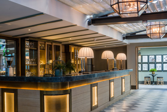
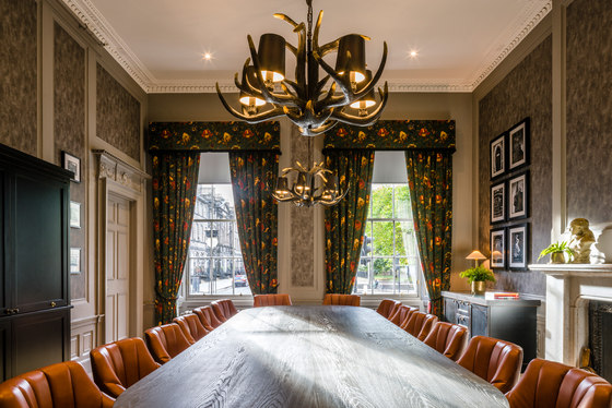
The pre-function space is located directly behind the bar area of The Garden and shares part of the same glazed roof. The area benefits from a soft glow of light, created by mid-century-inspired table lamps, which sit on the bar counter, whilst glass and metal lanterns continue the outdoor feel. This space can be sealed off for functions, as it leads directly into The Gallery (the former ballroom), where grey-toned woodwork acts as a backdrop for gallery-feel art displays, featuring local artists. On the George Street side of the hotel, floor-to-ceiling glazing affords passer-by views directly into The Gallery between new charcoal grey curtains, coupled with a white sheer.
BABA:
BABA is the stunning new destination restaurant and cocktail bar within The Principal Edinburgh Charlotte Square, with both offers under the direction of Jonathan MacDonald and Daniel Spurr from hit Glasgow restaurant Ox and Finch, in partnership with restaurant and bar visionaries Robbie Bargh from Gorgeous Group and Katherine Arnold.
BABA offers a boldly unconventional menu of simple, fresh, tasty small plate mezze dining and the restaurant’s unique twist is the flavour of ‘Levantine escapism’, infusing everything from its personality and design to the bold eastern Mediterranean mezze food offer. Goddard Littlefair was asked to provide a step change in terms of the look and feel of these spaces and this change in approach is immediately apparent.
‘To give these hospitality spaces a strong and unique personality, but at the same time ensure they linked well to the rest of the hotel, we incorporated a number of period elements that paid respect to the building such as Georgian-era tiling designs, as well as architectural salvage elements that linked other key spaces’ Will Hutchings of Goddard Littlefair explained. ‘We then alluded to the Levantine-influenced food offer with, for example, a series of rugs fitted to the walls like tapestry artworks and via the richness of the colour scheme, which includes aubergine, teal and peacock leather armchairs, with the whole concept overlaid with a bold and contemporary freshness.’
The BABA bar has its own street entrance, which signals the unique identity of the space within. A specially-commissioned mural of the ‘host’, Mr Baba, based on a vintage photograph, provides the backdrop to the bar counter. Elements of this image re-occur within the restaurant and across BABA’s brand collateral.
The bar itself has been refurbished with a re-finished, dark-stained, timber bar front and re-used zinc bar top, replete with the signs of ageing and character from its previous life. A new gantry above the bar counter has been constructed using mesh cages and scaffolding poles to provide storage for glassware. Contemporary bar stools now allow guests to sit at the bar counter. The bar ceiling is painted in a rich teal tone, with multiple antique framed mirrors attached to it, reflecting the activity beneath. A new, poured concrete floor has been decorated with a stencilled repeat motif, whilst the aubergine leather backrests on the bar banquettes, hung from scaffolding poles, plus a bank of reclaimed cinema seats, provide all-important contrast in the space.
Four wall 300 x 320 mm lights with timber-panelled shades (‘Rita’ by Graypants) add further interest by casting interesting shadows and playing with light. Two further examples are also used in the restaurant. Guests move from the bar to the restaurant via a glazed platform, which allows views over the space before stepping down into it. At the base of the steps is the restaurant’s show kitchen and dining counter, which is the first of a series of dining spaces, also including The Map Room, The Salon and The Library, each with a different emphasis, in addition to the main restaurant space.
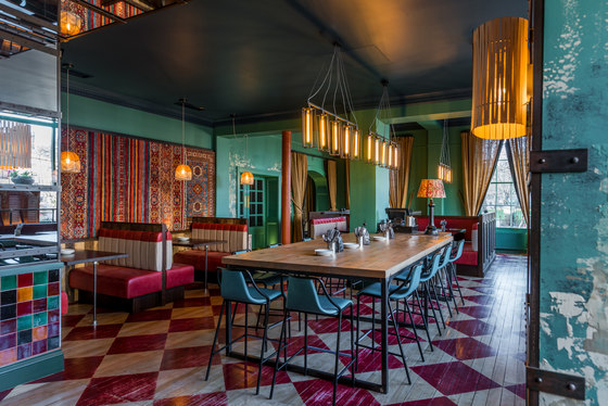
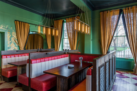
The main area features a vibrant colour scheme and an industrial, distressed design feel, with strong elements of the Levantine in terms of colours and detailing. An arresting palette of deep teals and sea-green is used for the walls and ceilings, on top of which specialist paint finishes have been applied by artist Diane Hill to evoke the passing of time and hint at the building’s age and materiality. The extensive use of mirroring reflects the richly-patterned, Middle Eastern, wall-hung rugs, as well as the deep red, terracotta and sea-green tiling, adding a sense of glamour and excitement to the space. A deep red chequerboard pattern, stencilled onto the floorboards, will wear with time and increase the scheme’s feel of worn authenticity.
In the centre of the space, a row of banquettes has moveable divider screens, so that the seating can be set up in variables of groups of ten, in either a four-plus-six formation or a two-plus-eight. The screen sliders use hardware originally created for barn doors and are set on rollers with timber frames and panels covered in red leather. The framework for the banquettes was created using reclaimed timber boards, surplus to requirements in the hotel’s third floor bedrooms, with decorative inset panels formed from interwoven strips of elasticated webbing, more traditionally used for the construction of chairs.
‘These are an excellent example of the resourceful upcycling we looked to incorporate wherever possible in the scheme’, commented Goddard Littlefair Creative Director Richard McCready-Hughes.
The restaurant’s inner wall also features a long row of banquette booths, whilst the window and back wall has freestanding tables with seats upholstered in either a turquoise or aubergine-coloured leather. Huge, shop-front-style windows face out from the restaurant onto George Street, where a series of salvaged shutters has been fixed along its length, allowing light ingress and affording diners a degree of privacy. Once again, mirror is used on the ceiling above this line of windows, so that passers-by still get glimpses of the interior activity.
Striking feature lighting includes five sets of bespoke, hand-forged lights with metal chandelier casings by Made by the Forge, along with twenty pendant lights made up of fret strings along the inner and window sides of the restaurant and which also continue into the bar area, by Danish designer Alexandra Raben. There are three more lights by the same designer along the restaurant’s back section and one super-sized one in burnt orange over the ‘snug’ seating area.
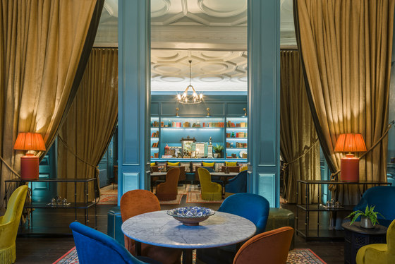
The Map Room, Salon and Library are individual ‘roomset’ spaces, semi-separated from the main restaurant, which can function as private dining areas. The rooms are bold and colourful with certain shared design treatments, including white ceilings, stained timber floors and peacock blue walls and shelving. The overall feel is ‘luxurious clubhouse’, featuring softer fabrics, such as velvets, rather than the leather used for the main restaurant furniture, where there is more need for high-usage robustness. The Map Room and The Salon are side-by-side and face The Library and Dispense Bar, whilst the corridor between that leads to some of the hotel’s bedrooms in the ‘old block’ section. Curtains are used to ensure a feeling of separateness from this through-traffic and to ensure a feeling of containment and intimacy. The curtains are in hessian with a charcoal velvet leading edge, adding texture and countering the rich materials used elsewhere.
The Map Room is characterised by an artwork collection of framed map and vintage travel posters. This is a colourful room, building on the peacock blue anchor colour with oranges and a burst of dark red. Furnishings include a reclaimed vintage sideboard, bent-wood and rattan chairs, as well as softer club chairs. Some of the furniture has a knowing, semi-ironic nod to old-fashioned standards, via the use of fringe detailing, for example. A lighting feature, by Janie Knitted Textiles, is made up of a cluster of twelve lights in three different shapes with dip-dyed wool shades in blue, orange and grey. The room is clubby in feel, but the dining tables are at proper dining height, so that the room is also very much appropriate for dining.
Directly opposite is the Dispense Bar, visible though a semi-glazed-panel arch. The timber and glazed bar once again features reclaimed bedroom timber. Linking to the vernacular of the BABA bar and its industrial feel, scaffolding poles are used here for glass storage, with coffee sacks used both for display and to obscure views of the kitchen.
Next door to The Map Room is The Salon, which has a more pronounced lounge feel, with tables at cocktail-dining height. Furniture is more heavily-upholstered in rich yellow, orange and peacock blue velvets.
Opposite is The Library, where the bookshelves are filled not only with books, but with objects and discoveries from around the world, setting up the first hints of the BABA narrative, which build as you progress through these spaces towards the restaurant. Bright colours and luxurious velvets prevail, with an eclectic mix of furniture, including four Persian and Afghan rugs.
Guestrooms and Suites:
No two rooms are the same in this great collection of 199 rooms, including 18 suites. The bedrooms are spread across three locations – the old block; the new wing and the ‘wee hoose’. The design treatment for all centres on comfort, colour and character, with fun and eclectic ‘salon hang’ artwork in each room, for example, ranging from the contemporary and abstract to cultural illustrations and highland animals, treated with a touch of irreverent wit. Art consultancy ARTIQ also sourced accessories for the rooms, from cocktail shakers to small succulents. For the corridors, vintage drink and advertising posters sit alongside animal prints and maps.
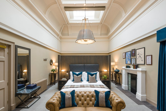
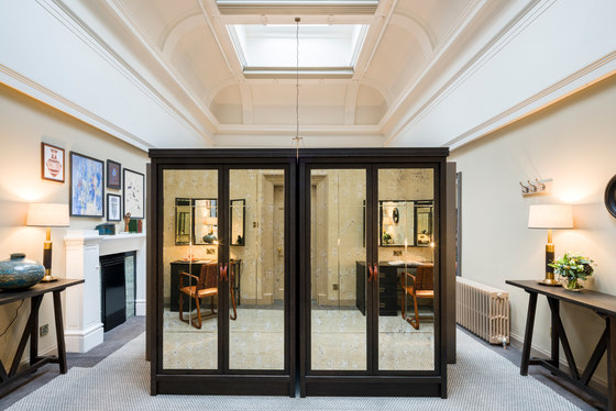
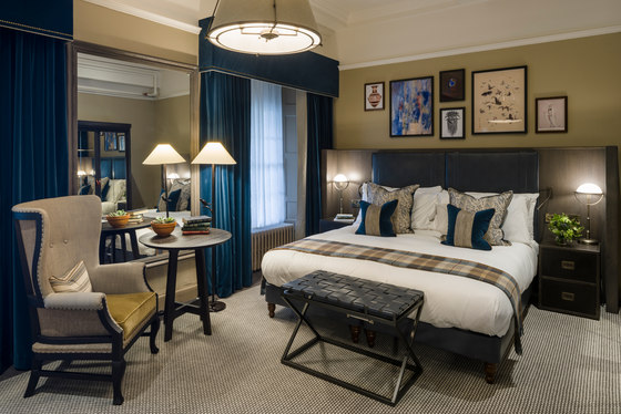
The old block guestrooms make the most of period details, such as refurbished listed detailing and cornicing. The overall design treatment is a balance between tradition and a more youthful, contemporary feel. Carpeting throughout is a white and grey dogtooth design from Newhey.
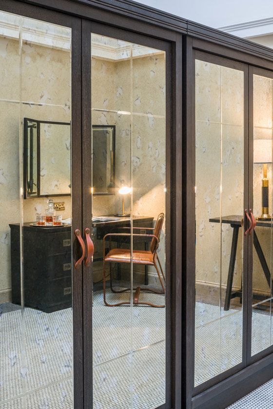
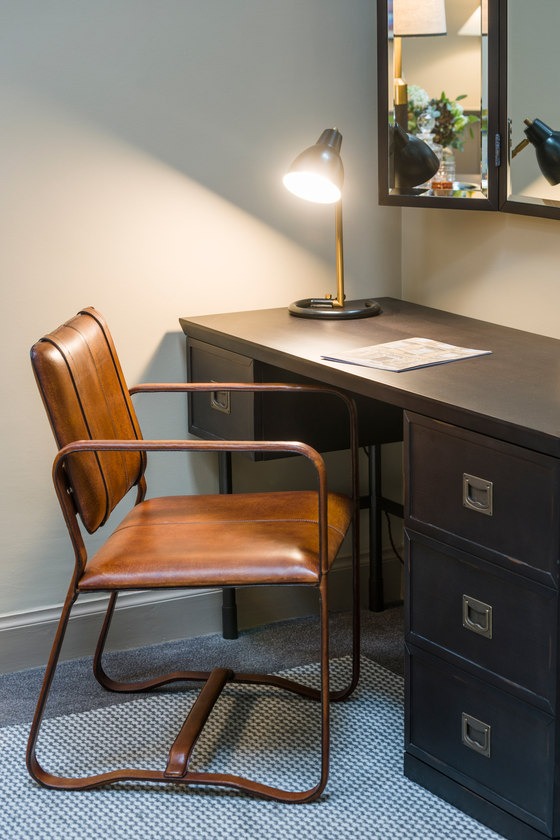
The beds feature upholstered headboards, with saddlery and buckle details in a deep blue/grey leather, plus freestanding items of cabinetry finished in a combination of deep ebony and soft, contemporary grey stained oak. Deliberately de-constructed wing chairs feature in some rooms, where exposed rear framing and webbing adds to the authentic, established, residential feel. The cabinetry carries details from trunks and suitcases from the golden age of travel and exploration, whilst tweeds, tartans and velvets provide warmth and a sense of place. The bathrooms in this block feature a contemporary treatment with high-quality sanitary-ware, bespoke lighting and mirrors.
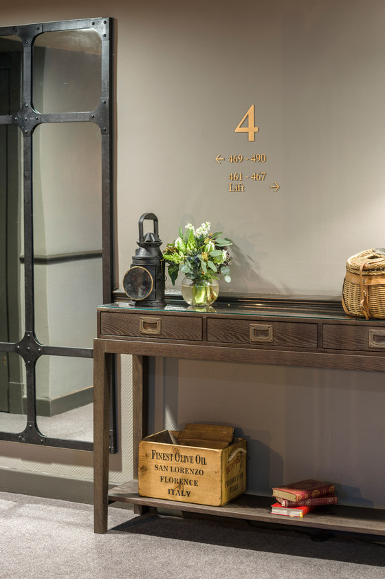
The old block linking corridors are painted in a green-grey tone, with pools of light outside each guest room. The new wing guestrooms are more uniform in layout and considerable effort was made to ensure they had the same sense of character and uniqueness present in the more historic areas of the building. The rooms here feature herringbone flooring from Karndean, overlaid with bespoke rugs, designed by Goddard Littlefair and produced by Brintons, which immediately convey a contemporary, residential feel.
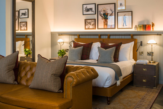
Painted timber tongue-and-groove panelling has been cleverly deployed on the headboard wall to enable the design team to optimise the layout without further structural work. Aesthetically, this also adds character and creates a platform for artwork and accessories to emphasise the hotel’s personal and individual style. Many rooms feature caramel-leather, buttoned Chesterfield sofas, as well the highly-original touch of bespoke artists’ easels to support the rooms’ TV screens.
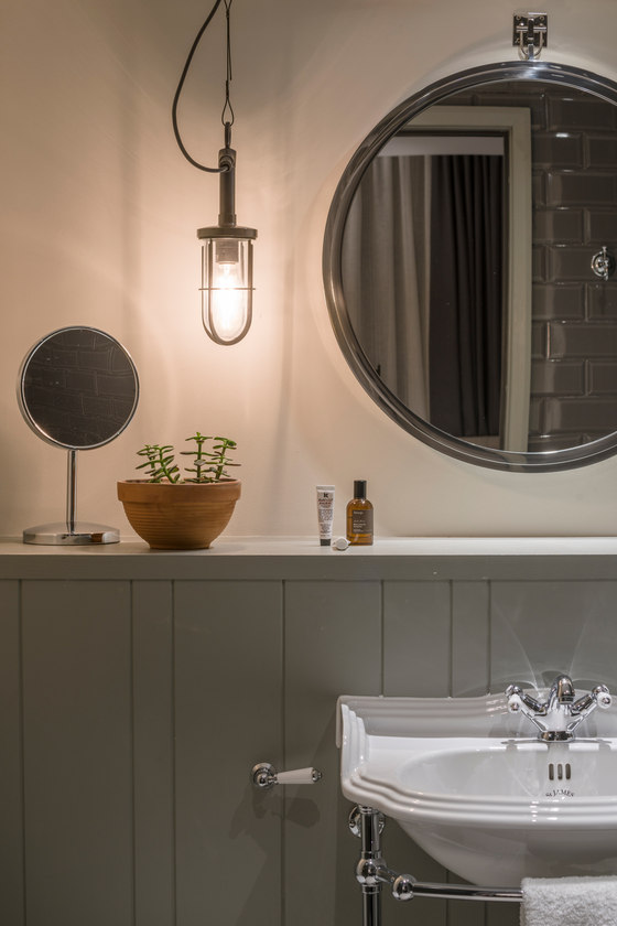
The tongue-and-groove panelling has been carried through into the bathrooms and runs behind the St James washstands, which have a traditional feel. Warmth is provided by metro tiles in a dark mink colour lining the walls of the generously-apportioned walk-in showers. The floor tiles are in a soft grey timber-textured ceramic.
All the bespoke freestanding furniture and guestroom lighting were designed in-house by Goddard Littlefair and produced by Thomas Johnstone, Ozo/Living Area and Heathfield Lighting respectively. The ‘wee house’, which is like a mini hotel-within-a-hotel spread over four storeys, has bedrooms with a similar feel, but with a unique bathroom treatment, featuring roll-top baths, marble washstands and tiles, as well as Victorian-style, chequerboard floor tiling in a herringbone pattern from Fired Earth, along with timber skirting and a dado rail.
Goddard Littlefair
