Photographer: Donkers Bouwkundig Tekenburo, Elsendorp

Photographer: Donkers Bouwkundig Tekenburo, Elsendorp

Photographer: Donkers Bouwkundig Tekenburo, Elsendorp
Transparent and simple house, The Netherlands
A practical, transparent and simple house, mostly intended to be discovered as you go through it, weaving through the different spaces.
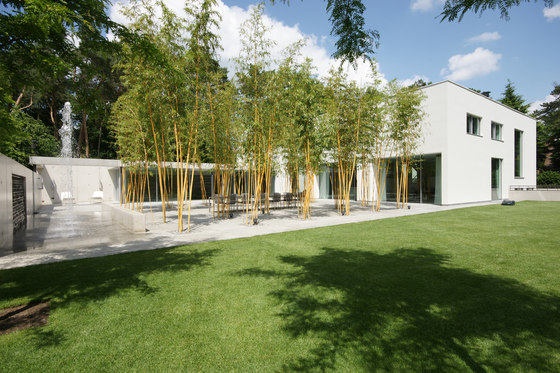
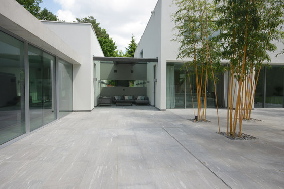
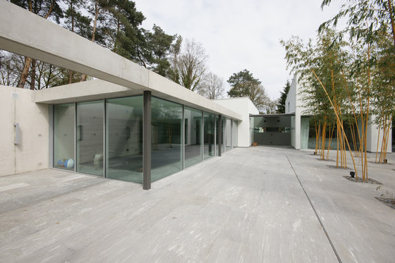
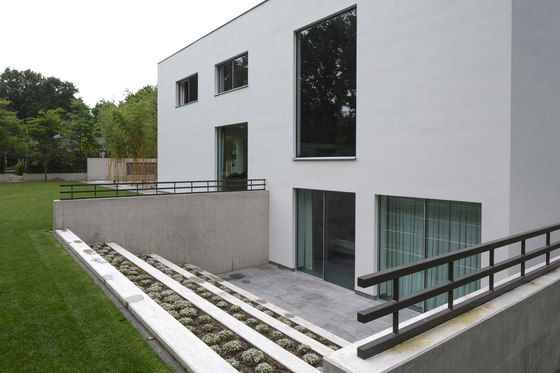
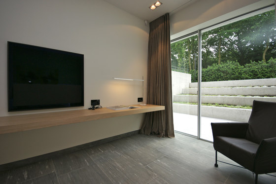
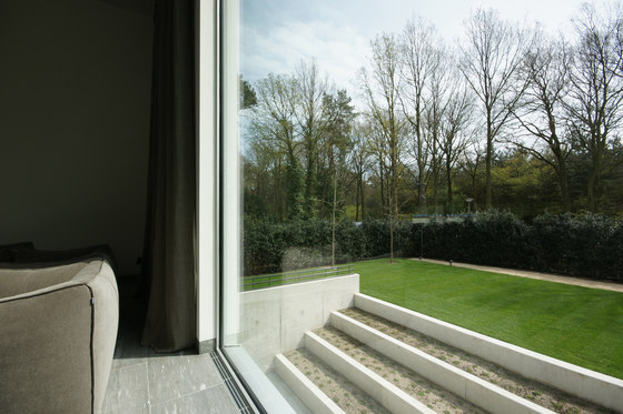
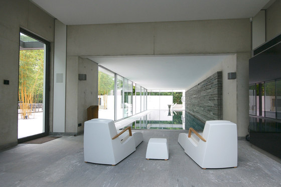
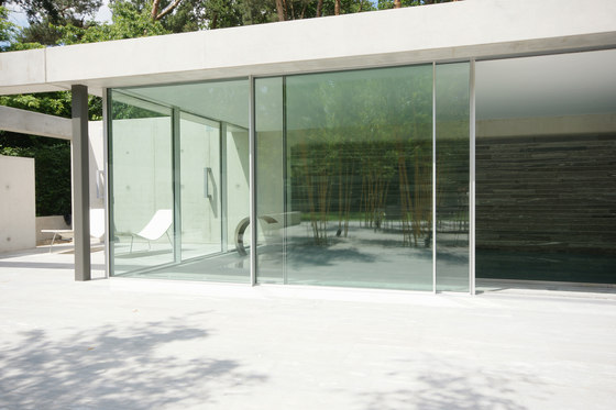
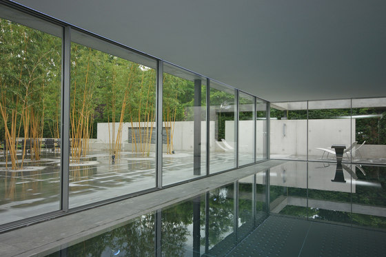
The house is spaciously transparent and open to the garden due to the implementation of large sliding glass doors. All glass surfaces are designed with the KELLER minimal windows® system. The idea was to separate the house a little but weave it through the exterior space. It is a completely private space with an amazing view and totally open to the surroundings.
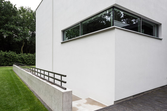
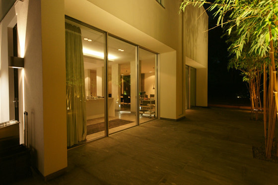
The land on which the private residence was built was designed with a magnificent green area, meaning that nature was an integral part of this project's design. The colours, light and texture of the chosen materials imitate and blend in with the surrounding nature, as if the house were simply a part of it. In this way, the evening light reflects from the tree trunks, colours playing with the tree bark. The location itself defined the entire project's conception with the absence of other houses providing the opportunity to create a clean and natural façade to this building.
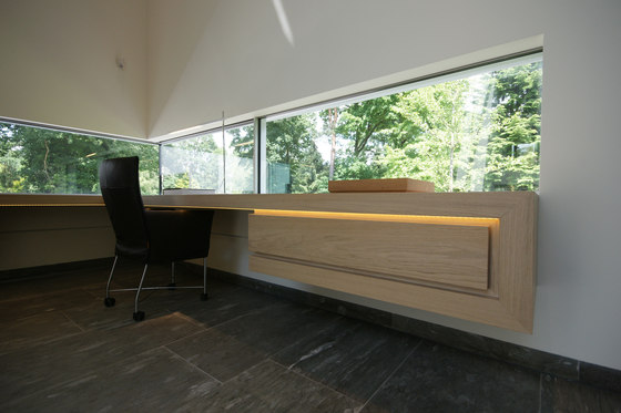
The design provided for several terraces, extensive views and outdoor access. The outside is brought inside by floor to ceiling windows in the main rooms, which provide an almost seamless outdoor feeling. It is a contemporary development where each space is meticulously designed. The key aspect of the property is its response to the light.
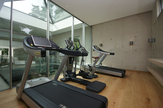
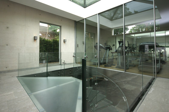
The house is an architectural achievement having three bedrooms, a dining room, a living room, an office, a fitness room, three accessible outdoor areas – one a complement to a bedroom, another made of glass on the dining/kitchen level and the third a swimming pool – and a twin garage.
The house is organised in a vertical and hierarchical way. The social areas are on the lower floors and the private areas on the upper levels. The courtyard affords a sense of depth and expansion to the spaces, allowing for all the floors from the basement to the first to be experienced as a single space connected vertically and horizontally. It’s a minimalist house with a unique design!
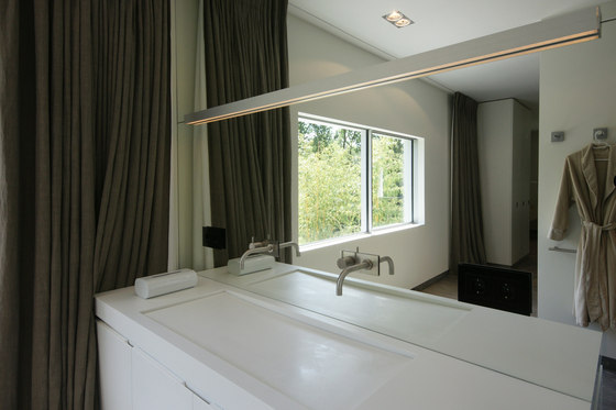
All interior decoration was specifically designed, from the wardrobe, dressers, kitchen, bedrooms, bathrooms and office furniture. The predominant colour in the house is white, creating a unity between the spaces and making it very lightweight and ‘clean’.
Architecture: Donkers Bouwkundig Tekenburo, Elsendorp

Photographer: Donkers Bouwkundig Tekenburo, Elsendorp

Photographer: Donkers Bouwkundig Tekenburo, Elsendorp

Photographer: Donkers Bouwkundig Tekenburo, Elsendorp

Photographer: Donkers Bouwkundig Tekenburo, Elsendorp

Photographer: Donkers Bouwkundig Tekenburo, Elsendorp

Photographer: Donkers Bouwkundig Tekenburo, Elsendorp

Photographer: Donkers Bouwkundig Tekenburo, Elsendorp

Photographer: Donkers Bouwkundig Tekenburo, Elsendorp

Photographer: Donkers Bouwkundig Tekenburo, Elsendorp

Photographer: Donkers Bouwkundig Tekenburo, Elsendorp

Photographer: Donkers Bouwkundig Tekenburo, Elsendorp

Photographer: Donkers Bouwkundig Tekenburo, Elsendorp

