Design Approach
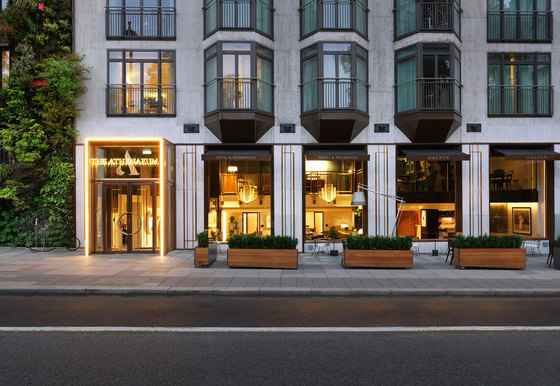
Speaking of the design approach to the project, Kinnersley Kent Design Partner Jill Higgins explained, ‘Above all, we were looking to open the hotel up in terms of light, space, circulation and visibility. The building’s original art deco nature has also been brought back to life by replacing the ground floor elevation with an elegant bronze façade with brass details referencing the 1930s modernist style.’
Exterior facade, entrance and terrace
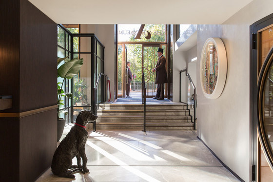
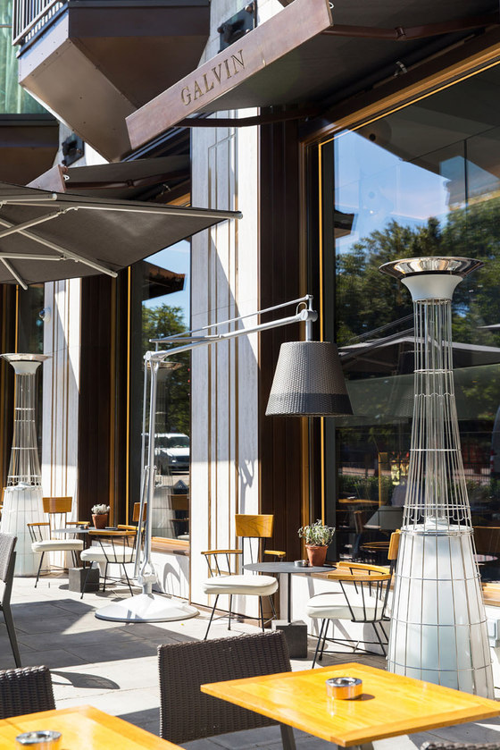
The hotel’s external appearance has been transformed, with an entirely new ground-floor-level façade offering guests spectacular leafy views out across the Royal Green Park via new floor-to-ceiling windows.
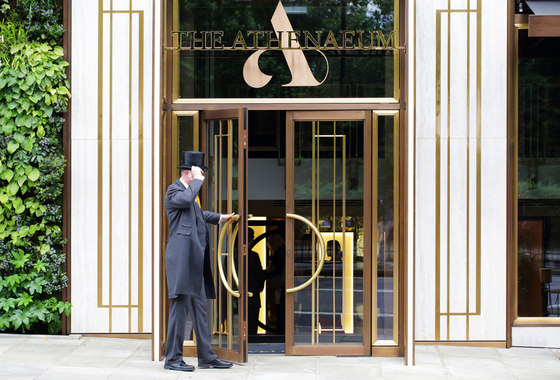
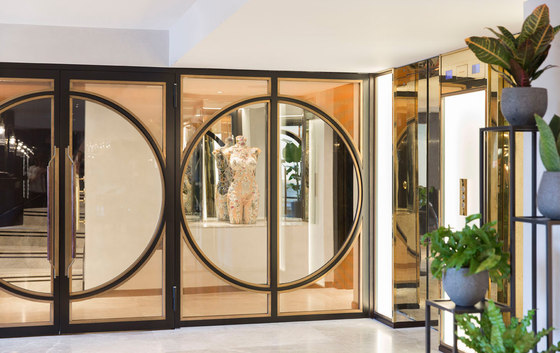
An impressive new, fully DDA-compliant main entrance has been relocated to the left of the façade, directly alongside the ‘Living Wall’ and created according to a design aesthetic of ‘authentic deco’. It therefore features classic architectural details of the era, such as stepped bronzework and geometric shapes, with a pattern overlaid on the doors, along with bespoke gilded metal inlays, featuring abstracted art deco shaping.
Outside the front of the hotel, a new terrace area has been created, forming one of the very few outdoor dining areas on Piccadilly in what was a relatively low-key, but very successful, transformation of available space in the project’s earliest phase. The design team also converted an existing secondary entrance on Downs Street into a new glass box with solid doors to serve as a direct entrance for non-resident guests to the hotel’s stunning new destination bar – ‘THE BAR at The Athenaeum’.
Lobby and overall interiors palette
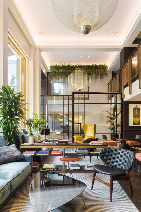
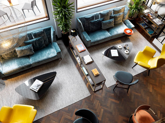
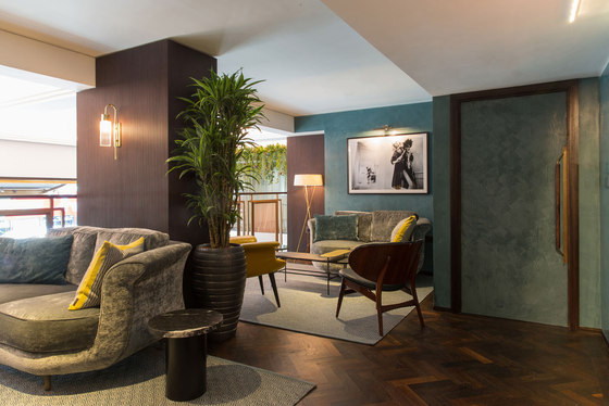
For the newly-remodeled, double-height lobby area - where the whole mezzanine galleried section has been squared off and pulled back to double the available space - the design team applied a playful interior architectural signature in the form of an eclectic mix of classic British furniture items, to reflect the hotel’s strong British heritage, mixed with contemporary and mid-century-modern European pieces.
‘We think of it as ‘mismatching’ with an educated, curated eye’, Jill Higgins said, adding that the chosen materials palette was ‘Rich, understated, high quality, indulgent and luxurious.’
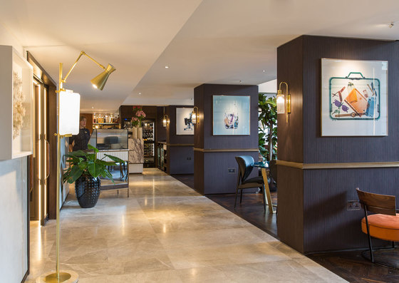
The scheme features lots of contrast and texture, with high-gloss and reeded finishes and thin and elegant metal forms set against a muted and subtle colour palette, punctuated by bright and contemporary accents. Materials include mesh-within-glass and a curated rose bronze that the Kinnersley Kent Design team created in order to get the exact look and feel required for the galleried balustrade to the mezzanine.
Stunning, open, metal screens create semi-private zoning between the open-plan lobby and restaurant space, whilst the columns, which are a strong feature of the space, are clad in a striking, narrow-reeded dark timber. The overall result is both playful and geometric, but not overly symmetrical, with the hotel’s art deco roots acknowledged but approached with a thoroughly contemporary sensibility.
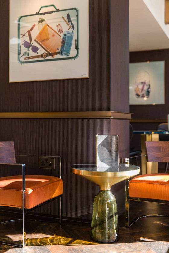
Furniture and fittings include two statement ‘Meshmatic Chandeliers’ by Atelier Rick Tegelaar, used here for the first time in the UK and chosen for their lightness, elegance and sense of playfulness, as well as to tie in with the metal in the overall materials palette. The space features a carefully-chosen selection of elegant chairs in smokey grey and teal velvets, with mustard and tangerine upholstery in leather and other fabrics, with all chairs chosen for their interesting tones, contrasts and juxtapositions.
Galvin at The Athenaeum
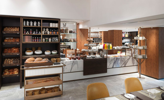
The entire ground floor has been designated as potential hospitality space, with a brand new espresso bar serving the lobby, as well as afternoon tea later in the day.
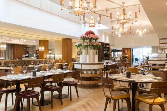
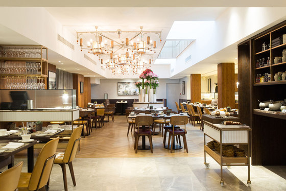
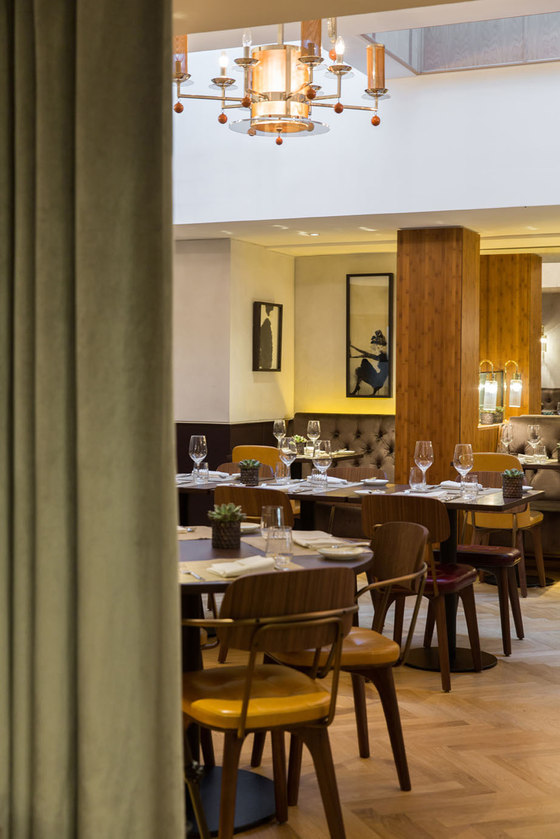
Kinnersley Kent Design worked both with The Athenaeum and with The Galvin Brothers on the design of the F&B spaces, as well as creating the identities and designing all brand collateral, from uniforms to tableware. An existing, centerpiece chandelier in the restaurant was retained because it was in great condition and, with its spare, mid-century aesthetic, fitted perfectly with the style of the new furnishings on the ground floor.
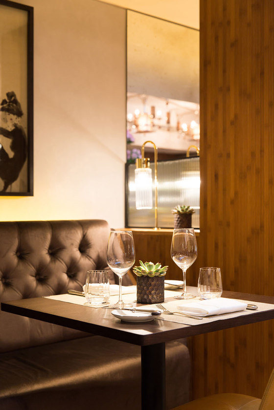
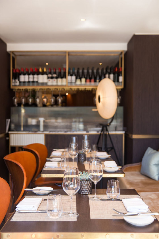
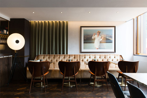
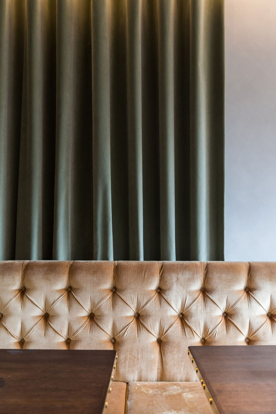
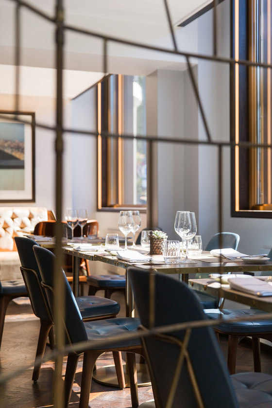
The flooring in the restaurant space is white oiled oak, whilst seating is a mix of bespoke, buttoned velvet banquettes and timber, metal and leather chairs. All tables were bespoke-designed by Kinnersley Kent Design to create the optimum arrangement of tables within the space.
The Bar at The Athenaeum
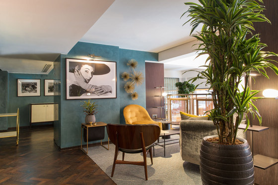
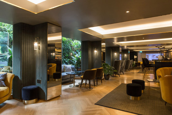
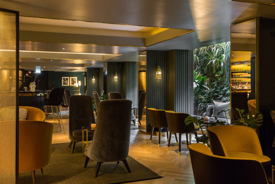
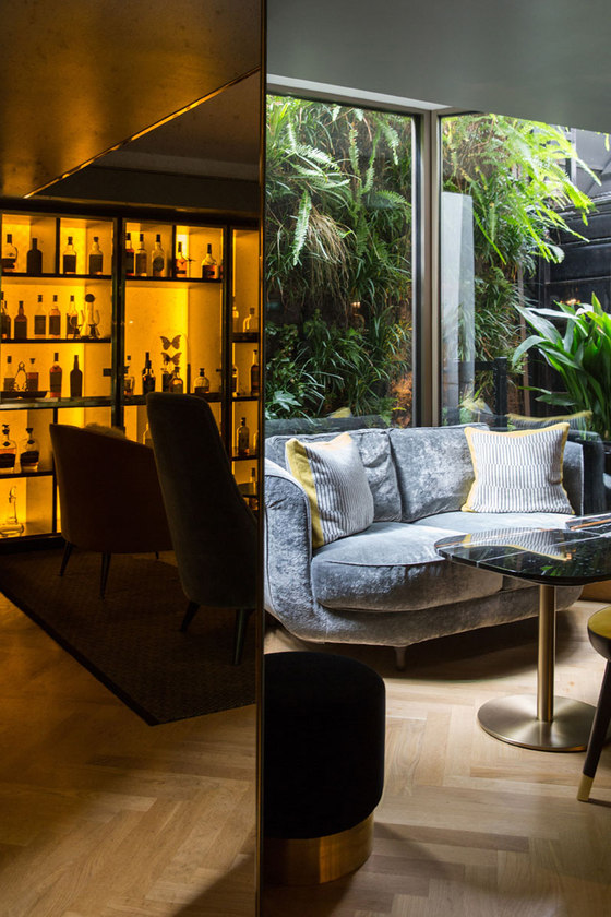
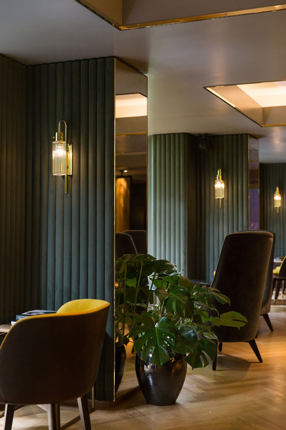
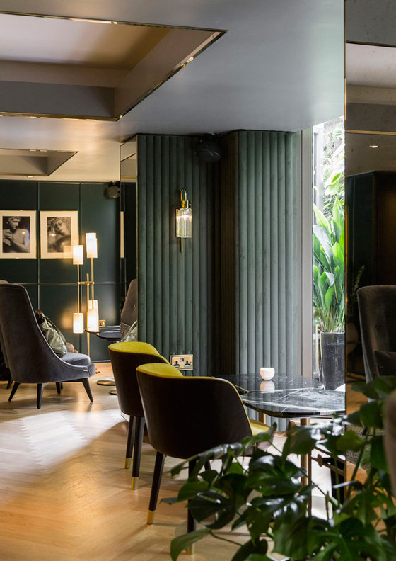
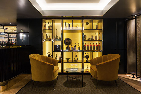
The bar at The Athenaeum is a sensual delight and a space that really comes alive at night, with a deliciously dark and tactile contemporary palette of blue-green, lemon yellow and stylish dark green suede, velvet and leather, with full-height glass walls backed by the tropical feel of the full-height ‘Living Wall’ greenery outside. Once you step inside, London’s busy Piccadilly thoroughfare feels a million miles away and there’s a sense of being in a secret, subterranean destination.
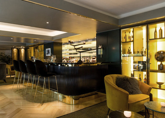
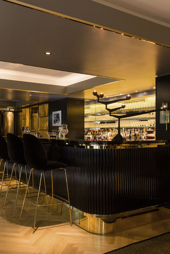
The bar itself creates a focal point within the space, flanked by bespoke cabinets, which hold the hotel’s extensive whiskey collection as well as a curated selection of interesting artefacts, chosen by Kinnersley Kent Design. The bar’s design takes the signature use of reeded finishes to another level, via a high-gloss reeded black front with stepped brass details and a Nero Dorato marble bar-top with striking gold and white geometric veining. Back-lit glass shelves create an elegant framework for the display of Giancarlo Mancino’s bespoke glassware.
The furniture here really ups the elegance factor, with long, slim forms and plenty of sinuous metal. Stand-out pieces include a console designed by Kinnersley Kent Design to the rear of the space and rugs, bespoke-designed by Kinnersley Kent Design and manufactured by Stepevi. Seating is a carefully-chosen mix of black velvet and brass barstools, lounge chairs in butternut velvet and armchairs with a black leather exterior and saffron nubuck interior.
The Gallery
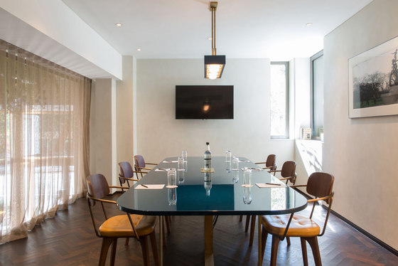
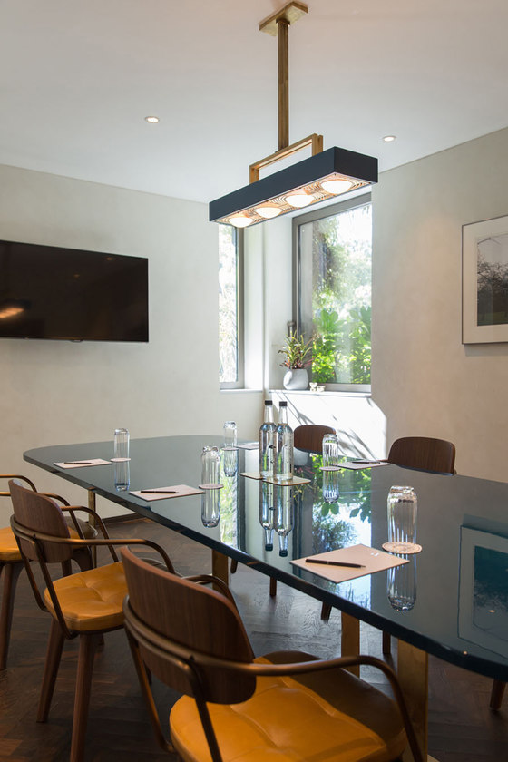
On the first floor – glimpsed as a mezzanine from the double-height atrium, The Gallery offers an exclusive feel and two new stunning private dining rooms with amazing views onto Piccadilly and across to Green Park, as well as meeting rooms aimed at a gap in the market for those looking something more relaxed and personal. The design feel here is informal and more domestic in scale.
Kinnersley Kent
Partner in charge: Jill Higgins
Architectural and interiors team: Jill Higgins (Partner), Jenny Andersson & Anna Perity-Pond
Branding and positioning: Lindie Kramers (Director)
Identity and graphics: Kenny Sum (Director), Lucy Toft (Main Designer), Diego Bucciero (Associate Director), Dimple Umeria-Alam, Chris Jones (Senior Designers)
