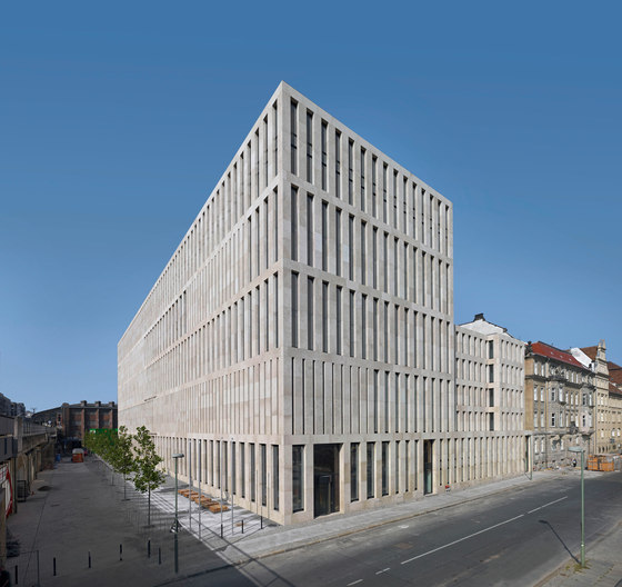
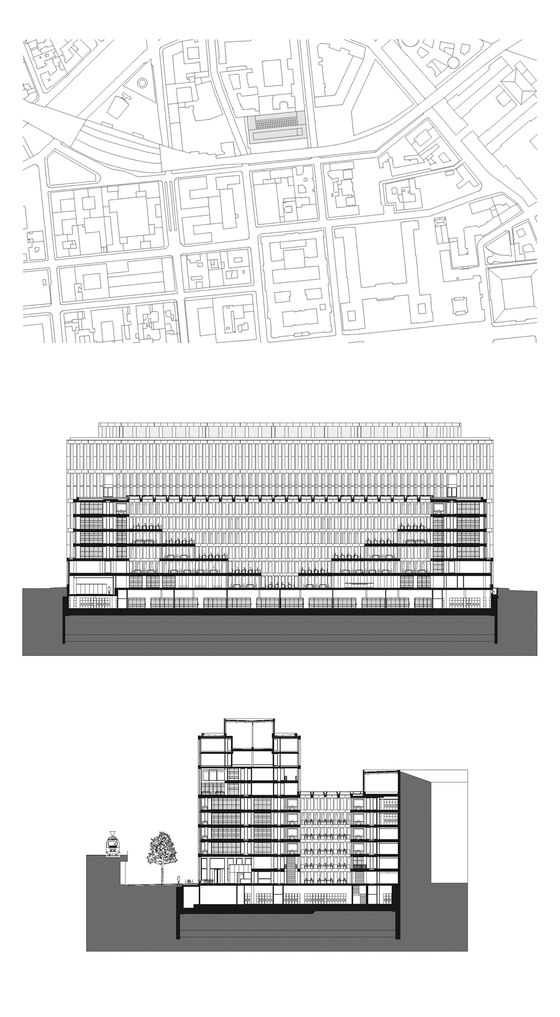
Humboldt University has had a new central library erected right in the centre of Berlin, only a few minutes walk from the famous museum island and Friedrichstrasse station. It will bring together – for the first time in the university‘s 200-year history – collections previously housed in separate libraries strewn throughout the city. The new Jacob and Wilhelm Grimm Centre is the largest open-shelving library in Germany and also contains the university computer centre, library administration as well as classrooms and meeting areas.
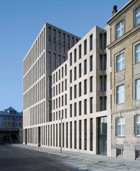
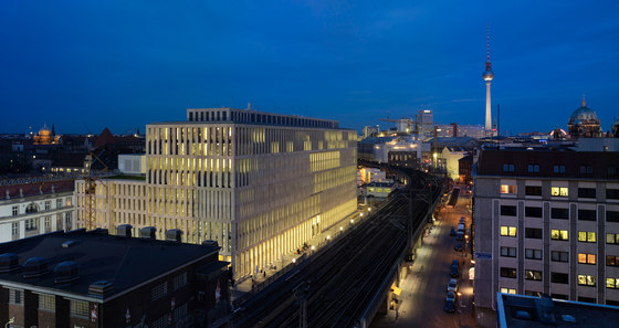
In terms of urban planning, we bore in mind the fact that Berlin in a very flat city, tending more toward the horizontal than vertical, whose buildings are as a rule no more than 22 meters tall – with the exception of public buildings. In order to mark the significance of the library as a public place of collected knowledge and as an urban architectural emblem of the book, one part of the building was designed to cross the lines of the upper city limits. Towering 38 meters high, this part of the building thrusts itself into the silhouette of the cultural landscape created by the nearby museum island. The concentration of a majority of the building functions in this section allows room for a nearby opening in the fabric of Berlin‘s Dorotheenstadt, creating the space for a small city square along the S-Bahn viaduct. This square serves as an entryway for a large number of the library‘s daily patrons.
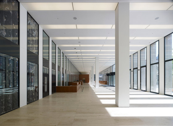
From the forecourt, one arrives in the centre of the elongated, two-story foyer, whose height lines up with the S-Bahn viaduct opposite. This room, which lies to the south of the forecourt, forms a light-flooded prelude in a refined succession of rooms leading to the heart of the building, the great reading room.
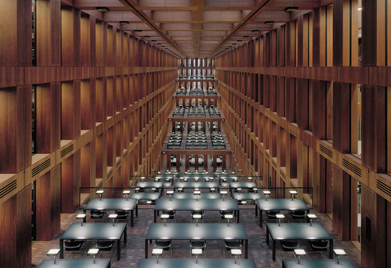
The great reading room (the taller section of the building protects it from direct southern light) was arranged in receding levels. Through its size and its many-tiered, almost scenic design, the space effects a sense of the outdoors, which is further emphasized by the large plates of glass used in the “sky” glazing. An unobstructed view of the clouds nearly gives one the feeling of reading under the open sky.
The debate over whether it would be better to have one central reading room or a number of smaller decentralized rooms ended with the decision to have both: all 2.5 million items in the library‘s collection are accessible from the huge, multi-leveled hall; reading areas are spread over the tiers of the great room, among them computer work areas. The reading room is therefore a central space that also makes decentralized work possible. Thus, different areas of study are brought together in the spirit of Humboldt and visitors are invited, in truest sense of the words, to cross the boundaries between them.
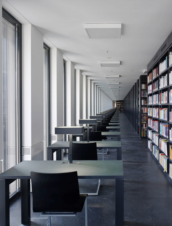
Despite the great depth of the building and the density of its interior furnishings, the library possesses a surprising porousness and openness. The source of this lies in the consistency of heights and widths throughout the building, born out in both the architecture and the furnishings. From almost any point within the building, patrons can see out of, or rather through, the building. To accommodate the desire for simple orientation, the interior of the building was organized symmetrically around a central axis. Through this symmetry, the reading room obtains a counterpart. For the purpose of its construction, architectural techniques were used to design a room of books and their readers, a room whose identity is tied to the significance of past libraries. As a complement to the introverted, central reading room, flexible and expandable reading islands have been arranged along the library façade.
The real highlight of the interior is in the 24-meter high research library, where the valuable contents of the Grimm Brothers‘ collection are preserved. From this lofty balcony, one has a panoramic view over the city of Berlin, as Eduard Gärtner once did.
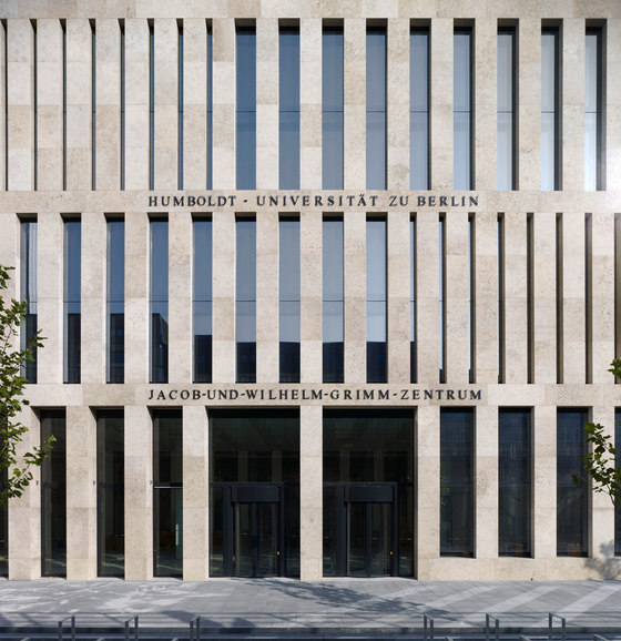
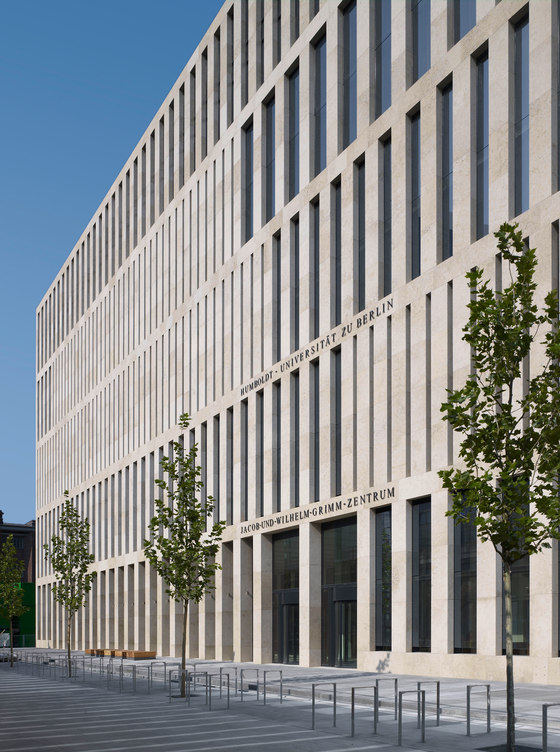
The façades subtly reveal the function of the building behind them through varying openings in the stone body of the structure. The distances between the pilasters in the façade, which are determined by the ground plan and vary by as much as 1.5 meters (and can also be understood as the spines of books), have an internal connection with the functions of the open stacks and reading areas.
The façade was erected using yellow-veined Treuchtlingen marble which makes a strong impression through its natural stone structure, emphasized by a high-pressure water treatment. In the interior decor, calmness and clarity are achieved by reducing the colour palette to just a few tones: white-gray, black-gray, reddish wood (black cherry), dark red and dark green surfaces. The open stacks have been built using glossy black linoleum floors, matte black-grey steel shelves and walls and ceilings painted white.
Special areas such as the reading rooms, reading alcoves and the fixtures of the main entrance hall have been covered with wall and ceiling paneling in a veneer of American cherry wood. Areas of heavy foot traffic such as the main entrance hall and the reading room‘s open stairway have been outfitted with natural stone flooring made of the same Treuchtlingen marble used for the façade.
Reading tables and table lamps are also part of the architectural design. The translucent quartzite glass used in the upper part of table lampshades makes reference to the table lamps in historical reading rooms. In the main entrance hall, a series of photographic panels depicting Humboldt University by New York artist Arun Kuplas were integrated into the wall covering.
In order to make full use of the thermal mass of the ceilings and to make the climate of the rooms as pleasant as possible, suspended ceilings were avoided. All building automation fixtures have been placed in the floor or in the concrete ceilings. The air circulation vents in the ceiling activate the thermal mass of the concrete. The bare ceilings are thereby cooled and, in turn, absorb the warmth of the rooms.
Area: 37 460 m²
Humboldt-Universität zu Berlin
Max Dudler
Architects: Andreas Enge, Jochen Soydan, Andrea Deckert, Gesine Gummi
Project management: ProCon, Ingenieurgesellschaft für wirtschaftliches Bauen mbH
Construction management: Ingenieurbüro Peter Widell, Berlin
Building contractor: Humboldt-Universität zu Berlin
Support structure planning: Leonhardt, Andrä und Partner, Berlin
Technical installations planning: ZWP Ingenieur-AG NL Berlin
Fire protection consept: Müller- BBM Brandschutz GmbH NL Berlin
Free space planning: Max Dudler mit Lützow 7
Art acquisition: Arun Kuplas/ New York, Dr. Ruth Tesmar/ Berlin, Rolf Wicker/ Berlin
