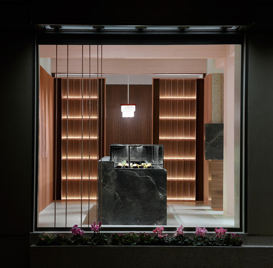
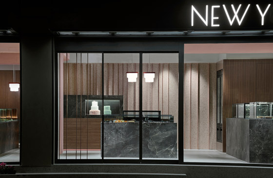
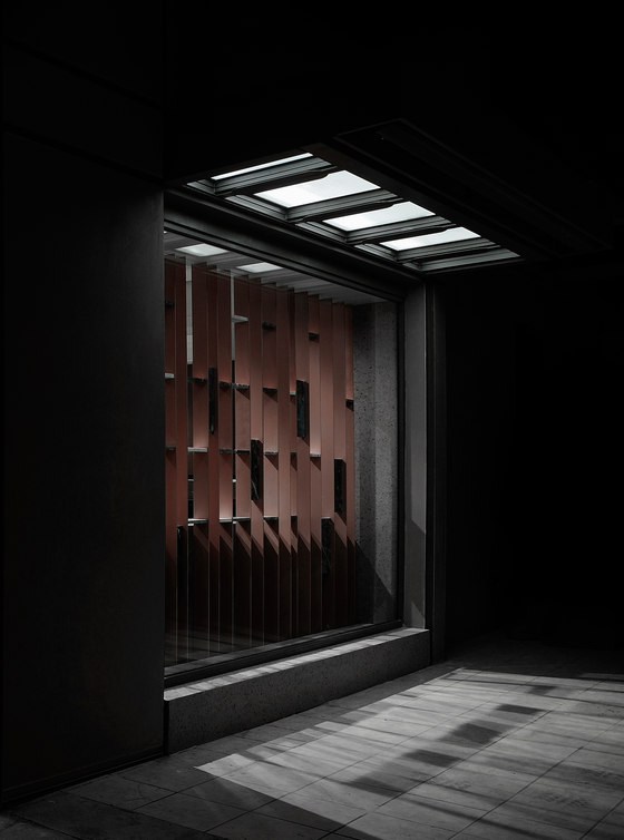
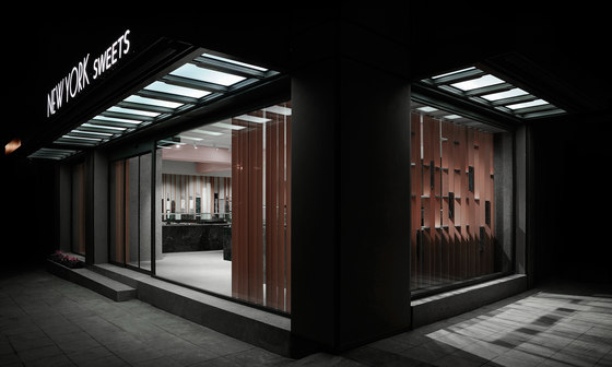
The famous pastry shop chain in Cyprus “New York Sweets” has decided to go through a radical rebranding. The brand has been established as a family business in 1986 and it still works in the same way. The main target of the company is to produce and sell a series of premium – mainly American sweets and pastries made of very high quality and fresh ingredients. The name of the company derives from the fact that their most popular products are mostly New York/American recipes.
The rebranding had to incorporate a series of interventions, not only regarding the brand identity and image (logo – graphics etc.), but also the presentation of their exquisite products and more importantly the remodeling of the stores. At this moment, the company runs seven pastry shops in different locations/cities in Cyprus. The biggest shop of the chain, located in the island’s capital has been chosen as the first one to be remodeled and it would therefore operate as a pilot store for the new venture.
The architecture studio Minas Kosmidis [Architecture in Concept] was called to design the new space that should worthily represent the philosophy of “New York Sweets” and its family tradition and character while at the same time redefining their aesthetic identity and resolving in the best way their new operating requirements. The space of the first (pilot) store is located in one of the most the main streets of Nicosia, which is characterized by heavy traffic and great transit of vehicles.
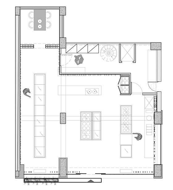
The store is in the ground floor and its floor plan is rectangular, having two its angular sides open towards outside. On the first floor, above the pastry shop, there is a storage space for raw materials, while a small part of the ground floor has been given to the preparation department and also houses the staircase which connects the two levels. Apart from that, the greater part of the ground floor has been dedicated to the display of the products.
For the new concept, the architects where asked to include in their designs a corner for the preparation of hot beverages – mostly different brews of coffe, hot chocolate and aromatic herbs, i.e. a small coffee shop. These products were already available for sale in the pastry shops up to now, but not in the form of ready-made hot beverages, just as raw products. Consequently, the new pastry shop should include the necessary spaces for displaying and selling sweet and salty pastries, a small coffee shop as well as a semi private meeting room for the appointments with clients who would discuss all the details regarding the catering of various events.
The floor plan of the new concept has been determined by the junction of a rectangle and a square shape and by the position of three columns of the building’s structure, where one of them is part of the façade, the second one is found in the middle of the space and the third is inside the preparation room. Regarding the aesthetic identity of the pastry shop, the name “New York Sweets” has contributed significantly as an inspiration during the design process.
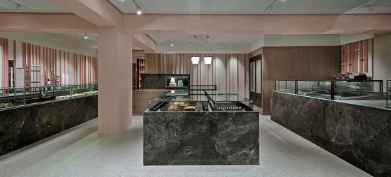
The strict orthogonal grid of Manhattan has been set as the design module for the organization of the diverse volumes of fridges/displays and counters inside the shop, as well as for the building’s façade, where horizontal and vertical metallic tubes create a grid, dividing in this way the ceramic tiles of the wall covering. Furthermore, for the shading and lighting of the shops facades, the architects designed three metallic horizontal canopies, with reference to the canopies in front of the entrances of historical buildings of New York.
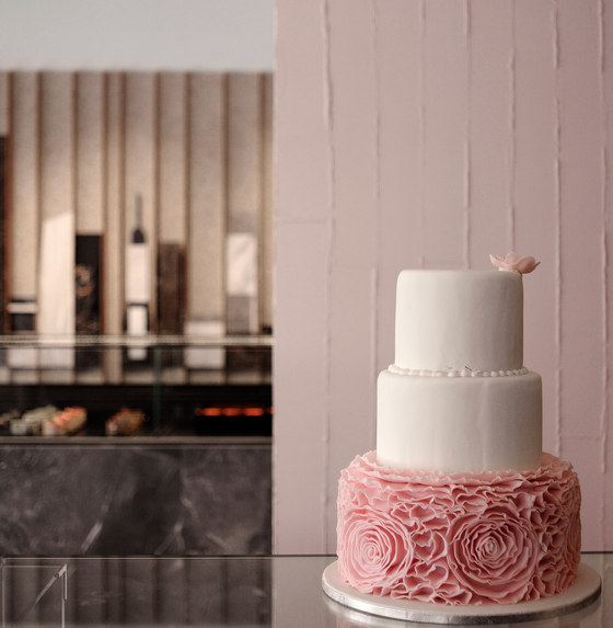
At the same time, the placement/styling of pastries inside the displays gives a similar effect as if they were colorful buildings in an air photograph of Manhattan. The corridors between the volumes of the display fridges give even greater emphasis to the idea of a tight urban grid. As a result, entering the shop, first there is a central freestanding refrigerator which displays the cakes and chocolate bites, while around it are developed all the other volumes of refrigerators and diverse functions; just after that, there is the counter and the displays where the special daily pastries are shown, while at its left side there is the longest volume of refrigerators, which constitutes an imaginary continuation of the meeting room.
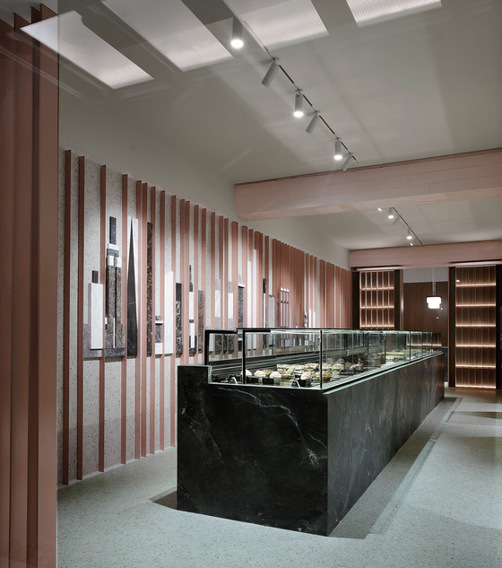
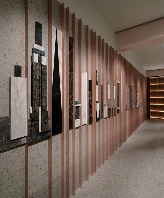
Finally, from the right side of the counter, has been dedicated a large space for the needs of the ice-cream freezers, the counter of the coffee shop and the display of the salty pastries. On the interior walls, repetitive metallic vertical blades leave uneven gaps between them and give the impression of a higher ceiling by their vertical placement, while at the same time remind of the edges of high rise buildings of New York as seen from the ground.
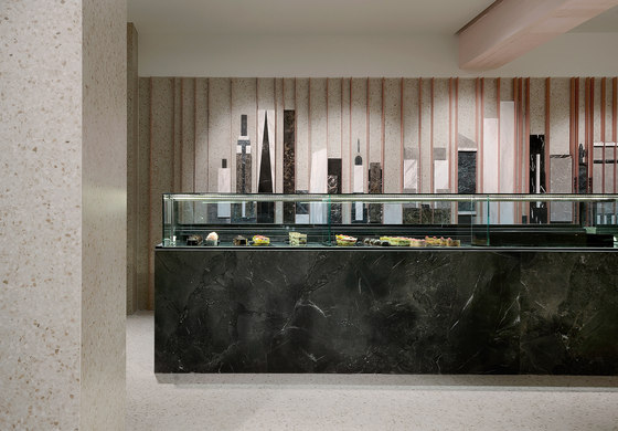
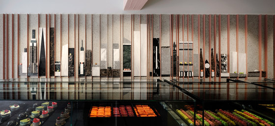
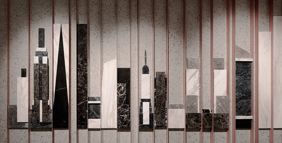
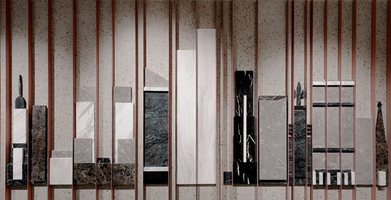
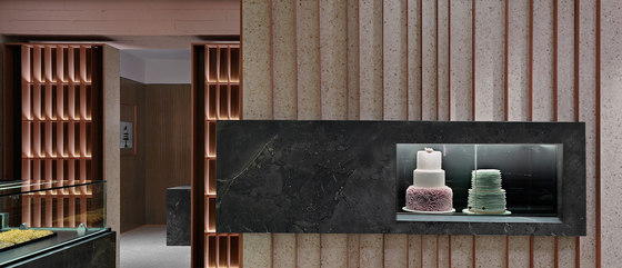
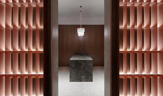
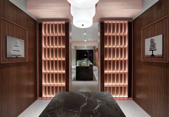
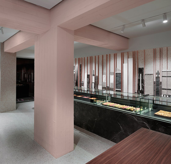
One of the elements that someone notices instantly entering the shop is the composition on the wall, behind the long refrigerator, of the skyline of Manhattan created by different types of marble. At the end of the same wall, there is the meeting room, which is divided by the rest of the space as a box in a box, inside which, are displayed in frames the available cakes and pastries as paintings in an art gallery. In the middle of the room, a central table can accommodate up to 4 persons and above the table two pendants with the shape of cakes light the room.
The entrance of the room is highlighted by two metallic structures of shelves, designed in order to display bottles of rare wines, champagne and other luxurious products. The inspiration behind their design, the architect said, that was found in the minimal repetitive lines of Aldo Rossi’s buildings. The volume of the cashier’s desk is covered by walnut wood veneers in order to stand out and is interrupted only by a small glass volume of a special display, eccentrically placed, which promotes a different daily delicacy every day, in a way usually seen in jewelry stores.
The closed wooden volume which incorporates the tall freezers for the storage of ice-cream cakes constitutes a continuation of the cashier’s desk in a game of full and empty volumes, serving at the same time as an ideal background for the coffee shop. The central column as well as the beams of the building’s structure have been let naked both as structural elements and also regarding their texture, while at the same time have been painted in a pale pink color, which combined with their texture reminds of smeared whipped cream.
Regarding the materials that have been used, the flooring and most part of the walls have been covered by mosaic tiles in pale colors of beige, Bordeaux and brown, creating this way a neutral background, which allows at the black-grey volumes of the refrigerators to stand out while at the same time compose harmonically the color palette of the pastry shop, in combination with the walnut wood veneers, the metallic pink elements and the different types of marble.
Minas Kosmidis
