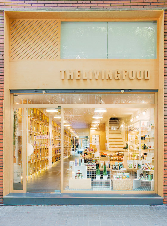
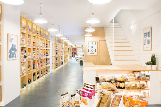
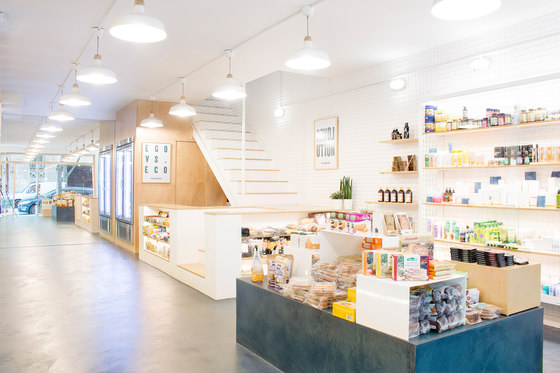
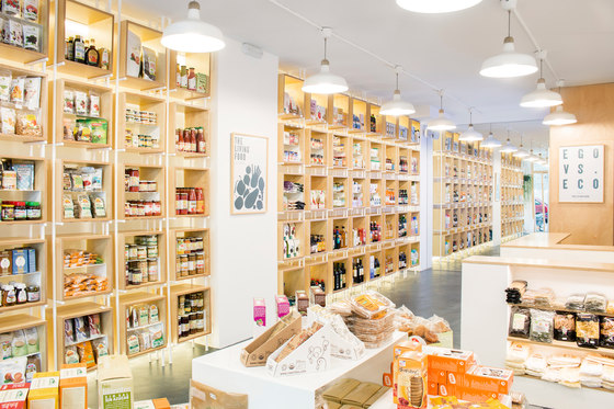
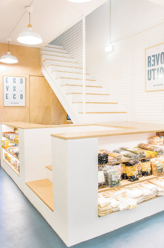
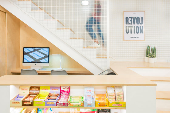
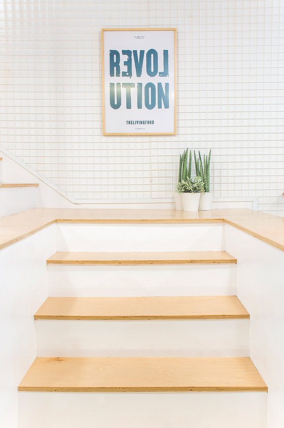
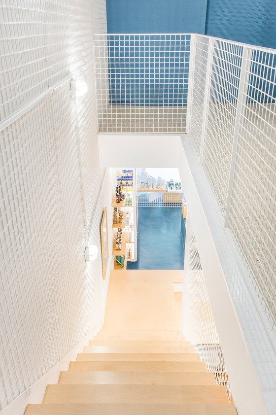
The intention from the beginning was to escape the stereotypes that today are associated with this types of business, and create a unique identity for a project that would clearly make a big difference in the market. The space is split on two floors. The ground floor was square with an open floor plan with a single section ladder leaning against one of the longitudinal walls. This was to be located in the store and above would be private areas. Our commitment to divide the ladder in two perpendicular sections, got an interesting division of space in different areas, and more wealth in the path. The volume of the ladder is integrated into a large cabinet where the counter with exhibiting shelves are located.
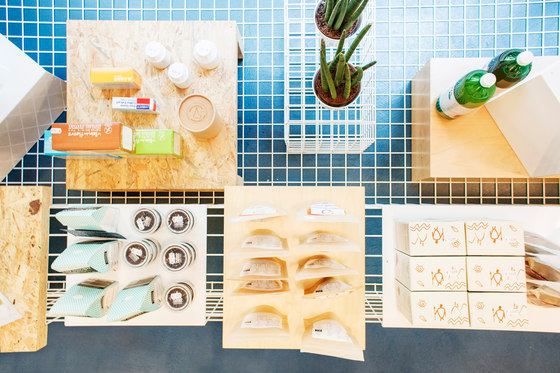
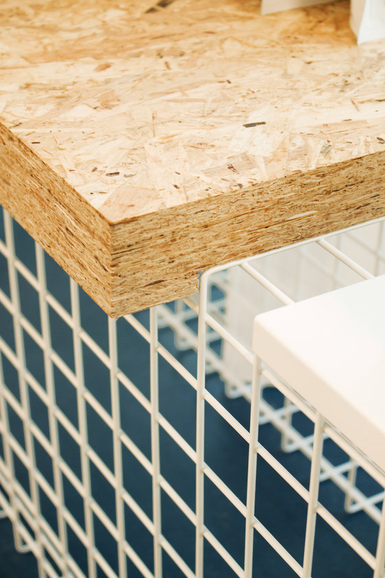
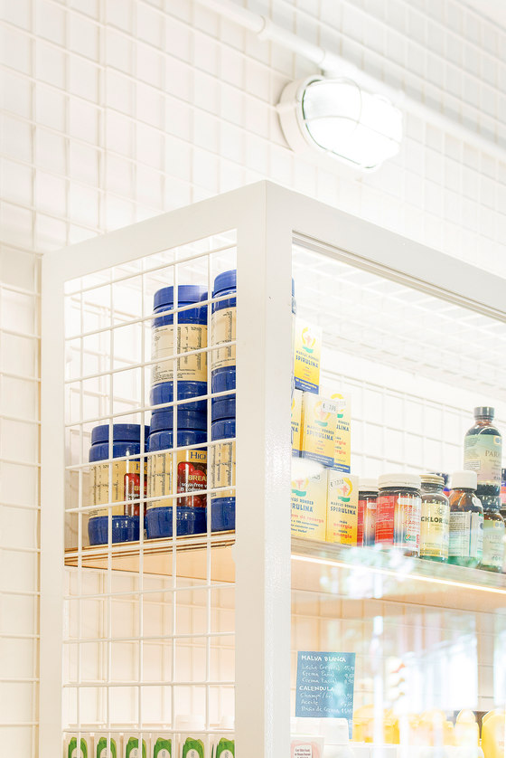
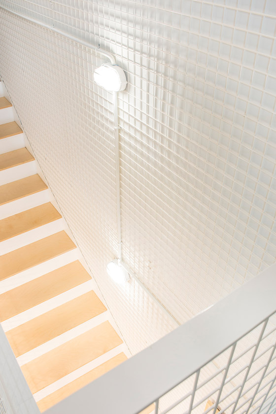
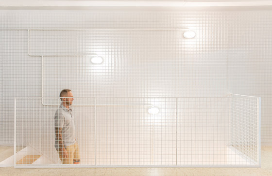
Life and health as the main engine and identity, they are represented in the interior conceptually through their colors and materials. White is very present, it brings the space closer to an almost aseptic clinical side, making it a very cool space. It has been applied on walls and ceiling, and part of the furniture. Worked with metal mesh as support and securing shelf, and also as handrail. The great showcase was also performed with glass doors where more valued beauty products are exposed.
Blue represents the wellbeing, and becomes the corporate motive and theme of the entire project. This is constantly present in the micro-concrete pavement blue, which gives it a differentiated identity. All graphic design is the work of Francesc Moret, having worked in the same color. Wood is the other protagonist, who represents the warmth in the close relationship of the boys.
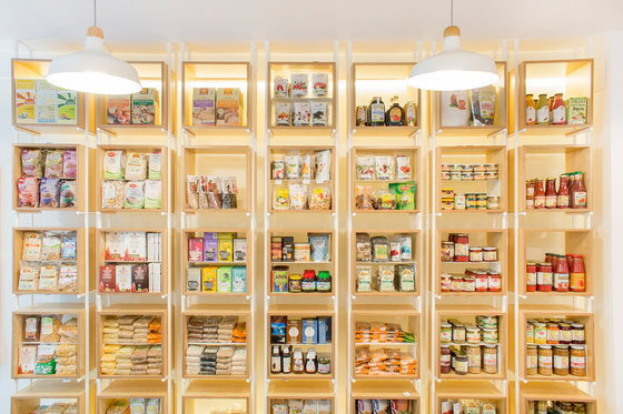
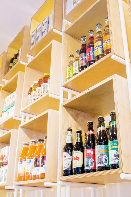
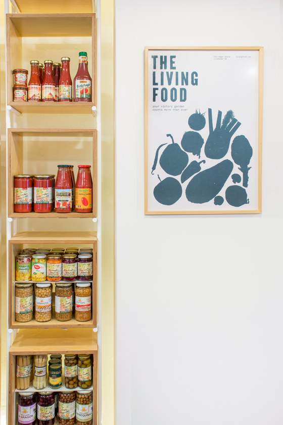
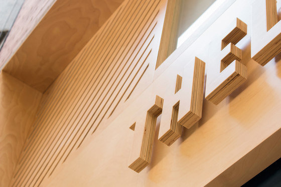
The wide variety of products forced us to design a neutral support, that would not add too much information to the whole, and also could be used outside. The marine board light-colored birch was chosen as neutral and warm support for all the furniture, such as the large shelf cubes, the counter or the stairs. The large birch application has been made in the facade, covering the entire height of the two plants, and getting a clear visual aspect from the street.
Miriam Barrio
Interior Design: Miriam Barrio Studio
Graphic Design: Francesc Moret
Furniture: Entremaderas
Microcement: Goian
Lightning: Dellum
