Photographer: Andrey Bezuglov

Photographer: Andrey Bezuglov

Photographer: Andrey Bezuglov
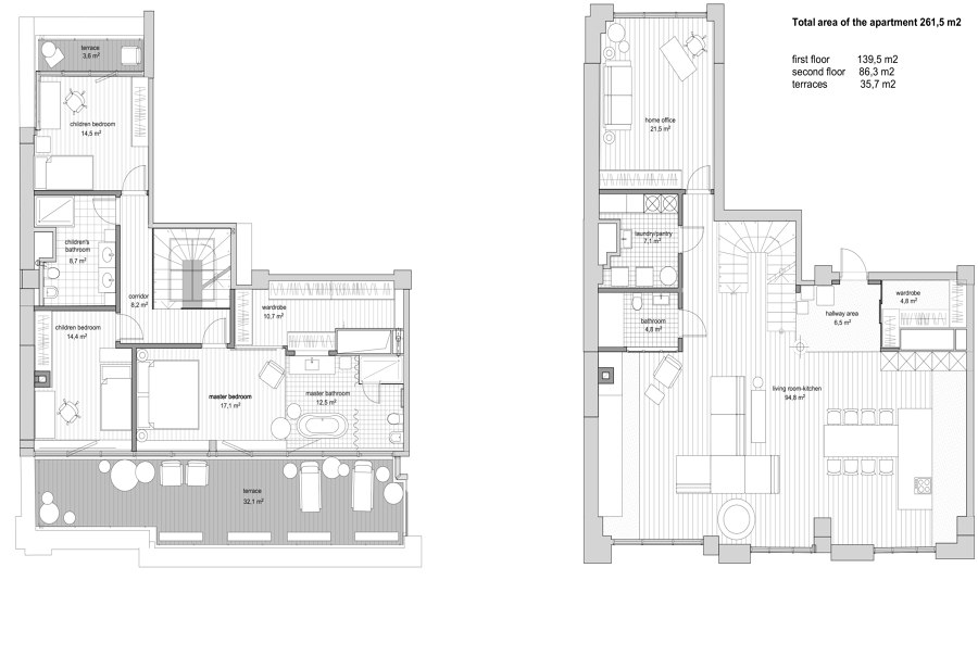
Two-stories apartment occupies two highest floors of a 13-story building in a new residential complex in central Kyiv.
The clients came with the request to design a comfortable space that reflects the personalities of apartment owners, a couple with two children. They are people who trust their guts and do not fit themselves into the box. It is reflected in a husband’s business as well as in the wife’s wardrobe, where there is that place for some unusual niche accessories. The owners related every new piece for home and every design solution not with some trends, but with their inner values and view of life.
– I like some classical elements, industrial style, natural materials, modern sculpture, and multiple other different things. I believe that it is possible to combine all of them. It requires stepping beyond stereotypes and arranging harmony by mixing different styles, textures, and emotions inside one space. – told the client and showed some references where a French villa went along with a minimalistic Berlin apartment. For Oksana Dolgopiatova who knows how to create multi-layer eclectic interiors, it sounded like a perfect match. She describes the style of the apartment as "Emotional eclectic".
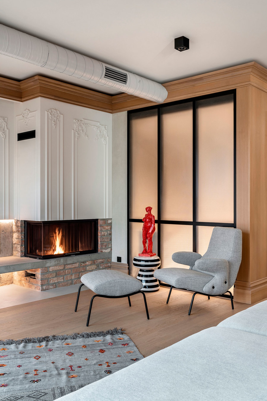
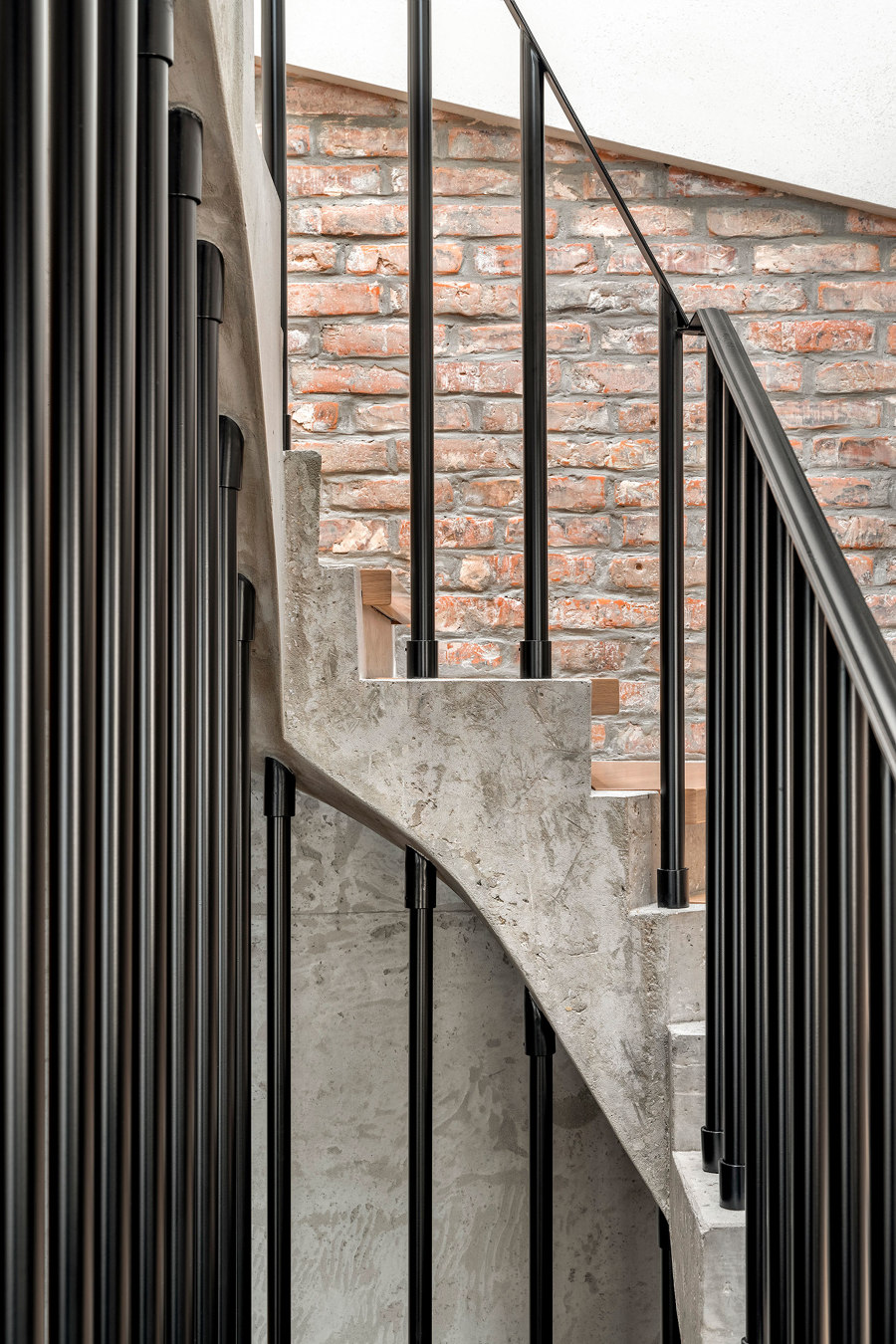
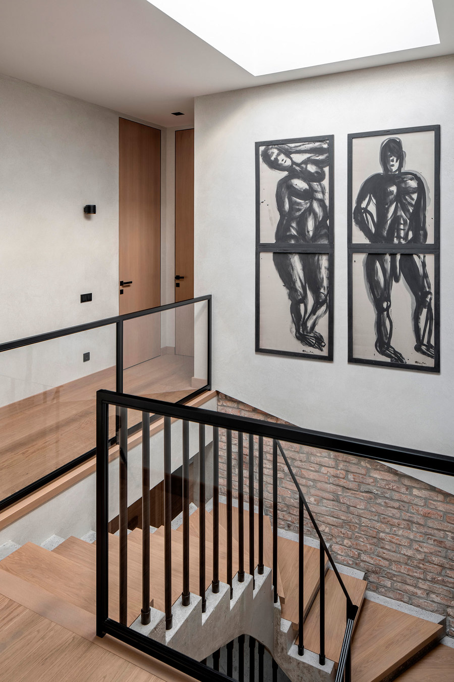
The longest step in the whole work was redesigning the space to reach comfort and functional zoning. They built two children’s rooms instead of one. The balcony was added to the cabinet and a part of the terrace to the children’s room. The staircase that was too narrow and used to occupy a lot of space next to windows was moved to the center. The clients dreamed of having daylight beams on the stairs, so a window in the roof was cut. The second dream was to get a real fireplace in the living room.
The main ingredients of the eclectic cocktail are classical quotes, industrial style, some minimalistic and postmodern elements, with juicy accents like modern art pieces.
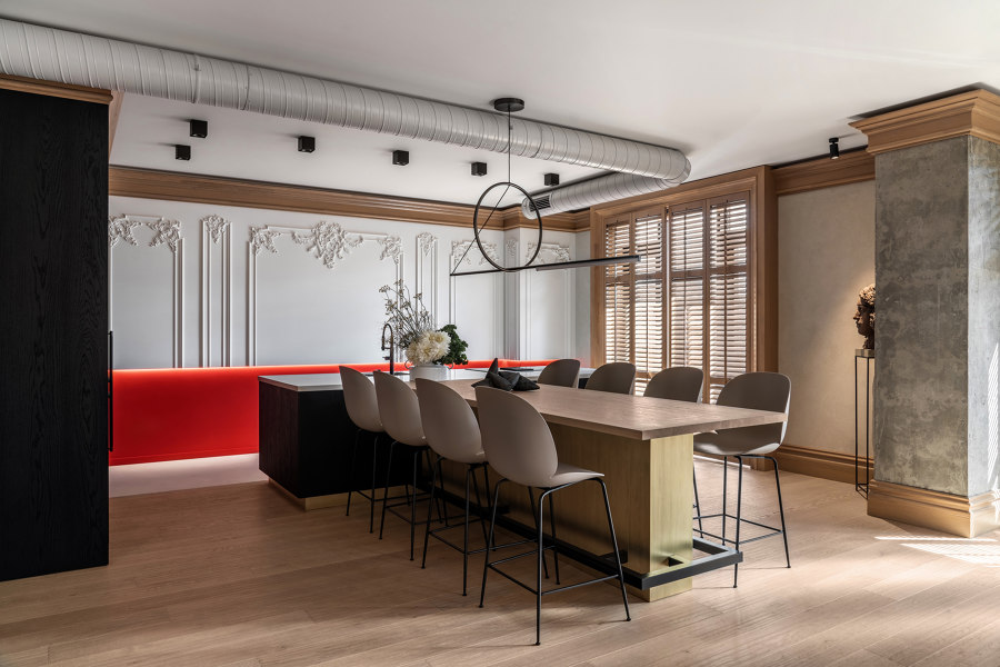
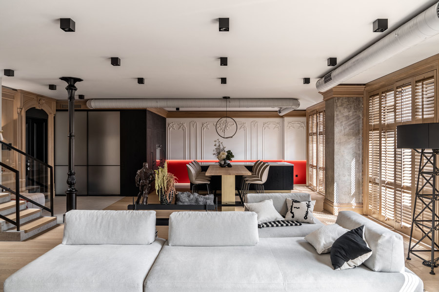
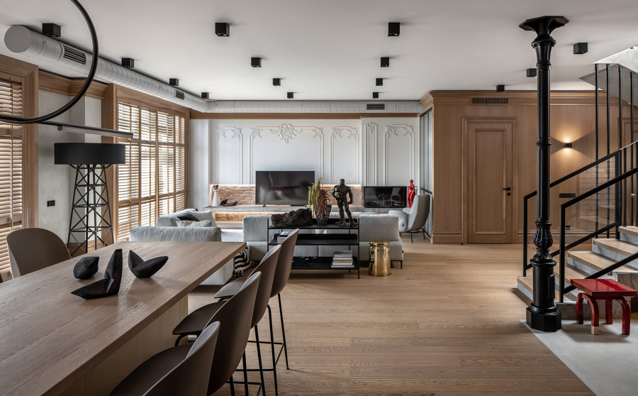
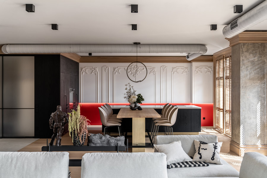
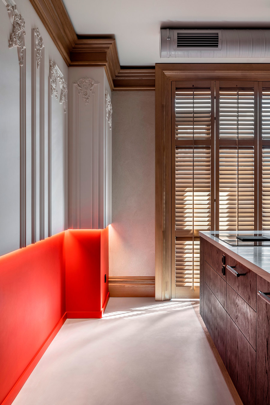
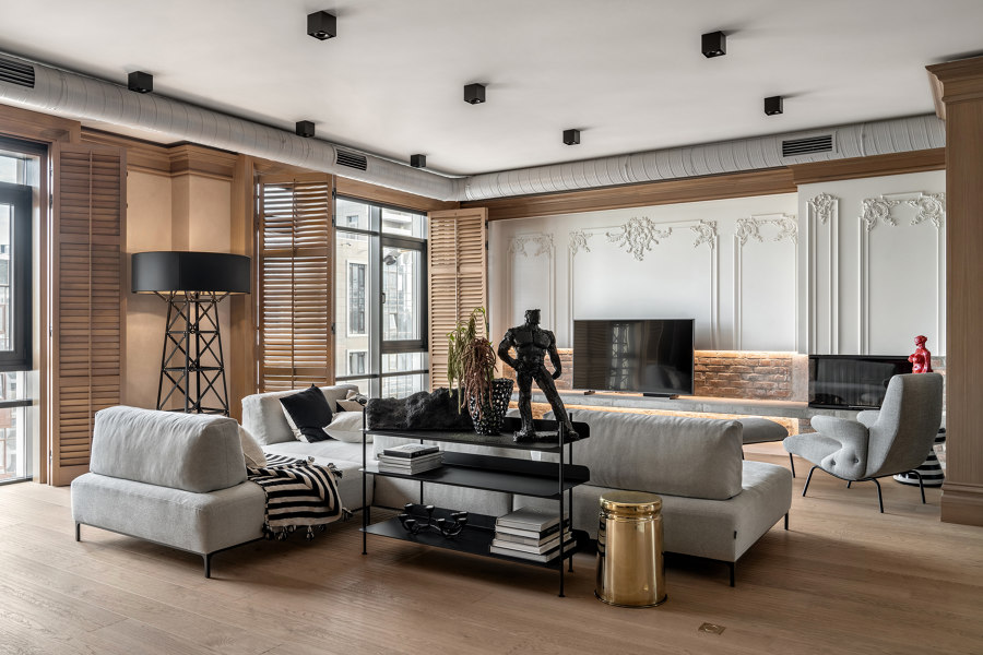
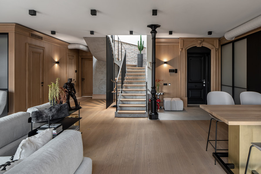
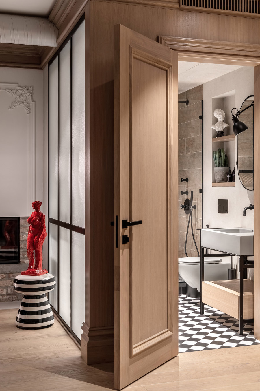
The center of the apartment is a spacious living room united with the kitchen. Baroque stucco work on walls, a solid cornice around the perimeter, and the entrance door looking like a portal, are tributes to the classical style. The entrance hall zone is visually unpaired from the living room with the cast-iron outdoor pole. The owners of the apartment deliberately refuse to have a corridor to get maximum united space.
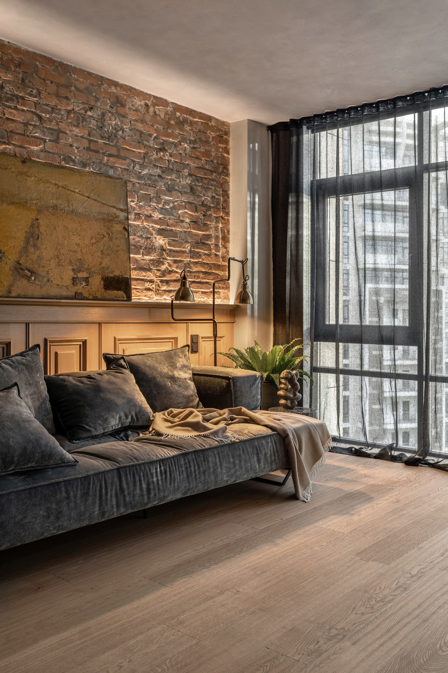
There are some elements of the industrial style such as a staircase construction that are strung on metal bars, uncovered brick walls, and parts of the continuous floor next to the fireplace and in the kitchen. An open ventilation system was made to keep the ceiling height because it is less than 3 meters at the first level of the penthouse.
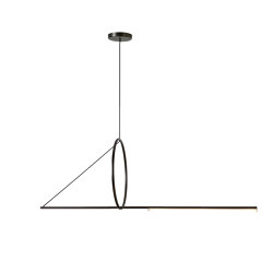
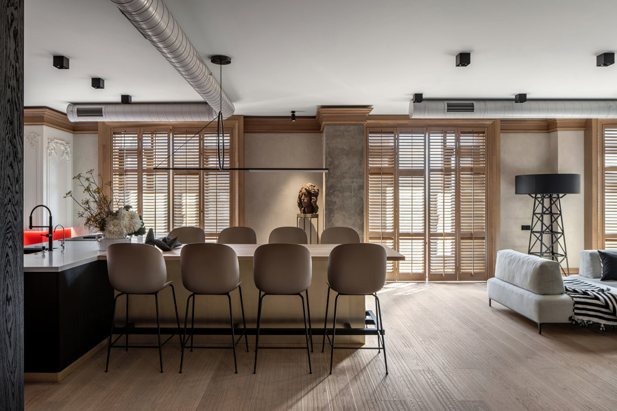
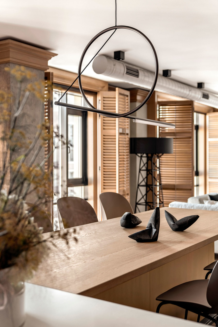
The kitchen island with the black facade is adjacent to a big table where the whole family gathers. The owner of the place loves cooking and sticks to healthy eating. It was significant for her to have an open view of the table and whole living room without any cooker hood or heavy pendant lamp in front of her eyes. That is why we had the hood inbuilt on the island and hung a thin minimalist light above the table.
Shutters on the windows protect from the bright sun and make picturesque shades inside the living room. The bottom part of the wall in the kitchen zone is painted into a Living Coral shade. It is an open, energetic color that gives the contrast impulse to the interior.
– When I work with eclectic, I always keep in my mind the general composition of the space. I mean the proportions and middle lines that link everything together. In this living room, we have sort of a horizon, the line 90 cm from the floor. It is the height of the fireplace, the tabletop of the kitchen island and the dining table, and the line where we cut the classical white panels on the wall. It is one-third of the full height of the space. This proportion organizes the chaos and glues the interior together. – the designer Oksana Dolgopiatova said.
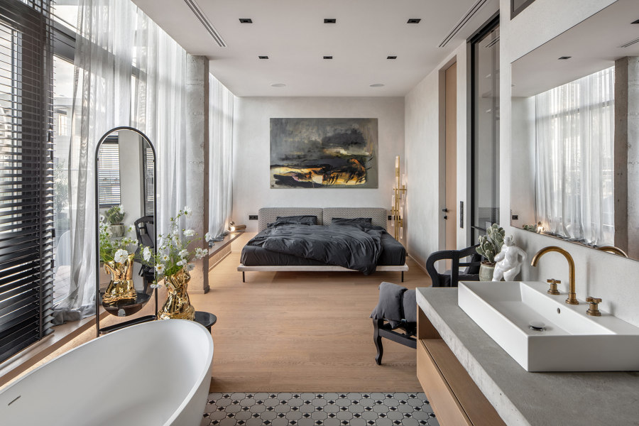
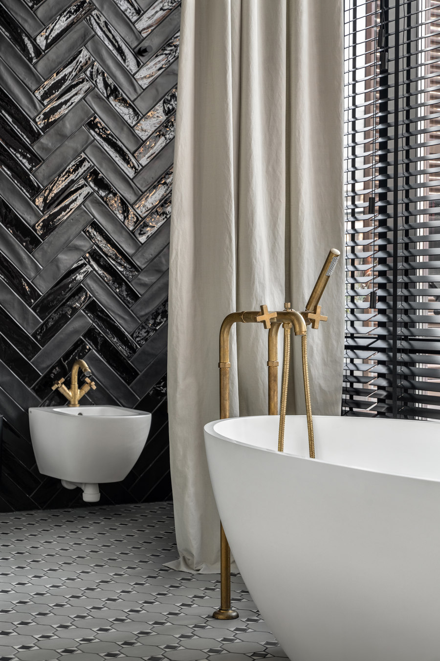
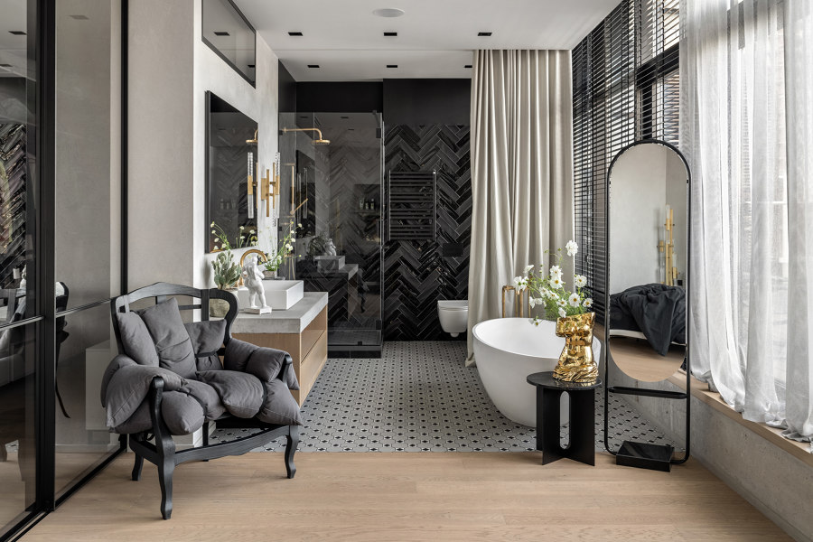
In the master bedroom that is located on the second level, a glass sliding partition was supposed to separate a bathroom. But the client liked the view in the bathroom and changed her mind during the remodeling process, having decided to keep the space united. There are a few classical accents in the bathroom, such as a pattern of ceramic tile on the floor and a standalone faucet made of brass that will look even better with age due to oxidizing.
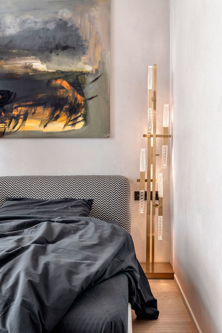
The final stage of the interior decorating was selecting art pieces. Numerous sculptures and paintings from contemporary Ukrainian artists who showcase their works in the Shcherbenko Art Center were placed in the apartment.
– It is rare luck to cooperate with such open-minded clients who are not afraid of too bright contrasts or unusual combinations. When some of their guests get to the apartment, they compare it with a hotel or a gallery. But the clients feel it differently, for them, it is a cozy and harmonic space where they like to be and where they always want to come back. – the designer Oksana Dolgopiatova said.
Design team:
Oksana Dolgopiatova

Photographer: Andrey Bezuglov

Photographer: Andrey Bezuglov

Photographer: Andrey Bezuglov

Photographer: Andrey Bezuglov

Photographer: Andrey Bezuglov

Photographer: Andrey Bezuglov

Photographer: Andrey Bezuglov

Photographer: Andrey Bezuglov

Photographer: Andrey Bezuglov

Photographer: Andrey Bezuglov

Photographer: Andrey Bezuglov

Photographer: Andrey Bezuglov

Photographer: Andrey Bezuglov

Photographer: Andrey Bezuglov

Photographer: Andrey Bezuglov
