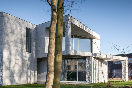
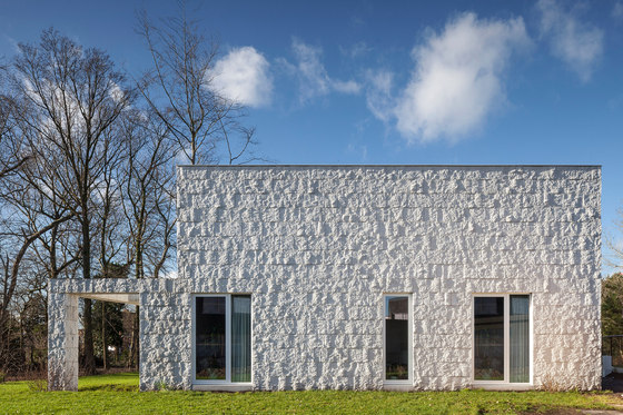
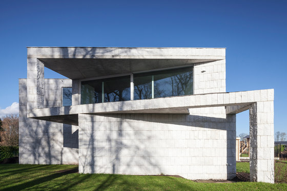
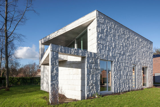
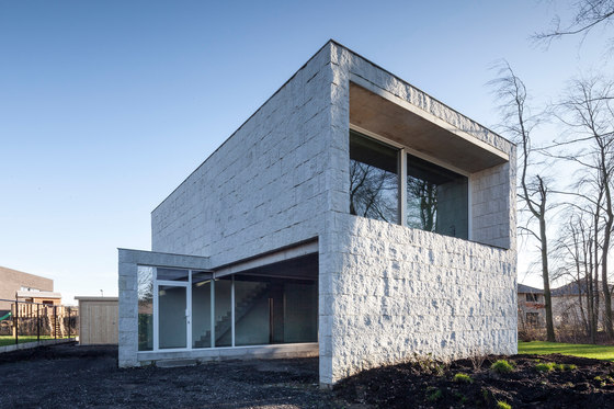
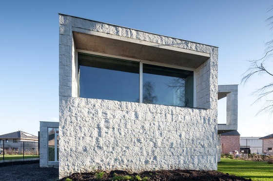
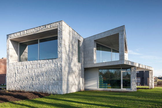
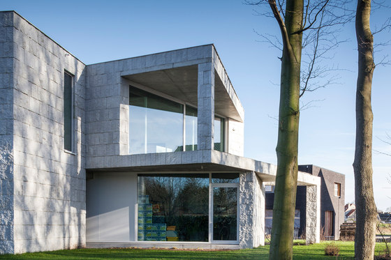
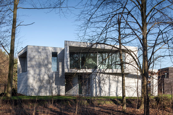
House QM answers the building regulations in a different and "twisted” way. House QM is situated in a new allotment that exists out of square plots of the same size, with the same building regulations; houses must recoil 5m of every side of the terrain, have 2 levels and must have a flat or sloped roof. This results in similar looking two-story houses as an extrusion of the square building zone. This house puts a twist on things.
An angular displacement of the building realizes an optimal combination of orientation, privacy and views. This “twisted” implantation improves the spatial qualities inside and outside. Three different garden zones were formed; the driveway and carport, the intimate garden on the side of the bedrooms and the more active garden on the south-west. The typology of two-story blocks was turned around to a deconstructed “bel-étage”. The main living spaces are situated on the upper floor, providing the residents with far reaching views and abundant light influx. The bedrooms are on the garden level regaining their required intimacy.
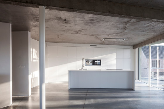
The rooms downstairs are entirely closed to the South and the North, also maximizing privacy. They are oriented to the East, the home office to the West. In the intimacy of the axil/internal angle is the main garden, where residents enjoy the garden from noon to night. On the upper floor both facades in North and East are completely closed, so that the residents avoid viewing from the allotment and the street. The kitchen and the dining room are completely open to the south, creating a broad view over the roofs and gardens with the countryside in the distance.
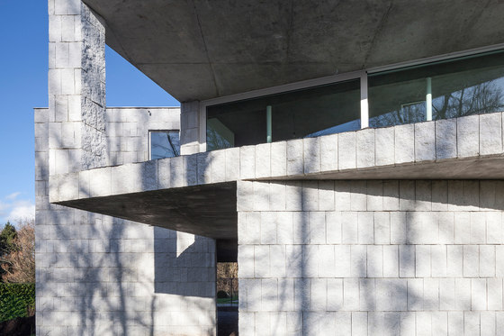
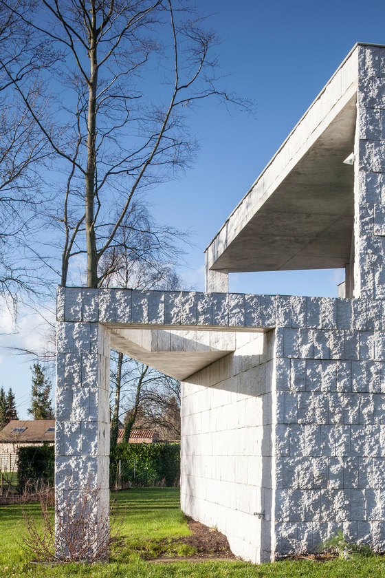
A large canopy covers partially an even larger terrace, providing the necessary shading according. An external staircase brings you from de terrace straight to the garden. The vertical canopy has a large opening directed to the garden in the West; enabling interaction between the terrace and the garden below. The lounge looks towards the west to catch the light of the evening sun and ends on a shorter balcony with ditto canopy.
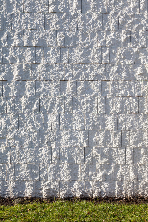
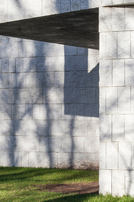
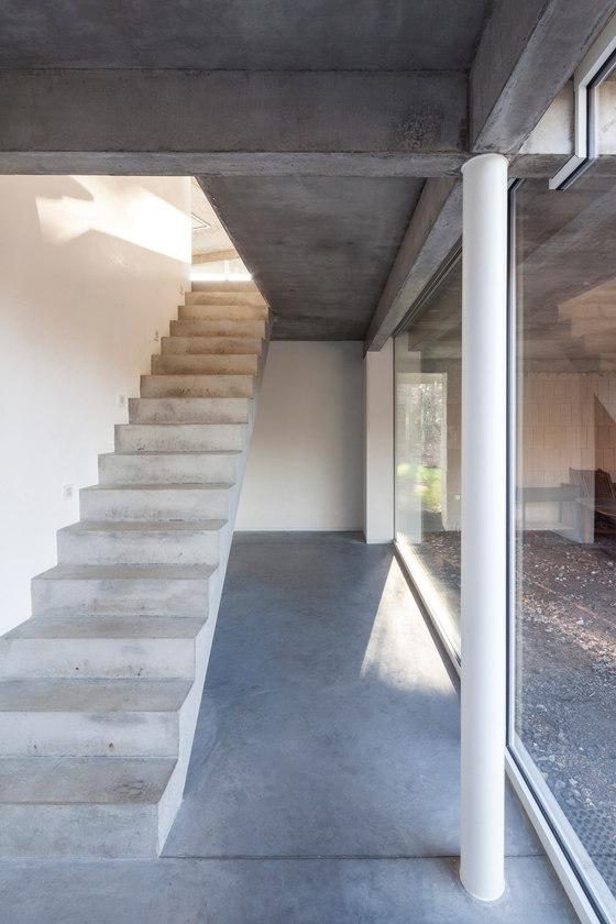
The ceilings are fair-faced concrete, the floor a poly-concrete. A large format cleaved concrete block was chosen as the façade material. The blocks are typically used in larger industrial or public buildings. The glued bond of the big blocks plays with scale. The light dramatizes the surfaces, giving the whole an estranging effect. Even with a continuous use of the same architectural elements, the building dynamics completely alter from various angles. By simply walking around the building, one can immediately feel the expression change.
OOA | Office O architects
Head designer:
Magalie Munters
