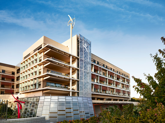
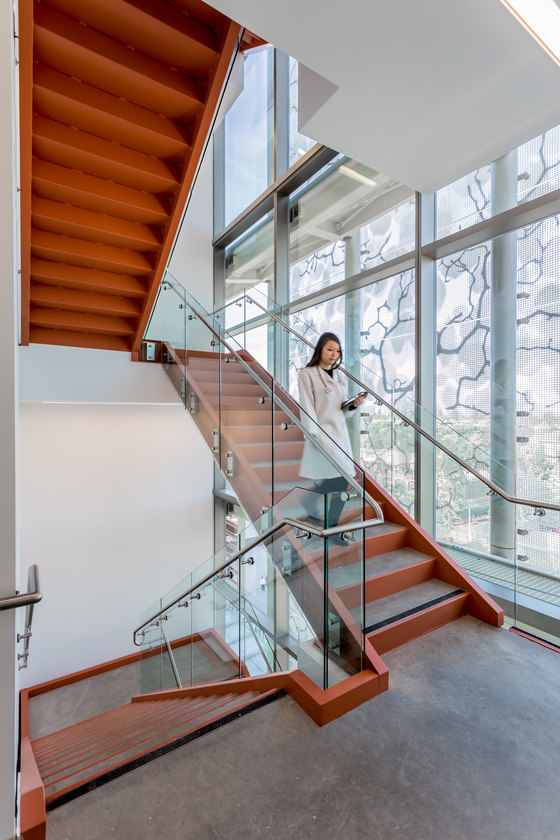
Lucile Packard Children’s Hospital Stanford’s expanded pediatric facility, an environmentally responsive, technologically innovative, and family-focused children’s healthcare center, has achieved LEED Platinum certification from the U.S. Green Building Council (USGBC). Designed by Perkins+Will in close collaboration with patients, families, doctors, and staff, and in conjunction with executive architects HGA and engineers Mazzetti, the facility is the second children’s hospital—and the fifth new-build hospital—in the world to earn this distinction for sustainability excellence.
“The Lucile Packard Children’s Hospital places a high value on its environmental stewardship and commitment to family-friendly, child-centric healing,” says Robin Guenther, FAIA, principal at Perkins+Will and project director for the hospital expansion. “As architects, it’s an honor to know that our building design is supporting the holistic healing of our population’s youngest patients.”
GENESIS OF DESIGN
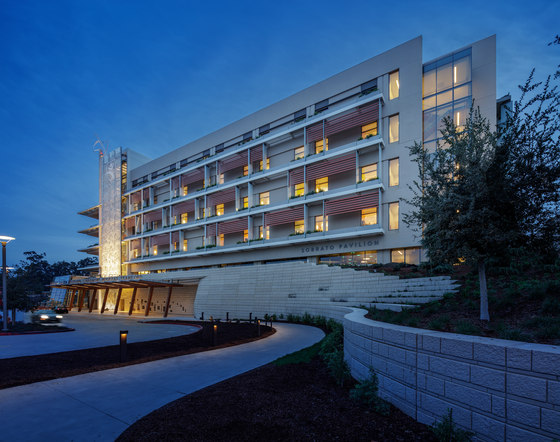
The new 521,000-square-foot hospital building creates an architectural dialogue between the operational efficiency of a rectangular grid, where all clinical services stack logically so doctors and staff can deliver effective healthcare, and the more playful, organic, often whimsical shapes and forms that exist in nature—and in a child’s imagination. This juxtaposition of rectilinear and organic form, reason and emotion, grown-up and child-like, was the genesis of the building design, Guenther says.
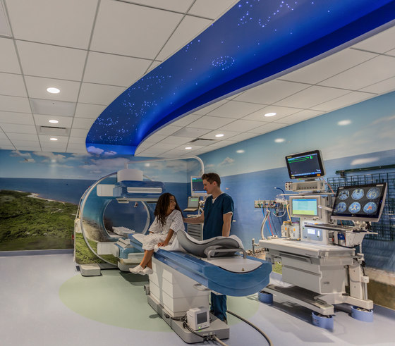
“It represents the blending of an adult world of rational efficiency—where parents want the highest quality medical care in a building that is easy to navigate—with the innocence and wanderlust of kids, who want to amble about, explore, and discover.” “Our approach was to begin with the design of the patient experience rather than the building itself,” says Rob Goodwin, FAIA, principal at Perkins+Will and lead designer of the hospital. “We focused on making a child’s understanding of nature an integral part of the healing environment.”
THE PATIENT JOURNEY
Getting Inside
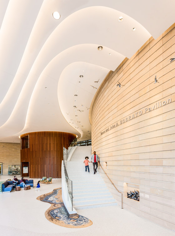
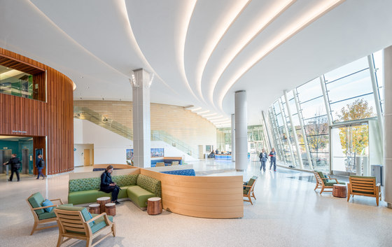
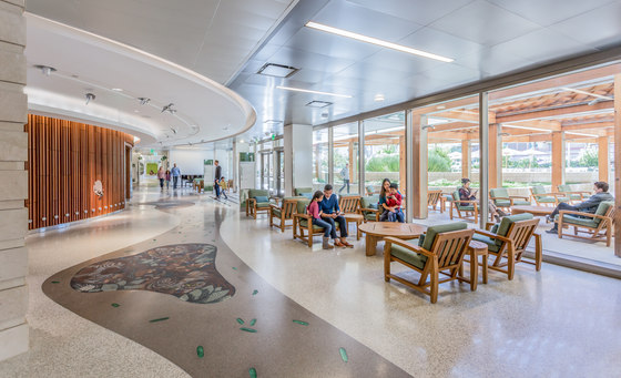
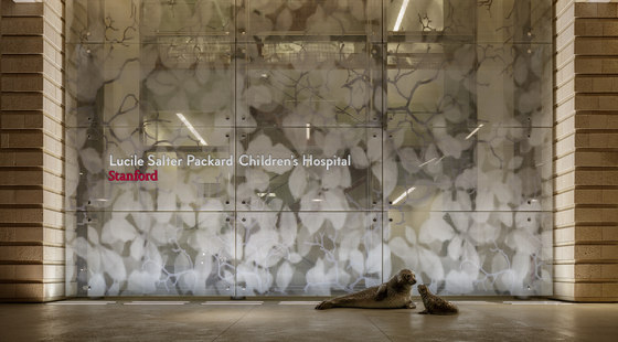
The patient’s journey begins upon entering the building’s main lobby, where a 20-foot-high glass wall overlooking the campus’s “Emerald Garden” floods the space with natural light, and where a sculptural white ceiling of undulating, LED-backlit, terrace-like layers recalls the swirling sands of a California shore. Life-sized metal sculptures of California least terns—birds that are indigenous to the bays of the Pacific Ocean—are suspended high overhead, “soaring” in flocks to lead visitors to clinical destinations and contributing to a sense of calmness and serenity.
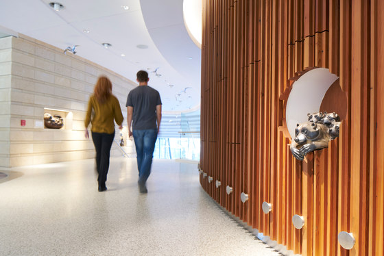
Past the grand staircase, in the center of the lobby, is the main elevator tower. Its oval exterior, clad in reclaimed redwood with a vertical groove reminiscent of the bark of an actual redwood tree, stands tall and wide. Sculptures of beloved animals native to California make their homes in carefully placed “tree holes,” welcoming visitors upon their arrival to each of the hospital’s six floors.
Navigating Up and Down
Every level is color-coded and organized by California’s six eco-regions—a child-friendly wayfinding strategy informed by the expertise of ecologists at the university to ensure geographic and scientific accuracy. The higher the level in the hospital, the higher the elevation of the corresponding eco-region. For example, California’s Rocky Shore is ground floor, the Redwood Forest is the first floor, the Valley is the second floor, the Desert is the third floor, the Foothills are the fourth floor, and the Mountains are the fifth floor.
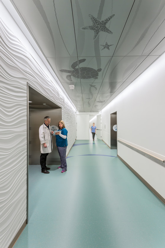
“Families wanted this hospital to express authenticity in its design so that their children would feel comforted by its familiarity and inspired by its opportunities for discovery,” says Annelise Chikhale, senior medical planner at Perkins+Will. “They wanted it to be special.” And special it is. The moment a child exits the elevator at any floor of Lucile Packard Children’s Hospital, he or she is transported into a place of wonderment with eye-catching murals, art, and animal sculptures at every turn. Museum-quality wall graphics not only orient patients and their families, but also provide interactive educational moments, sharing fun animal facts, figures, and photographs.
Navigating To and Fro
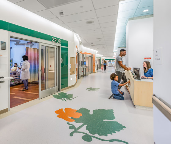
Each care unit on the patient floors borrows its name and visual identity from an animal indigenous to the particular California eco-region. Examples include the Cottontail Rabbit unit on the Foothills floor and the Valley Quail unit on the Central Valley floor. Ceiling-to-floor murals that tell the story of the lives and habitats of these animals highlight the corresponding entrance to each unit, simplifying navigation for patients, families, and staff alike.
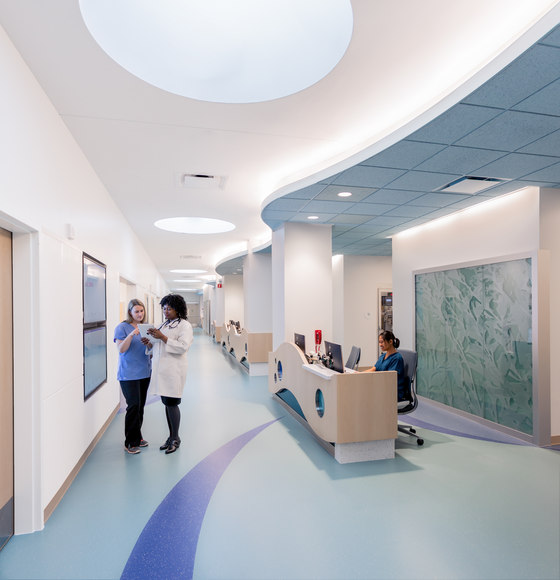
Care-team work stations within each unit are also designed with children in mind. Clear portholes built into the stations’ desks—positioned at the height of a child’s eyes—reveal life-size images of animals and plants. The desks’ bright colors, textures, patterns, and irregular shapes allow for sensory stimulation. The corridors around the perimeter of the nursing stations are colorful, bright, and well-lit, too.
Throughout the design process, the Perkins+Will team never took their eyes off the end-goal: to design a healing experience so special, uplifting, and distinctly positive, that it would captivate the senses and appeal to sensibilities of children. “We constantly asked ourselves, ‘What would a child who is 5 years old experience while walking through this building? What is at that child’s level?’” says Guenther.
Letting Kids Be Kids
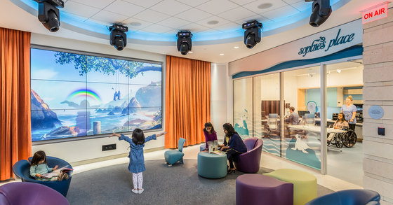
On the hospital’s ground level, The Story Corner features a large interactive video wall. Here, patients are entertained by an array of LED lights, bright, bold colors, and a hip, high-tech vibe. A multifunction play space features bookshelves and comfortable child-size seating to allow children to immerse themselves in literature. Adjacent to the Story Corer is a broadcast studio equipped to cast live performances and other activities directly to patient’s rooms if the patients are unable to leave their care unit.
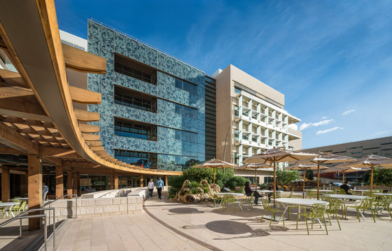
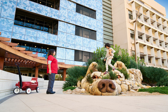
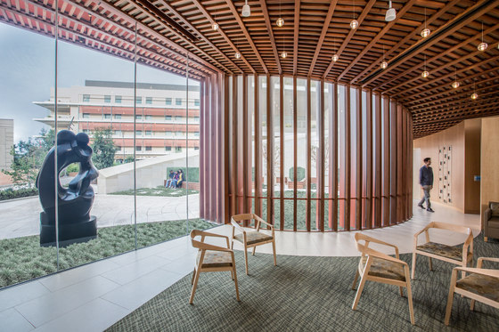
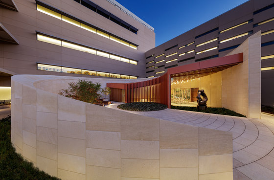
Not far from the Broadcast Studio and Story Corner, just one floor up, is the Dunlevie Garden, a sun-filled outdoor healing garden offering nature paths and climbable, interactive animal sculptures. An assortment of patio tables, benches, and lounge chairs offers families space. A reclaimed redwood canopy provides shade to an outdoor terrace, and easy access from the terrace to the hospital’s cafeteria gives patients and their families the option to dine al fresco.
SUSTAINABILITY INNOVATION
Energy Use Reduction
In the world of sustainable hospitals, Packard Children’s Hospital stands out for its innovative systems. Compared to current building code, the new hospital is designed to reduce energy consumption by 38 percent and reduce energy costs by 45 percent. Compared to the average regional hospital, it reduces energy consumption by 60 percent. Compared to the average U.S. hospital, and when combined with an efficient central utility plant and the carbon-neutral electricity grid in Palo Alto, it minimizes carbon emissions by 90 percent.
That’s the equivalent of eliminating the amount of carbon emitted from burning 16.1 million pounds of coal, or from driving 36.1 million miles in a gasoline-powered vehicle, each year Horizontal louvers and vertical fins installed on the building’s façade at precisely measured angles corresponding with the orientation of the sun provide shade to the patient rooms, reducing the need for air conditioning and lowering energy use. Displacement ventilation, another strategy, ushers in cool air at the floor level rather than high from the ceiling, where energy-intensive fans would be needed to force the cool air down. Packard Children’s is the first hospital in the country to use displacement ventilation in all patient rooms. Additional energy reduction strategies include increased thermal insulation, enhanced daylighting, and a large green roof, along with LED lighting, an on-site wind turbine, and photovoltaic panels.
“Environmental responsibility has been intrinsic to both the mission of the hospital and the expression of its design since the start of the project more than a decade ago,” says Goodwin. “Lucile Packard Children’s Hospital Stanford is a benchmark for sustainability in healthcare. It is a prime example of a private institution taking a leadership role in the global effort to minimize the impacts of climate change.”
Locally Sourced Materials
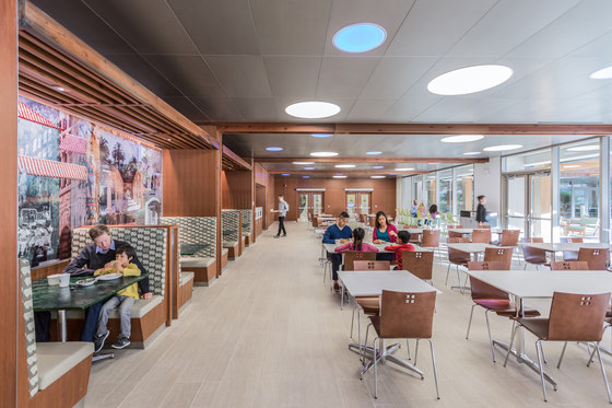
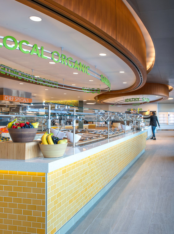
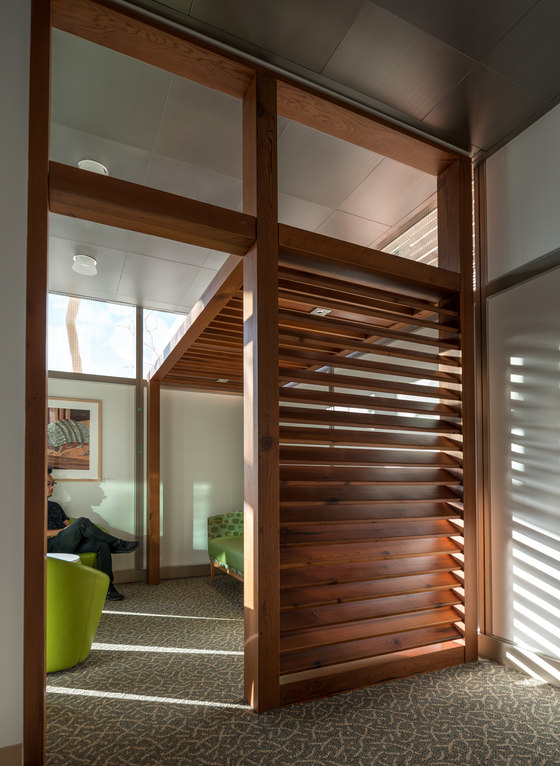
Moreover, the hospital’s building materials contribute to energy and carbon reduction. More than 28 percent of them (calculated by cost)—from carpet and ceiling tile to structural steel and concrete—contain recycled content. And more than 26 percent of them were extracted or manufactured within 500 miles of Palo Alto, such as the ceramic tiles in the hospital’s cafeteria, which were produced in the Bay Area. The outdoor canopy in the Dunlevie Garden, the main public elevator tower, the paneling and trim in the cafeteria, and a series of corner “nooks” are made with reclaimed redwood—much of it salvaged from the massive, 200-foot-tall Moffett Hangar 1, an iconic 1930s naval hangar in nearby Mountain View that had long been a landmark in Silicon Valley before being deconstructed in 2012.
Water Use Reduction and Conservation
The hospital reduces water consumption by nearly 40 percent over building code. This is accomplished through ultra-low-flow fixtures and creative conservation strategies, including a 110,000-gallon underground cistern—the first hospital in California to employ this technology—that filters, stores, and reuses water collected from rainfall, mechanical equipment condensate, and even water used in hemodialysis.
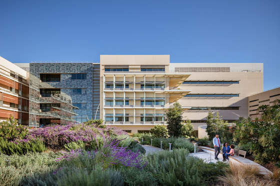
The new building also increased landscaped and open space by 3.5 acres. This space, which includes a vegetated roof and multiple outdoor gardens, harvests rainwater, helps restore the natural environment, and increases biodiversity. Native or adapted plants require minimal irrigation, and when they do, only non-potable water from the cistern is used.
“The impressive water conservation measures that this project employ reflect the team’s integrated and systems-thinking design approach,” says Breeze Glazer, Perkins+Will’s sustainable healthcare leader and sustainability coordinator for the new hospital. “It demonstrates how design goals like avoiding potable water use for irrigation and creating more landscape in a water-challenged region don’t have to be mutually exclusive. By thinking differently about the availability of resources from both the environment and building, what seems impossible becomes achievable.”
Healthy Materials, Healthy Living
The design team took great care to adhere to the Green Guide for Health Care (which Guenther co-coordinated in 2002), and used Perkins+Will’s Precautionary List to screen out products and materials containing potentially toxic substances. For example, there are no PVC-containing building materials in the hospital, and the furniture is free of flame-retardants.
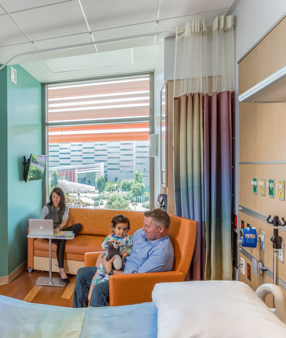
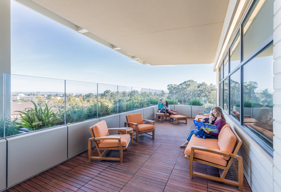
But healthy design isn’t just about preventing exposure to toxins. It’s also about increasing connection to nature and the outdoors—a strategy known as biophilic design. At almost every turn, patients, their families, and staff have ample opportunity to see and interact with nature and the outdoors. Beginning with each of the single-bed patient rooms, for example, window planters brimming with greenery add color and life to each child’s healing environment while framing vistas to the outdoors. And on every patient unit, two outdoor terrace overlooks—one dedicated for patients, the other for staff—allow for convenient outdoor access, fresh air, and a stunning view of the California foothills.
In addition, three major gardens—the Dunlevie Garden for patients and families on the first floor, the Ford Garden for staff, and the Emerald Garden adjacent to the lobby—provide immersive outdoor experiences. “When we’re sick, or when we’re caring for others who are sick, we often feel vulnerable. So we quite naturally seek refuge,” Guenther says. “And as human beings, we tend to associate certain natural landscapes, like calming forests and colorful, tranquil gardens, with refuge.”
A non-denominational sanctuary on the first floor is another example of a space designed for refuge. It offers indoor peace and quiet, and opens to an outdoor healing garden rich with calming flowers and other greenery.
Finally, none of the hospital’s clinical areas are below the ground entry level; this design decision, while atypical of most hospitals, ensures that children and families no longer have the experience of going down in an elevator to “the basement” for care.
BESPOKE, EXPERIENTIAL DESIGN
One of the design requirements was that the new hospital building itself should be “un-self-conscious.” In other words, what people should remember is the experience of being there and receiving care; its building form and architecture should be designed to support and enhance that experience.
“We talked a lot about what that meant, and how—as architects who approach design as a form of art—could deliver on that promise,” says Goodwin. “It was a formidable challenge, but what we ended up with is a subtly beautiful design that enables people to have deeply personal, memorable, and positive experiences both within and around the building.”
To create those experiences, the design team focused on children, families, and local context. “The building is for everyone—not just children. It holds amazing feats of medicine and incredible acts of kindness with equal grace.”
Child-Friendly, Family-First Healing
One experience that the client and the design team felt was important to recreate was the comfort of “home.” That meant creating a variety of spaces that allow families to be together and interact with each other, and their environment, in different ways. Single-patient bedrooms are spacious enough for built-in sofa beds that accommodate up to two family members. And within each of those rooms, the team designed a dedicated family closet, storage space, and a laptop charging station.
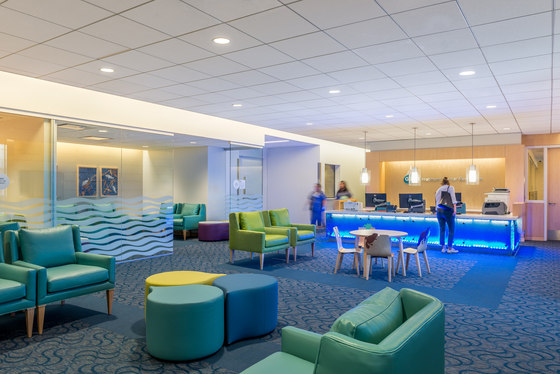
To allow families to tend to “household” activities together, like preparing meals, family kitchens and laundry facilities are located on every floor. The hospital’s Dunlevie Garden also acts as a “back yard” that keeps little ones entertained outdoors while also connected with nature.
A Hospital Unique to Northern California
Perkins+Will designers went to great lengths to create an experience that reflects and embraces the hospital’s surroundings. Silicon Valley is a wellspring of healthy, sustainable workplaces, so health, sustainability, and advanced technology had to permeate the design of every aspect of the hospital, Guenther says.
“When we looked at other children’s hospitals, particularly in clinical areas, it struck us that there was a prevalent look and feel—lots of primary colors and geometric shapes. We knew this hospital had to be uniquely Northern California. Together with the Packard Children’s community, we created a building that belongs here and nowhere else. That’s exactly how it feels.”
Perkins+Will
