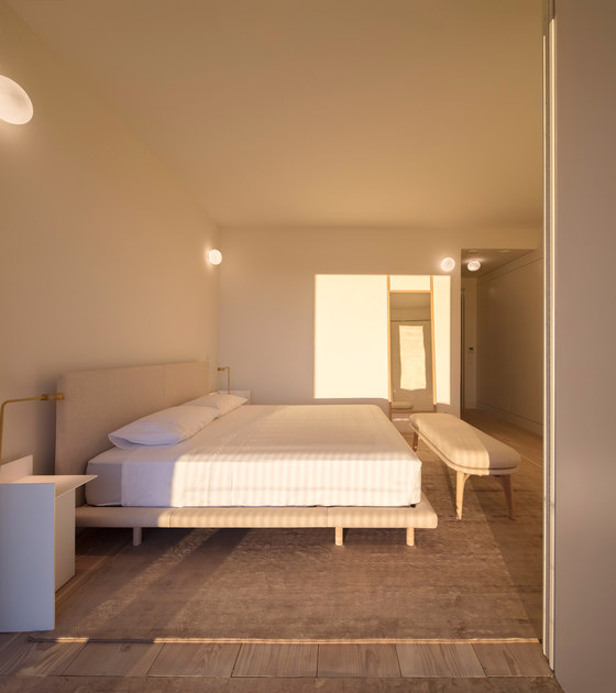
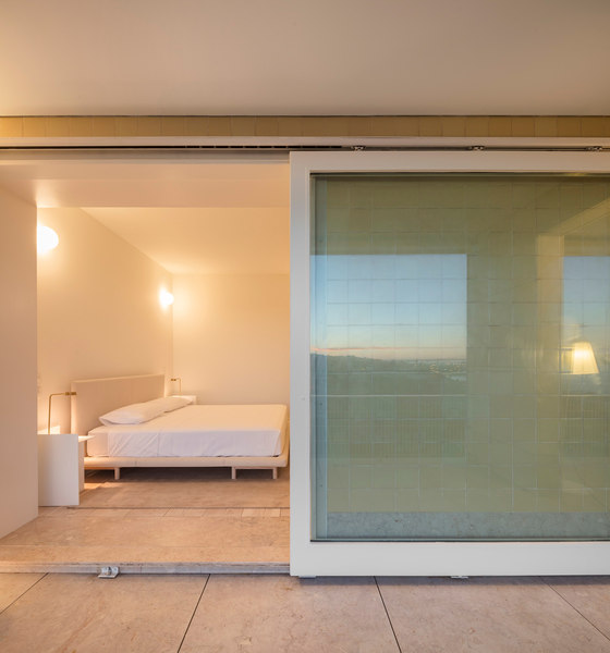
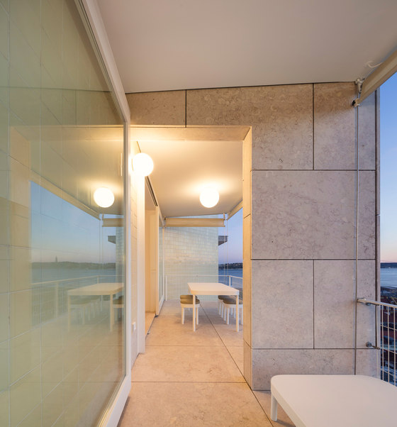
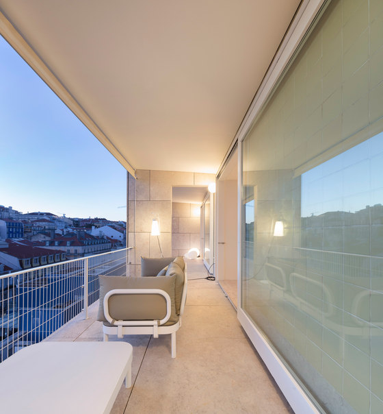
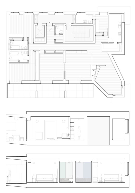
The apartment is located in one of the blocks making up Terraços de Bragança: the set of buildings designed by Álvaro Siza Vieira in Lisbon’s Chiado district that completed construction in 2004. Working within the scope of a Siza Vieira project represents a difficultly desirable challenge. The inexorable weight of the inherent responsibility runs in parallel to a sense of pointlessness of intervening within a framework that requires no such work.
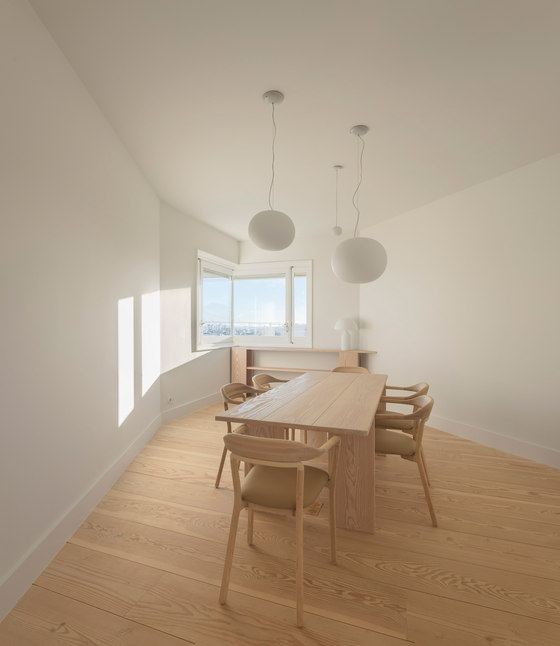
We thus focused on the needs, desires and expectations of the client. The apartment area was to be maximised. To this end, we eliminated the technical cabinets and their ventilation infrastructures existing throughout the bathrooms, bedrooms, the corridor, the living room and the storage room, which were relocated behind the suspended ceiling. Furthermore the spatial structure was maintained while repositioning only the door accessing the living room and removing the wall that closed off the dining room.
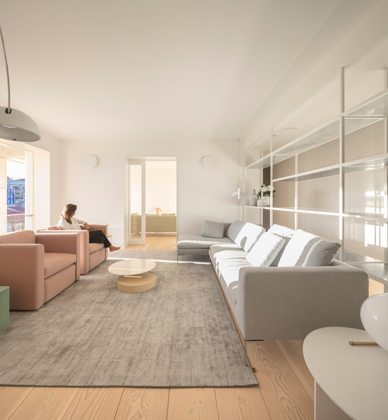
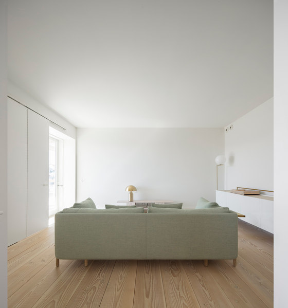
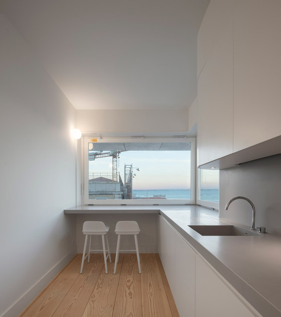
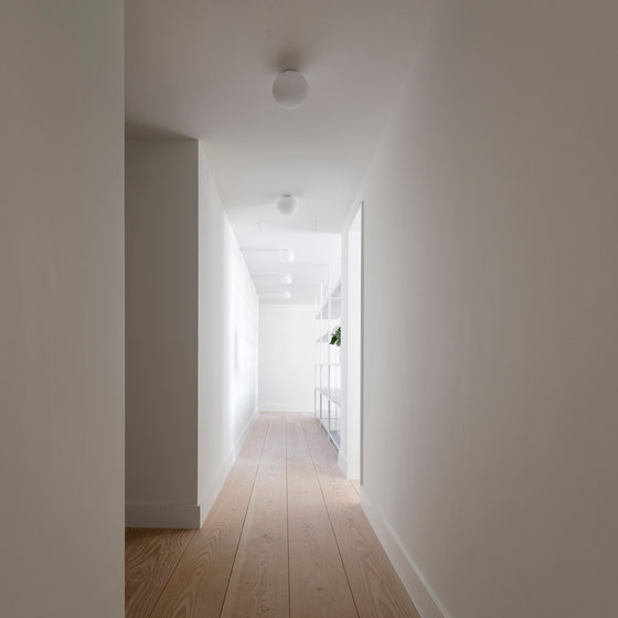
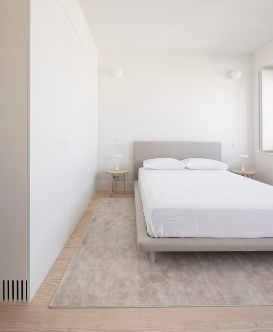
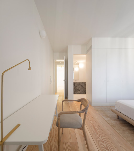
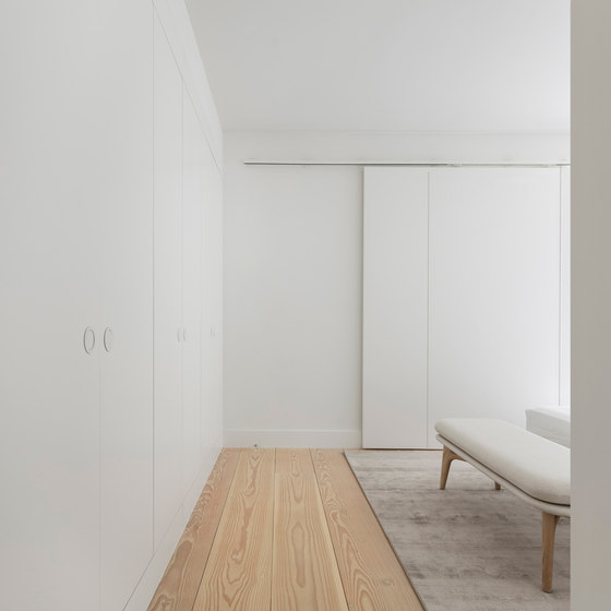
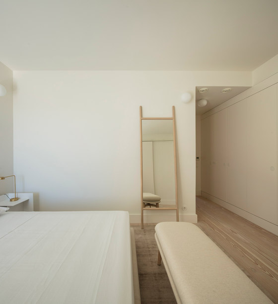
The dark wooden floor tiling, in narrow planks, was replaced by lighter, broader planks. The inner doors, at a substantially lower height than the Northern, Southern and Western window facades, were rescaled, retaining their breadth and raising their height to match that of the windows. Furthermore, within the scope of the purpose of this operation, the entire carpentry system underwent redesigning with higher skirting boards and thinner frames that also integrated new ventilation grids in both the skirting boards and fixed furniture.
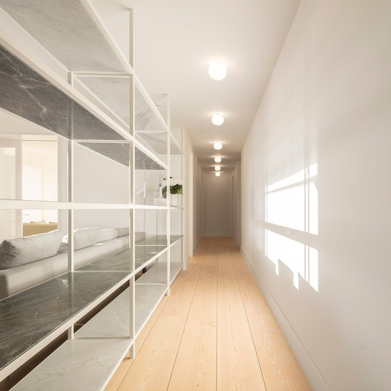
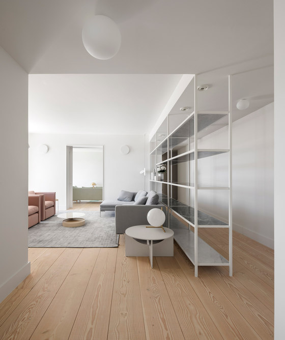
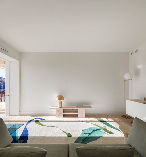
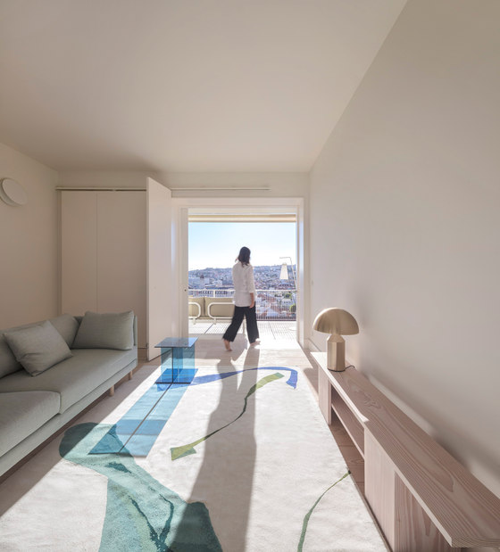
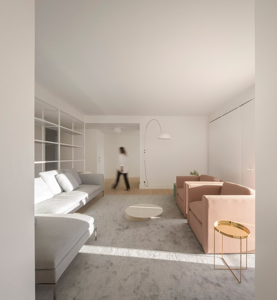
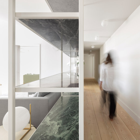
The objective here was to bring about a more luminous apartment while fostering a greater sensation of amplitude and, above all, of a more generous ceiling height. The built-in living room shelf-stand, where the room meets the corridor, was replaced by another: a delicate metallic structure, without any back panel, to separate the two areas while enabling a mutual visual relationship – privileging the apartment’s marvellous westward view – and the natural illumination of the corridor.
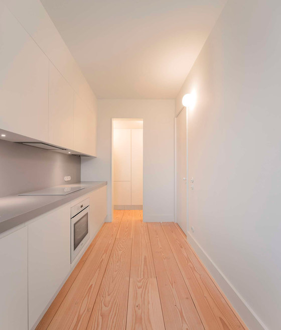
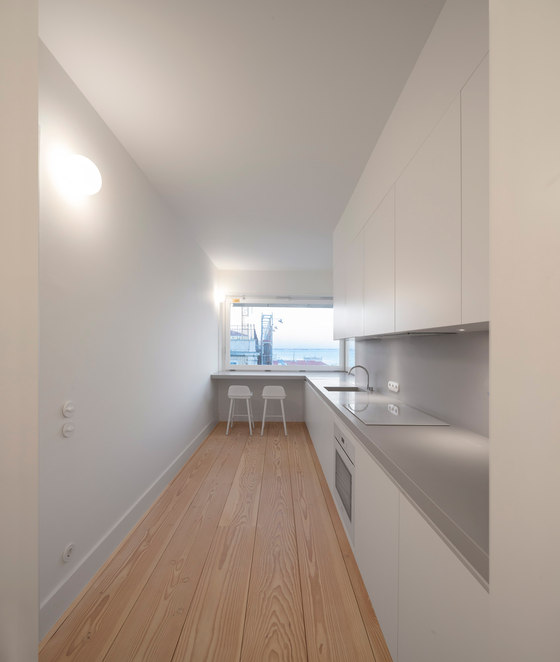
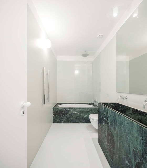
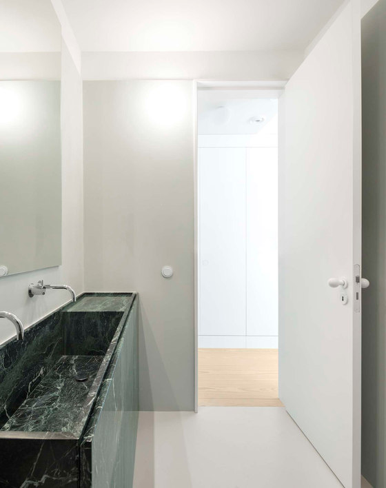
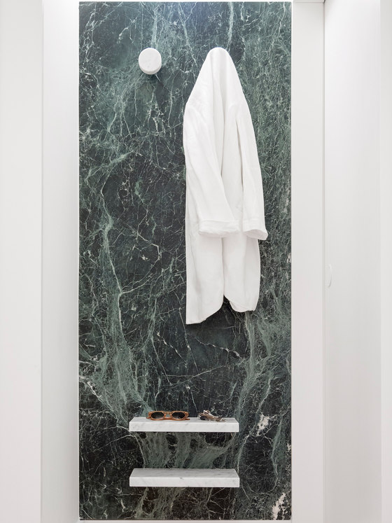
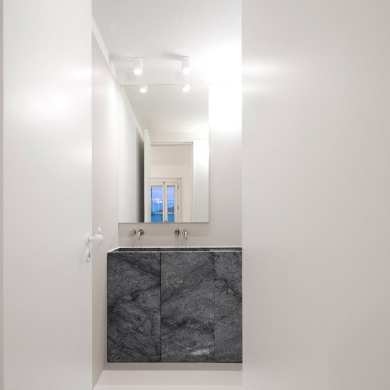
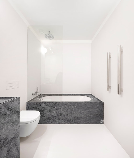
The en suite and service bathrooms, as well as the kitchen and pantry, underwent structural alterations with the reorganisation of their layouts alongside new finishing materials. The carpentry solutions, tailored to meet the wishes of the client and the specific characteristics of their host spaces, the details to the stone fixtures, and the total reformulation of the lighting project all proved determinant to the intervention in these spaces.
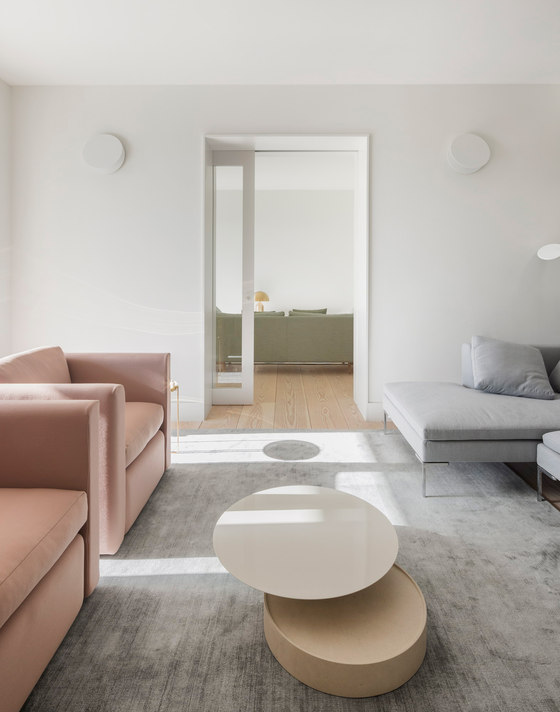
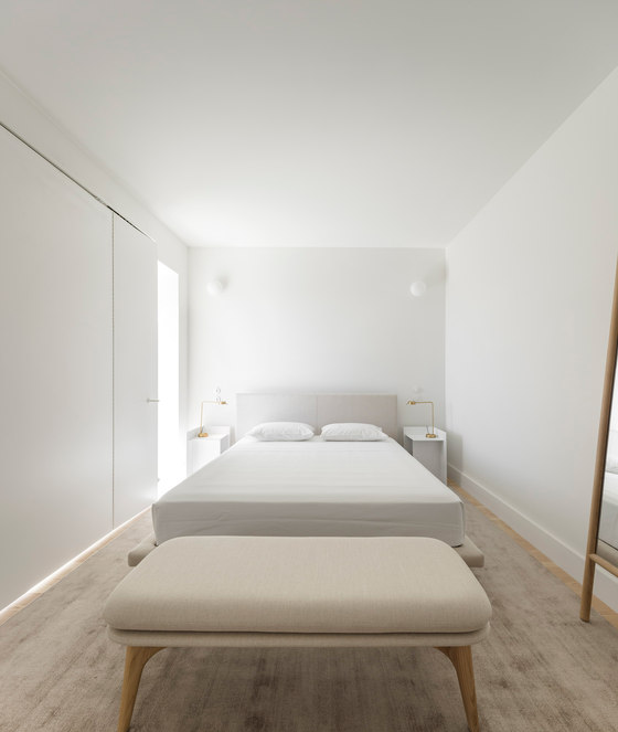
The furnishing project followed the same principles as the architectural design project in striving for an ample and appropriately luminous ambience. As in the bathrooms, the floor tiling and stone patterns stand out as protagonists against the smooth and homogenous coloured surfaces – in colour block –, like the coloured blocks of Terraços de Bragança.
rar.studio
