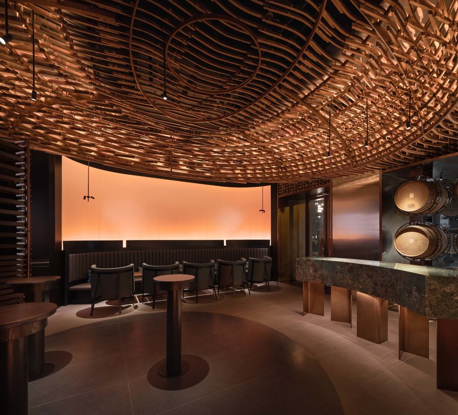
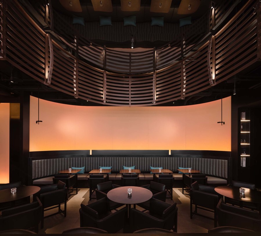
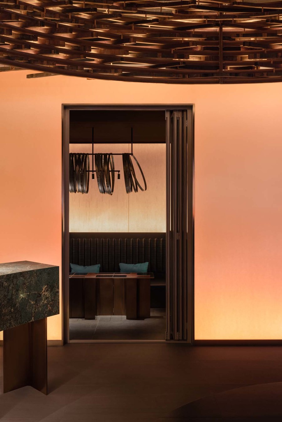
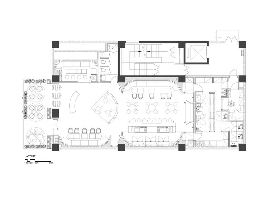
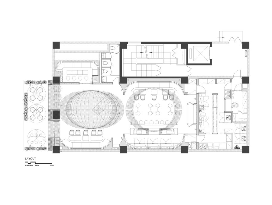
The build of the overall space sequence reflects quoting, extracting, and amplifying the factory's production process and importing the details of the materials used in the production process into the space design. Create a mutually beneficial symbiosis between the winery and its bar space, and support each other. The overall space planning of Laizhou Bar comprises a whiskey tasting area, VIP room, bar area, kitchen, bathroom, and outdoor seating area. Regarding the whole bar, it is necessary to consider the actual consumer needs and show the brand spirit that can echo the Laizhou Distillery.
Behind every beautiful product, there is always an aesthetically pleasing production process. The aesthetic trend in production extends not only to the beauty of products but also to the beauty of the production environment and the products themself. Bacchus has always adhered to the green production concept of "born from nature, walking with nature" based on having one of the few global whiskey distilleries with both pot and continuous column stills. At present, as China's most extensive whiskey distillery, it has become the first group company in China to practice the green concept of net zero emissions and take carbon neutrality as its long-term goal. Therefore, the beauty of production naturally became the design inspiration for their first flagship whiskey bar in Shanghai.
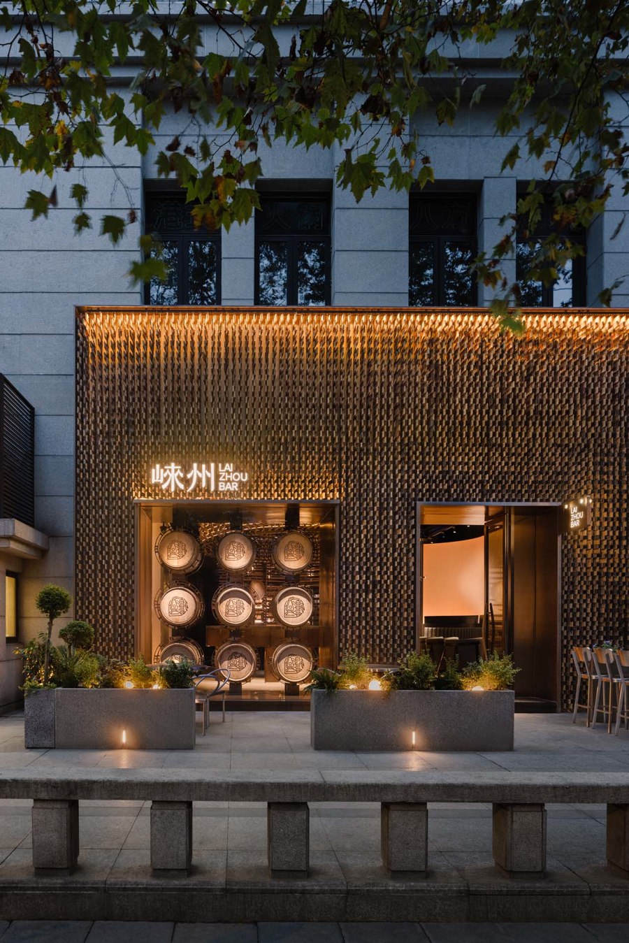
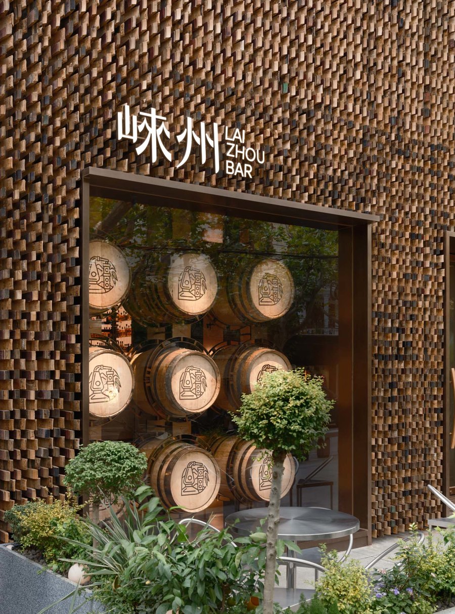
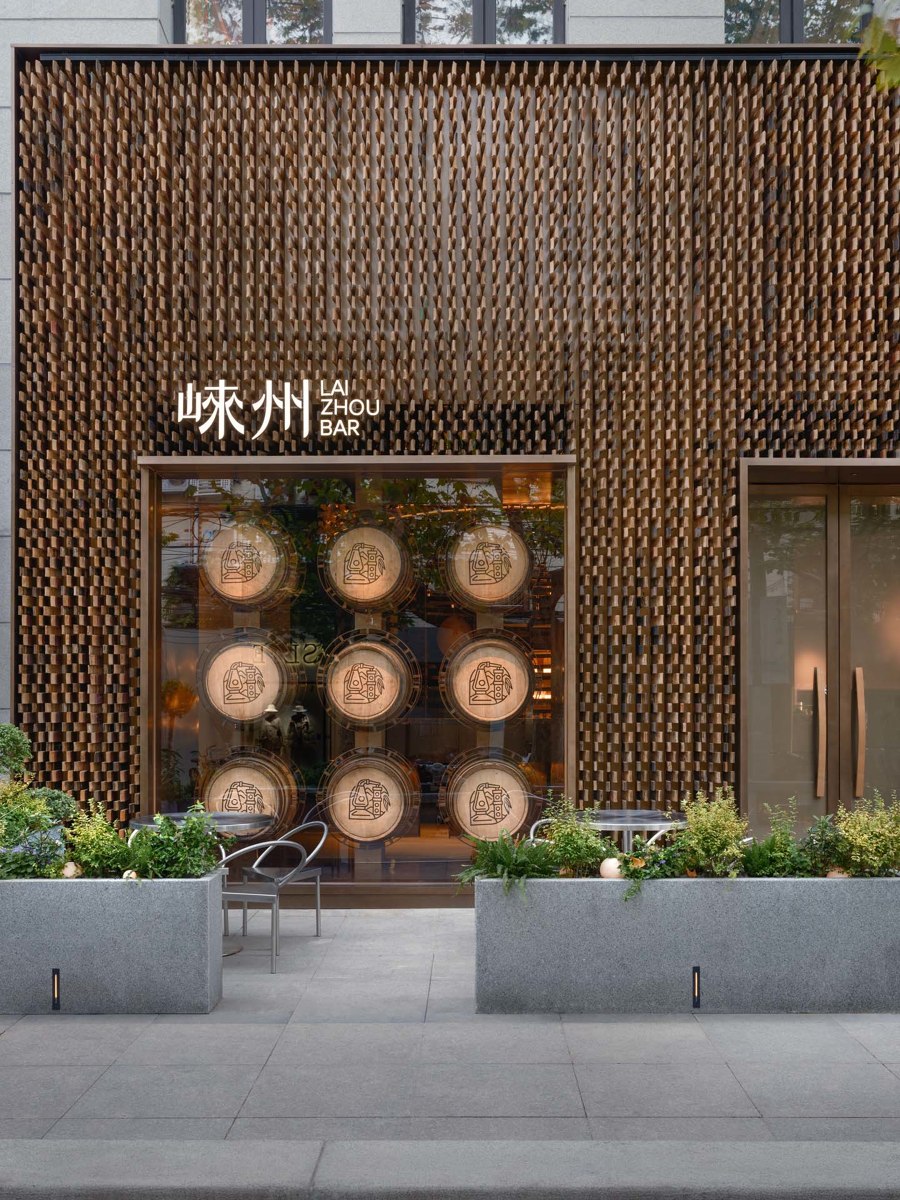
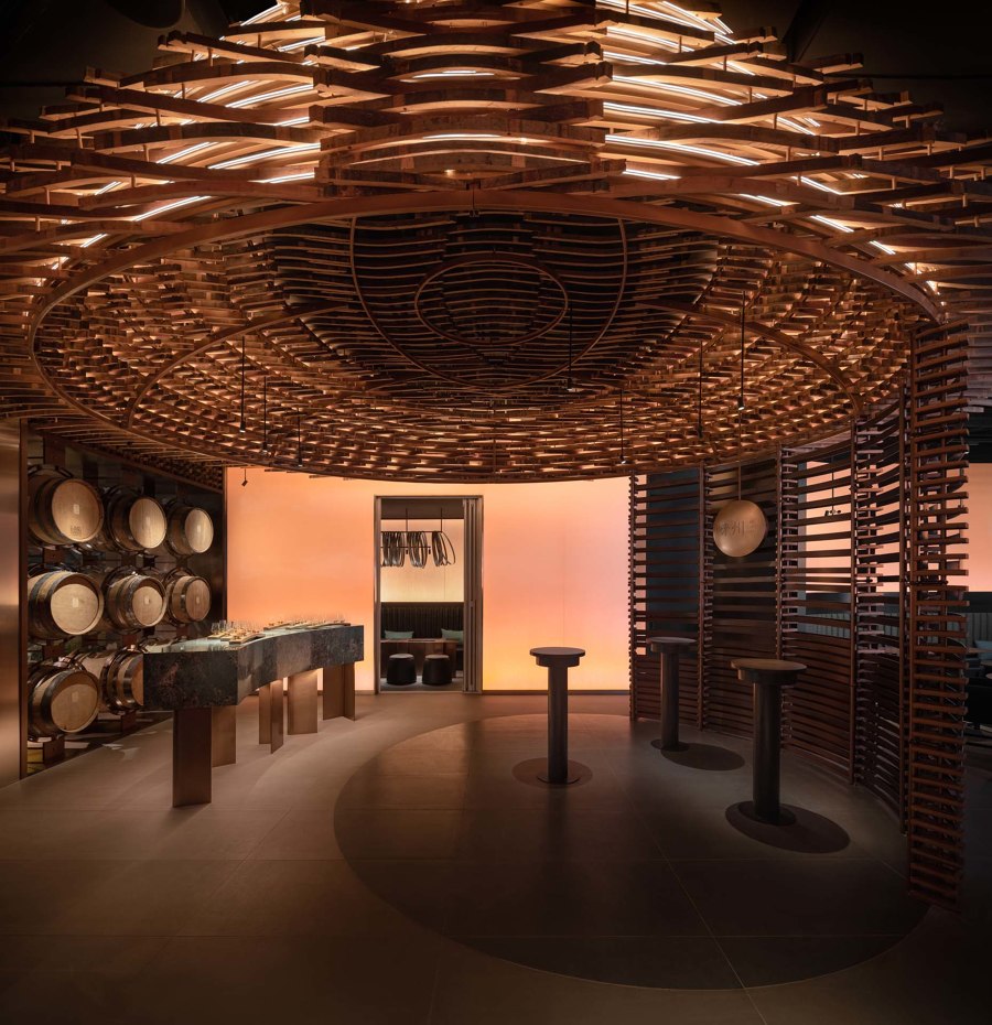
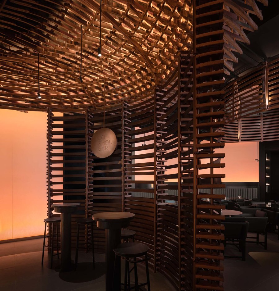
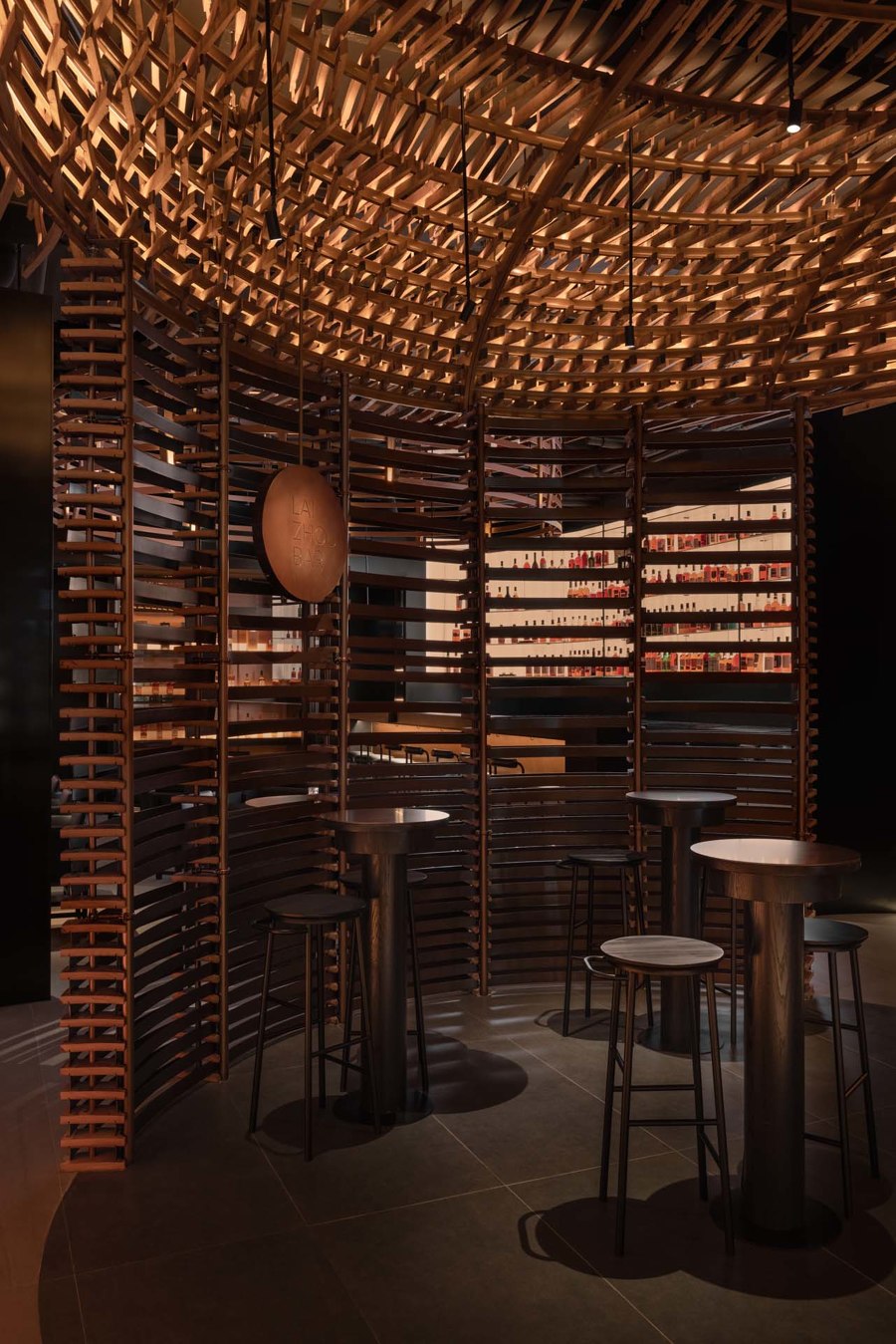
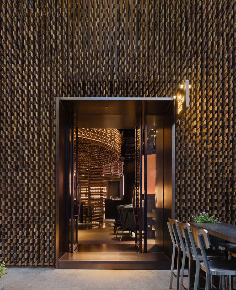
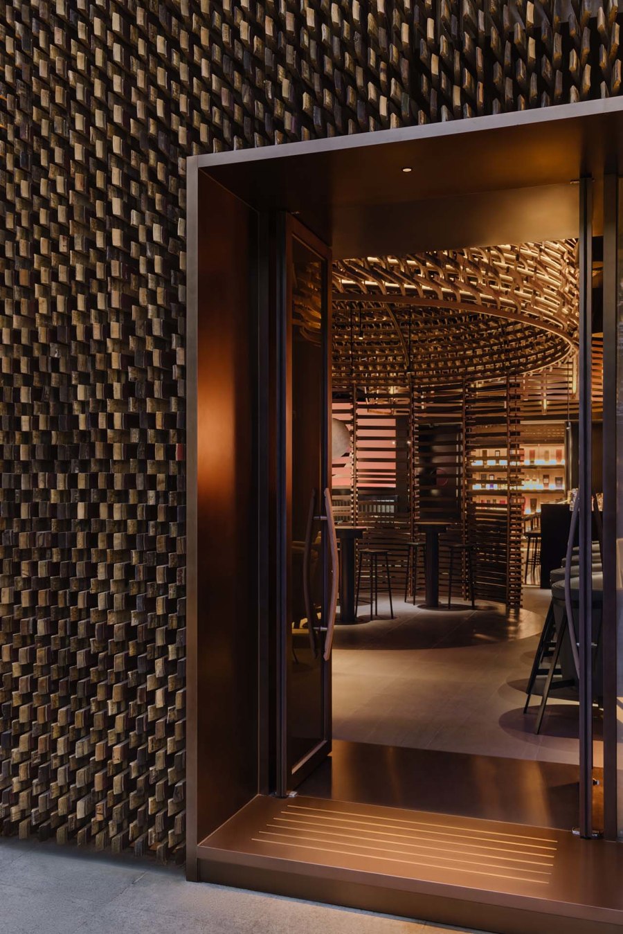
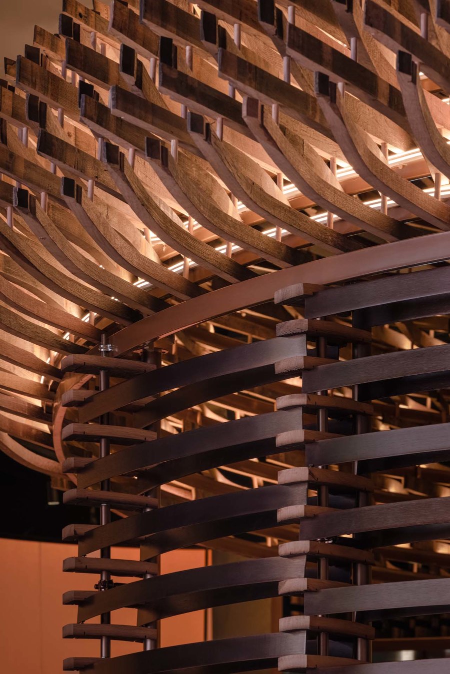
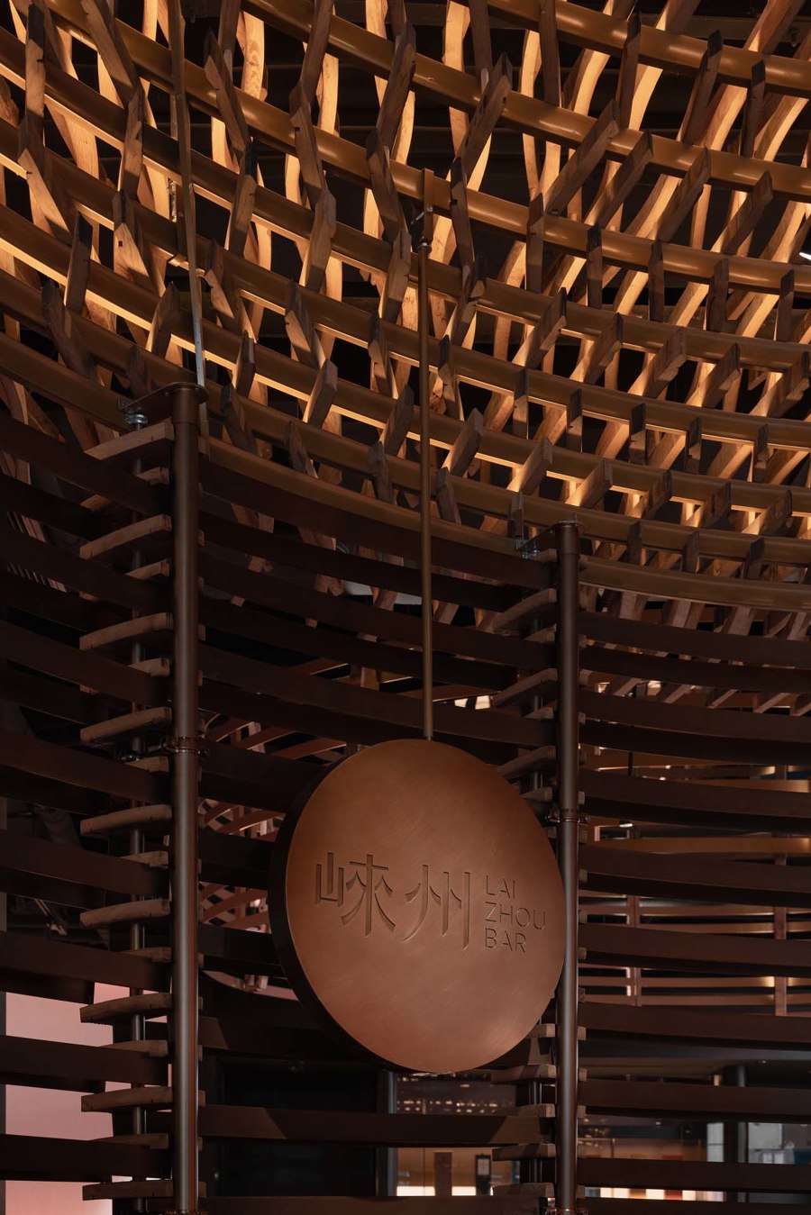
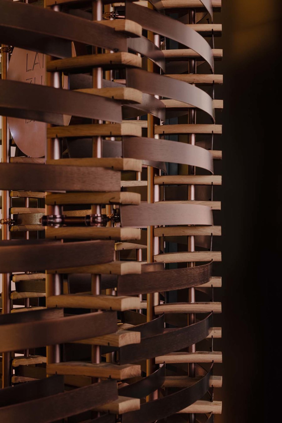
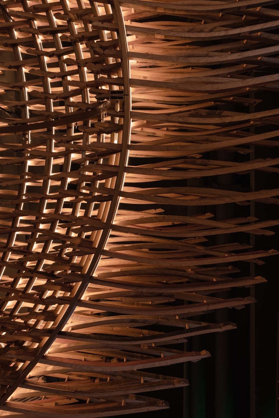
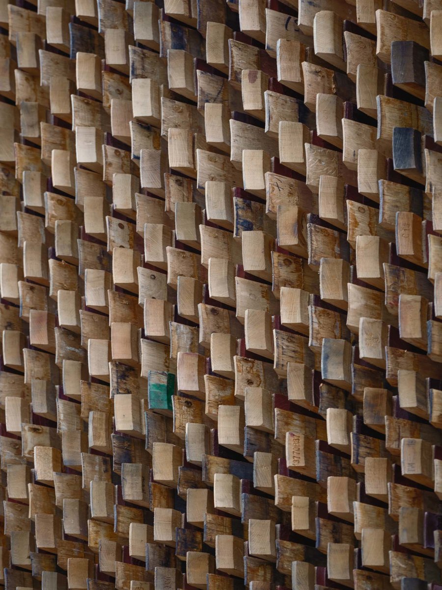
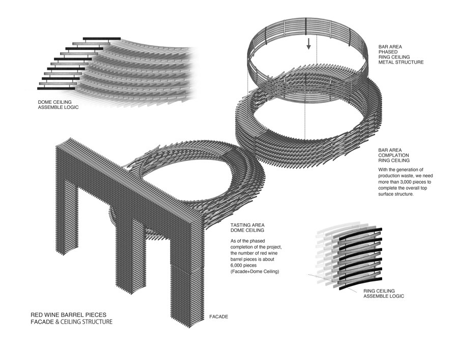
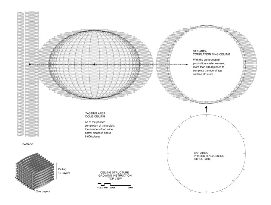
We used around 6,000 pieces of discarded wooden barrels dismantled from the whiskey barrels of the distillery to assemble the long site from the outside to the indoor entrance tasting area until the bar area in the back area to form a coherent flow spatial visual experience.
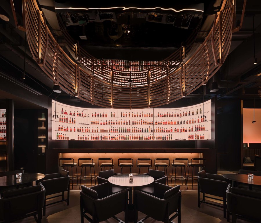
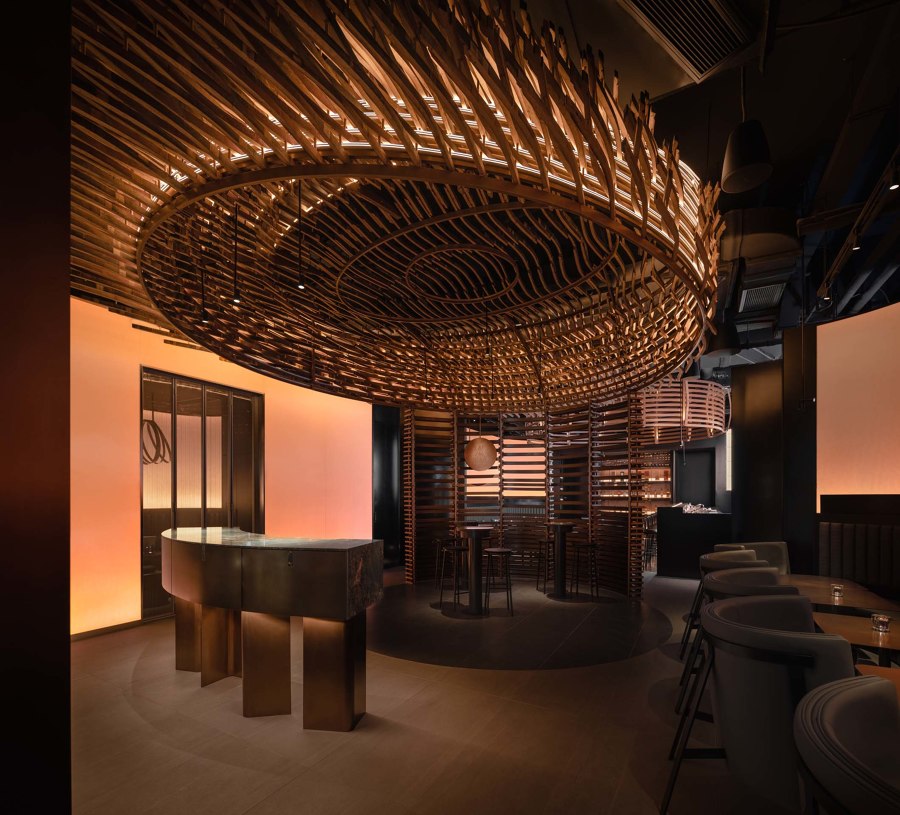
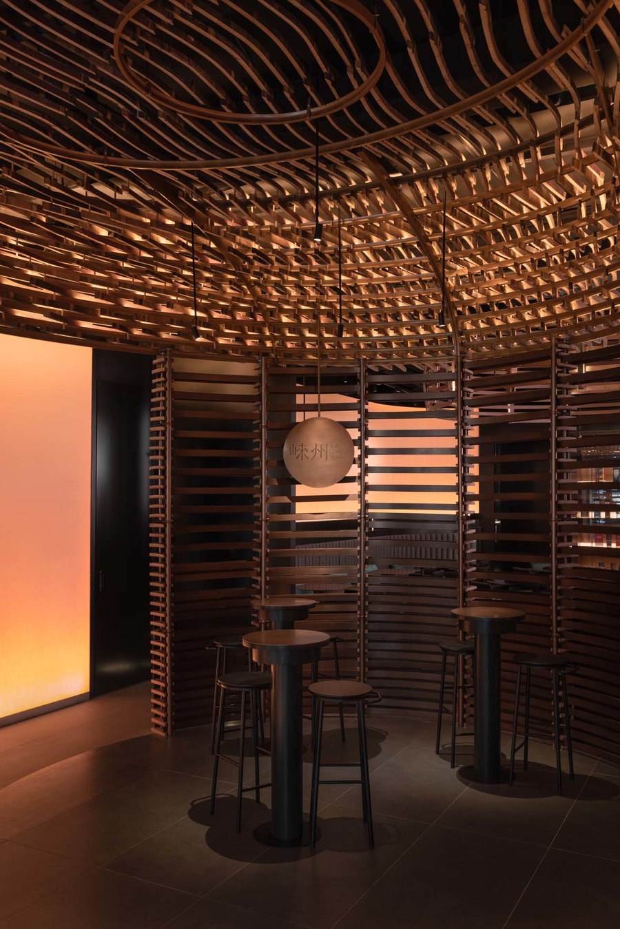
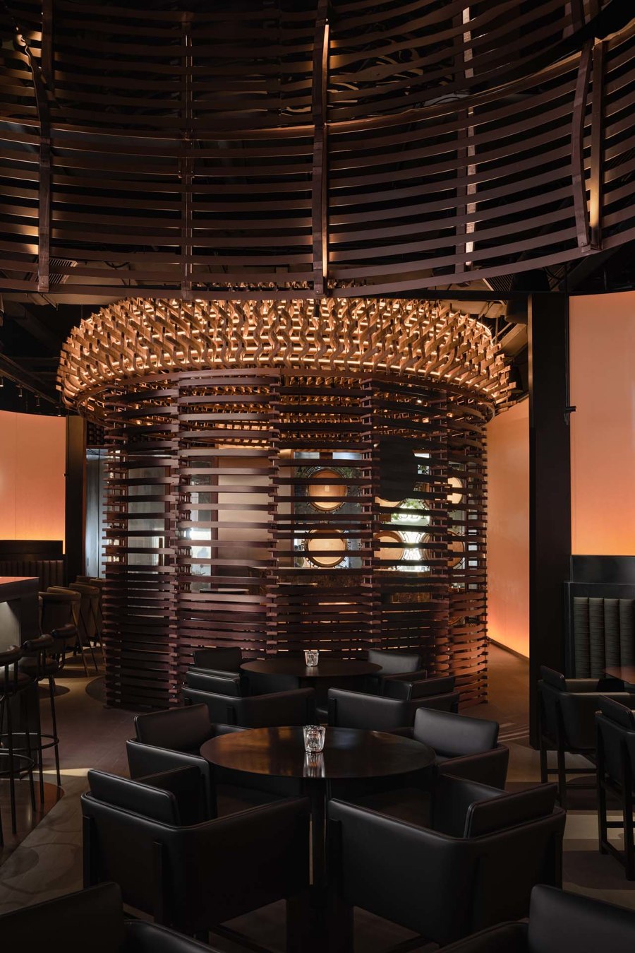
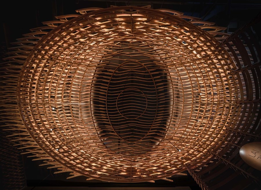
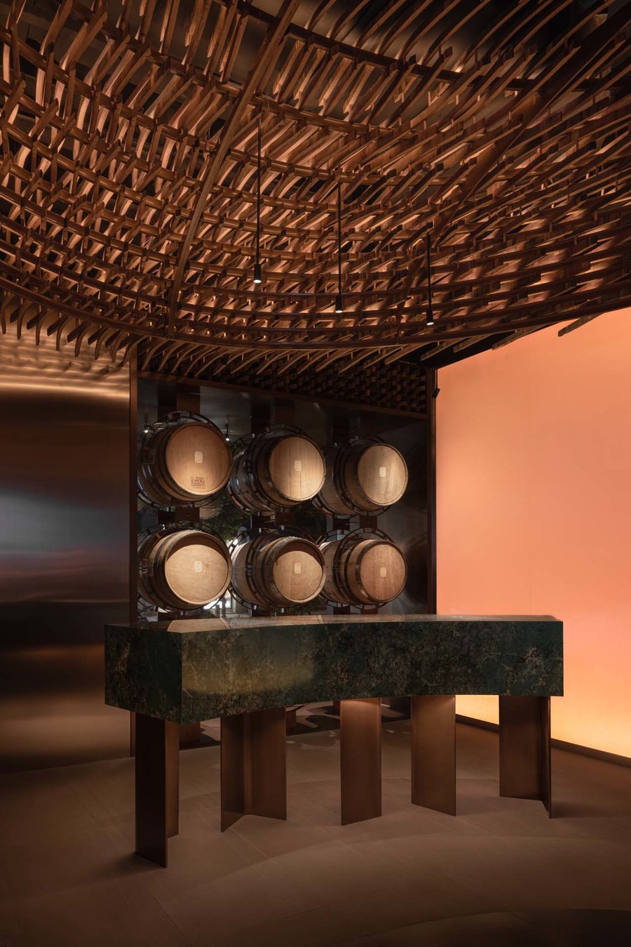
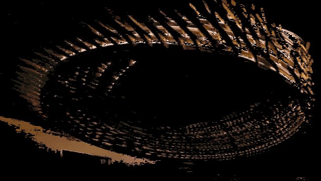
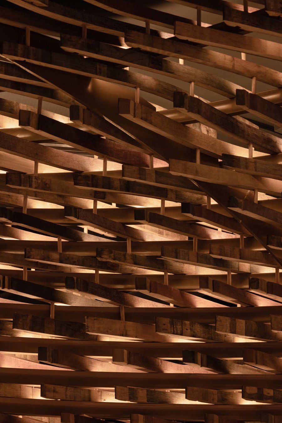
The double-ring structure on the top of the indoor tasting and bar areas forms an infinite visual impression, echoing the distillery's green and environmentally friendly whiskey production methods. The dome structure formed by discarded wooden barrel pieces on the top surface highlights the particular function (whiskey tasting) as the center of the space. In addition, the lighting design of the marquee strengthens the unique flow of natural time extension at night.
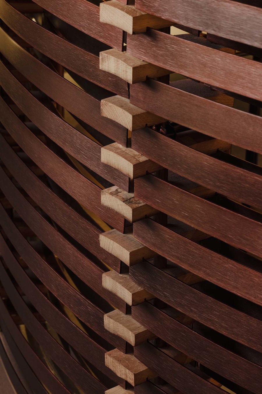
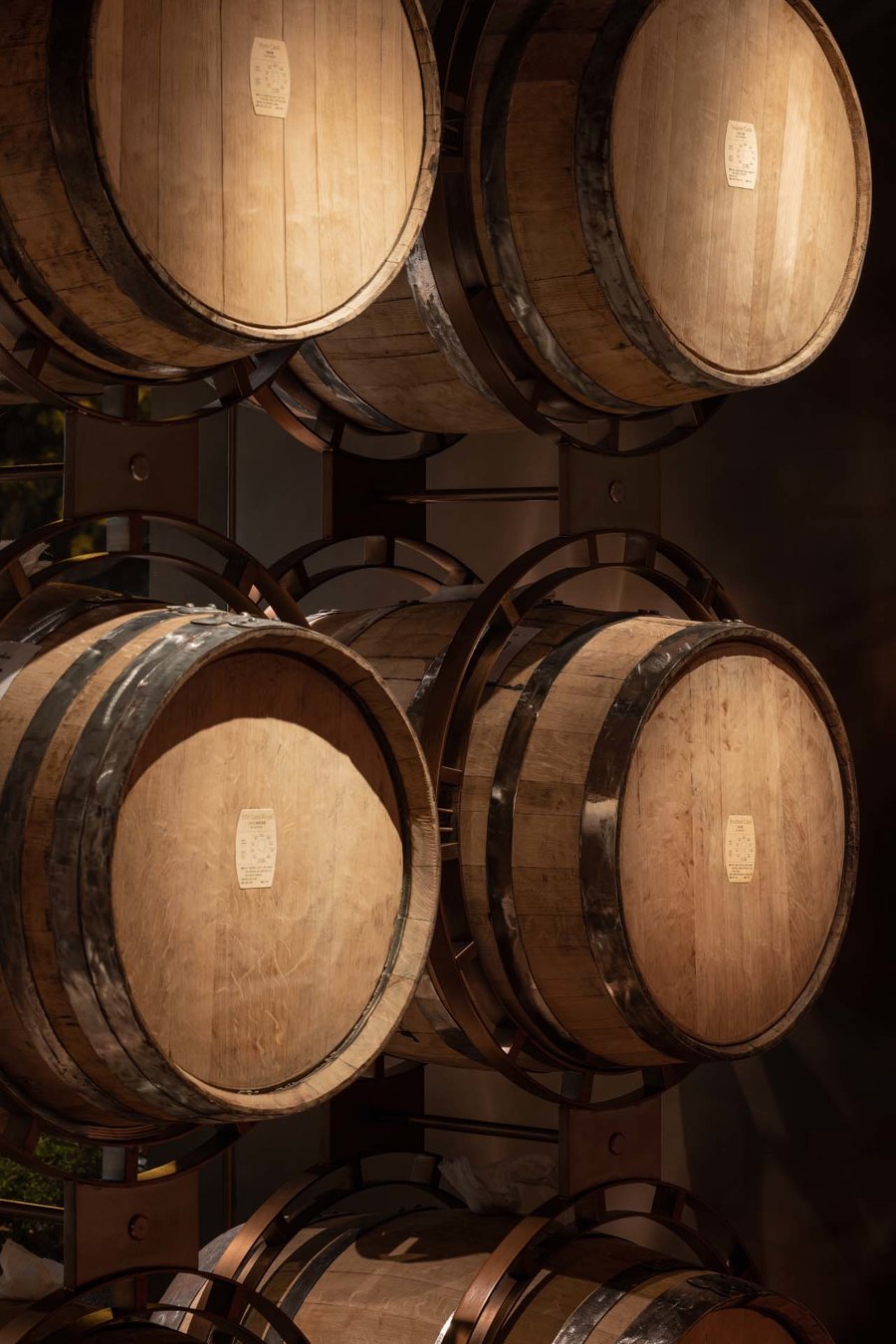
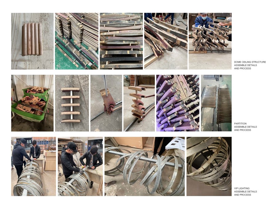
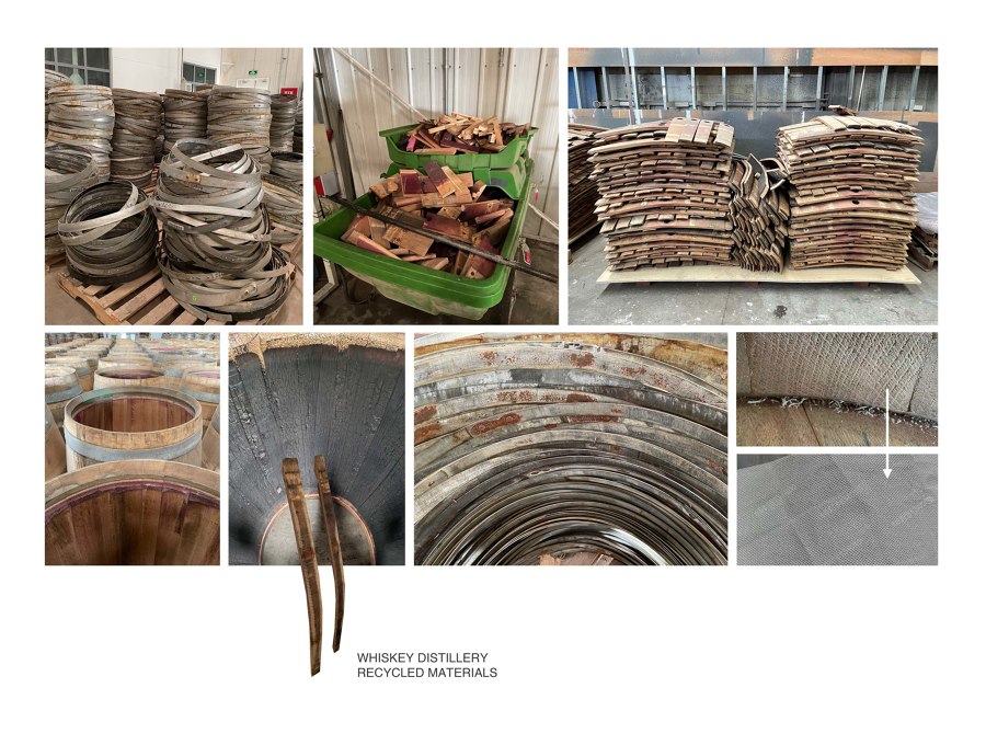
Regarding materials, we adhere to the winery's sustainable concept and use the winery's discarded wooden barrels and barrel metal rings as the most important structural materials in the interior, forming the bar's unique facade and ceiling structure. Each dismantled barrel piece is different in the curvature of the wood piece, width, length, and grain. Through the various size details and textures of each piece, we classify them and apply them to different positions on the facade and ceiling dome. Due to the limited number of discarded oak barrel pieces - quantity gradually increases with production. Therefore, for the double-ring structure, we decided to build the dome of the tasting area first like a nest. Then, with the growth of time, the discarded wooden barrel pieces are accumulated step by step towards the dome of the bar area for construction. The bar area's top metal structure provides the foundation for adding the wooden frame in the next step.
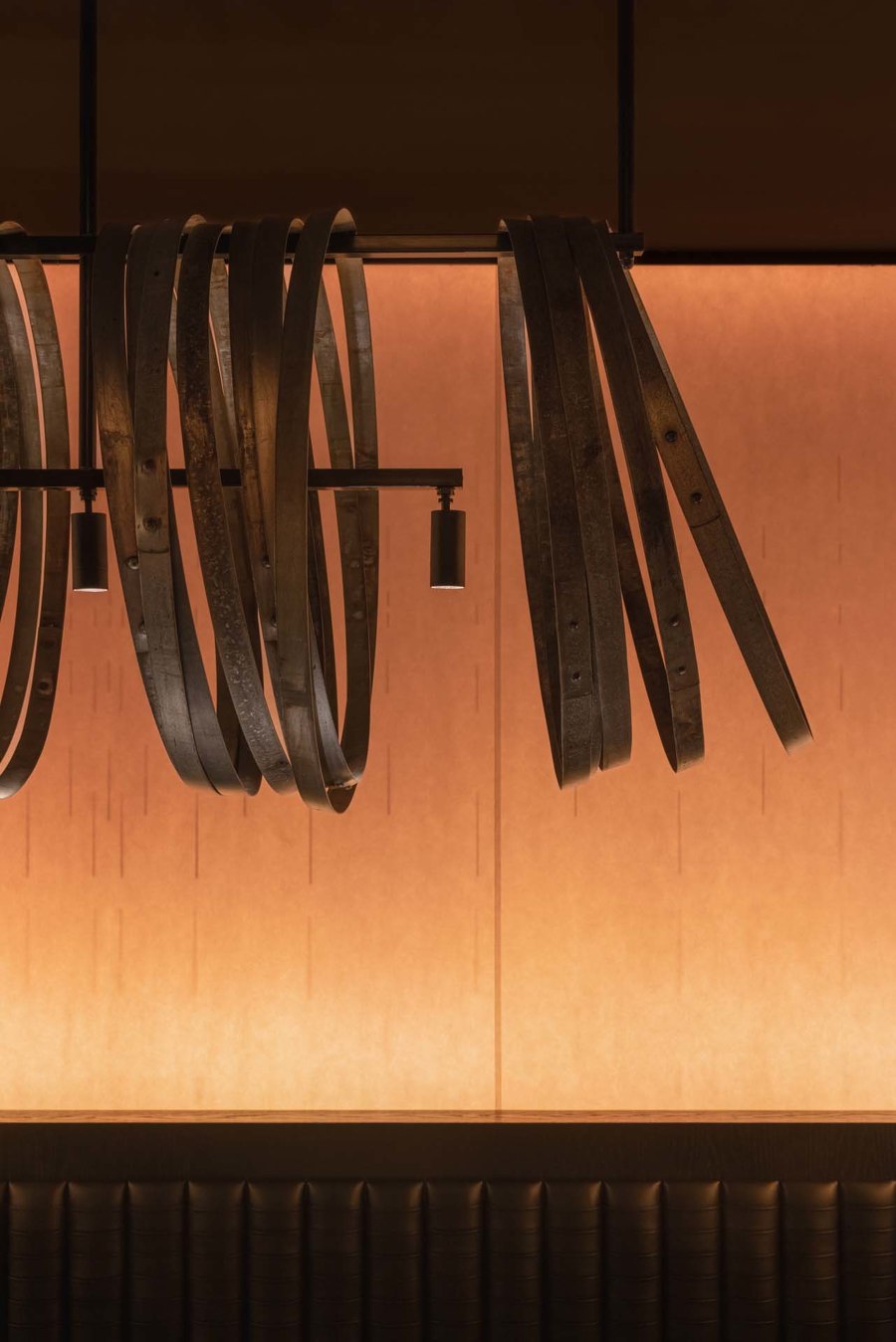
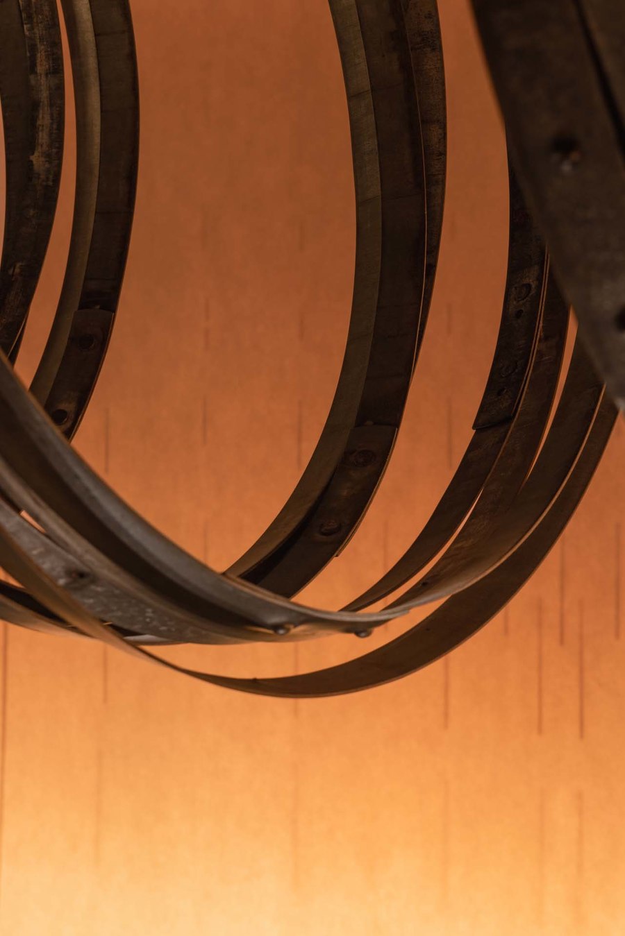
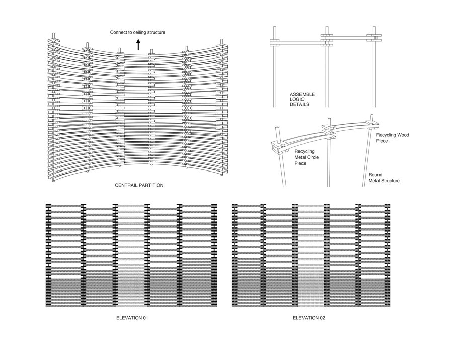
Based on the flowing shape, the unique use of traces of the wooden structure brings a unique sense of history washed by time and years to the space. In addition, in the partition between the tasting area and the bar, we combined discarded metal rings and a part of the cut wood structure with holes to form a coherent material expression from top to bottom. At the same time, the VIP room lighting is made of metal rings of discarded barrels. The natural color of the metal ring is assisted by ambient light, which naturally shows a special artistic appearance. Traces are an aesthetic feature that has always existed in the whiskey production process, such as the cross-sectional details of the oak wood chips, the carbonized surface left after the fire toasted the barrel, the contrast between the vicissitudes of the barrel and the round taste of the wine itself, and so on.
We use non-woven fabrics to imitate the texture pattern of oak to form the background wall of the wine display in the space and the upper half of the wall in the booth area. The changing color and slightly shining lighting atmosphere neutralize the sense of stability and coordination of the dome wood structure on the top surface, making the overall space atmosphere younger. The smoked metal plate and distilled copper plate materials form the other wall parts, which reshape the sense of thickness and the dark characteristics of the whiskey bar.
Design Team:
RooMoo Design Studio
