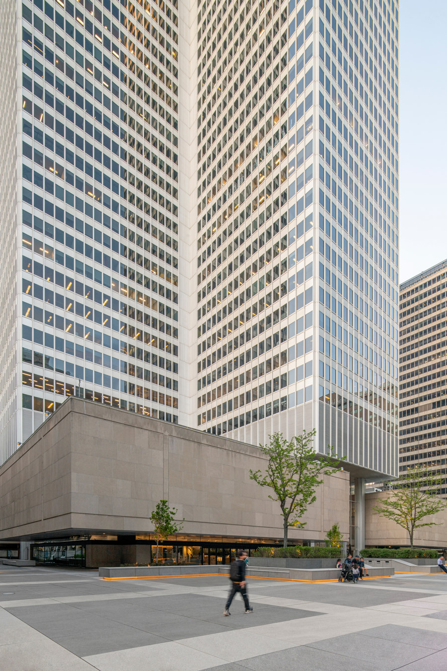
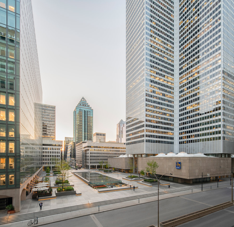
As part of a larger project to revitalize the iconic Place Ville Marie and its esplanade, Sid Lee Architecture is proud to present the new offices of leading creative firm Sid Lee, which is now headquartered in three of the quadrants formerly occupied by the Royal Bank of Canada.
The architectural makeover of the spaces is part of the revitalization of downtown Montreal and an affirmation of the agency’s commitment to creating new links with the urban epicenter. It also features a luminous and open renewal of one of the city’s most iconic spaces. With workers returning to offices, the Biosquare stands out as a place for inventiveness, floating in the heart of downtown, a liminal space bridging the street and the interior through the free flow of ideas.
A microcosm open to the city. The redesign of the space was based on two major principles and grounded in the desire to make the original offices lighter and more welcoming.
First, the free flow of the urban platform dictated the design, with the aim of achieving continuity between the city outside and the offices within. The campus — which the architects also call the Biosquare because of its shape and biophilic elements – is thus an extension of the urban environment in which it is located, at the intersection of disciplines and social spheres.
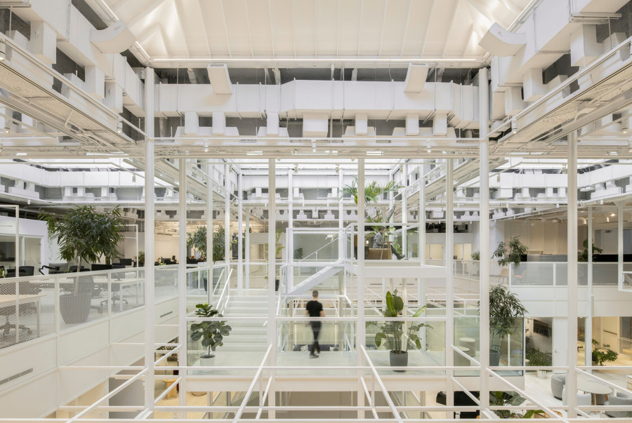
That continuity principle is also found in the infinite grid structuring the organization of the space. Covering the entire office area, the grid made it possible to conceptualize an open zone where different functions coexist easily and freely. In contrast to siloed, fragmented offices, Sid Lee Architecture used that template as a platform to link all of the spaces and the people moving within them. The Biosquare is thus a shared microcosm with endless possibilities; a collective world where professions mingle and the boundaries between functions are blurred.
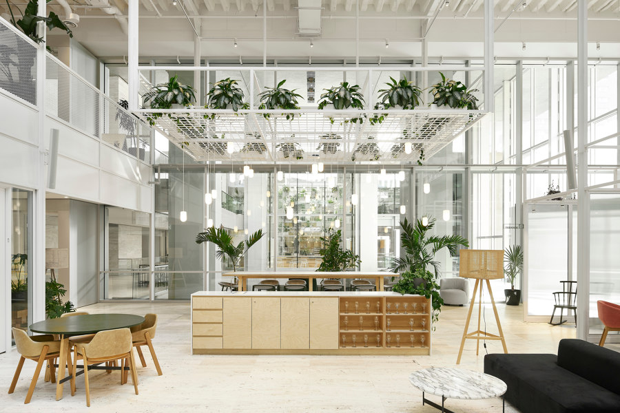
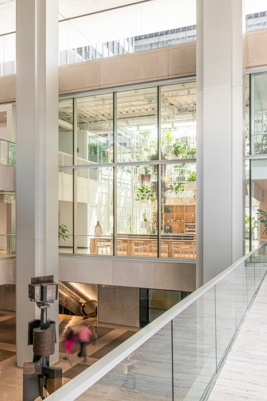
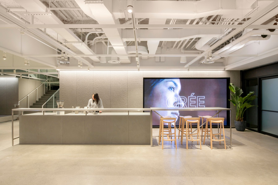
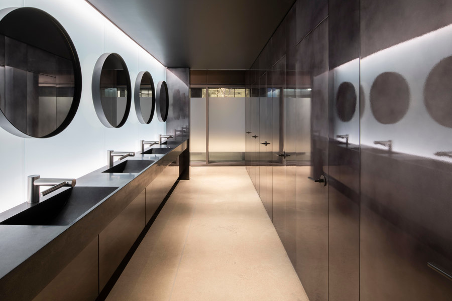
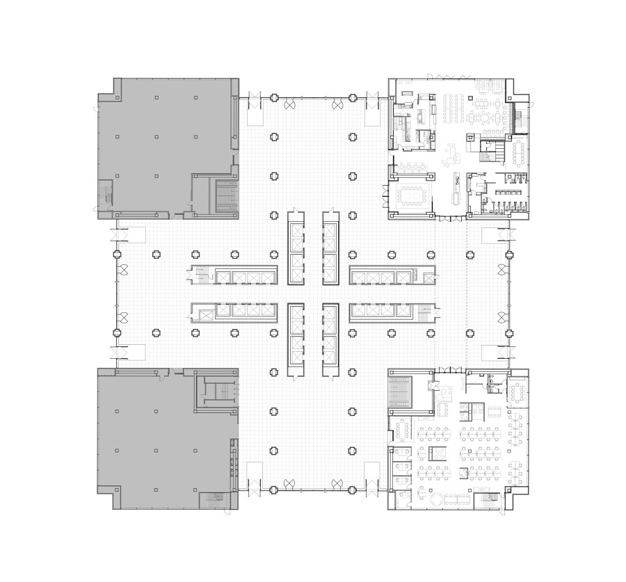
Mineral space. On the ground floor, the main entrance to the Sid Lee offices provides an uninterrupted view of the public plaza. The dominant material type on this floor is mineral, with monoliths made of bush-hammered stone rising to form the café, kitchen, and washroom spaces. This level’s different uses create the impression that each function is emerging from the ground independently. Here, we can infer a reference to the underground city, which provides a setting for the vitality of urban activity in nearby areas.
In the large clusters of stones, the delicate touch in the details preserves a sense of lightness. Shapes and materials brush against each other as if floating. Each element is freely added to the others, strengthening the impression of completeness and fluidity while letting nature make its own path.
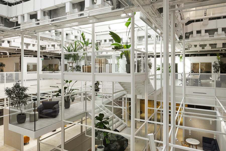
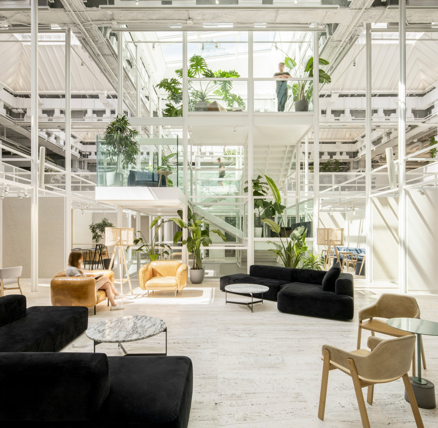
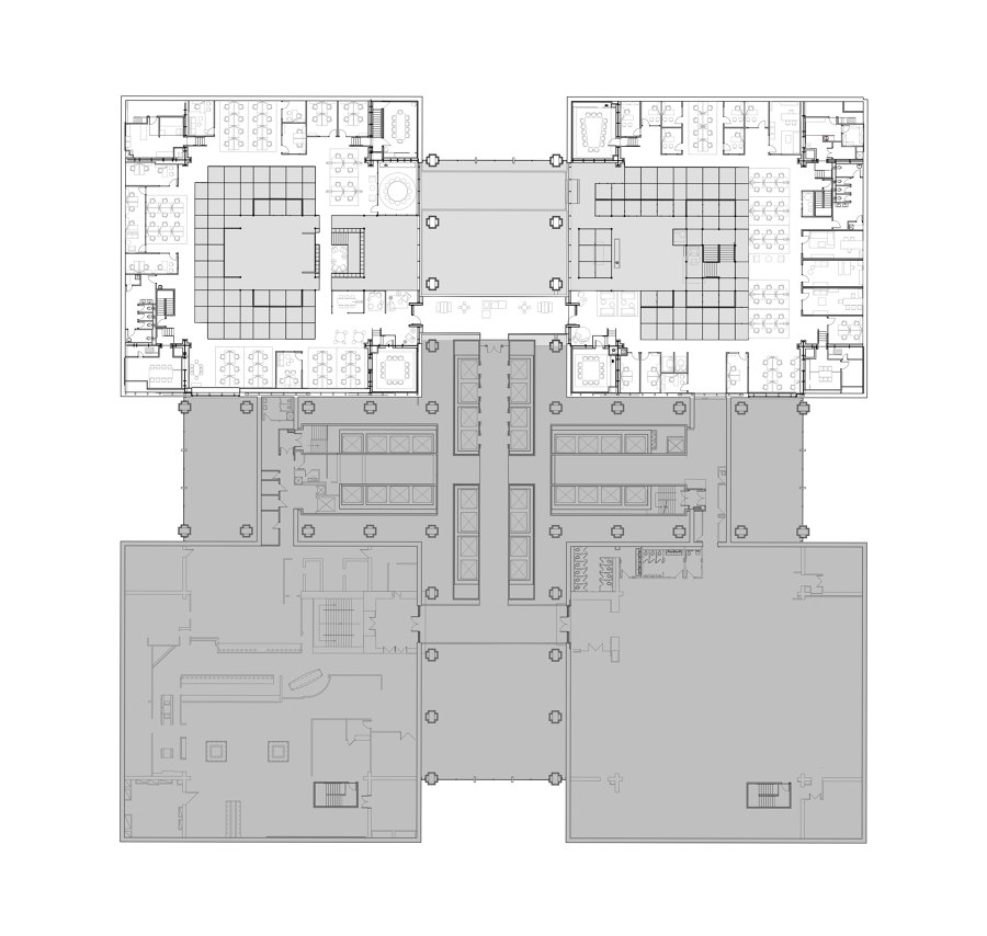
Biophilic environment. As we ascend to the first mezzanine and gain access to the two large stone quadrants where Sid Lee’s main creative and working spaces are located, the natural elements that were already starting to emerge from the ground now take center stage. We have arrived in a dynamic place where the magic happens. A third bridge has been added to the two existing ones to connect these two cubes in an agile and flowing manner.
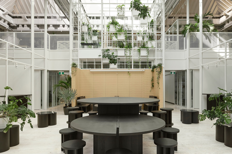
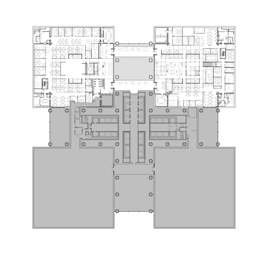
On this floor, the grid as an organizational concept is apparent in each element, whether architectural or aesthetic. The center of each quadrant serves as an agora, offering a more welcoming atmosphere that encourages people to gather. A balcony effect is created naturally when we turn our gaze upward and outward. Around the symbolic core of the common space, the rooms become smaller and more private.
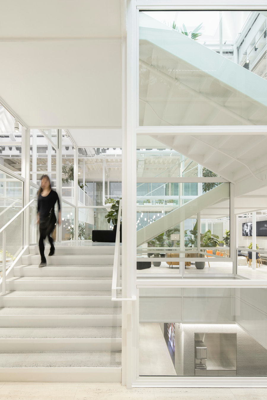
Here, the grid structure serves as a framework for bringing together different worlds in a single ecosystem. It is a large canvas that allows us to deploy creative territories and gives the visual impression that anything can be built, that we can integrate blocks, walls, new functions, and new ideas as they appear. This architectural metaphor also reminds us that everything is connected while free-floating in the air.
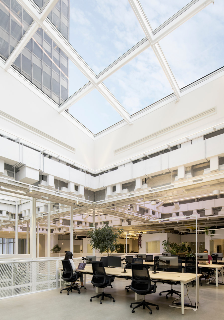
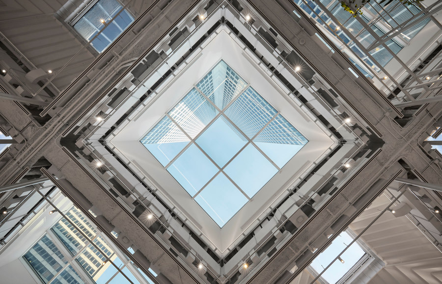
Inspiring creativity. The original travertine floors were uncovered and enhanced in the renovation process, and the skylights were stripped to reveal their structure, several of which were also strategically enlarged. Thanks to the linearity of the aerial grid, our gaze is led upward to the vast swaths of the sky that were deliberately highlighted and made visible from most workstations.
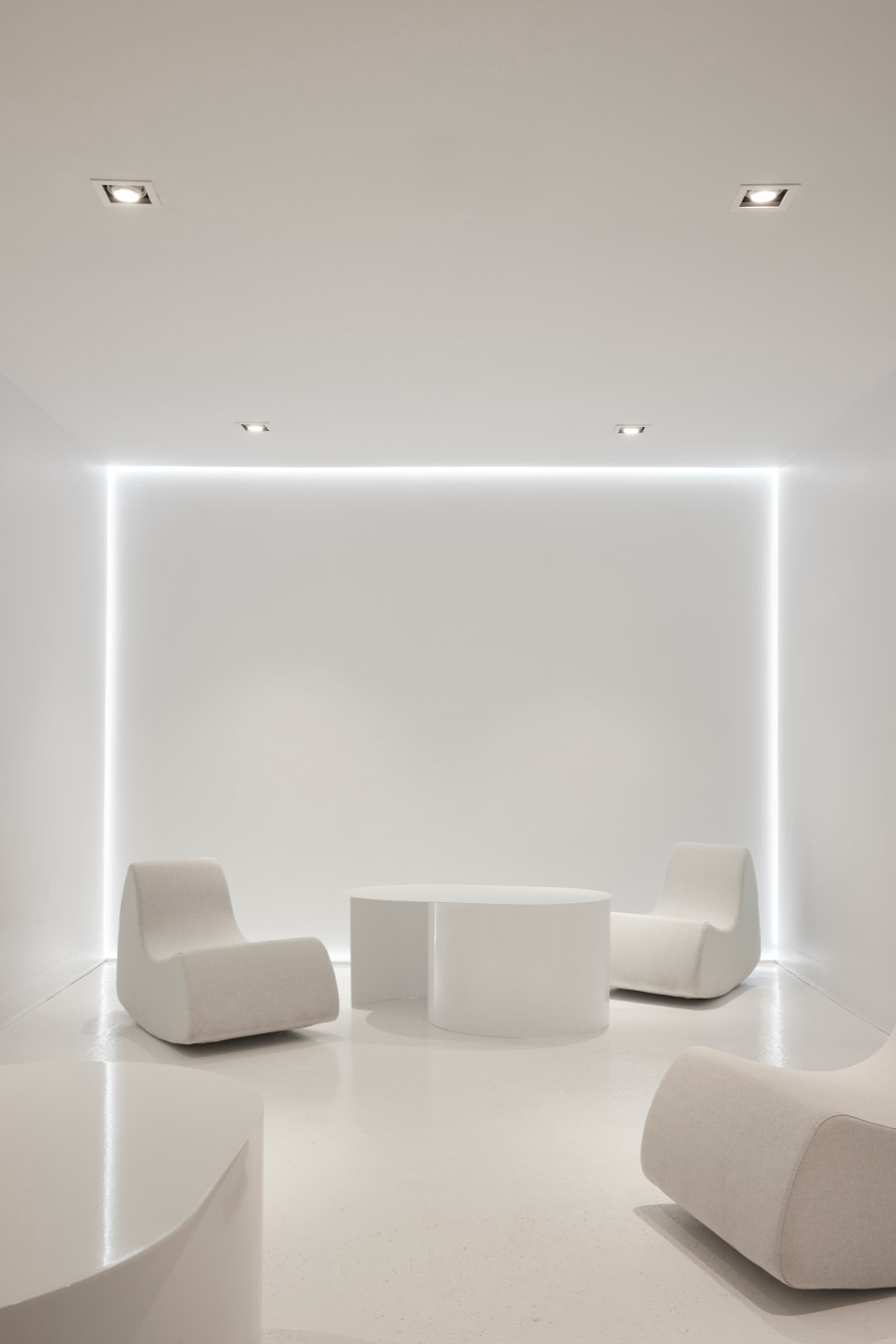
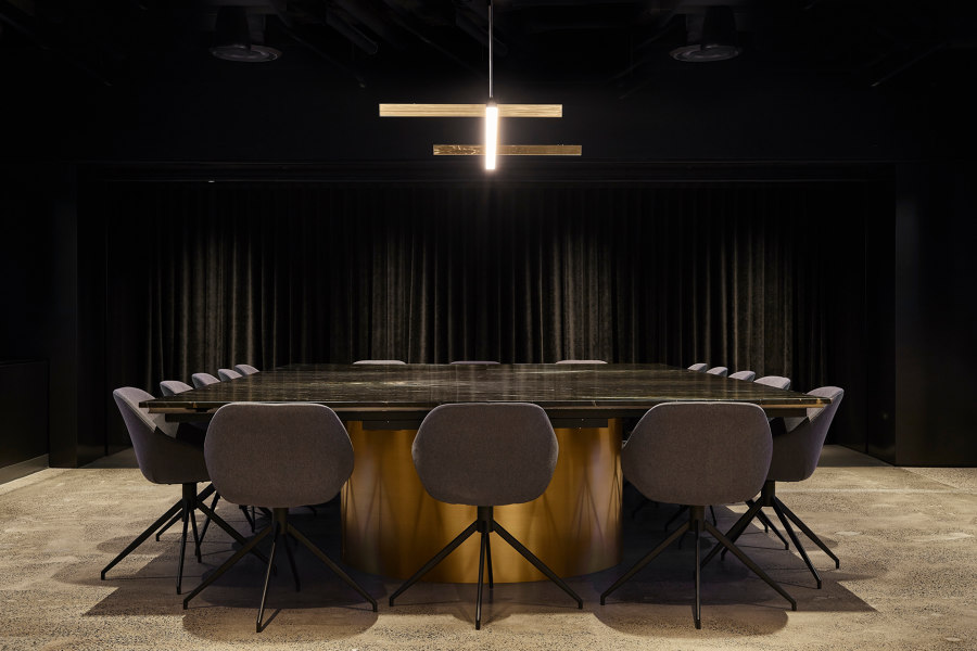
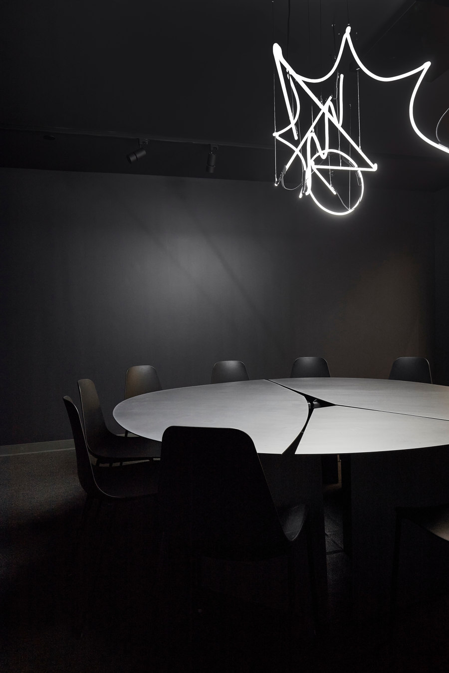
The space is punctuated with multiple light fixtures by local lighting and design studio Lambert & Fils while a series of rooms displaying strong and distinctive conceptual identities stand on the periphery of the main grid and agoras. Created with the intent of providing inspiring environments for the firm’s teams, these spaces are ultimately immersion rooms for imaginative work. Inspired by natural references and familiar textures, they embody, in a sense, the multiplicity of imaginations that come together at Sid Lee.
Design Team:
Sid Lee Architecture
