Nestled in the prestigious East Melbourne district, renowned for its historic charm and parks and gardens, this bespoke apartment is housed within the illustrious Tribeca building complex, once the Victoria Bitters Brewery. The Cellars and Middle Tower buildings were converted into apartments in the 1990’s while the Old Brew Tower, which still holds a significant amount of its brewing equipment, is now mixed use and a museum space. The apartment's interiors were originally designed by design icon Philippe Starck.
Nicole Rutherford of The Stylesmith transformed the 1990’s outdated apartment by blending contemporary materials and finishes with the building’s storied past. What was once a modest two-bedroom, one-bathroom residence has been reimagined into an expansive, luxurious one-bedroom sanctuary.
Originally designed for a couple as their Pied-à-terre, the Stylesmiths renovation introduces thoughtful enhancements such as generous and clever storage, a gourmet kitchen, and dedicated work-from-home areas, all enveloped in a sumptuous, hotel-inspired aesthetic that pays tribute to the building’s rich history. The couple were seeking a refined urban escape to complement their country home; this project effortlessly blends luxury with a sense of calm, reflecting both their love for quality and the property’s unique character.
The design philosophy focuses on textural finishes and minimalist luxury, creating a space that balances comfort with sophistication. Carefully chosen materials and colours maximise light and space, crafting an inviting living environment. The furniture scale was thoughtfully considered to achieve harmony within the open-plan layout, seamlessly integrating the kitchen, living and dining nook.
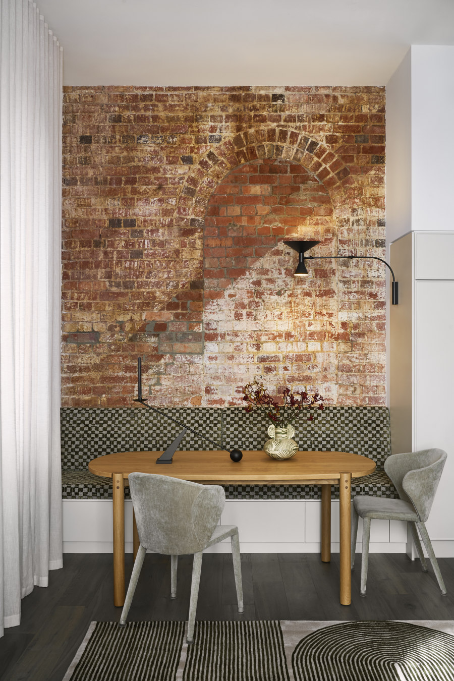
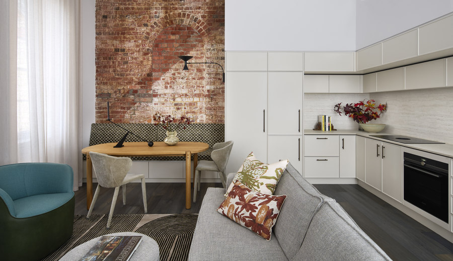
At the heart of this urban haven lies an open-plan living area that merges contemporary design with a dash of rustic charm. A key feature is the exposed brick wall, which pays homage to the building’s industrial roots. Its rich reds and browns infuse warmth and history into the space, contrasting beautifully with the sleek, modern finishes surrounding it. The brick’s rugged texture is complemented by the smooth, polished surfaces of the kitchen cabinetry and countertops, finished in a muted cream hue. This choice not only enhances natural light but also serves as a neutral backdrop for other design elements.
Adjacent to the exposed brick is a sophisticated dining nook, where a wooden table with a natural grain finish takes centre stage. The table's organic warmth is echoed in the soft, upholstered chairs covered in luxurious woven velvet. A patterned custom banquette in shades of grey and green adds visual interest, tying together the earthy tones of the brick and wood. Subtle lighting defines the ambiance, with a sleek black wall-mounted lamp casting a gentle glow on the brick wall, highlighting texture and colour.
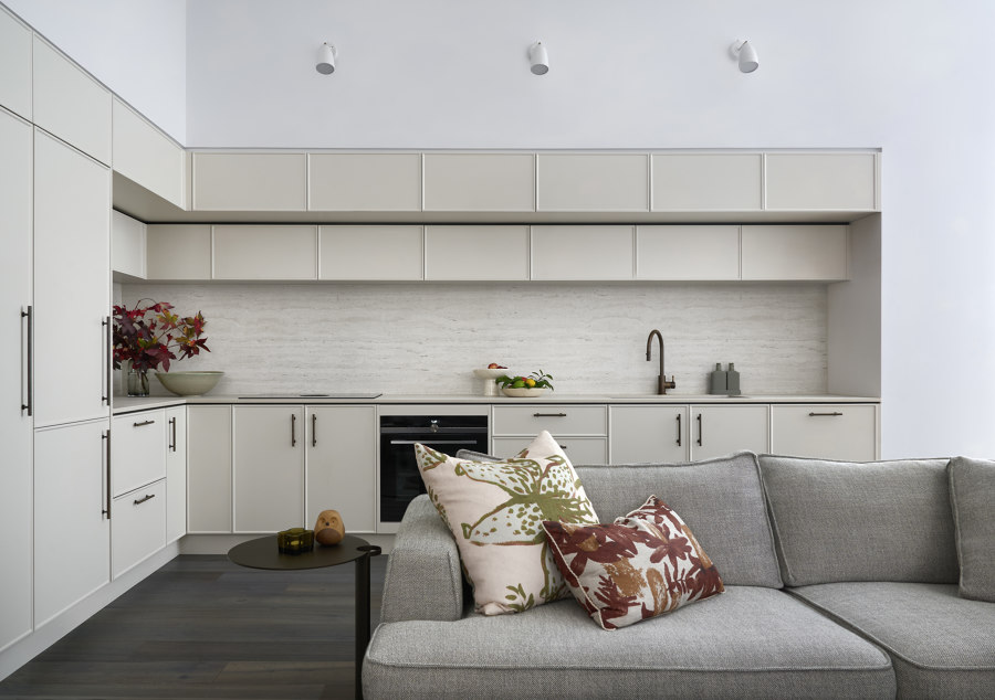
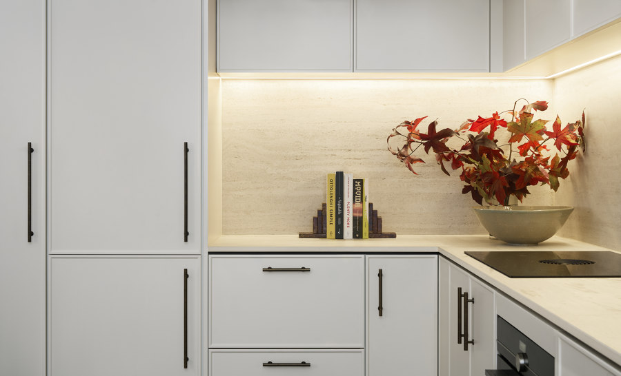
The kitchen, seamlessly integrated into the open-plan space, serves both functionality and quiet elegance. Embodied by soft, muted tones, the cabinetry sits beautifully within the space offering a timeless appeal but also enhancing the room’s spaciousness, reflecting light and creating an open feel. A highlight of the kitchen is the engineered travertine backsplash and countertop, which add a touch of opulence with their delicate veining and luxurious texture. The design prioritises both form and function, with ample storage provided by floor-to-ceiling cabinets. Clean lines and minimalistic handles contribute to the sleek, modern aesthetic, while integrated appliances maintain a clutter-free environment. Under-cabinet lighting casts a warm glow across the marble surfaces, highlighting their natural beauty and adding to the space’s sophisticated, cosy atmosphere.
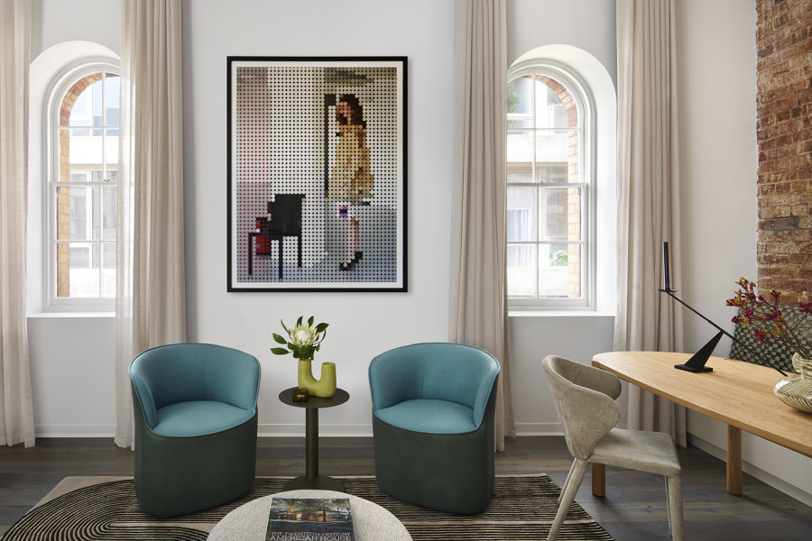
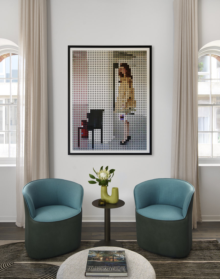
The adjacent living area is a haven of relaxation, featuring a plush, light grey sofa adorned with botanical print cushions in autumnal hues of burnt orange and olive green. Curved swivel occasional chairs in vibrant teal work in unison with artwork by Elizabeth Shaw offering a bold contrast, adding a pop of colour without overwhelming the cohesive palette. Dark, wide-plank oak flooring grounds the space, providing a sophisticated foundation that contrasts with the lighter tones of the walls and furniture, adding depth and a touch of drama.
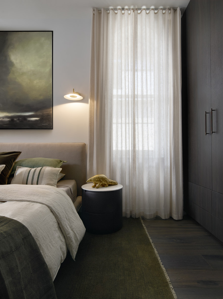
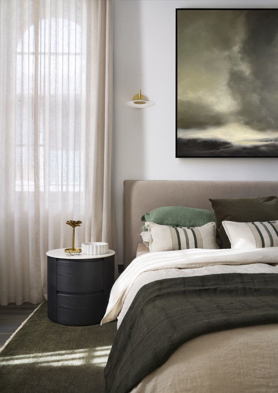
The serene bedroom is underpinned by earthy tones creating an urban oasis retreat. The room features a restrained colour palette of soothing neutrals, dark timber and green tones which are evident in the landscape artwork by Peter Watts. Soft, muted grey walls provide a calming backdrop, enlivened by rich textures and complementary hues. The bed, dressed in sumptuous linens, serves as the room’s focal point. A plush linen beige headboard adds comfort and complements the sleek dark elements of the room. Beside the bed, a round dark timber and marble nightstand offers a striking contrast to the room’s light and airy elements.
Natural light filters through sheer, floor-to-ceiling curtains in a delicate creamy hue, casting a gentle glow and maintaining privacy while keeping the room bright and airy. A chic, modern wall sconce with a golden finish mirrors the nightstand’s design, casting a soft, inviting light that enhances the room’s tranquil atmosphere.
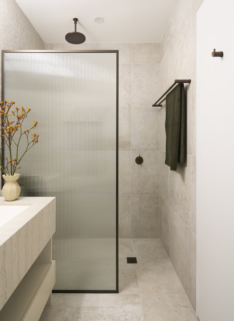
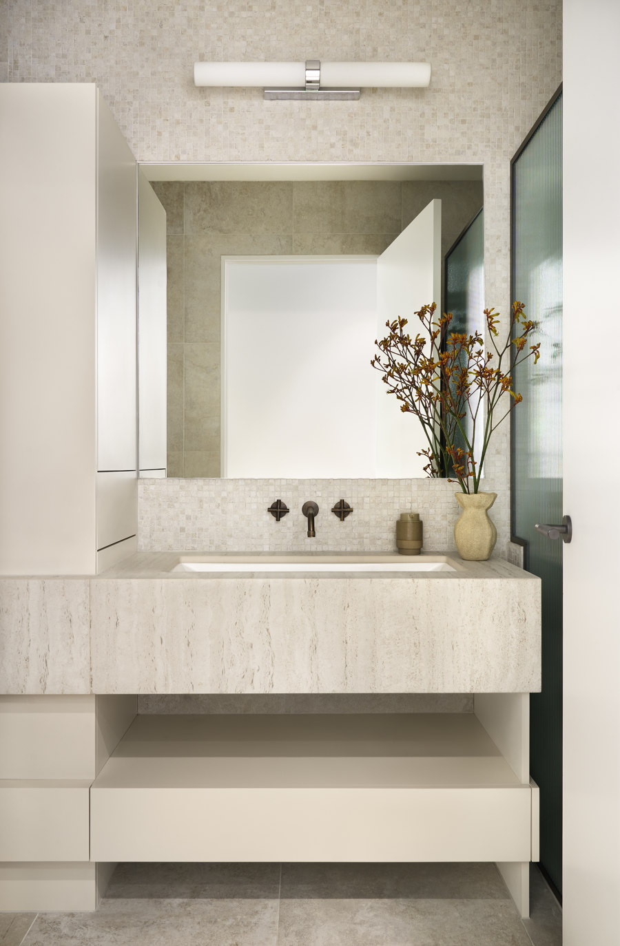
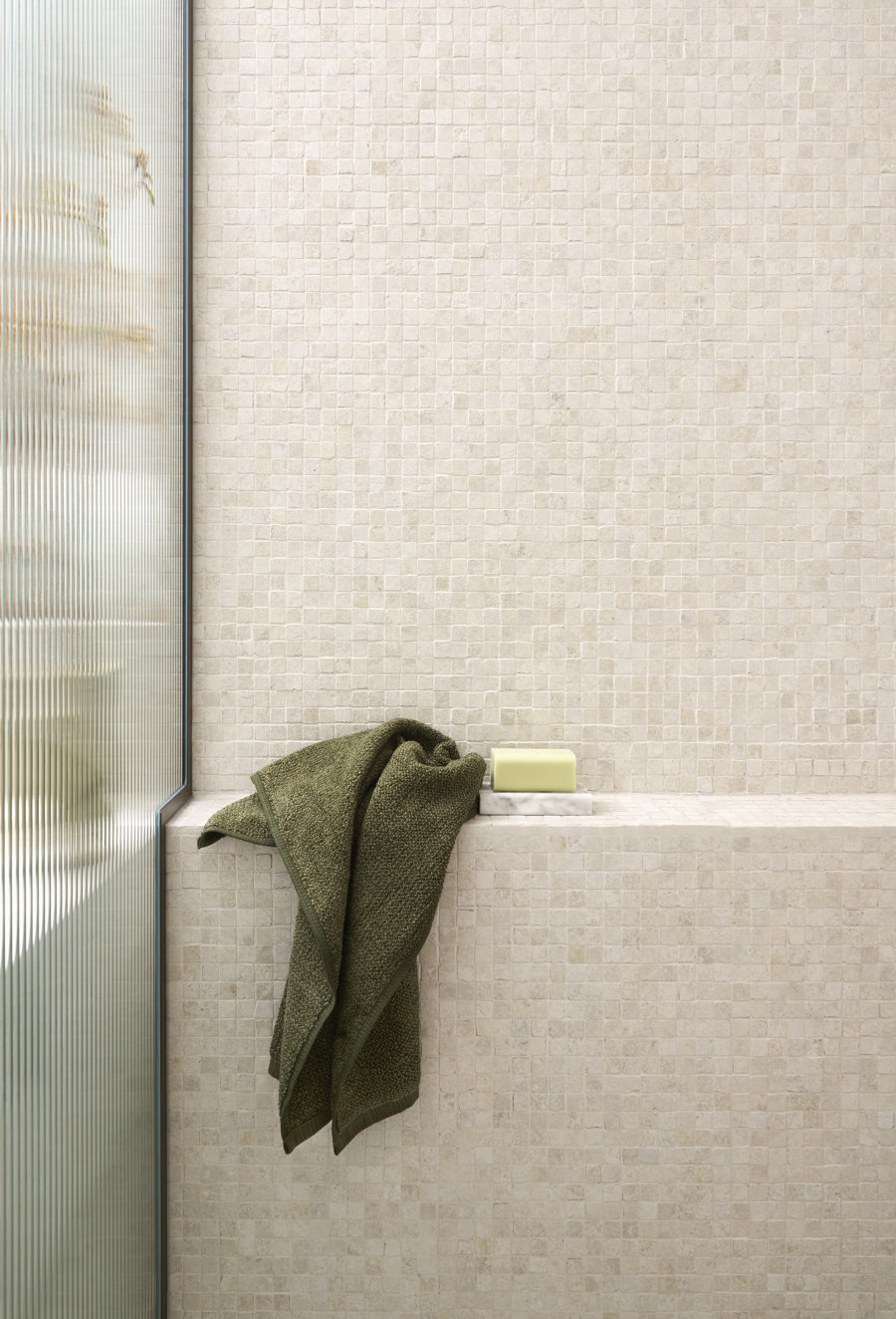
The bathroom showcases meticulous design, with every detail curated for functionality and style within a petite footprint. The neutral palette of beige and cream is highlighted by engineered travertine stone on the walls and floors, adding depth and texture. The generously sized walk-in shower features a reed glass partition, providing privacy while allowing light to filter through, creating an ethereal glow. The black metal frame of the shower partition adds a modern edge, complemented by burnished brass fixtures throughout the bathroom for a cohesive, contemporary look. The vanity unit, crafted from engineered travertine, features a minimalist floating design that enhances the sense of space. Discreet, modern lighting frames the mirror, providing ample illumination without detracting from the minimalist aesthetic. This soft glow enhances the travertine’s natural tones, creating a warm and inviting atmosphere.
Design Team:
Lead Designer: Nicole Rutherford
