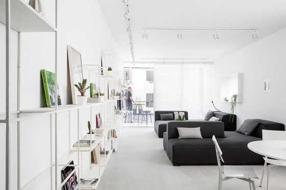
The 80 sqm long strip apartment, located in central of Tel Aviv, intended for a holiday home town for a family who likes to entertain has transformed by Interior designers Yael Perry, Dafna Gravinsky and architect Amir Navon into a minimalist airy space punctuated by delicate black & white grid and furnishings.
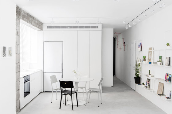
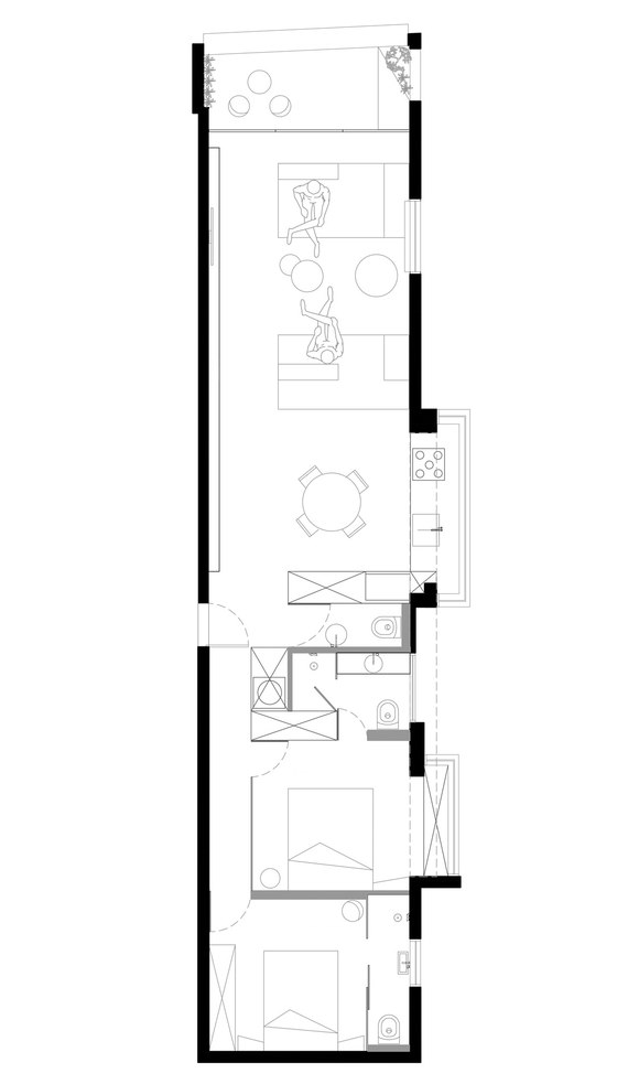
The apartment was re-divided as a grid structure which maximized the apartment potential & includes a bright living space, kitchen & two spacious master bedrooms. The grid became the conceptual design of the project and is evident in the design spaces of the apartment, furniture, lighting and styling. All furniture and lighting were custom made by us.
The renovation took about seven months planning and execution. Air conditioning units were placed & hidden in the bedrooms and bathrooms ceiling, in order to keep the ceiling of the public area in its original height, in order to provide a sense of continuity, wide and brighter space, the space was designed in monochromatic shades.
The entire floor of the apartment was covered by a concrete micro-toping layer. The apartment entrance cross the apartment to two. public space on the left and private spaces to the right.
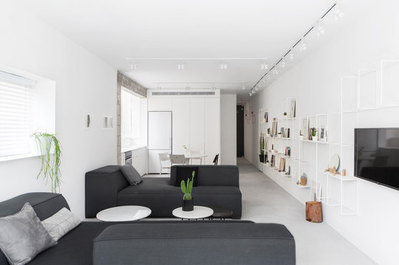
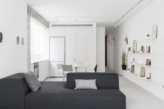
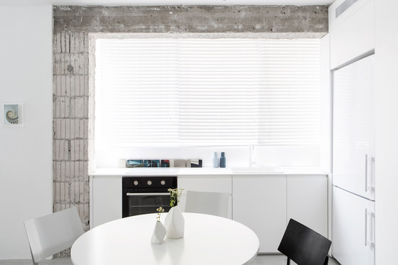
The kitchen worktop was placed in a niche under exposed concrete beam. Kitchen appliances were hidden in high white cabinets. Round dining table was chosen for the kitchen area in order to create a pleasant interactions between the surrounding.
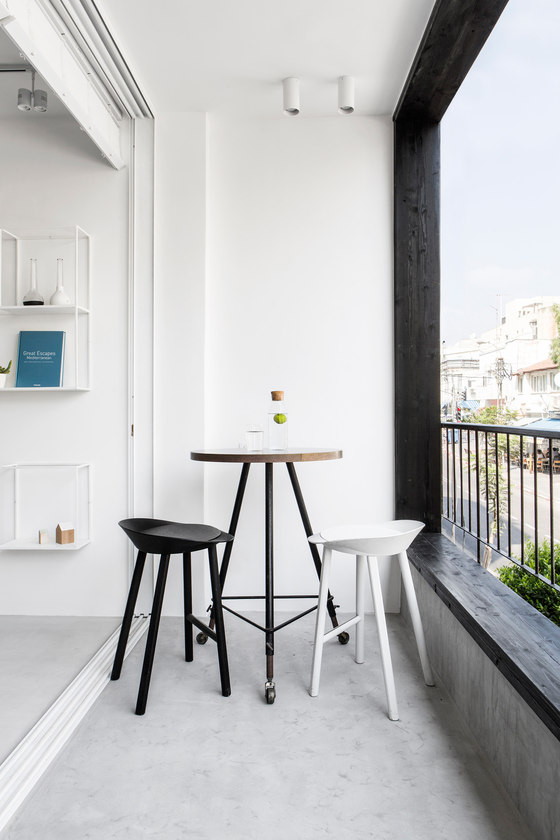
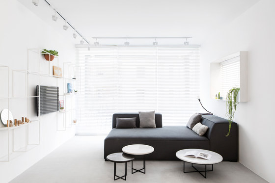
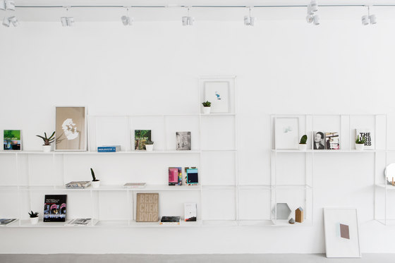
The public space includes the kitchen, living room and sun terrace. The public space is mostly monochromatic and so we have designed 3D elements which provide an extra dimension to the space. Along the living room kitchen wall, we designed an 8 m minimalist white iron library its depth is 20 cm only and display design books, magazines and artwork as displayed in galleries.We framed the living room window using a white thin iron frame and decorated it with plants & accessories.
We custom made modular sofas for the living room which provides endless seating variations and it can also become one luxurious lair couch. the modular sofas allows many interactions between people in the living room and the kitchen. Between the couches we placed three round marble tables. Those tables are modular as well and can be placed according to the sofas location in the space. The sun Balcony was framed in black wood as part of the geometric concept.
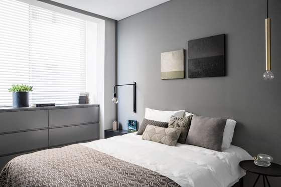
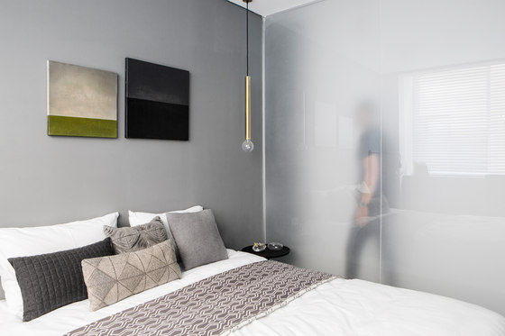
The master bedroom was painted in several shades of grey. Light grey glass wall separates between the bedroom and the corridor. Two different geometric side dressers were custom made for this room. Grey Wardrobe separates between the sleeping area and the bathroom.
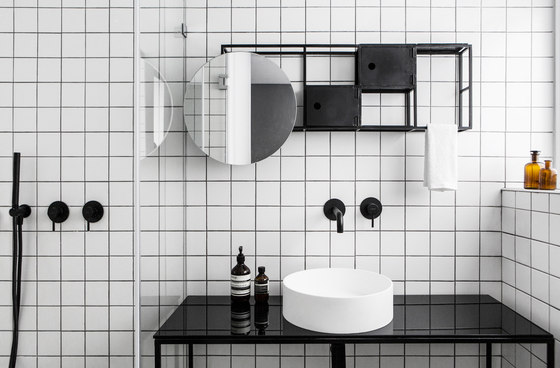
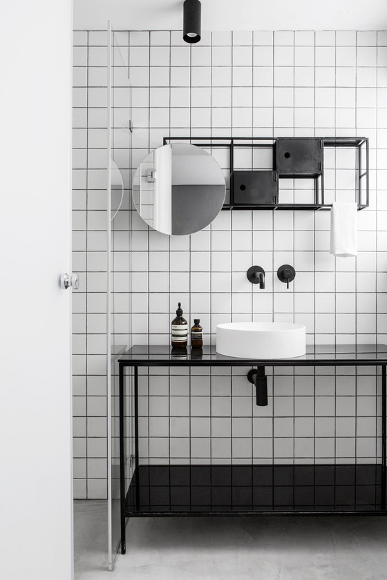
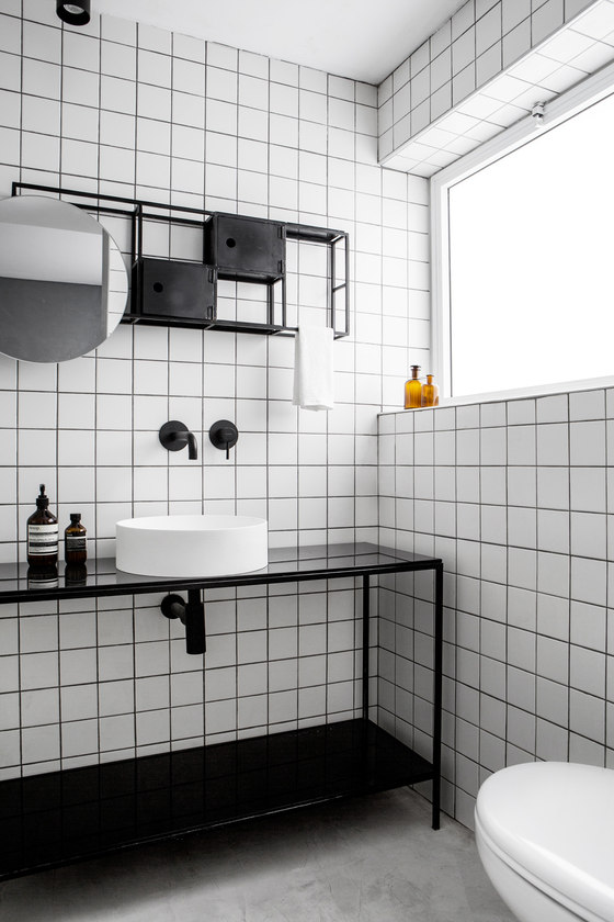
The bathroom was covered with black and white grid tiles. luxurious shower & round white corian sink was placed on top of black glass & perfectly integrated with the minimalist black and white grid. A black iron facilities storage for daily care products and a round mirror were hung over the sink.
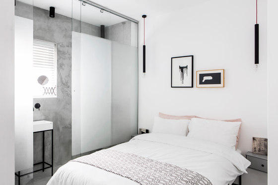
The entrance to the master guest suite is through a high matte black glass door. In contrast to the master bedroom, this bedroom is bright & painted in white. On both sides of the iron bed, were hung two grey geometric dressers & above them, two long black lighting fixtures hung by a red cable.
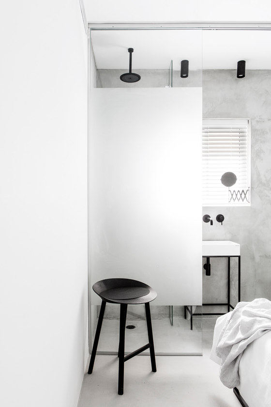
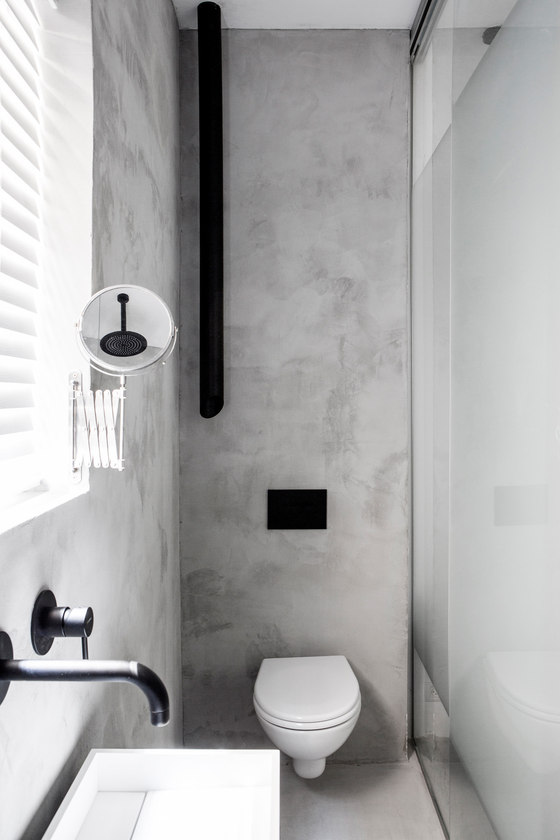
The bathroom walls were covered in concrete layer that suitable to showers area & combined with black rain shower, luxurious taps & a rectangular corian sink was placed on a black iron base. White glass separates between the sleeping area & the shower. 30% of the glass remained transparent in order to let the light enter to the sleeping area.
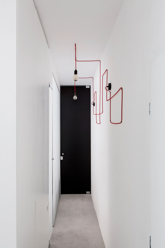
Bright corridor leads to the two master bedrooms. The corridor walls were painted white, light grey glass wall separates between the corridor & the master bedroom. The bright glass let the light enter the corridor & makes it more airy & brighter. Down the hall, high matte black glass door which lead to the master guest suite. Custom made light fixtures was hung by the designers using a red power cable in a geometric structure on the corridor wall and ceiling.
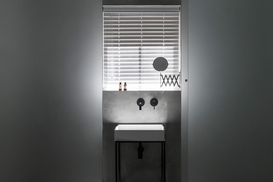
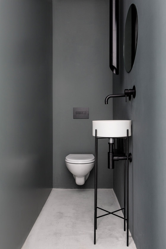
Minimalist dark & dramatic guest bathroom walls painted in grey/olive green color. Round corian sink was placed on a custom made minimalist thin metal base. Long light cylinder hung from the ceiling and a circular light beam illuminates the sink.
On the first meeting with the customers we realized that the long strip apartment structure is challenging. Throughout the project we sticked to the design concept and due to the challenging structure, the apartment spaces were designed tightly and accurate to the last millimetre.
All furniture & lighting were custom made by us & filled us with great satisfaction.
Yael Perry
Dafna Gravinsky
Amir Navon
