Bowled over: Alape
Brand story by Katharina Sommer
Goslar, Germany
07.11.17
20 years ago Gerhard Busalt designed the first dish basin for ALAPE. A clean shape for clean hands. Here's how it all began.
Industrial designer Gerhard Busalt developed the archetype of the dish basin 20 years ago, deriving its shape from the bottom third of a sphere

Industrial designer Gerhard Busalt developed the archetype of the dish basin 20 years ago, deriving its shape from the bottom third of a sphere
×Twenty years ago, Alape introduced onto the market the first dish basin made of 3mm glazed steel. It was an artistic reinterpretation of the classic washbowl. This development involved testing and perfecting the form and resilience of the steel over a considerable period of time. The result was an enamelled steel basin with a material thickness of just 3mm – a design of almost delicate elegance, distinctive for both its minimalist form language and high functionality. Over the years, many further designs have been created on the basis of this original. We are taking this anniversary as an occasion to look back at the history of the dish basin and introduce our current products.
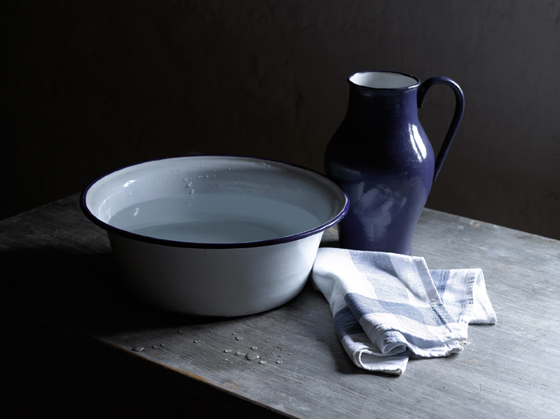
Top: An enamel wash bowl inspired the design of the first dish basin. Today, there are many new interpretations on the classic. Above: Industrial designer Gerhard Busalt

Top: An enamel wash bowl inspired the design of the first dish basin. Today, there are many new interpretations on the classic. Above: Industrial designer Gerhard Busalt
×The starting point for the conception of the dish basin was a study by the industrial designer Gerhard Busalt, who has collaborated with Alape since the early 1990s and now heads the renowned office busalt design. In his investigation, Busalt dealt intensively with the enamel bowls and pitchers that were used for washing in the Biedermeier period. Their “rigorous form”, which was “condensed to the essential”, especially fascinated him.
Busalt ultimately settled on the form of a spherical section. It expresses the rigor he sought, and at the same time is oriented to the “spherical movement” we make when washing our hands. To avoid the impression of the basin tapering back inwards at its top edge, Busalt chose not a hemisphere, but rather a one-third sphere, which visually expands towards its perimeter.
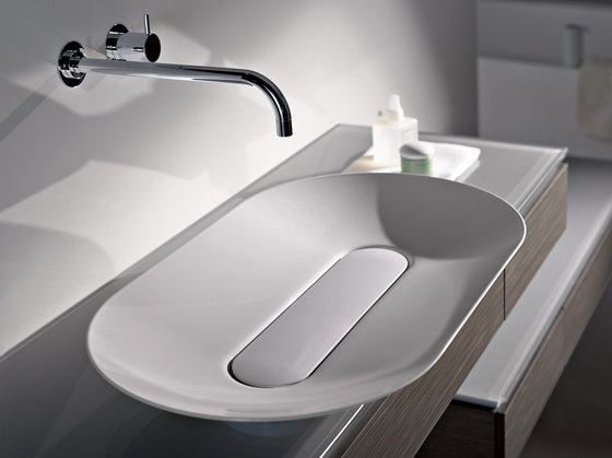
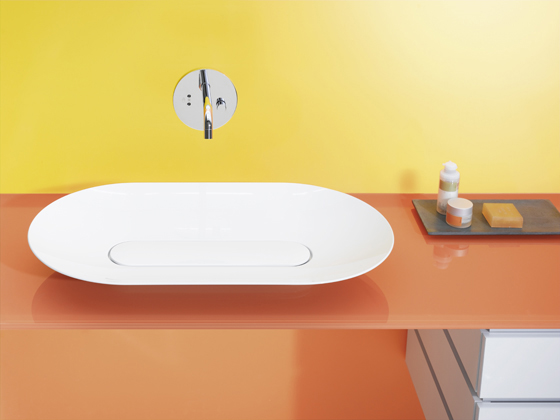
For the “Insert” model (top), the dish basin is situated asymmetrically into a hollow form. The oval variant of the dish basin (above)

For the “Insert” model (top), the dish basin is situated asymmetrically into a hollow form. The oval variant of the dish basin (above)
×The production of the dish basin posed two challenges. Firstly, a special technique had to be developed to shape the 3mm steel. This required a hydraulic press of a type that didn’t yet exist, and so had to be specially developed. Secondly, instead of being chamfered, as was customary up to that point, the basin was to be given a freestanding, enamelled edge. The solution was a C-shaped grind that enlarged the surface and afforded the enamel powder better adherence.
The first dish basin underwent two years of development before it was launched in 1997, giving bathrooms a new look. “The market was dominated by undermount and built-in basins, so there was an emphasis on the bearing surface and the overall impression,” explains Jürgen Kloss, head of design and product management at Alape. “A dish basin of this kind is like finding a little Madonna sitting on an exalted throne atop the washstand. (…) It was an entirely new appearance – and one that we could now say is a classic.”
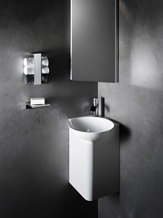
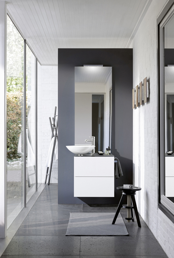
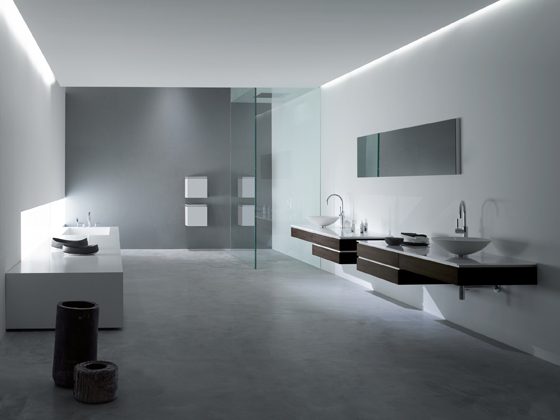
The dish basin is as attractive in spacious bathrooms as it is suitable for small washing areas
The new basin form quickly achieved great popularity and paved the way for many additional 3mm products and reinterpretations. Especially where space is limited, the minimalistic, clear design vocabulary and refined elegance of the enamelled steel offers a functional as well as aesthetic solution. Therefore, along with different forms and versions, Alape’s portfolio includes various washplaces for extremely small spaces – solutions that represent further developments of the archetypes designed by Busalt.
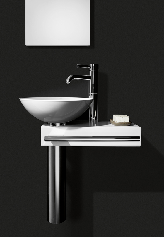
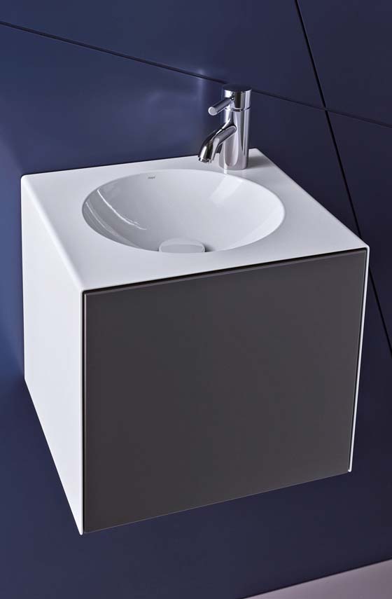
“Piccolo”, for example, integrates a basin, towel rail and shelf surface in a minimum of space. In the “Insert” model, the dish basin is set asymmetrically in a rectangular glazed steel cabinet that offers additional storage space. The washplaces in the new rectangular series “Folio Guest Bath” also include ample storage space. Here, the centrally placed basin is recessed into, and set flush with, a circumferential washstand cover that rests on a handle-less, push-to-open base cabinet.
Top: The new wash series “Folio Guest Bathroom” offers a range of possibilities for small spaces, including a flush mount basin and a small, rectangular under sink cabinet. Above: The elliptic dish basin takes up slightly more space

Top: The new wash series “Folio Guest Bathroom” offers a range of possibilities for small spaces, including a flush mount basin and a small, rectangular under sink cabinet. Above: The elliptic dish basin takes up slightly more space
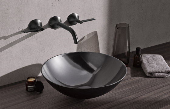
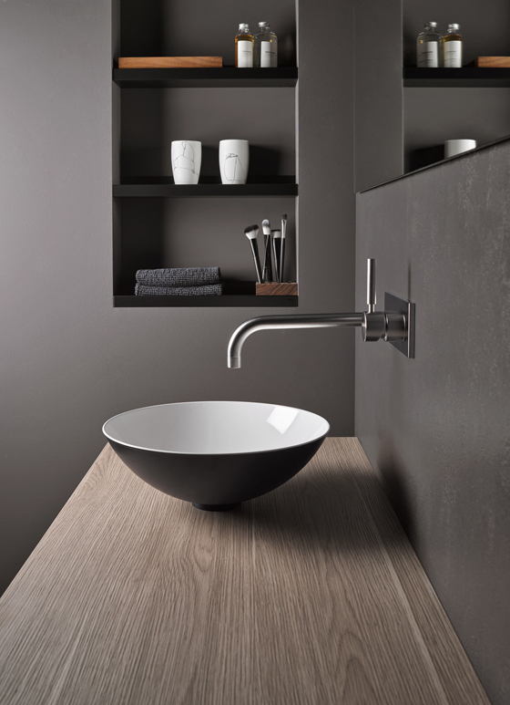
×For the twenty-year anniversary, the classic dish basin by Busalt with two new surface designs was given a completely new appearance. Whereas “Metallic Dark Iron” presents a dark, reflective metallic surface that showcases the form and geometry of the basin, “Bicolor” plays with the black/white and matt/shiny contrasts, highlighting the elegant refinement of the 3mm-steel basin.
The dish basin began as a revolutionary product that had a decisive influence on the market. The interpretations and further developments that have arisen from it continue to demonstrate, even twenty years later, the striking quality of its pure language of form combined with its timeless, functional design.
Two new surface colourways “Metallic Dark Iron” and “Bicolour” refresh the classic’s look in honour of its anniversary

Two new surface colourways “Metallic Dark Iron” and “Bicolour” refresh the classic’s look in honour of its anniversary
ש Architonic

