Skin deep: new beauty-brand interiors
Text by Alun Lennon
02.12.20
For beauty and cosmetics brands, the experience for consumers in-store is delivered as much by the project as it is by the products and service. And there’s nothing superficial about it.
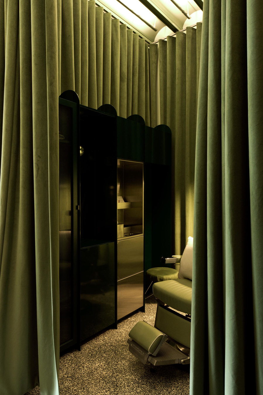
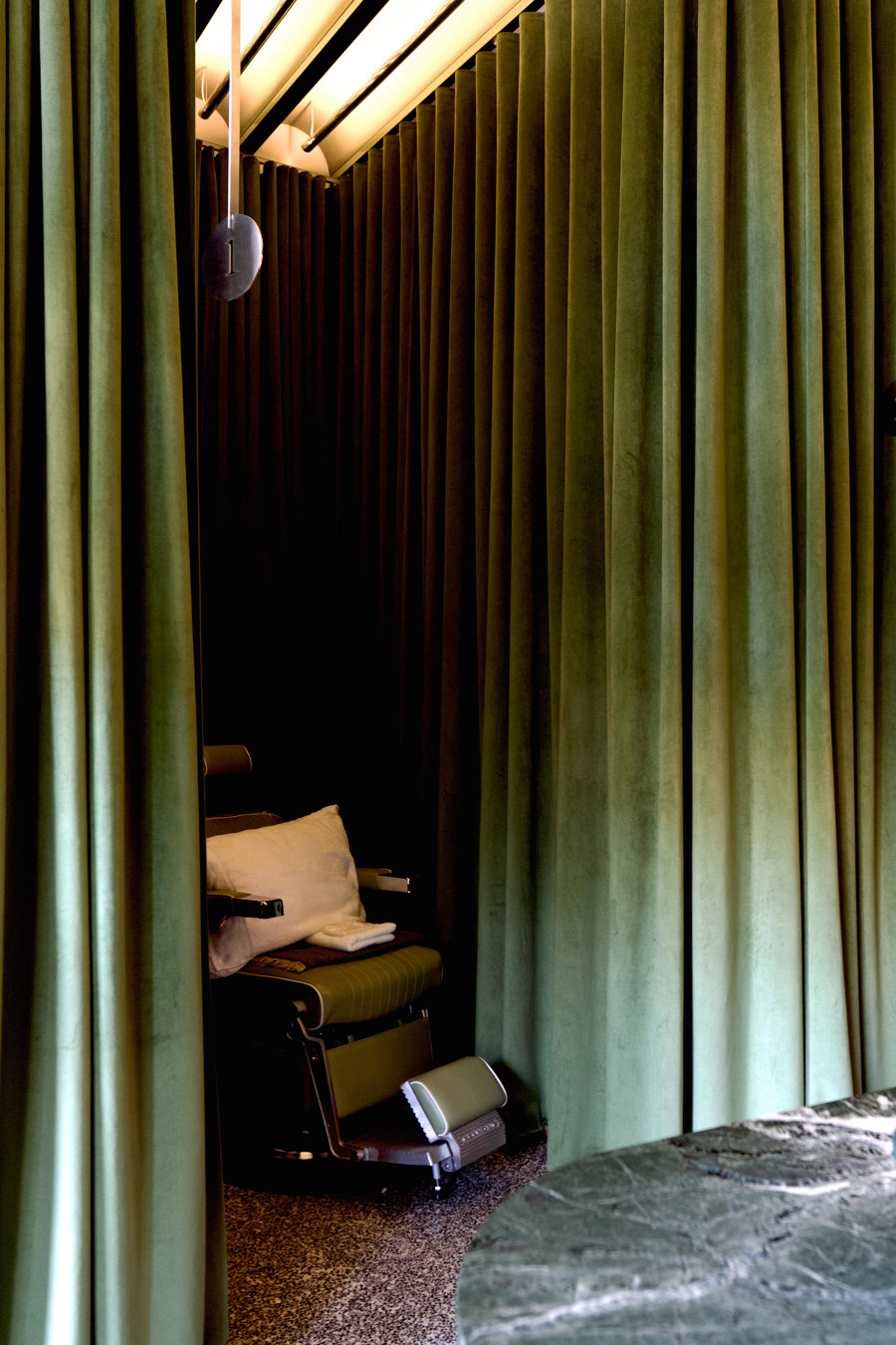
A treatment space in Fig beauty treatment store in Vancouver, designed by Scott & Scott Architects. Photo: Olivia Bull. Courtesy of Scott & Scott Architects

A treatment space in Fig beauty treatment store in Vancouver, designed by Scott & Scott Architects. Photo: Olivia Bull. Courtesy of Scott & Scott Architects
×Most brands have long understood the power of shaping space, when it comes to their bricks-and-mortar stores. More than a means of creating atmosphere, the aim is to form a lasting relationship with the visitor via a unique, and often sensory, experience. And if the shop can also function as a means of brand expression, even better. Best practice for this can often be found in the beauty segment, where – as can be seen from our survey of projects below – brand values, product presentation, and concept-driven interior design are closely intertwined.
01
Aesop Shinjuku
Tokyo, Japan
2020
Project by Case Real
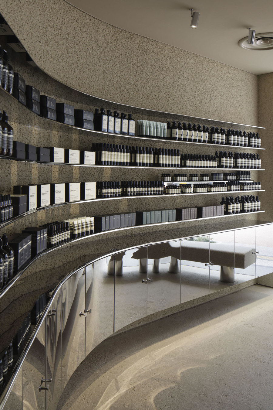
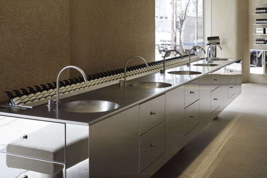
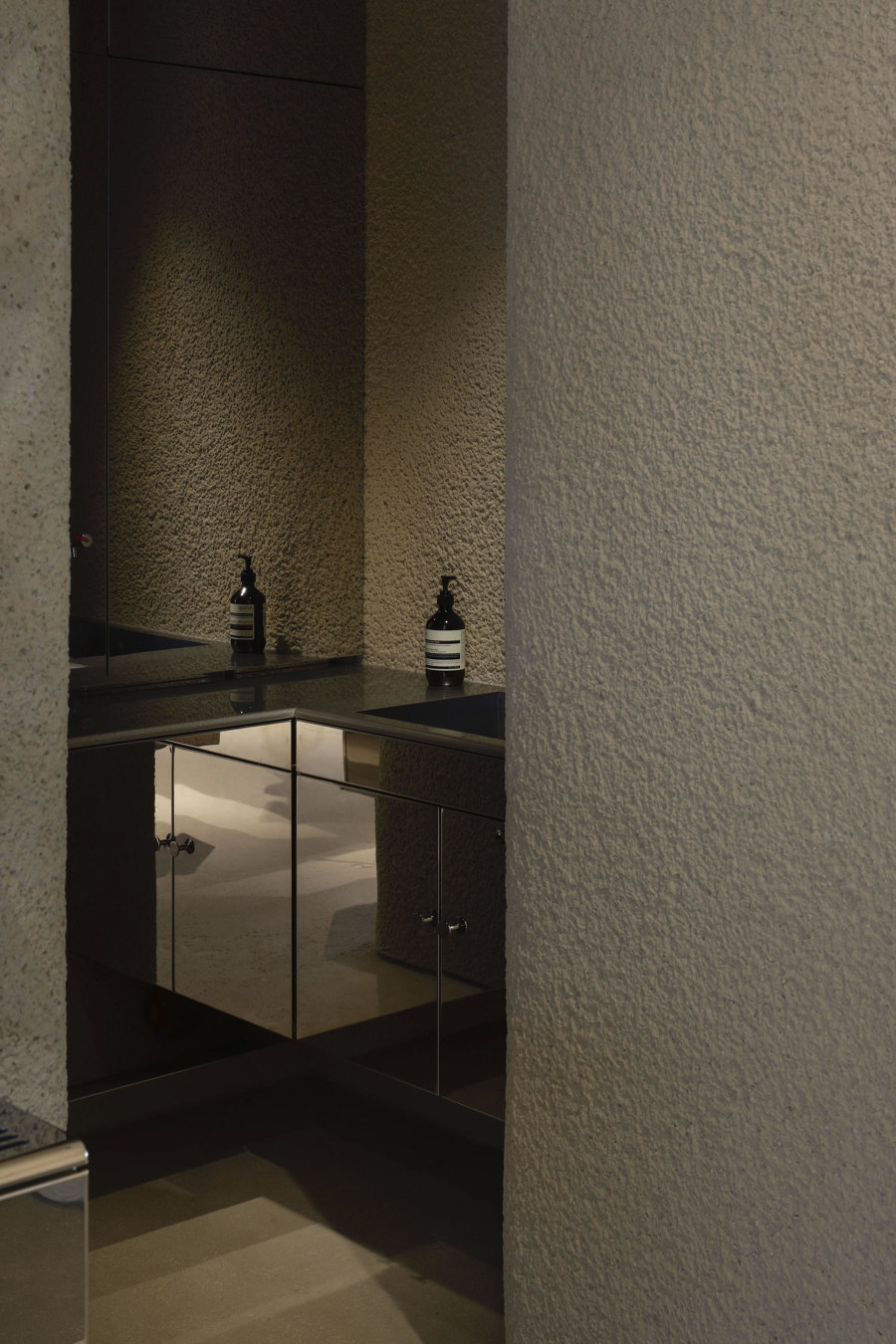
For their Aesop store design in the neon city of Shinjuku, Case Real chose stainless steel with a mirror finish for the main material. Chipped plaster walls finished with a rough expression, combined with a glorious artificial volume of stainless steel are applied to create a shop space that is distinct to Shinjuku but also reflects the Aesop brand through its design.
Photos: Daisuke Shima
...
02
Shen
Brooklyn, New York, United States
2020
Project by Mythology
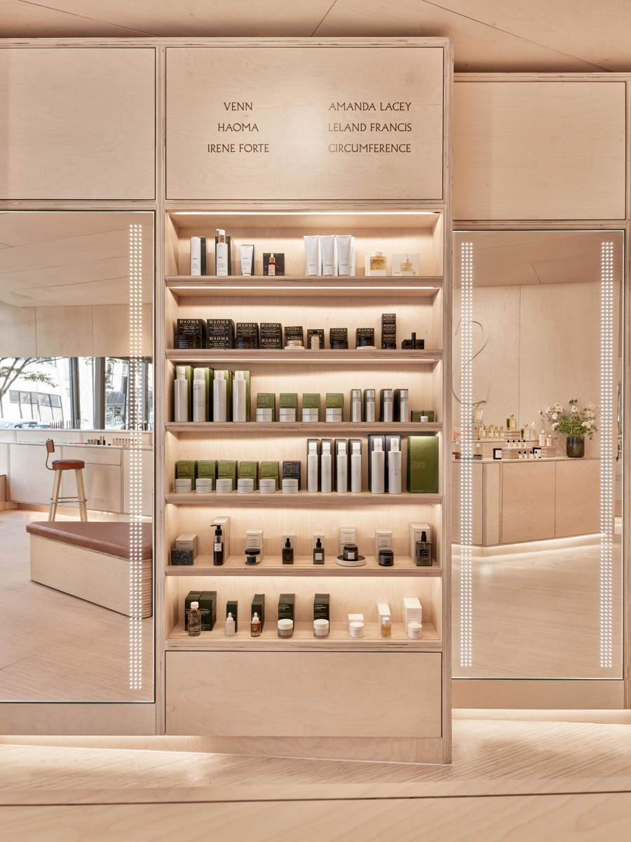
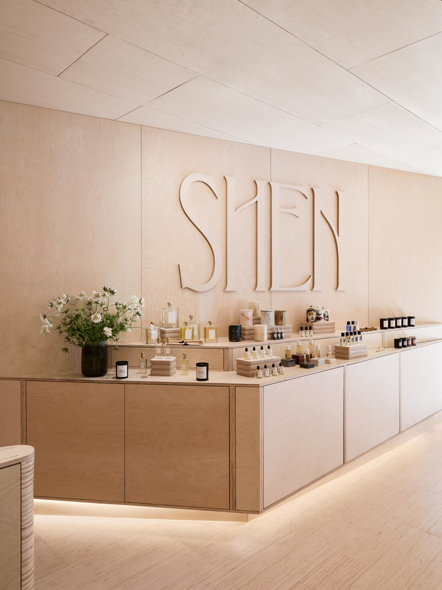
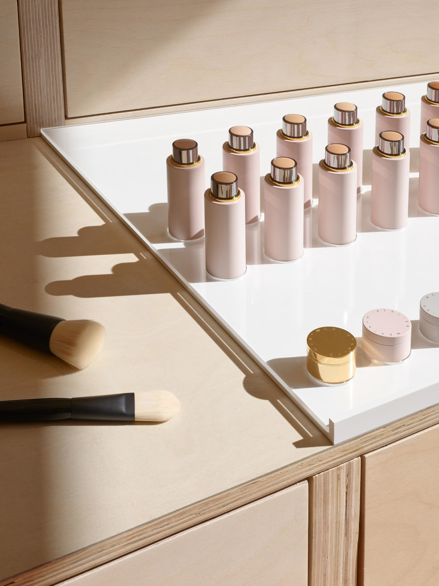
The new SHEN Beauty store in Brooklyn was designed by design collective Mythology. They imagined a retail experience divided into thirds: the left wall offers a self-guided search, the right wall is reserved for services, and the middle space showcases islands designed for exploration and discovery. The unexpected use of sustainable plywood, which wraps the entirety of the space, plays into the unpretentious nature of SHEN founder Jessica Richards low-key ‘in-the-know’ approach.
Photos: Brooke Holm
...
03
SOFI Natural Cosmetics Shop
Belgrade, Serbia
2020
Project by Studio AUTORI
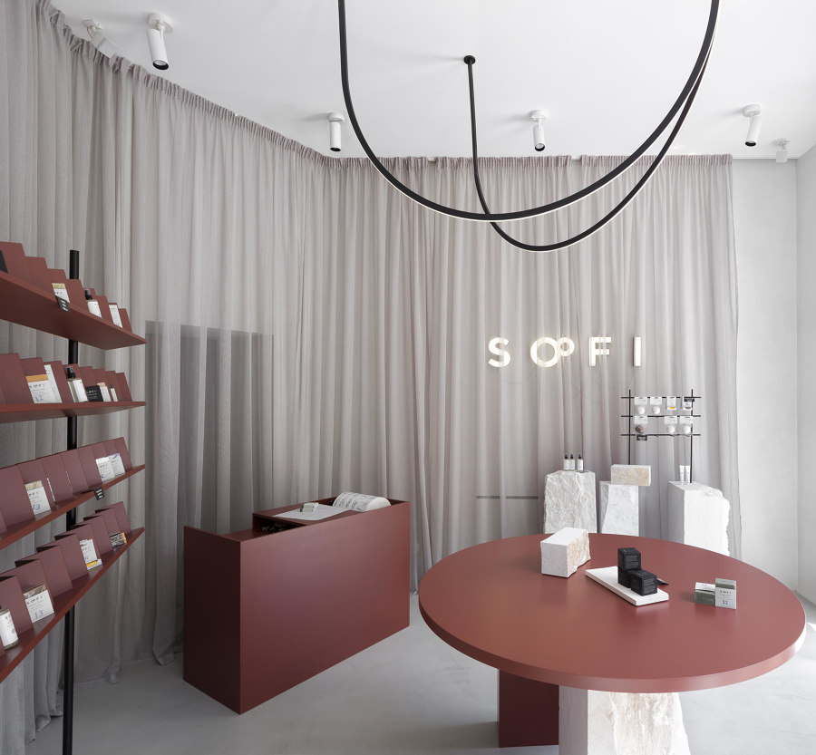
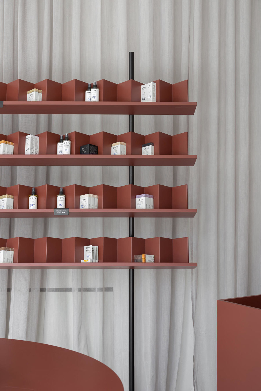
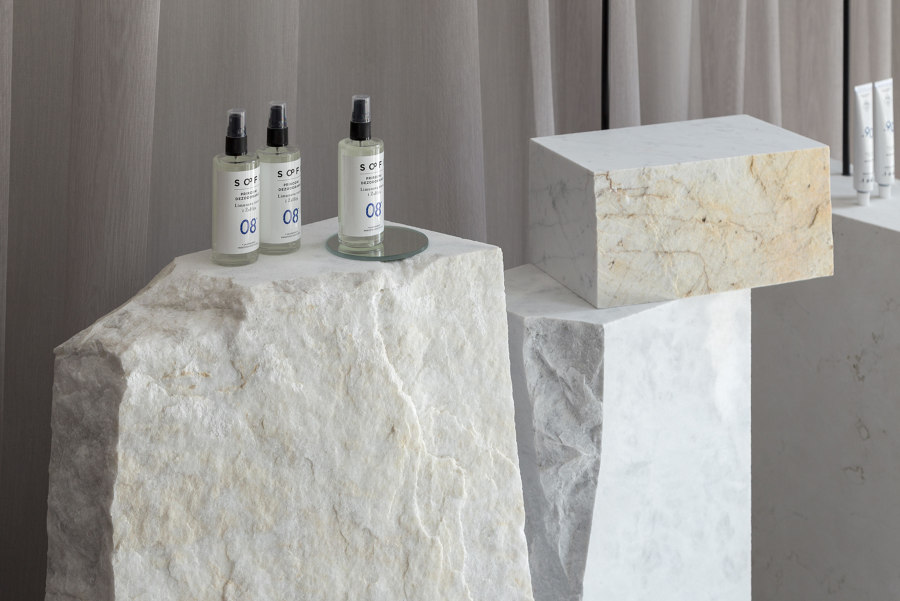
Natural cosmetic brand SOFI's philosophy focuses on fully exposed natural ingredients, and drawing on this, studio AUTORI chose a small number of raw and distinctive elements in the design of the Belgrade store’s interiors. Scrap marble that had been discarded due to flaws, was minimally processed and brought back to life, and balanced by serene, soft materials such as translucent curtains
Photos: Relja Ivanić
...
04
Fig
Vancouver, Canada
2019
Project by Scott&Scott Architects
For Fig’s beauty treatment store in Vancouver, Scott & Scott Architects designed a space in which creates a comfortable treatment experience and exhibits Fig’s range of products. A system of integrated detailing and velvet curtains within the colour range of a fig are utilised to create a relaxed experience with soft acoustics and illumination. Durable stone, terrazzo, metal and glass elements counter these softer elements where hygiene is paramount.
Photos: Olivia Bull. Courtesy of Scott and Scott Architects
© Architonic
