Mind the Gap: architects fitting extraordinary buildings into small spaces
Text by Alyn Griffiths
London, United Kingdom
26.03.12
Every city evolves differently, according to fluctuations in population and wealth, changes in industry and other social and economic factors. As old buildings are replaced, or new ones constructed, spaces between these buildings appear or alter; spaces that are either promptly integrated into the fabric of their environment or are left dormant and unused. Architonic examines how contemporary architects are capitalising on the benefits of these forgotten alleys, gaps and passages and transforming them into practical and desirable urban property.
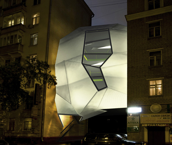
Parasite Office za bor architects 2011 3D and Photographs: Peter Zaytsev
The unrelenting development occurring in many urban centres makes it increasingly difficult to find attractive sites for new buildings, with any land that is available often being prohibitively expensive. One solution, proposed by Russian architecture practice za bor architects for a competition organised by architecture biennale ARCH Moscow, is not to touch the ground at all and instead to straddle the space between existing buildings.
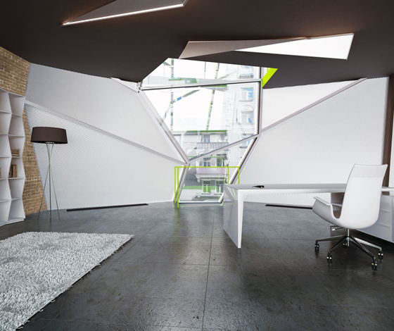
Parasite Office za bor architects 2011 3D and Photographs: Peter Zaytsev
The architects identified that Moscow is full of multi-storey buildings with blind end walls and wide passageways between them, leading from the street to courtyards or public spaces, and proposed that these redundant spaces could be used to house offices for the city’s burgeoning array of creative businesses.
The Parasite Office is aptly named after its ability to cling to the buildings that host it. A stainless steel framework clamped onto the exterior facades of the adjoining blocks supports a three-floor volume with an accessible roof area, which is divided by modular floor panels. The faceted surface facing the street is made from lightweight and durable polycarbonate that will glow from within at night, while the flat facade facing onto the courtyard at the rear is fully glazed.
Parasite Office za bor architects 2011 3D and Photographs: Peter Zaytsev
Hanging the Parasite Office high above the street means that access to the courtyard is retained and the building’s impact on existing patterns of urban flow are negligible. Despite its name and the visions this conjures of dystopian urban landscapes infested by random clinging structures, the design of the Parasite Office offers an intelligent and sympathetic response to the need for flexible workplaces within inner city environments.
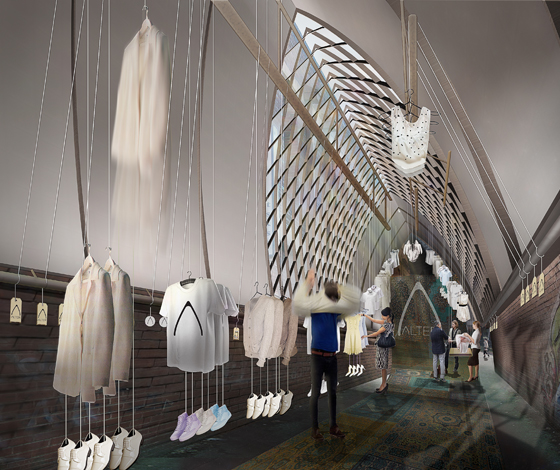
Alter concept Simon Bush-King Architecture & Urban Design 2011 © Simon Bush-King
In the Australian city of Melbourne, the development of underused back alleys and passageways began over a hundred years ago, when some of the small access lanes behind large properties were roofed and turned into arcades. The city’s ‘laneways’ are now populated with bars, restaurants and shops and their transformation into prime real estate is reflected in their increasing rental costs. When approached by a client looking to launch a pop-up retail venture, Amsterdam-based architect and urban designer Simon Bush-King and interior architect Sarah Rowlands proposed a way to use the narrow, dead end alleys near the busy shopping streets to house a temporary showroom.
Alter concept Simon Bush-King Architecture & Urban Design 2011 © Simon Bush-King
The design for a structural roof suspended between the buildings on either side of the alley doesn’t touch the ground at any point. A timer A-frame locks in place and can be adjusted to fit spaces of different widths, while a tensile membrane stretched over the frame provides shelter and security. All the interior fittings are hung from the roof and a curtain over the entrance is animated by a wind machine to attract the attention of passers-by on the adjacent street. The proposal could be adjusted to suit different purposes and demonstrates a considered response to a very specific type of urban space that would offer a cost efficient way to enliven these underused alleys.
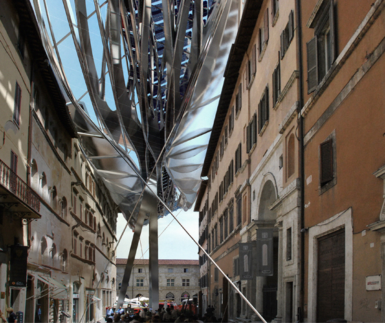
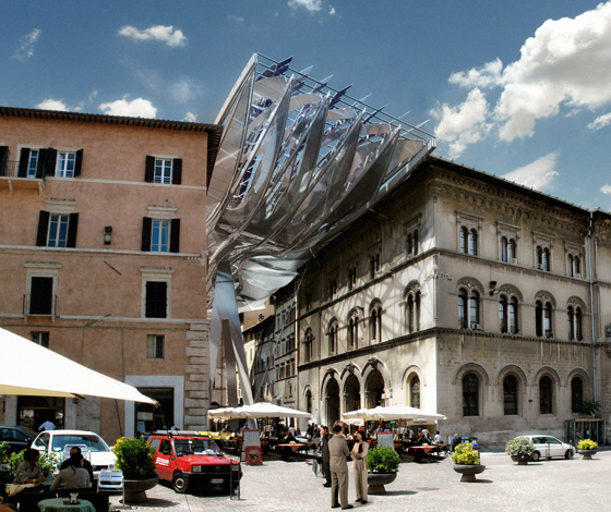
Energy Roof Perugia Coop Himmelblau 2009 Image © COOP HIMMELB(L)AU
The practice of covering streets with a glazed roof to create indoor galleries has been common in Italy for centuries, but a competition entry by Dutch architects Coop Himmelblau for the city of Perugia in 2009 took this idea to a new level. They proposed the installation of a free form “Energy Roof” that would turn a city centre street into a new, covered public space. The 80-metre-long structure is raised 18 metres above the street level on a huge tripod and would mark the entrance to an underground passageway that connects the centre to the Pincetto metro station.
Energy Roof Perugia Coop Himmelblau 2009 Image © COOP HIMMELB(L)AU
The dynamic and fragmented form of the three-layered roof is defined by its additional function: energy generation. It includes a lower level of laminated glass and translucent pneumatic cushions that gather rainwater, a structural middle layer and a top layer that channels wind towards five turbines and features photovoltaic panels that are optimally positioned to capture sunlight.
Though well meaning in its attempt to add layers of functionality to an existing space, the appearance of the Energy Roof is so alien as to make it seem totally separate from the historic buildings that line Via Mazzini. Currently, it is arguable whether this type of ‘landmark’ architecture benefits or detracts from the original character of its surroundings, but perhaps as space in larger urban areas becomes even more restricted, this design demonstrates how parts of historic towns may need to be adapted to new purposes.
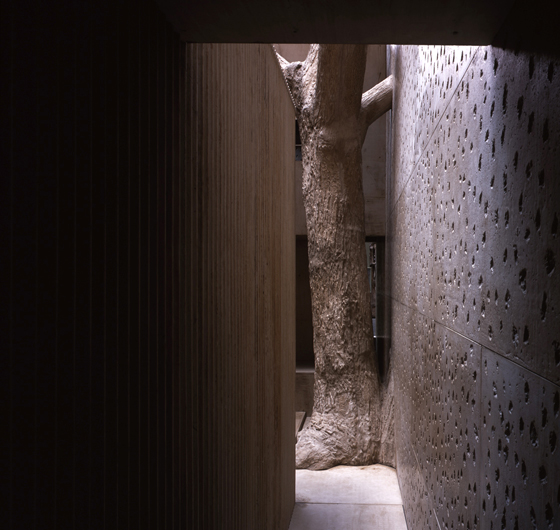
In-between Architecture Studio Mumbai Architects 2010 Photo credit: Hélène Binet
Attitudes towards the use of dead spaces within towns and cities vary drastically around the world. While many first-world countries enforce planning regulations to maintain control over every piece of land and restrict unauthorised building, in less developed regions there are many urban centres in which every centimetre of space is precious and put to good use.
In Mumbai, India, architecture practice Studio Mumbai observed that locals were creating dwellings in the narrow gaps between buildings and decided to recreate a section of a tiny area sandwiched between their own studio and the adjacent warehouse as their contribution to the Victoria and Albert Museum’s 2010 exhibition, 1:1 Architects Build Small Spaces. They produced a “cast” of the negative space, with its typically confined passageways divided into small rooms, and even featuring the tree that reaches through the walls on the site.
In-between Architecture Studio Mumbai Architects 2010 Photo credit: Hélène Binet
The full scale representation was transported to the V&A’s famous cast courts, metres from a full size replica of Michelangelo’s 'David', and featured a plain exterior, designed to “camouflage” it among the surrounding statues and architectural elements. The architects decided to accurately represent the volume of the multifunctional spaces but not the contents, resulting in an abstract and ambiguous architectural study that gives an impression of what it might be like to inhabit such a space, while leaving the visitor the freedom to imagine the decorations, colours, sounds and smells that would exist in the real environment.
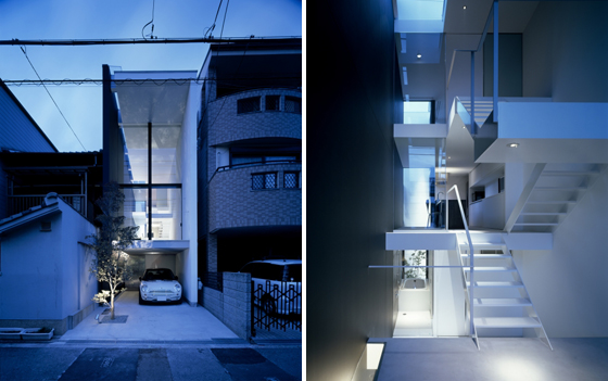
A House in Showa-cho Fujiwaramuro Architects 2008 Photo credit: Toshiyuki Yano
Residential projects constructed on tight plots can often result in truly innovative proposals, and nowhere is this predicament more common than in the cities of Japan. In the downtown Showa-cho district of Osaka, Fujiwaramuro Architects were asked to design a house for a plot measuring just 17.89m x 3.94m, sandwiched between two other properties. The solution, as often happens when trying to exploit the full potential of a small piece of land, was to build vertically.
The architects squeezed four storeys, including a basement level, into the space and still managed to retain a bright and roomy feel within the interior through the expansive glazing on the front of the house and a clever staggered floor layout that creates double-height spaces with views onto the street. Glass panels in the ceiling and a staircase with open treads that works its way up through the centre of the building also allow light to penetrate the interior.
The house’s lack of width is compensated for by the length and height of the building and the devices used to connect the interior space with the sky and the surrounding environment. A tree planted in the yard in front of the house will provide a degree of privacy as it grows and the project exemplifies a dilemma that will affect many architects tasked with designing for smaller and smaller inner city spaces: how to create privacy while retaining a light and attractive interior environment.
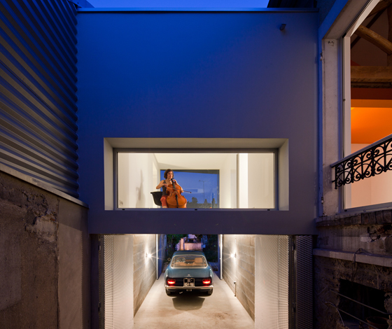
Extension to a house in Chaville CUT Architectures 2011 Photo credit: Luc Boegly
Property owners living in the outskirts of cities may sometimes be lucky enough to have additional land around their home that they can develop if they need more space. In the Parisian suburb of Chaville, CUT Architectures are responsible for the design of a residential extension that has transformed a redundant gap between an original 1920s detached house and the neighbouring modern property. The architects inserted a floating box that connects the two buildings and provides the owner, a cellist, with a dedicated rehearsal room.
The concrete extension has a fully glazed front surface that minimises its visual impact and allows light to fill the room, while at night the simple box frames the glowing interior. The space below the extension is used for parking and can be securely locked by closing the folding aluminium doors.
Extension to a house in Chaville CUT Architectures 2011 Photo credit: Luc Boegly
CUT Architectures were invited to design the extension when the clients, who already owned the modern home to the east of the site, bought the 1920s house next door. The angular form of the front of the extension traces a line between the two facades, offering a sense of continuity between the contrasting architectural styles. Inside the 1920s house, ceilings were removed, colourful mezzanines added, and the original timber frame uncovered. The project exemplifies the contemporary need for the adaptation of outdated residential property and demonstrates that voids between buildings in suburban locations are equally as suitable for creative development as their inner city equivalents.
The increasing lack of space in urban environments is resulting in some extraordinary and innovative projects that make the very most out of very little and challenge preconceived ideas about where new buildings can be constructed. Cities never stand still and it seems that even the smallest spaces will keep on blossoming with buildings as urban evolution continues on its unrelenting and unpredictable path.


