Team Picks: the architecture and design stories we loved in November
Text by Architonic
Switzerland
29.11.23
In this monthly format, we bring you the must-see projects and articles you may have missed over the last four weeks on Architonic. Featured in November: private and public spaces for the senses, a reimagined architecture archetype and an exclusive preview of the fair season to come.
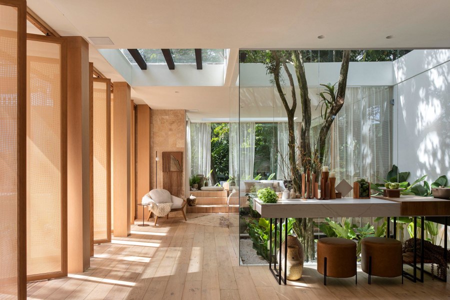
Senses House by UP3 Arquitetura. Photo: Denilson Machado – MCA Estúdio
PROJECTS
Casa Senses is a hotel refuge proposal in the countryside built at CasaCorRio 2023 by architects Cadé Marino, Michelle Wilkinson, and Thiago Morsch, from UP3 Architecture office, at the invitation of Brentwood, which provided all the furniture for the space. The house was assembled from three reused containers and a metal structure that allowed expanding the built area, in a box format, up to 105 m2. The main inspiration for the project came from contemporary country houses, with solutions that promote maximum integration of the internal environments with the surrounding nature. The concept of integration was also explored internally through fluid spaces that communicate with each other, subtly compartmentalised to avoid abrupt visual barriers.
James Wormald, Organic Content Editor:
'Integrating with the tropical climate is a key aspect of contemporary Brazilian architecture and interior design, and this show house in Rio’s Botanical Gardens converses with it at every turn. From the controlled acceptance of sunlight, ventilation and rainfall through its main facade of pivoting panels and an indoor terrarium at its core, to the natural textiles and aesthetics of its materials, this house is at one with the surrounding nature. And with the northern hemisphere well into its colder, darker half of the year, this reminder of its vegetative beauty offered me pure escapism.'
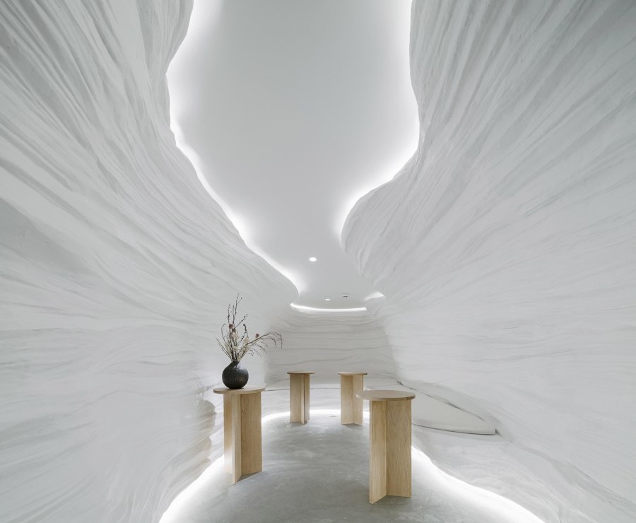
KSANA Tea House by Juti architects. Photo: Peerapat Wimolrungkarat
Ksana is a brand of matcha green tea imported from Uji City, Kyoto Prefecture. The word 'Ksana' comes from Sanskrit, meaning a small period of time or balance. It is the root of the word 'ขณะ' (ka-na) or 'moment' in Thai, and in the root of the Japanese word '刹那' (setsuna) meaning time. After tasting the brand's high-quality matcha, Juti architects decided to create a brand flagship store that celebrates moments in an equally serene fashion. In the space, visitors are invited to escape from the busy city to drink tea in a cave-like structure with fibreglass walls moulded with CNC foam and paired with oak-coloured tables and countertops.
Valeria Montjoy, Senior Content Editor:
'With the countless architecture projects and design trends we have the privilege of discovering every day, it can sometimes be hard to be surprised. So, when it came down to selecting my top pick for the month, this tea house in Bangkok, Thailand, stood out for its unique, outside-the-box, pleasantly surprising interior. Its cave-like walls are enough to create a minimalist, yet innovative and surreal landscape that transports users, enabling them to escape the chaos of the city.'
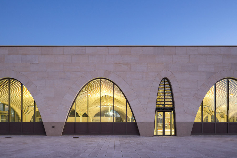
Saint Dizier's Market by Studiolada Architectes. Photo: Olivier Mathiotte
The city of Saint-Dizier is one of 222 cities committed to the 'Action Cœur de Ville' national plan that seeks to improve the life condition of the inhabitants of medium-sized towns and to ensure the lead role of these towns in the territory's development. At Saint-Dizier, the market project represents an essential element to the revitalisation strategy of the city’s heart aiming to recreate a local economy based on local commerce and artisan work. By absorbing the massive stone construction history, it also tries to reinterpret a traditional structural approach: the right usage of the right material at the right place facing multiple constraints.
Daniela Porto, Content Operations Manager:
'I’m a huge fan of functional public spaces; the ones that are not just beautifully designed, but also contribute to the community and offer solutions to the inhabitants of their neighbourhood. In the case of Saint Dizier’s Market in Saint-Dizier, France, the project is part of a country-wide plan to revitalise medium-sized towns by boosting local economies and commerce. In terms of the design itself, the blend of stone, wood and steel, and the different-sized arches make it a beautiful structure worth visiting.'
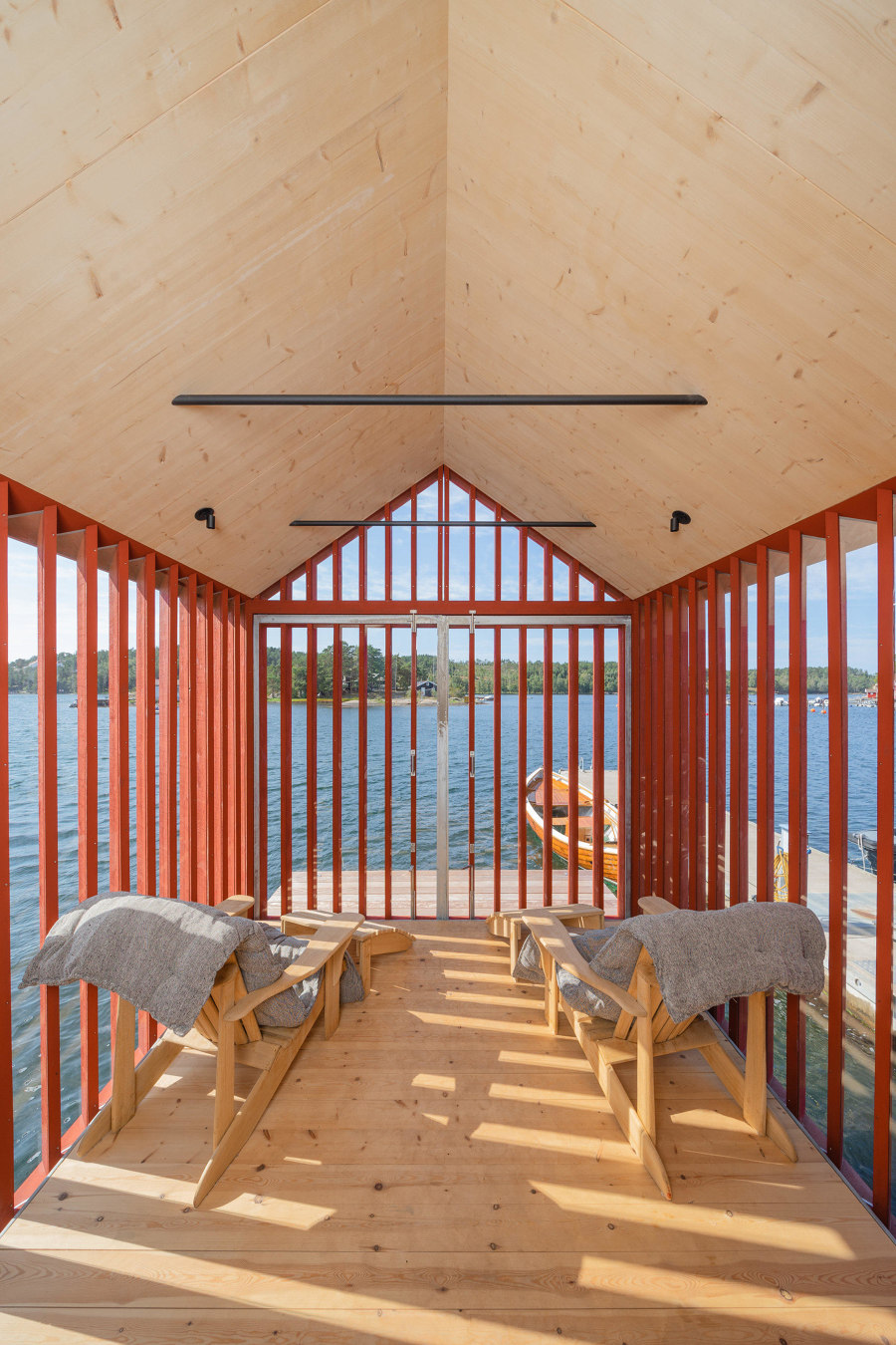
'Five glass-wrapped homes living life on the (water’s) edge'. Lucia Smart Cabin in Inari, Finland, by Pirinen Salo Oy. Photo: Marc Goodwin

'Five glass-wrapped homes living life on the (water’s) edge'. Lucia Smart Cabin in Inari, Finland, by Pirinen Salo Oy. Photo: Marc Goodwin
×ARTICLES
While our ports, lakes and waterways are no longer the international transport hubs and feeding grounds they once were, the improved air quality, more temperate climate and improved relaxation and mindfulness that’s brought by the presence of fresh or flowing water, means specialist spaces such as riverside pubs, beachfront hotels and lakeside homes are some of the most popular of their type. These homes of varying size taken from the ArchDaily and Architonic project archives show how prized nearby waterbodies can be better utilised with great architecture and design.
Enrique Tovar, Brands & Materials Content Editor:
'Throughout history, bodies of water have played a crucial role in influencing the spatial organisation and distribution of human settlements, thanks to their ability to support various facets of life. This article makes a particular case for a return to basics by exploring a universal architectural expression, such as housing, where architecture adapts to the context rather than imposing itself. This reinforces the notion that there are several ways (in this case, five) to confer function and form to the same typology in similar circumstances.'
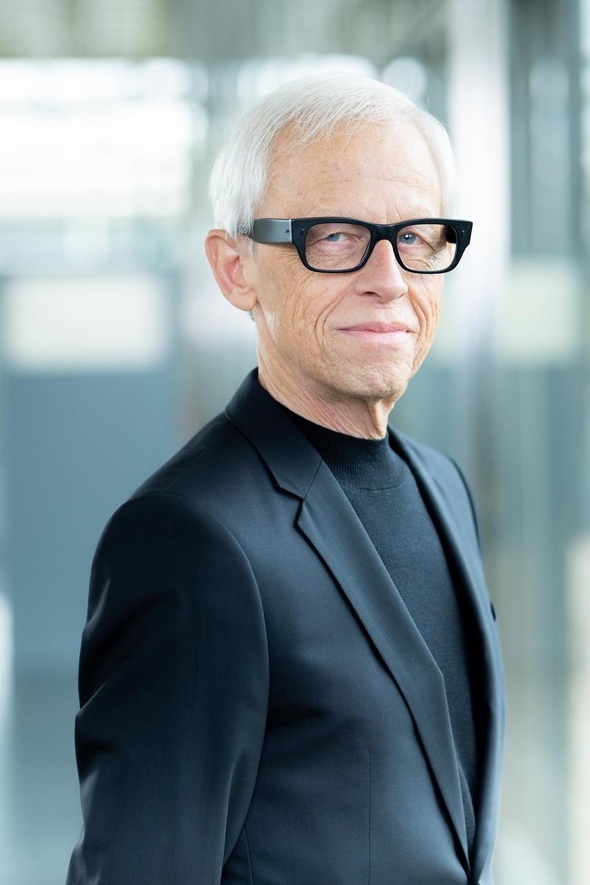
'Making friends at imm cologne.' Dick Spierenburg, creative director imm cologne. Photo © Koelnmesse / imm cologne

'Making friends at imm cologne.' Dick Spierenburg, creative director imm cologne. Photo © Koelnmesse / imm cologne
×After its experimental, pared-down ‘Spring Edition’ last June, January 2024 sees imm cologne back to its traditional timing – and in rude health. It’s not business as usual, though. And rightly so. The fair is evolving at a pace to reflect the changing needs and behaviours of both professional visitors and brands, each hungry to connect on a deeper level, beyond the presentation of new products. We sat down with imm cologne creative director Dick Spierenburg on the fair's 2024 theme of ‘Connecting Communities’ in a changing landscape and why the trade fair is returning to its January date.
Simon Keane-Cowell, Editor-in-Chief:
'Small, Dutch and extremely talented' is how I welcomed Dick Spierenburg to the stage at a live talk I did with the seasoned imm cologne creative director a while back. His latest interview with Architonic, in advance of the fair's 2024 edition, is a must-read. Not only because it tells us what professional visitors can expect when they pitch up at the Koelnmesse in January (the programme includes Live Talks by Architonic!), but also for what it says about the overall direction of travel for large-format, physical design shows.
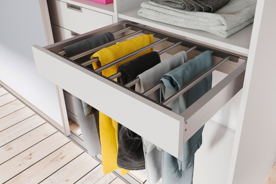
'Eight storage features to keep wardrobes and closets organised.' Trouser pull-out by raumplus
Although most of us have been at it from a young age, dressing oneself can be hard. Choosing items based on cut, colour, style and suitability to the day’s activities, environments and forecasted weather are all decisions to overcome. After all that, there’s the arduous task of actually finding them – now the only ones that will do, before changing one’s mind and starting all over again. Taking the stress out of getting dressed, these helpful storage elements for wardrobes and walk-ins pull out, fold down and light up to enable easy organisation, putting the fun back into dressing up.
Alun Lennon, Content Editor:
'The unforgettable mental image of my colleague James Wormald wrestling a fitted bedsheet into submission brought me back to his recent article on some helpful features for closets and wardrobes that assist users in managing domestic storage challenges. As someone whose coat-hanging weapon of choice is the back of a chair, James’ reminder to us about the array of specialised products available for the safe storage of belt and watch, trouser and shoe, made me question whether It’s time I upped my closet game.'
. . .
© Architonic
Head to the Architonic Magazine for more insights on the latest products, trends and practices in architecture and design, or find inspiration in a whole world of projects from around the globe through ArchDaily's architecture catalogue.
