Unsung America - Bruce Fifield: Fanny-tastic
Text by David Sokol
Washington, DC, United States
22.04.09
“The first two minutes of a person’s interaction with a chair are incredibly important to how a person judges that chair and compares it to other products on the marketplace.”
“The first two minutes of a person’s interaction with a chair are incredibly important to how a person judges that chair and compares it to other products on the marketplace.”
That’s Continuum design director Bruce Fifield speaking from Milan. He is referring to findings from a blind study that Continuum conducted before designing the Acuity chair for Allsteel, the Muscatine, Iowa–based office systems manufacturer. Fifield’s insight couldn’t ring more true with me. Back in New York, I tried out the Acuity chair. Despite, or perhaps because of, Continuum’s almost-three-year-long development period, instantly I coveted one. For once in my life I was sitting straight up—posture that would make a Pilates instructor proud. Full disclosure: I’ve got a herniated disc, so I’m trickier to fit than most. And yet, up until that test drive the “ergonomic” in “ergonomic task chair” quite literally felt like a misnomer.
What differentiates Acuity from the other chairs in which I’ve spent too many hours courting a computer screen? Fifield calls it a “dynamic adaptive fit.” That description can be broken into several parts.
First, consider the way the seat and back interact. Some chairs operate by spring load: As the sitter pushes back, the seat moves back, too, as propelled by the spring. The spring is adjusted via lever to accommodate weight. Funniest home videos happen when a heavy person reclines in a chair spring-adjusted for a featherweight, he pushes too hard, and he falls on his neck. When Continuum began researching Acuity in September 2005, Allsteel had already begun deploying an alternative known as a weight-activated system in which the seat lifts in a series of cantilevers as you recline. “Lifting your own weight is a way to close the loop,” Fifield says. But he adds, “We wanted to optimize the execution. We wanted the back to change shape, to adapt to the lumbar area, as you lifted your own weight.”
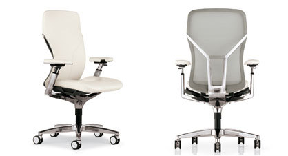
Then consider the second aspect of the composition. The back comprises an hourglass-shaped plane of mesh framed in thick injection-molded plastic. Meanwhile, a Y-shaped structural prong juts out and up from the seat base to connect the mesh surface at two points. By forging—or “trapping,” as Fifield puts it—this pair of links, the back flexes. It hugs the spine when sitting upright (the feeling that seduced me initially), and during reclining, the curvature of the back increases in sync with the lumbar. For the finicky user, a side control locks in the upright position or sets the maximum degree of reclining.
The maximum width of the arms, on the other hand, reflects Americans’ increasing girth.
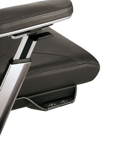
Those flips and switches are the third piece in this tripartite of posture. They also represent Fifield’s second priority in designing Acuity. “A chair should be smart enough to take some ergonomic adjustments out of the equation,” he says. For the inevitable fine-tuning, though, the designer says equipment controls should be intuitive. That meant removing them from their usual hiding places beneath the chair—a tangle of incomprehensible knobs and their attendant icons—and placing them in sight, adjacent to the parts of the chair they’re supposed to control. Armrest controls, which manipulate height, distance from the seat, inward and outward cant, and distance between arms, are located in, well, the armrests. To lock the back, look down and to your left, exactly where you would adjust the back in a car’s driver’s seat.
Automobile design informed the Acuity exercise, Fifield admits. Which also says something about the state of American design. “North America is very stratified,” he notes. “There are higher levels of fit and finish, of design sensibility and artisanal quality, in automobile development. That creates a point of reference for everybody, because everybody drives a car in America, and it has raised awareness of design among Americans significantly in the last 15 years.” That would explain the attention paid to details like the beveled edges of Acuity’s armrests, or the way the Y formation of the back mechanism is reflected in the manufactured Y stitching on the leather seat. The maximum width of the arms, on the other hand, reflects Americans’ increasing girth.
The ergonomic chair seems to open a unique window on America, particularly the way that Americans consume it. Consider how the ergonomic chair emphasizes softness and comfort. Implicit in those terms is productivity and profit. Aesthetics is next on the agenda, and that runs neck and neck with environmental responsibility—despite Fifield’s comparison to auto design, or his using 45 percent recycled content to make Acuity.
Yet Acuity also offers a commentary on the culture of American designers, even expatriate ones. Although Fifield founded the Milan studio for Boston-based Continuum in 1987, and today he has 20 employees under his wing, Allsteel’s was Fifield’s first chair assignment. And consider how that field was already populated by landmark products like the Aeron chair. “There’s always something you can do better,” Fifield says. “We were surprised by the number of experiences that weren’t where they should be.” Continuum didn’t tiptoe into the category. It stomped. Perhaps, then, industrial design taps into America’s love of inventors and cowboys at a time when both those professions appear anachronistic.


