Heal Thyself: new healthcare architecture
Text by Dominic Lutyens
London, United Kingdom
16.06.17
As hospitals embrace a more patient-centred approach, so do their architects, giving rise to curative spaces that dovetail stress-free wayfinding with a proximity to nature.
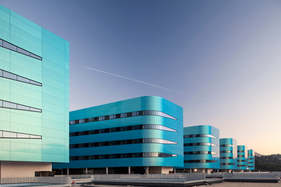
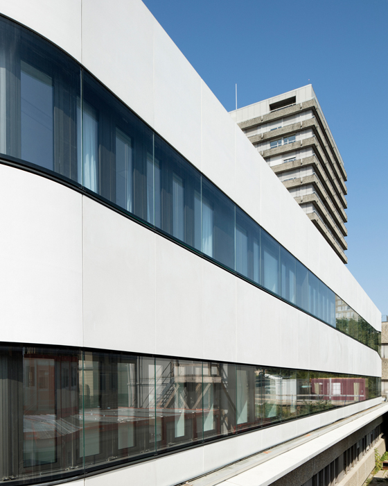
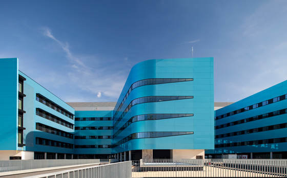
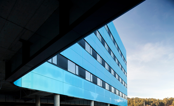
The shimmering façades of Álvaro Cunquiero Hospital by luis vidal + architects in Vigo, Spain constantly change colour due to a coating of prismatic paint. Photo: Cortizo

The shimmering façades of Álvaro Cunquiero Hospital by luis vidal + architects in Vigo, Spain constantly change colour due to a coating of prismatic paint. Photo: Cortizo
×Hospital design today – even within the public sector – reflects a shift away from prioritising the staff's convenience to focusing on patients’ wellbeing. David Watts, managing director of CCD Design & Ergonomics, a human behaviour and design agency, points to evidence of this in the UK’s NHS, which aims is to drive up levels of customer satisfaction: “To achieve this, hospitals are looking to other sectors, such as hotels.” He cites the importance now placed on effective wayfinding in hospitals traditionally blighted by labyrinthine, featureless corridors that are disorientating for patients and visitors and make it longer than necessary for staff to get from A to B.
Another way to reduce patients’ stress levels is to dovetail nature — traditionally seen as aiding the healing process — and architecture. True, there’s nothing new about this: Alvar Aalto’s Paimio Sanatorium for TB in Finland, completed in 1933, is in a forest and Aalto’s design included routes for walks through the trees. But architects of hospitals increasingly espouse this approach.
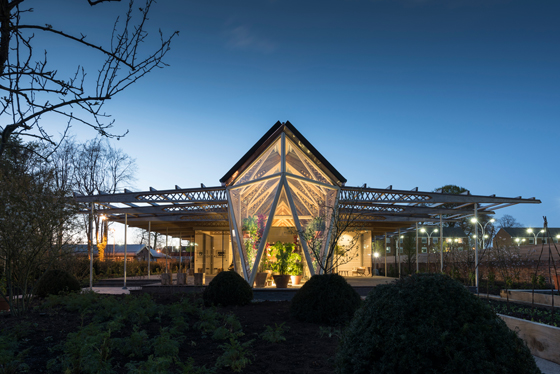
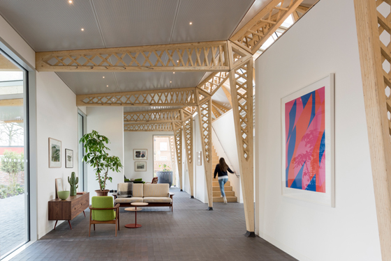
Norman Foster designed this Maggie’s Centre for cancer care, which is near The Christie hospital in Manchester and its oncology unit. It’s designed to create a domestic atmosphere in a garden setting. Photo: Nigel Young / Foster + Partners

Norman Foster designed this Maggie’s Centre for cancer care, which is near The Christie hospital in Manchester and its oncology unit. It’s designed to create a domestic atmosphere in a garden setting. Photo: Nigel Young / Foster + Partners
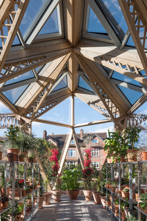
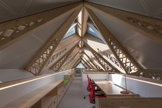
×Norman Foster’s 2016 Maggie’s Centre for cancer care, set in a garden, is a good example. Foster, who once suffered from and survived bowel cancer, has created a highly transparent, timber-framed structure to “help connect it with the surrounding greenery”, he says. This is reinforced by its many windows, skylights and a greenhouse where patients can grow flowers and other produce. The centre also boasts airy, open-plan interiors, a library, exercise room and kitchen. The intricate geometry of its timber frame echoes Foster's signature high-tech aesthetic but here he has exchanged machine-inspired metal for warmer wood. Ultimately, Foster’s aimed to create a welcoming, homely building “without the institutional references of a hospital or health centre”.
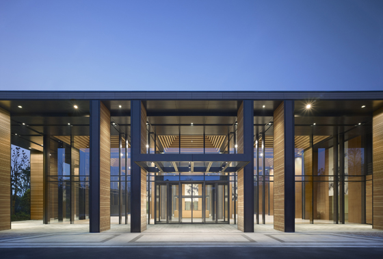
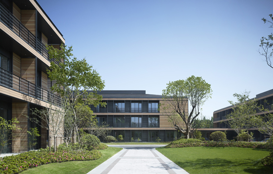
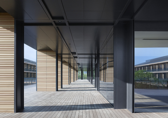
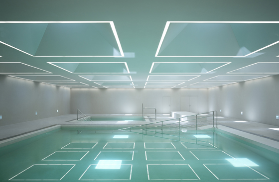
Designed by Gerkan and Schütz, Wuhzen Medical Park in Shanghai features a deeply recessed façade, shielding the building from sunlight and helping to keep the interiors, which include spacious corridors and therapy pools, cool. Photos: Christian Gahl

Designed by Gerkan and Schütz, Wuhzen Medical Park in Shanghai features a deeply recessed façade, shielding the building from sunlight and helping to keep the interiors, which include spacious corridors and therapy pools, cool. Photos: Christian Gahl
×Also emphasising its relationship with nature is Meinhard von Gerkan and Stephan Schütz’s clinic, Wuzhen Medical Park in China. Specialising in neurology and orthopedics, it comprises courtyard houses around a lake in a park, a restaurant and gymnastics rooms. Patient rooms on the upper floors and an outdoor terrace enjoy spectacular views of the picturesque setting.
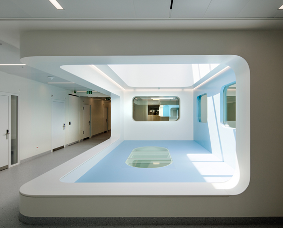
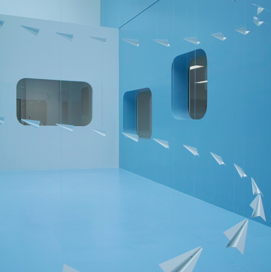
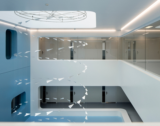
The two-storey, generously glazed extension to the Coordinated Centre of Oncology (meier + associés) in Lausanne, Switzerland has interiors with rounded contours designed to counter anxiety experienced in an oncology department. Photos: Yves André

The two-storey, generously glazed extension to the Coordinated Centre of Oncology (meier + associés) in Lausanne, Switzerland has interiors with rounded contours designed to counter anxiety experienced in an oncology department. Photos: Yves André
×And the two-storey extension of the Coordinated Centre of Oncology in Lausanne, Switzerland, designed by meier + associés architectes, has a gargantuan green roof which is pierced with skylights to draw natural light in. But its main hallmark is its organic, round-contoured facade and interiors, which create a more soothing, fluid environment than conventional hospitals with their monotonous, sharp-edged, baldly functional corridors.
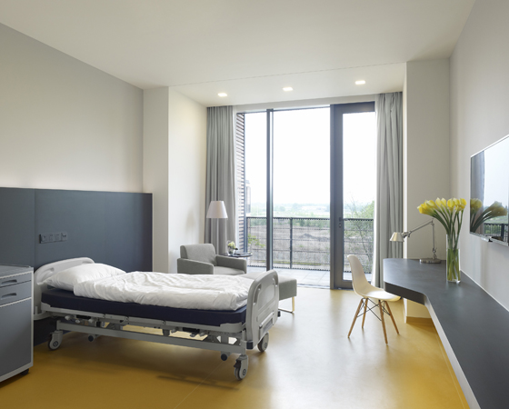
Contrasting the metallic façades, the interiors of the Álvaro Cunquiero Hospital in Vigo, Spain boast soothing, neutral tones and noise-reducing acoustics. Photos: Cortizo

Contrasting the metallic façades, the interiors of the Álvaro Cunquiero Hospital in Vigo, Spain boast soothing, neutral tones and noise-reducing acoustics. Photos: Cortizo
×Finally, the visually arresting Álvaro Cunqueiro Hospital in Vigo, Spain, created by luis vidal + architects, is the antithesis of characterless, institutional hospitals. Its monumental façade is coated with prismatic paint, which changes colour depending on how light hits it. Internally, it has a clear layout flooded with natural light. Amenities include operating and consulting rooms, a nursery, library, café and even a heliport.
© Architonic
