Less is More: bigging up micro-architecture
Text by Dominic Lutyens
London, United Kingdom
14.06.15
Sustainability, cost-efficiency and space are just some of the factors driving an international renaissance in pocket-sized architecture that’s big on expression and style.
Yasutaka Yoshimura’s Window House, which he describes as a ‘house to see through’. It’s a three-storey structure simply by dint of being raised off the ground, thereby providing space for a patio underneath; photo: Yasutaka Yoshimura
×Renzo Piano might be famous for designing the EU’s tallest building – the 310-metre-high Shard – yet he has long harboured a personal obsession with micro-architecture.
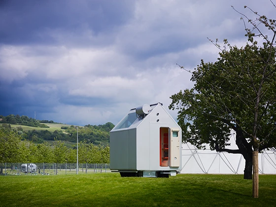
In 2010, Rolf Fehlbaum, Vitra’s chairman, offered to develop a final prototype of Renzo Piano’s pet project, his Diogene house, which was exhibited for the first time at the Vitra Campus during Art Basel in 2013
×In the 1960s, while teaching at London’s Architectural Association, Piano joined forces with students to build mini-houses. About 10 years ago, he began developing a minimalist house called Diogene, which was featured in a booklet about him published by ‘Abitare’ magazine in 2009. Now installed at the Vitra Campus in Germany, this experimental house, with a surface area of just 2.4 by 2.4 metres, is named after ancient Greek philosopher Diogenes, who reputedly lived in a barrel since he deemed worldly luxuries extraneous. And, inspired by Roman architect Vitruvius’s notion of the primitive hut as the basic building block of architecture, it’s self-sufficient: it harvests rainwater and is fitted with solar panels. Its economically designed interior boasts a living room with a pull-out sofa and folding table under a window. Behind a partition are a kitchen, shower and toilet.
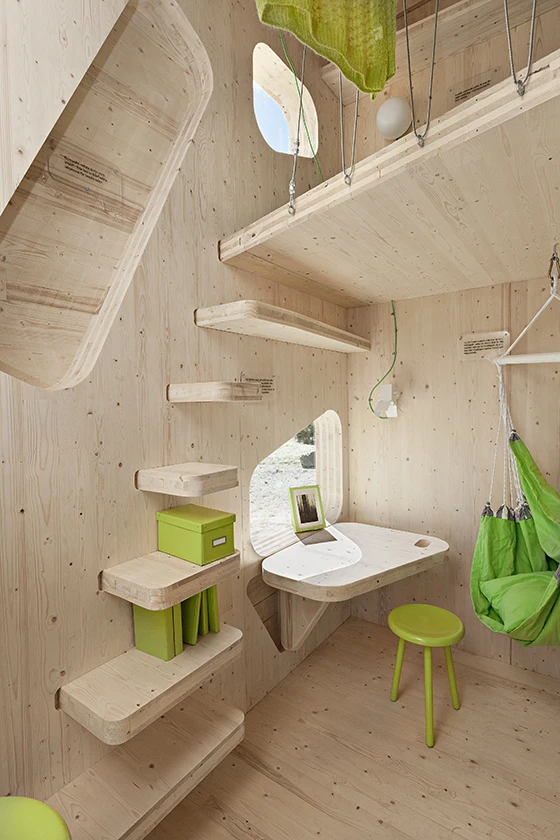
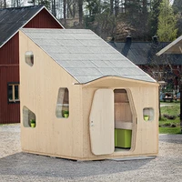
Tengbom’s house used as student accommodation is designed to be ecological since it’s mainly made of renewable wood, which can be sourced locally in Sweden, thus minimising its transportation
×Piano is not alone in championing micro-architecture because he equates it with sustainability and rigorously space-saving interior design. Swedish architects Tengbom have developed a 10-square-metre wooden house for students with real-estate company AF Bostäder and wood-processing firm Martinsons. Co-designed with students of Lund University as affordable, sustainable housing, it’s made of super-strong cross-laminated wood (chosen for being a renewable resource) and incorporates a kitchenette, bathroom and mezzanine to sleep on. Two window shutters fold down for use as a dining table and desk. ‘Through this efficiently designed layout, the rent students normally pay is reduced by 50 per cent,’ says Linda Camara, one of its architects.
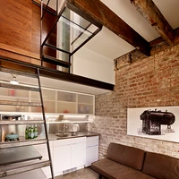
The ultra-compact Brick House by Azevedo Design boasts such space-saving features as a built-in walnut wardrobe, as well as a 1-square-metre wet room and wall-mounted toilet in the bathroom
×More space-saving still is Azevedo Design’s Brick House in San Francisco – a conversion of a boiler room, built in 1916, into a guesthouse. Measuring 2.5 metres by 3.5 metres, it somehow accommodates a living room, kitchen and en-suite bedroom. Original wooden roof beams inside now support a loft-level bedroom. ‘The project fully takes advantage of volume as opposed to just square footage,’ says studio founder Christi Azevedo, who added more space by installing a glass mezzanine. Leading to the bedroom, this is reached by a ladder onto whose lower rungs a kitchen worktop is slotted.
The Window House creates a sense of more space thanks to the dramatic connection it makes with the natural world outside. Its huge windows afford panoramic views of Sagami Bay and Mount Fuji; photo: Yasutaka Yoshimura
×Finally, architect Yasutaka Yoshimura has designed a romantic, 3-metre by 8-metre weekend house for a single resident in Kanagawa, Japan. Its key feature is transparency: its two huge windows afford contrasting views – of Mount Fuji to one side and the sea to the other. The house is raised on concrete pillars to protect it from high tides; the space under it is used as a sheltered patio. Steps lead up from here into the house and its dining room and kitchen and, on a floor above, its living room and tiny bedroom.
Diminutive perhaps but micro-architecture has an appeal that remains undiminished.