Virtual winner's podium – the ICONIC AWARDS 2022: Innovative Interior (2/9)
Brand story by Gerrit Terstiege
Germany
01.03.22
Over the course of several weeks, we are celebrating the winners of this year's ICONIC AWARDS: Innovative Interior. Here, we present part two of our nine-part series, which is all about colour…
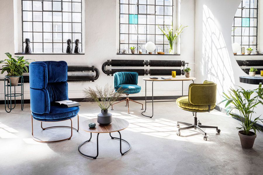
The trademark of Vank's Ring series is its sweeping, scenic lines. Ring is a hybrid solution for home offices and meeting rooms in offices, hotels and coworking spaces, retail spaces and other public areas

The trademark of Vank's Ring series is its sweeping, scenic lines. Ring is a hybrid solution for home offices and meeting rooms in offices, hotels and coworking spaces, retail spaces and other public areas
×Why is colour so important, particularly in relation to interior design? Perhaps because by deciding on a colour – or on certain colour combinations – you greatly change the overall impression of an object. Of course, this also applies to the design of entire rooms. If you think of floors and walls, for example, you are dealing with very large surfaces whose colour effect can be enormous.
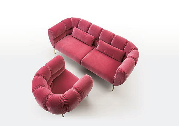
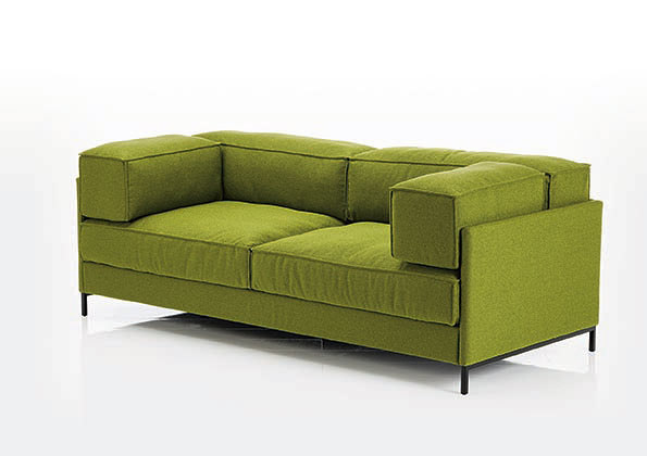
Kati Meyer-Brühl's fully sustainable easy pieces cover combines iconic design with maximum transparency, simplicity and versatility. Magnolia, on the other hand, creates luxurious islands of calm that invite you to relax with soft curves and quilting

Kati Meyer-Brühl's fully sustainable easy pieces cover combines iconic design with maximum transparency, simplicity and versatility. Magnolia, on the other hand, creates luxurious islands of calm that invite you to relax with soft curves and quilting
×A few years ago, I visited the Dutch designer Hella Jongerius in her Berlin studio and asked about her approach to colour. Jongerius has been advising the German-Swiss furniture brand Vitra for many years and defines, for example, new, subtle colour palettes for the classics in the manufacturer's range. But the task is not quite as simple as one might first imagine.
‘Sometimes it takes me several weeks to find the right colour,’ Jongerius openly admits. ‘I look at a colour sample in the morning. Then I put it aside. I look at it in the evening. Then I don't deal with it at all for a week. The whole thing really takes time. Suddenly I have found the solution, and then we do a test. But on a chair, the colour looks completely different. And then everything starts all over again.’
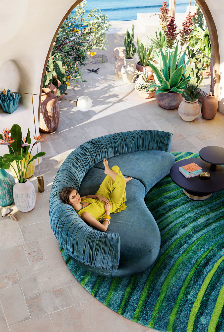
Nanami by Bretz and Dagmar Marsetz: Time and evolution are reflected in the organic form a the collection which is devoid of corners or hard edges

Nanami by Bretz and Dagmar Marsetz: Time and evolution are reflected in the organic form a the collection which is devoid of corners or hard edges
×The general public is often not fully aware of the experimentation and skill that are necessary to bring a creative idea to market. That's why the 'ICONIC AWARDS: Innovative Interior' awarded by the German Design Council are so important in raising awareness, both among professionals in the interior design industry and manufacturers who may be looking for new creative partners.
Together, the chosen products act as a barometer of new trends, which is why a visit to the Iconic Awards exhibition during imm cologne has always been a must for me as a design journalist. Unfortunately, it didn't take place again this year due to Corona, but luckily, you can find out about all the winners at the website – and discover more on the topic of colour trends in particular.
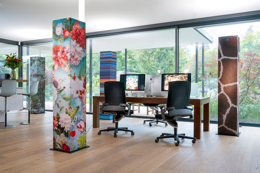
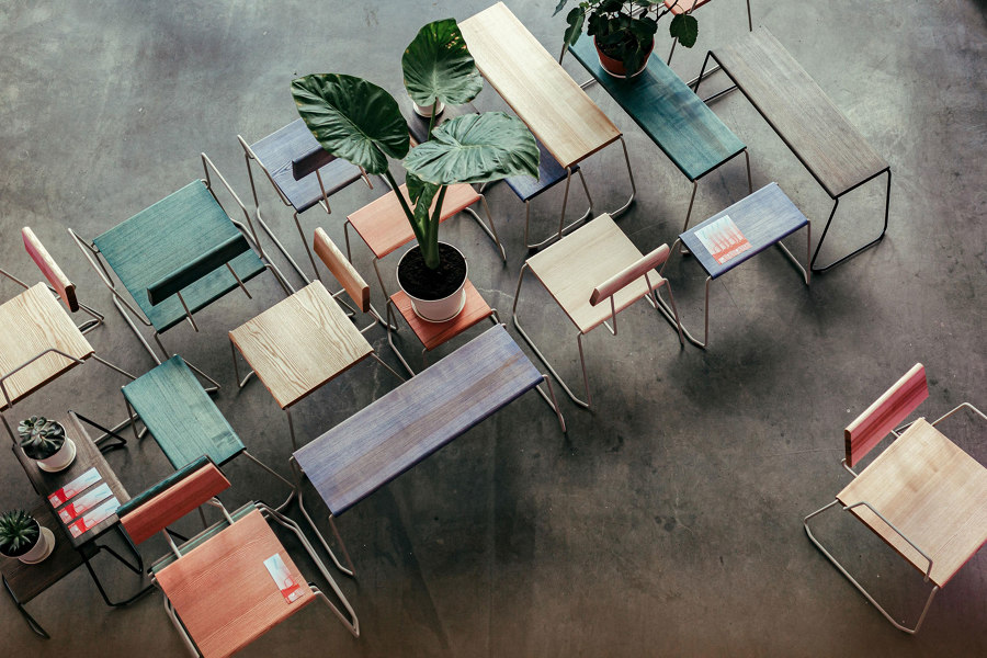
MONO-LIT is a new type of acoustic lighting tower by Kasper in collaboration with lighting specialist Derungs (above). The Dickicht collection by sustainable furniture manufacturer Fuchs & Habicht (below) is available in an aesthetic mix of colours

MONO-LIT is a new type of acoustic lighting tower by Kasper in collaboration with lighting specialist Derungs (above). The Dickicht collection by sustainable furniture manufacturer Fuchs & Habicht (below) is available in an aesthetic mix of colours
×In general, manufacturers today offer products in a large selection of colour palettes, so their customers – or architects and interior designers – can choose which tone suits the respective purpose and individually determine the colour climate of an interior concept.
The meta-trend for colours in interior design is individualisation, but that does not equate to arbitrariness. On the contrary. In fact, it is precisely once you’ve settled on the exact colour shades that are to be available that it becomes exciting.
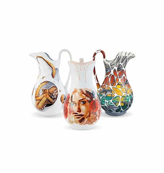
In the Urban.Art@VA project, limited to 195 pieces, three Portuguese graffiti artists – Violant, MrDheo and Odeith – apply their art and technique to a slightly modified replica of an old porcelain water jug

In the Urban.Art@VA project, limited to 195 pieces, three Portuguese graffiti artists – Violant, MrDheo and Odeith – apply their art and technique to a slightly modified replica of an old porcelain water jug
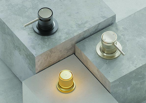
×Colours are often linked to specific materials whose glossy or matt surfaces not only have to match the form and function of a product, but should also be able to respond to a variety of furnishing styles. The 'Tate' faucet series by Felton Industries Limited, for example, which was honoured with first prize. It is available in a variety of finishes to match diverse colour schemes and integrated lighting further enhances its spectrum.
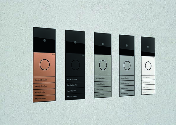
Today, door communication systems must also match the respective colour and material concept of a building. The minimalist Gira System 106, which can be installed flush with the surface, was awarded 'Best of Best'. The modular series is offered in six finishes, including two different shades of silver as well as a copper tone which looks particularly striking and elegant in combination with the black function modules.
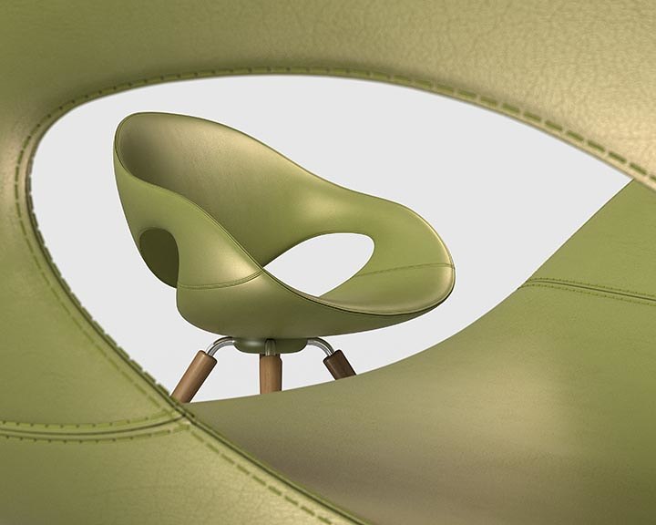
In furniture design, choices of upholstery fabrics and materials have long been a main concern – but in this field, too, it is important to discover exactly which tone harmonises with the appearance of a sofa or an armchair. One example is the green shade of the 'Winner' award recipient 'Moon Chair' by Mac Stopa for Tonon, which emphasises the organic shape of the seat shell by reminding the viewer of plant leaves. In a bright red, the association might have taken on a more floral nature instead.
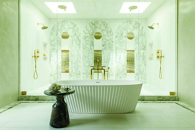
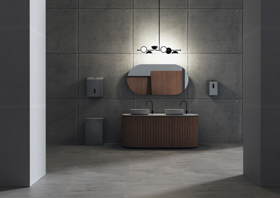
Bowie by MTI Baths adds unexpected texture to the bathroom (top). Tate by Felton offers conventional fittings as well as digital mixers (middle), while Ophardt uses smart technology for its SanTRAL® Plus series of hygiene products (bottom)

Bowie by MTI Baths adds unexpected texture to the bathroom (top). Tate by Felton offers conventional fittings as well as digital mixers (middle), while Ophardt uses smart technology for its SanTRAL® Plus series of hygiene products (bottom)
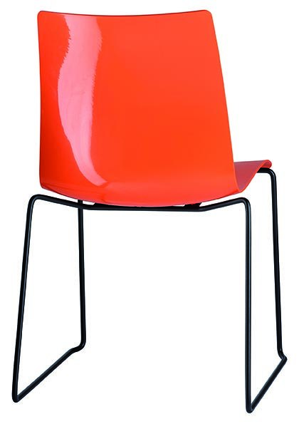
×In art class, we learned that black and white are 'achromatic' colours – but this phenomenon can have a particularly strong effect. An office chair like 'Unigamma' by Brune in classic black will probably never go out of fashion. Recipient of the 'Winner' prize, the chair, which is available with a stackable skid base among other formats, oozes timeless chic. For those with a more colourful disposition, the chair’s plastic shell is available in blue, green, red and white, too.
To give you an even better idea of current colour trends, we’ve listed some additional 'ICONIC AWARDS 2022: Innovative Interior' winners below that bet big when it came to their distinctive shades:
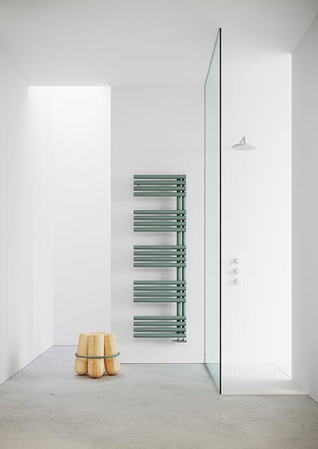
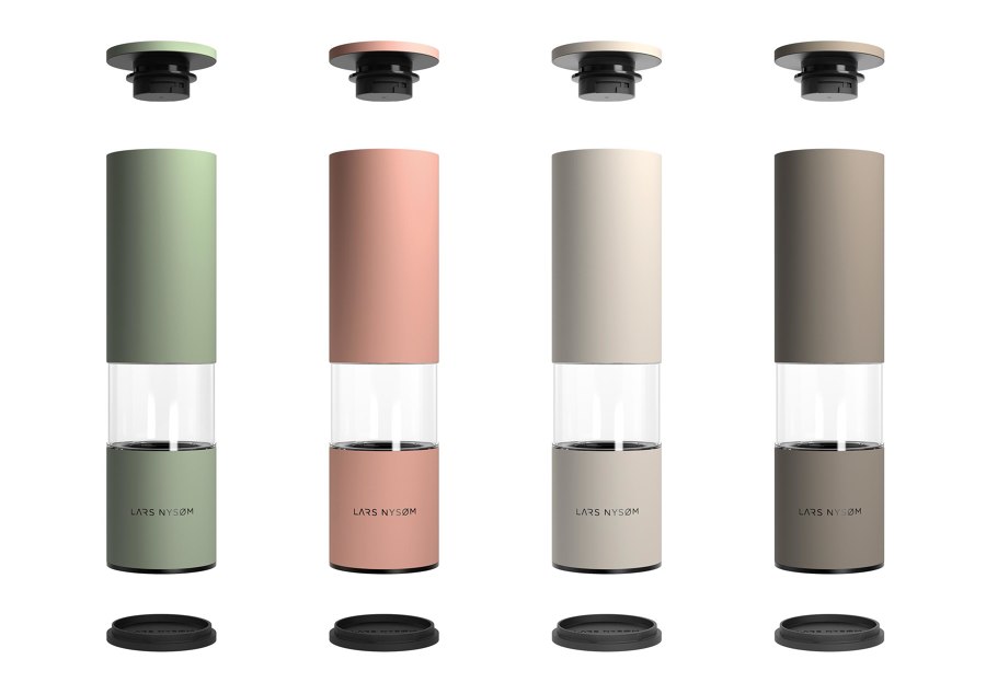
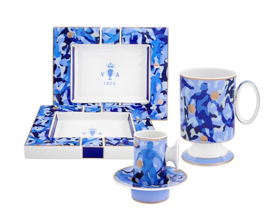
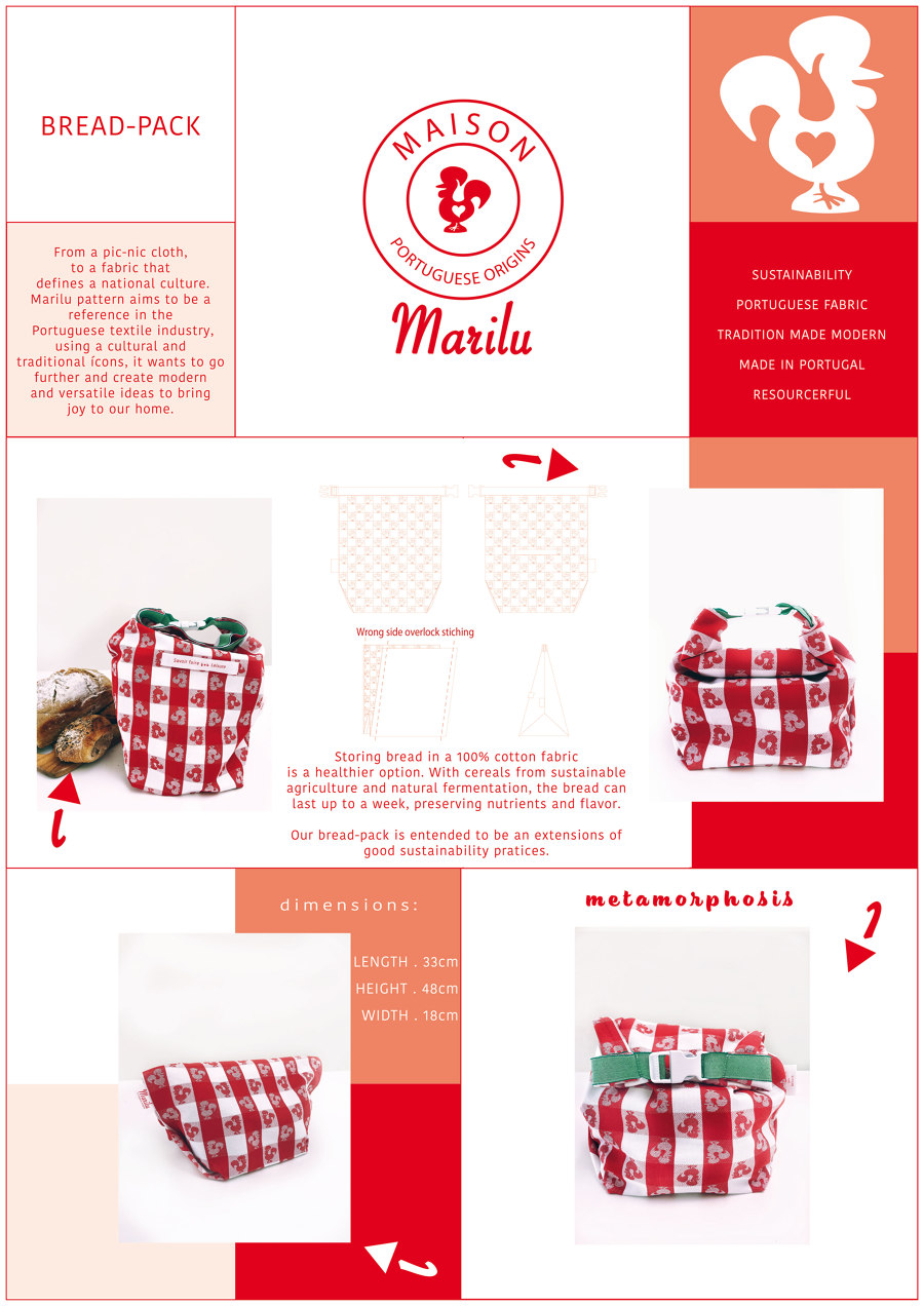
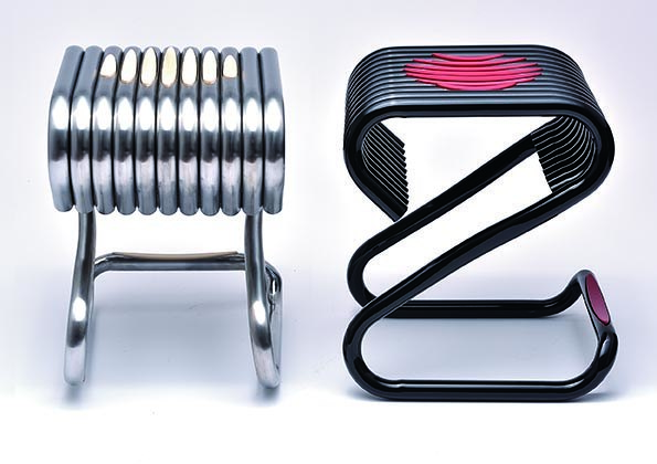
From top to bottom: Looper by Tonon, Federica by Cordivari S.r.l., Gira System 106 flush by Gira and Tesseraux, Lagom by Lars Nysøm, Kick-off by Vista Alegre Portugal, Marilu by Marilu, UNIGAMMA by Brune and Uwe Sommerlade, Re Birth by 4 Design by DW

From top to bottom: Looper by Tonon, Federica by Cordivari S.r.l., Gira System 106 flush by Gira and Tesseraux, Lagom by Lars Nysøm, Kick-off by Vista Alegre Portugal, Marilu by Marilu, UNIGAMMA by Brune and Uwe Sommerlade, Re Birth by 4 Design by DW
ש Architonic
