Great care: HEWI redesigns fitting icons for the healthcare sector
Brand story by Markus Hieke
Bad Arolsen, Germany
12.05.23
By relaunching their iconic range 477/801 with new colour combinations, the Germany-based expert for barrier-free bathroom products gives new life to a design classic and refreshes care architecture across age groups.
Creating a design icon is not easy. With the 477/801 range, HEWI succeeded in producing a true fittings classic that has now been relaunched with updated colour combinations
Design icons don’t just appear overnight. They are preceded by a very precise observation of society, its needs and most often intimately tied to humanity’s technological achievements. This explains, for example, why the development of the first coloured and plastic door handle by Rudolf Wilke coincides with the moon landing: suddenly, everything in design had to be light, round, colourful and preferably ‘spacey’. Further examples include Luigi Colani's 1969 Satellite Kitchen and Dane Verner Panton’s experiments with a new material. The product, polyamide, was used to create a new seating furniture typology named after him: the plastic chair without back legs, which is still produced in series today.
Design icons don’t just appear overnight. They are preceded by a very precise observation of society, its needs and most often intimately tied to humanity’s technological achievements
But back to the brand at hand: HEWI. The company has been writing success stories at least since the introduction of their lever handle range 111 in 1969. Ten years later, its sanitary series 477 maintained the door fitting’s design language and ushered in a new, overarching principle: universal design – an ethos of ‘design for all’, which was further expanded 20 years later with the sanitary series 477/801, the first system for barrier-free bathrooms on the German market. The approach: to set the tone in the sanitary area with barrier-free products for washbasins, toilets and showers that support movement, provide safety and enable independence without appearing purely functional or stigmatising.
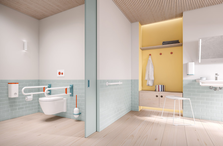
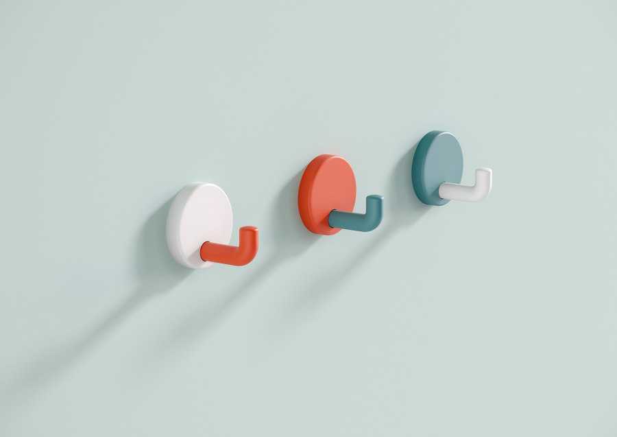
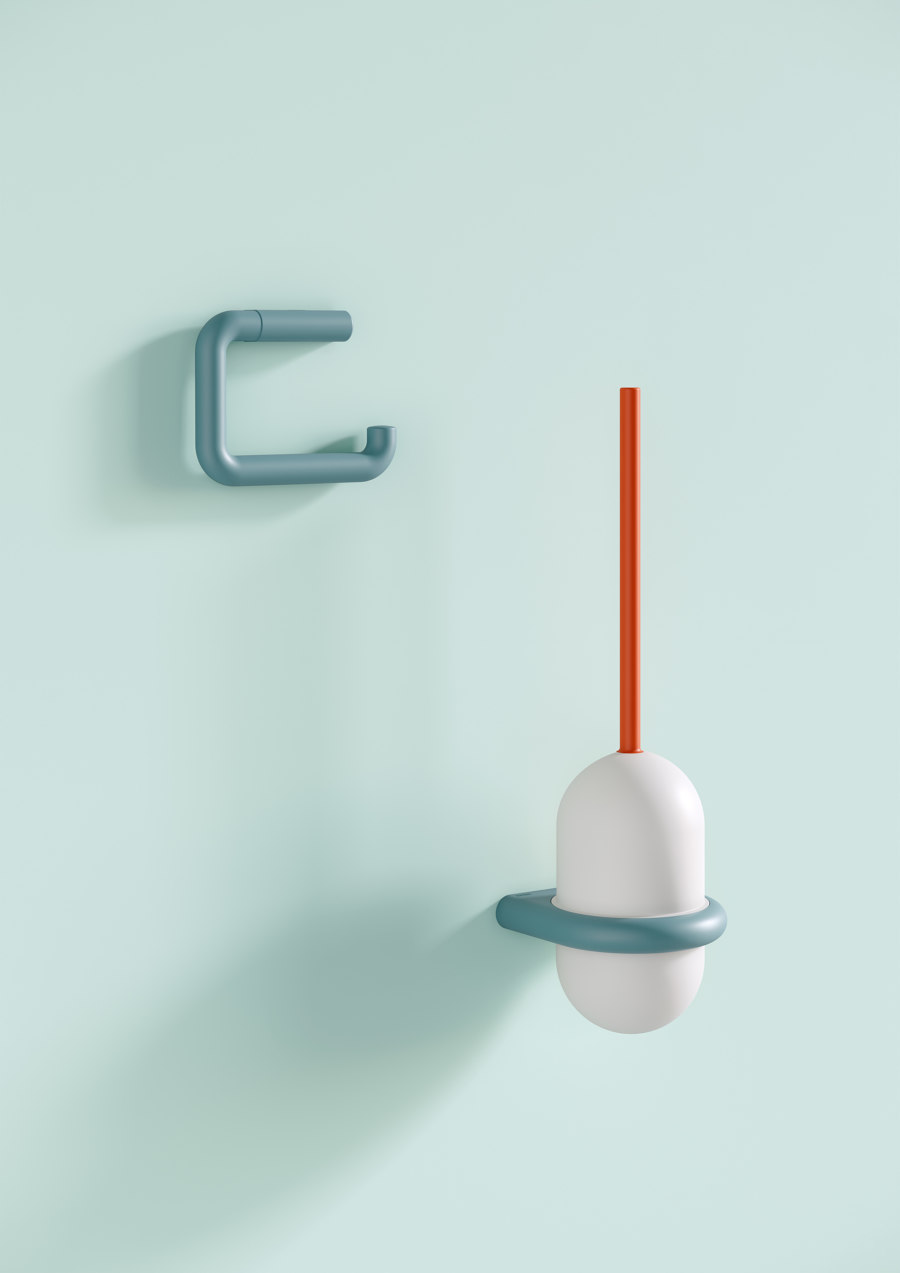
HEWI's new colour canon of coral, aqua blue and pure white not only offers colour-stimulating accents, but also has practical functions for people with impaired vision
HEWI's new colour canon of coral, aqua blue and pure white not only offers colour-stimulating accents, but also has practical functions for people with impaired vision
×New colour worlds
Whereas Range 477/801 was previously available in a monochrome signal white, jet black, 14 other glossy shades and five matt varieties, HEWI is now expanding it to include three special colour concepts for furnishing healthcare buildings and daycare centres. ‘Design icons make an impression, are still desirable after decades and, with only a few modifications, appear as young, fresh and innovative as on the first day,’ explains the company. Grab rails, folding support rails, shower rails, folding seats as well as accessories such as the toilet brush holder and wall hooks can now be selected in one of three colour editions.
‘Colour reaches us on an emotional level, creates atmosphere and brings authenticity and individuality to interiors’
To liven up clinics, which are known to most as sterile, uninspiring places, with vitalising splashes of colour, HEWI suggests a harmonising trifecta of tones: coral, aqua blue and pure white. ‘Colour reaches us on an emotional level, creates atmosphere and brings authenticity and individuality to interiors,’ says HEWI. In planning, moreover, it increases a project’s design scope and pays tribute to the concept of ‘Healing Architecture’ by supporting the recovery process through consciously used design elements. Certain colour tones and materials, for example, contribute to a feeling of security and create a relaxing and stress-free environment.
For international barrier-free expert HEWI, these considerations are of the utmost relevance, ‘which is why the interaction between people and their surroundings as well as the healing and regenerating aspects of design have been incorporated into the colour concepts of Range 477/801.’ In addition, the product’s colour accentuation also serves another function: it signals which parts are important for its use and thus supports intuitive application. This is particularly advantageous for people with impaired vision and an example of how this tricolour variant unfolds its full potential in the care sector.
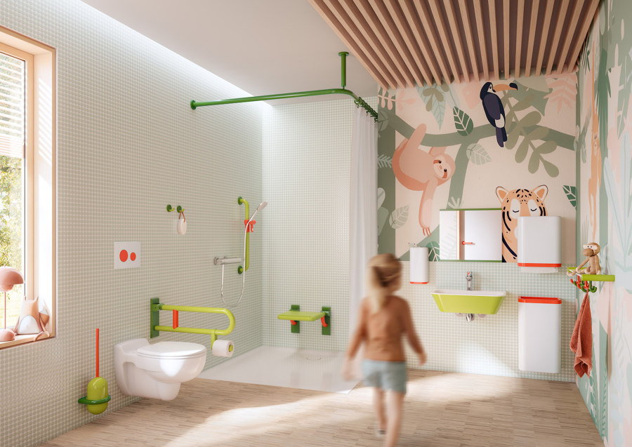
With blue (above) and green colour worlds (below), HEWI offers vibrant, child-friendly highlights for an often sterile and uninviting environment
With blue (above) and green colour worlds (below), HEWI offers vibrant, child-friendly highlights for an often sterile and uninviting environment
×Playful at the highest level
HEWI has also developed two lively colour concepts especially for children's clinics, nurseries and day-care centres. The tricolour variant apple green, may green and coral exists alongside a triad of aqua blue, steel blue and apple green. Both options have a soft, calming and harmonising effect – a convincing counter-offer to a sterile, clinical look, where robustness and ease of care have long taken precedence over design sophistication. The ICONIC products of Range 477/801 can thus be used to create imaginative washrooms for children by harmoniously complementing a tile or wallpaper concept and serving as accents in combination with the use of natural materials.
When it comes to quality, the company knows no compromises – and that applies all the more to its icons
To ensure that HEWI can promise a high and consistent level of durability across products, the manufacturer works with high-quality polyamide, available in both a high-gloss and matt ICONIC finish. One thing is of special note: When it comes to quality, the company knows no compromises – and that applies all the more to its icons.
© Architonic
Head to the Architonic Magazine for more insights on the latest products, trends and practices in architecture and design.


