Cultural conversation
Text by Indesign Media Asia Pacific
Australia
25.08.14
A radical new building challenged a large law firm to adopt a radical new workplace culture (Text by Paul McGillick)
Open plan, activity-based working, agile working, flexible working – it is easy to lose sight of the wood for the trees when all we need be concerned about is: Is it an appropriate workplace?
That requires genuinely evidence-based design which, in turn, involves answering a few simple questions: Who are we, what do we do and how can our work environment facilitate that as well as possible?
Workplace culture is inseparable from the physical work environment, but a new physical workplace can certainly facilitate cultural change – the way people work. Historically, accountants and lawyers have long epitomised this, mainly for the wrong reasons, because when we think of them, we tend to have a Dickensian vision of dark, defensive and cluttered offices filled with columns of paper files in no discernible order. But even accountants and lawyers, spurred on by the liberating benefits of digital technology, have recently begun to explore new ways of working.
The connecting stairs, here linking the Level 17 client arrival floor with Level 16 and its breakout area, library and work areas

The connecting stairs, here linking the Level 17 client arrival floor with Level 16 and its breakout area, library and work areas
×Corrs Chambers Westgarth is a large legal practice which has bit the bullet and taken up the challenge of driving a new workplace culture, assisted in no small measure by the remarkable new building at 8 Chifley Square in Sydney which, by its form – highly transparent, north-facing, 790 square metre, U-shaped floorplates stacked as seven ‘villages’ oriented around two, three or four-storey atria – effectively demands a new way of working.
Corrs was moving from one of Sydney’s already established premium grade offices which was a traditional legal workplace – “highly cellularised”, as Brenton Smith (who headed up the design of the new workplace) describes it. Enclosed offices, lots of paper, a lack of purpose-built rooms and limited opportunity for the staff to socialise, but still one of the city’s preeminent buildings, which was a lot to compete with.
The aim was to completely change the culture with a strategy to encourage more collaboration, teamwork, knowledge sharing and transparency. The transparency concerned the way the company worked internally, but also the way it engaged with clients. Now, when clients visit the company, they feel a part of it because of the transparency of the building and the fit-out – they can see people working, see front and back of house. It is an experience which begins at reception on the client floor (Level 17) and ideally culminates over a glass of wine on Level 18 in the classy café and wintergarden.
A further strategic objective was to position Corrs as an international player, not simply a localised Australian practice. “That,” says Brenton Smith, “resonates with the choice of building. It’s an international building, so you have to create a space that reflects an international standard.”
The result of all this strategising is a conversation between the fit-out and the building, because the building encourages a certain way of working. As Robert Regan, partner in charge of the Corrs Sydney office Corrs) comments: “Corrs is the first large Australian law firm to take serious steps toward the workplace of the future. 8 Chifley is a brand new building, with great amenity, which supports Corrs’ strategy. It allows us to leverage our strengths through collaboration, and have the flexibility to choose the space that is most conducive to achieving the best outcomes. Working collaboratively is about greater connectivity and using the space to promote interaction. The move provides us with a workplace of the future that benefits our people and our clients.”
Bates Smart, who won a design competition for the job, recognised that this was a landmark building, beautifully articulated with its exterior crossbracing and grand six-storey entry space at ground level. Hence, the aim was to design an interior which celebrated the architecture. As a result, wherever you are, you have views – sometimes just dramatic glimpses or, more often, sweeping views of the city and out towards the Harbour – through to the outside and the bracing. This is supported by subtle references inside such as the timber panelling and the floor tiling on the client floor which hint at the angularity of the external bracing.
Beyond that, says Brenton Smith, another objective was “creating a space which had a degree of elegance and sophistication without being overtly opulent…this was about elegant restraint”.
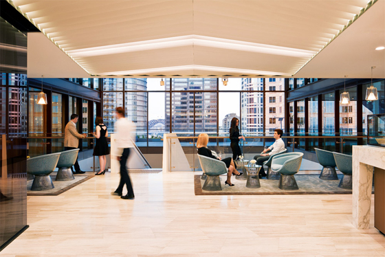
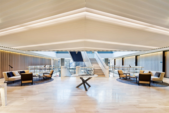
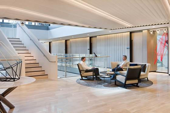
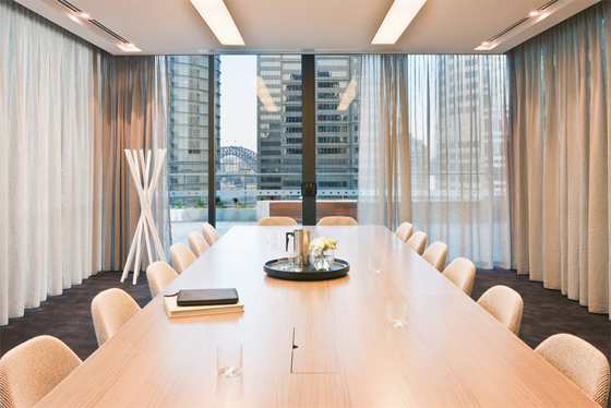
This restrained elegance, expressed through a light, soft palette and a considered choice of loose furnishings and rugs also works as a calming contrast to the base building – which, for all its drama, is a powerfully muscular statement. This reassuring ambience is announced on arrival at Level 17 reception where the splendid view is counterpointed by a quietly expansive client waiting area. This level also provides a variety of client meeting spaces including a set of four on the eastern side which can be combined to accommodate 150 people. On the opposite side of the atrium is a large meeting room screened by a series of directional blades which provide privacy, but still draw light in and avoid the clumsiness of filmed glass.
Client arrival area looking towards training and function rooms
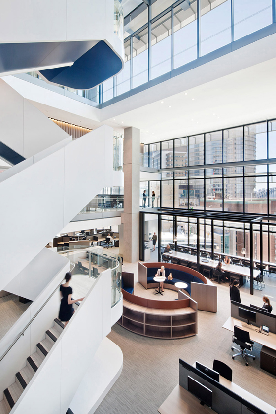
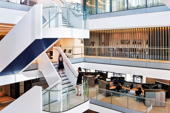
The client/arrival floor is one of four making up the central ‘village’ for Corrs. These levels are linked by an internal stairway which has its own, softer character to contrast with the robustness of the base building. The stairs have a curved profile with glass balustrading and are painted marine blue on the underside. The glazing ensures that the view is never obstructed, while the curved form and marine blue have a nautical overtone, making the link to the Harbour.
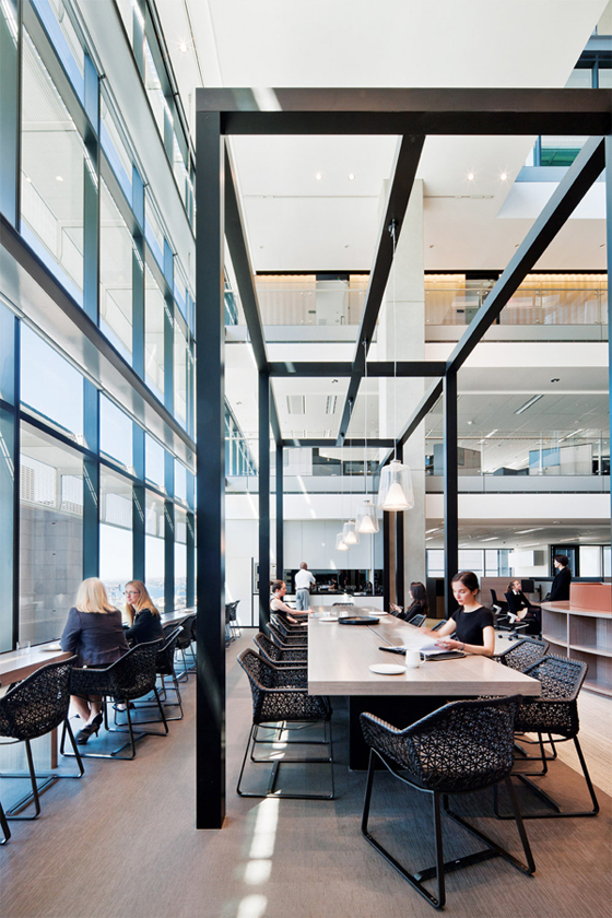
The marine blue underpainting also has another function – looking upwards from the atrium base, it punctuates the potentially overwhelming experience of the void. The solution creates breakout spaces available to all on either side of the atrium base. In this way, people also get to share the light and the views equally. The space is also anchored by the circular library pod and by an open frame over the central breakout area which provides a reassuring sense of enclosure and some human scale.
The atrium base on Level 16 showing the breakout area
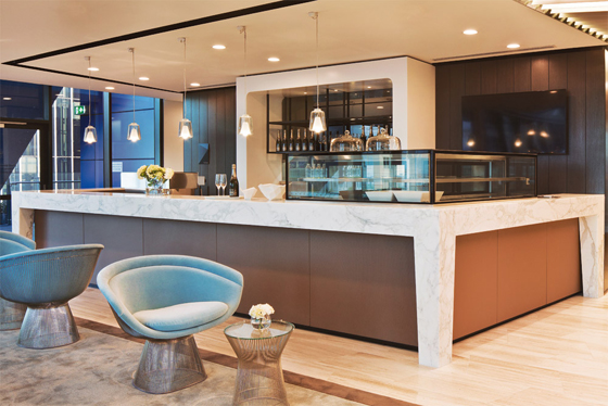
Managing the change from an enclosed office culture to an open and collaborative culture invariably entails a trade-off. To give up the privacy of their offices, staff need to feel they have gained something. At Corrs the gain is in the form of quality communal space, both in the atrium base, and particularly with the Level 18 café, wintergarden and the wrap-around outdoor terrace with its phenomenal sense of being high up at the heart of the city. On this level, the mood is less corporate and more high-end hospitality. Postoccupancy feedback shows that Corrs’ staff not only enjoy this space enormously, but also take considerable pride in it.
Complementing this are the workstations. Work floors are fully flexible and a single type of customised workstation is used. Designed and manufactured by Unifor, the workstations present more as a beautiful piece of joinery than a functional unit. With a ratio of 1:18 per square metre they occupy a large – which is to say, comfortable – footprint, offering personal storage space while their rounded, leather-capped tops provide a sense of private space without seeming overbearing or isolated.
The connecting stairway and a work area with the custom -ised Unifor workstations
All up there are 48 workstations per floor, plus 20 on each of the three atrium bases.
Corrs represents an outstanding example of base building and interior environment working together to facilitate a major cultural change in a profession many thought would never abandon its cosy closets.
Corrs Chambers Westgarth
Architect: Bates Smart
Design team: Simon Swaney, Julian Anderson, Brenton Smith, Hayden Crawford, Tommy Sutanto, Megan Fox, Martine Bonich, Polly Gee, Rachael McCarthy, Tamara Young
Total floor area: 8,000m2
Time to complete: 2 years
Furniture: Workstations by Unifor, task chairs, ‘On Chair’ from Wilkhahn. In Meeting Rooms, Herman Miller Eames Aluminium chairs from Work Arena, Thinking Ergonomics ‘Eona’ table from Corporate Culture. In Breakout Areas, Kettal ‘MAIA’ dining chairs from dedece. In Reception Areas, Maxalto ‘Clio’ chairs, ‘Febo’ sofa and B&B Italia ‘Fat Fat’ table from Space Furniture, Minotti ‘Van Dyck’ round table from dedece. In Level 18 Boardroom, table from Unifor.
Lighting: In Ground Floor Reception, Louis Poulsen ‘LP-AJ-F’ lamp from Corporate Culture. In Bar/Café, Oluce pendant from Euroluce.
Finishes: In Meeting Rooms, broadloom carpet from Rugs, Carpets & Design. In Level 17 and 18 Reception, custom rugs from Designer Rugs. Throughout Workstations, upholstery from Kvadrat Maharam, South Pacific Fabrics, NSW Leather Co. and Pelle Leathers, tinted glass provided by Viridian. Generally throughout, zinc wall cladding from VMZINC, paint from Dulux, protective metal coating from Interpon, floor joinery by Laminex Group, timber veneer finishing from Fethers, wallpaper from Unique Fabrics. In Client Waiting Rooms, DuPont Corian solid surfaces from CASF. On Level 17 and 18, ‘Shima Chiaro’ stone slab from Skheme, and Calcutta marble from Euro Marble.
___
Photos: Shannon McGrath
