14 ways to maximise visual interest on a blank wall
Text by James Wormald
19.07.23
Walls can often feel like they’re just in the way, blocking the freedom of the open plan. But these vertical canvases are far more useful than they seem. Here are all the decorative ways to fill them.
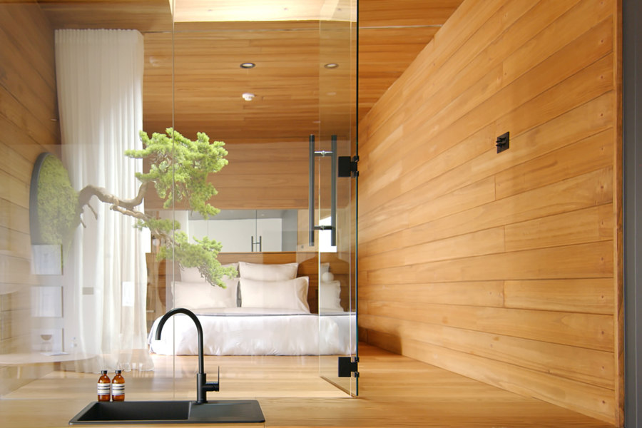
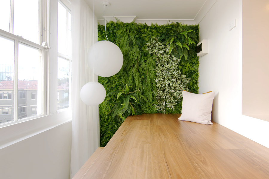
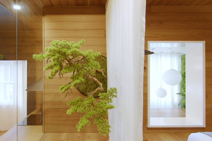
A Unique zero-maintenance wall-fixed bonsai tree provides biophilic mediation to an interior zen garden at The Ryokan Manly House by Dform project. Photo: Never Too Small | Nam Tran

A Unique zero-maintenance wall-fixed bonsai tree provides biophilic mediation to an interior zen garden at The Ryokan Manly House by Dform project. Photo: Never Too Small | Nam Tran
×The growing interior trend of maximalism encourages us to fill our homes with colour, pattern and function, letting creativity flow free without rule or restriction. But it’s not as simple as just throwing everything together and waiting to see what sticks. The following products and surfacing techniques complement each other to bring previously lonely walls to life.
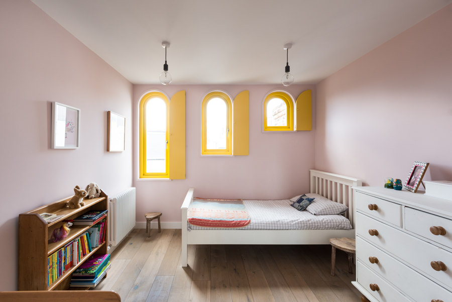
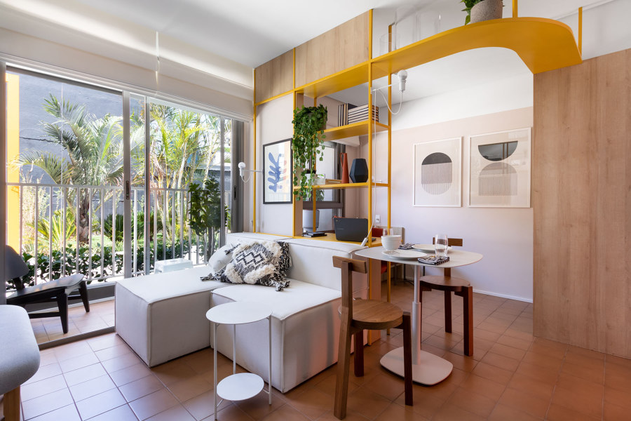
Wall-defining bright yellow window frames at the Valetta House by Office S&M. Photo: French + Tye
Outlining window frames with contrast
Already helpful in breaking up the wall space, exterior windows tend to be a forgotten, and even frustrating, part of the interior design process, seen as areas to work around, not to work with. But as Office S&M shows at the Valetta House in London, when a bold, contrasting and even colourful change is made to the frames, windows can become much bigger, wall-defining features.
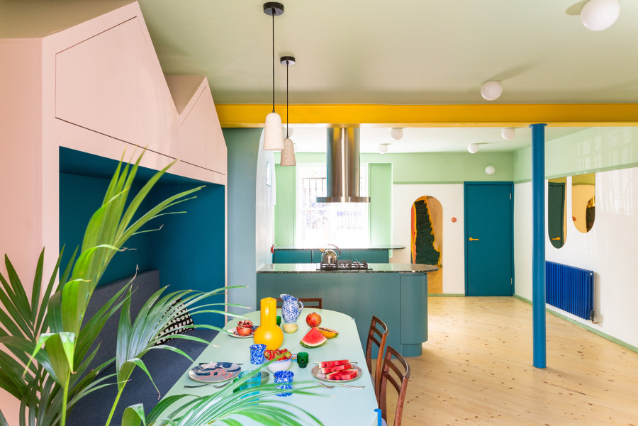
Angle-lined mirrors at the entrance of the Mo-Tel House by Office S&M. Photo: French + Tye
Double space and light with mirrors
Mirrors and reflective surfaces are especially useful in passageways and hallways to help reflect light and open up the visual panoramic, helping narrow spaces feel less constricted. While most mirrors, whether in halls, bedrooms, dressing rooms or living spaces, are best placed at head height, at the Mo-Tel House, architects Office S&M have applied mirrors higher up and lower down on the wall, helping to expand the space vertically.
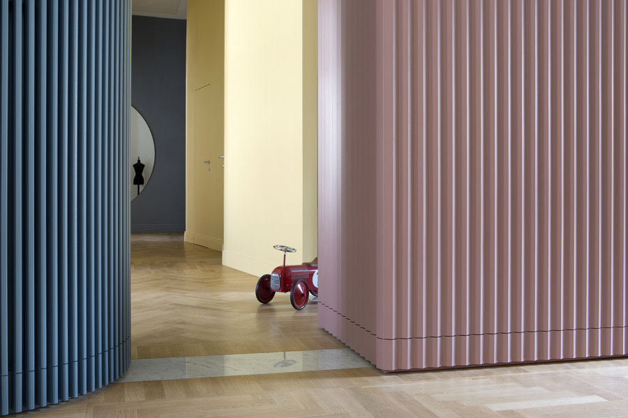
Pleated-effect pastel walls at the dramatic Theatre House by Bodà Architetti. Photo: Barbara Corsico Photography

Pleated-effect pastel walls at the dramatic Theatre House by Bodà Architetti. Photo: Barbara Corsico Photography
×Wall finishes that add bold dimensions
While the flat surface of skim-finished walls can sometimes feel like a blank canvas awaiting a creative influence, just the simplest addition can leave you wanting more of the same. At the Theater House in Italy, the clients – fans of the arts – requested an ‘apartment that becomes the theatre and its inhabitants the actors,’ as explained by architects Bodà Architetti, who provided pink and blue pleated wall volumes to appear like drawn curtains as a backdrop to the interior.
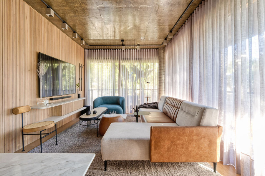
Light translucent full-length curtains draw texture and depth across the edges of the Loft Chartier’s living space by Studio Colnaghi Arquitetura. Photo: Vinicius Ferzeli

Light translucent full-length curtains draw texture and depth across the edges of the Loft Chartier’s living space by Studio Colnaghi Arquitetura. Photo: Vinicius Ferzeli
×Pleating walls with curtains
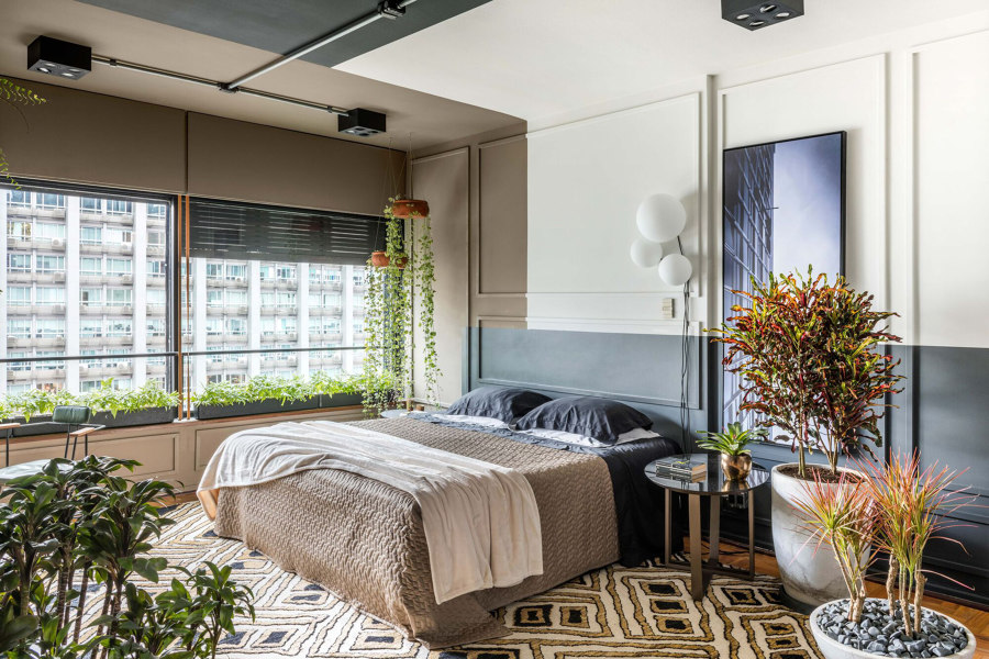
A more flexible way to add the full-length look of pleated curtains is to install actual curtains. The Loft Chartier apartment in Brazil, by Studio Colnaghi Arquitetura enjoys plenty of natural light from floor-to-ceiling, corner-wrapping sliding glass doors, but when privacy is required, translucent curtains cover the surface with the cosiness of draped fabric.
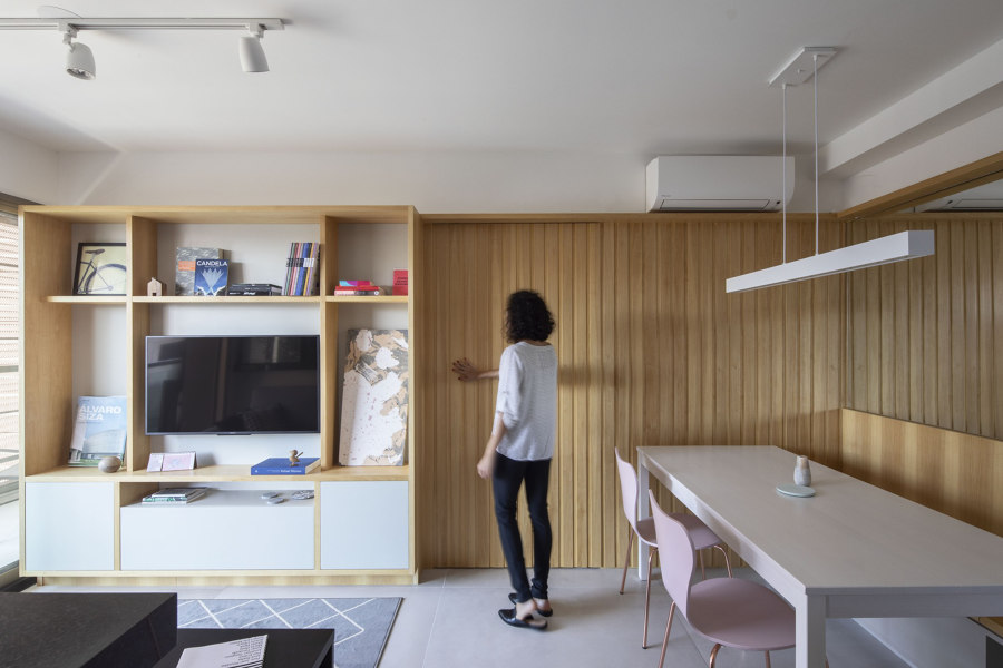
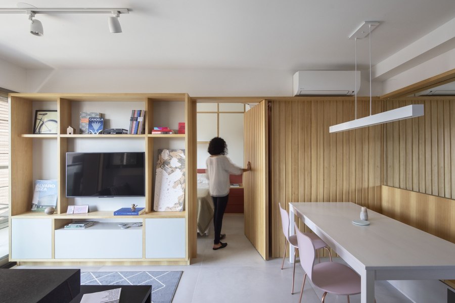
Linear wood panelling at the Ortho Apartment by Fabrica Arquitetos allowed the architects to hide a secret door. Photo: Pedro Napolitano

Linear wood panelling at the Ortho Apartment by Fabrica Arquitetos allowed the architects to hide a secret door. Photo: Pedro Napolitano
×Panelling that hides many sins
By installing wood panelling along a small section of wall at the Ortho Apartment in Brazil, TAU Arquitectos shows how the beauty of the natural material can command the stage all by itself, needing no additions or amendments. By selecting panelling with a simple linear pattern, meanwhile, the wall is able to seamlessly hide an invisible pivot door.
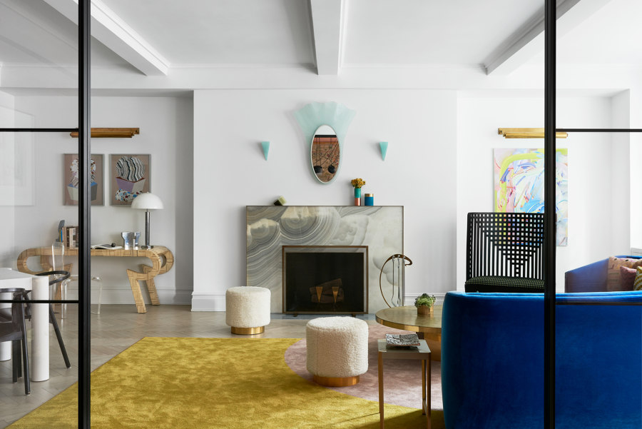
Wall lights at the Park Avenue Prewar Apartment bring together the art deco wallscape (top), and spotlights paint the panelling at The Curated Home (bottom). Photos: Brooke Holm (top), Tim Crocker (bottom)

Wall lights at the Park Avenue Prewar Apartment bring together the art deco wallscape (top), and spotlights paint the panelling at The Curated Home (bottom). Photos: Brooke Holm (top), Tim Crocker (bottom)
×Wall lighting that makes an impact
Wall lights can be chosen to match or contrast with any interior style, colour or material palette. The Park Avenue Prewar Apartment, for example, by MKCA, uses different shapes, sizes and ranges of wall lights as small but important parts of the design. Even when the products themselves stay out of the way, meanwhile, the effect can be used to paint the walls – like on this long stretch of panelling in The Curated Home by Mustard Architects.
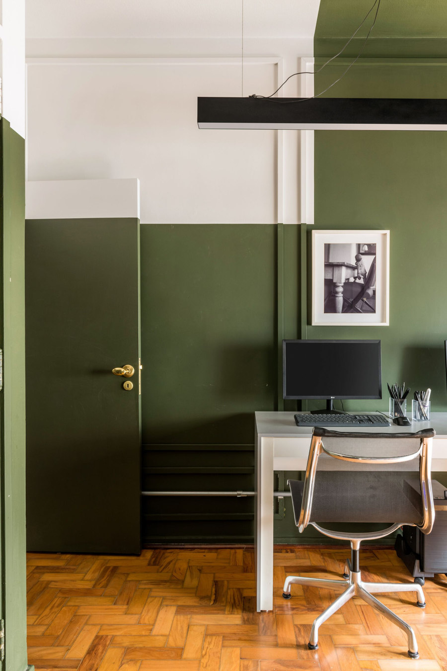
Bold cuts of contrasting paint colours graphically define the walls at the Pauliceia Apartment by Ricardo Abreu Arquitetos. Photos: Renato Navarro

Bold cuts of contrasting paint colours graphically define the walls at the Pauliceia Apartment by Ricardo Abreu Arquitetos. Photos: Renato Navarro
×Transitioning with colour contrast
Although walls might need a little help to stand out, if space is minimal, this doesn’t always need to be achieved by fixing products to them. At the Paulicéia Apartment in Brazil, by Ricardo Abreu Arquitetos, highly contrasting colours are painted together to cut through the surface in unexpected routes, often surprising and challenging by doing so through doors and panelling.
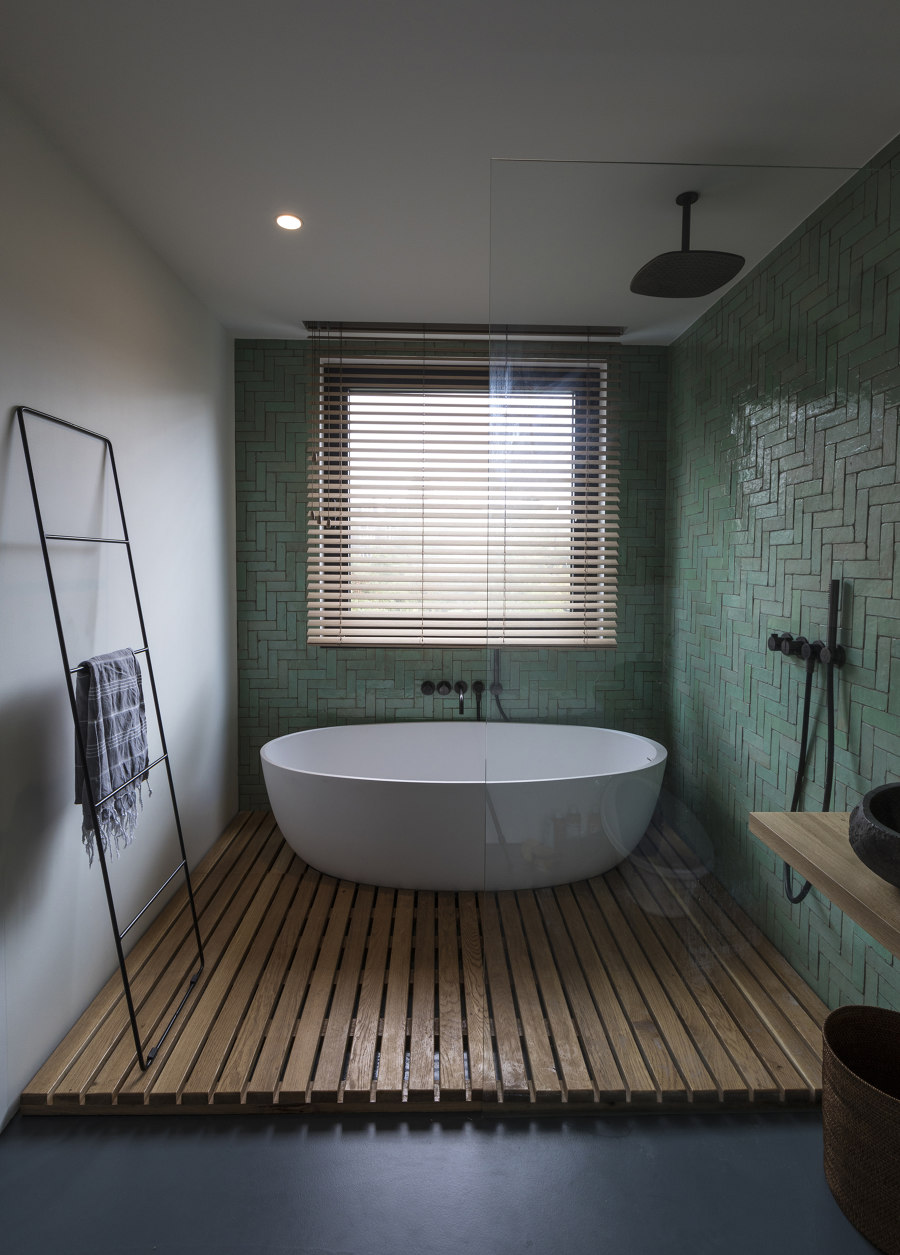
The straight-lined herringbone pattern of the Frans Hasstraat bathroom is all the decoration the bath and shower walls need. Photo: Luuk Smits

The straight-lined herringbone pattern of the Frans Hasstraat bathroom is all the decoration the bath and shower walls need. Photo: Luuk Smits
×Hygienic patterning
For high moisture and food preparation areas like bathrooms and kitchens, it’s harder to find suitable wall-hung products to bring them to life, while also staying safe from water or food damage. But medium-sized tiles that allow near-infinite patterns, such as the green vertical herringbone applied at the Frans Halsstraat apartment in The Netherlands, by Cantero Architecture, allow for creatively individual patterning.
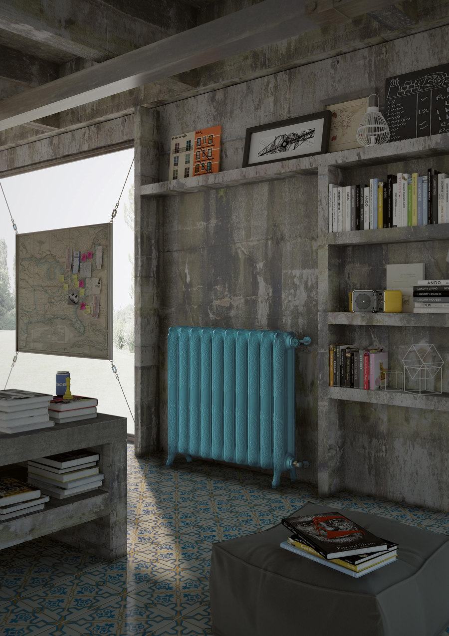
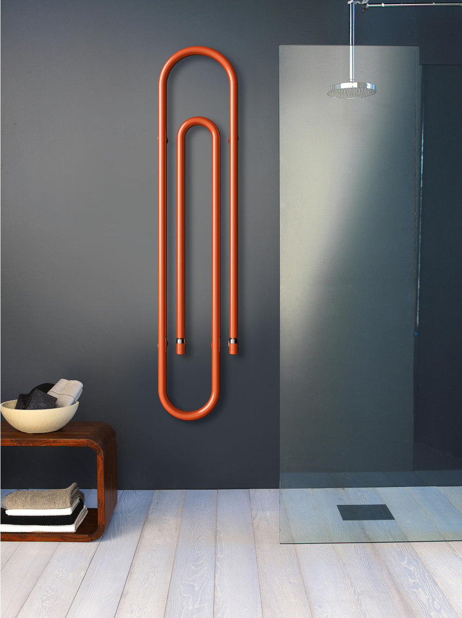
Colourful cast-iron Tiffany radiators from Scirocco add impact to the traditional design (top), while the brand’s sculptural Graffe radiators (bottom) sit like artwork on the wall

Colourful cast-iron Tiffany radiators from Scirocco add impact to the traditional design (top), while the brand’s sculptural Graffe radiators (bottom) sit like artwork on the wall
×Colourful designer radiators, tall or short
Traditionally, radiators tend to obstruct the design of a wall, rather than enhance it, with many hidden behind covers. The industrial look of a cast iron radiator such as Tiffany from Scirocco H, however, is very much in-line with modern design aesthetics. And with more sizes, shapes, colours and orientations now readily available, radiators like Scirocco H’s Graffe can use their colourful, sculptural qualities to warm up walls anywhere.
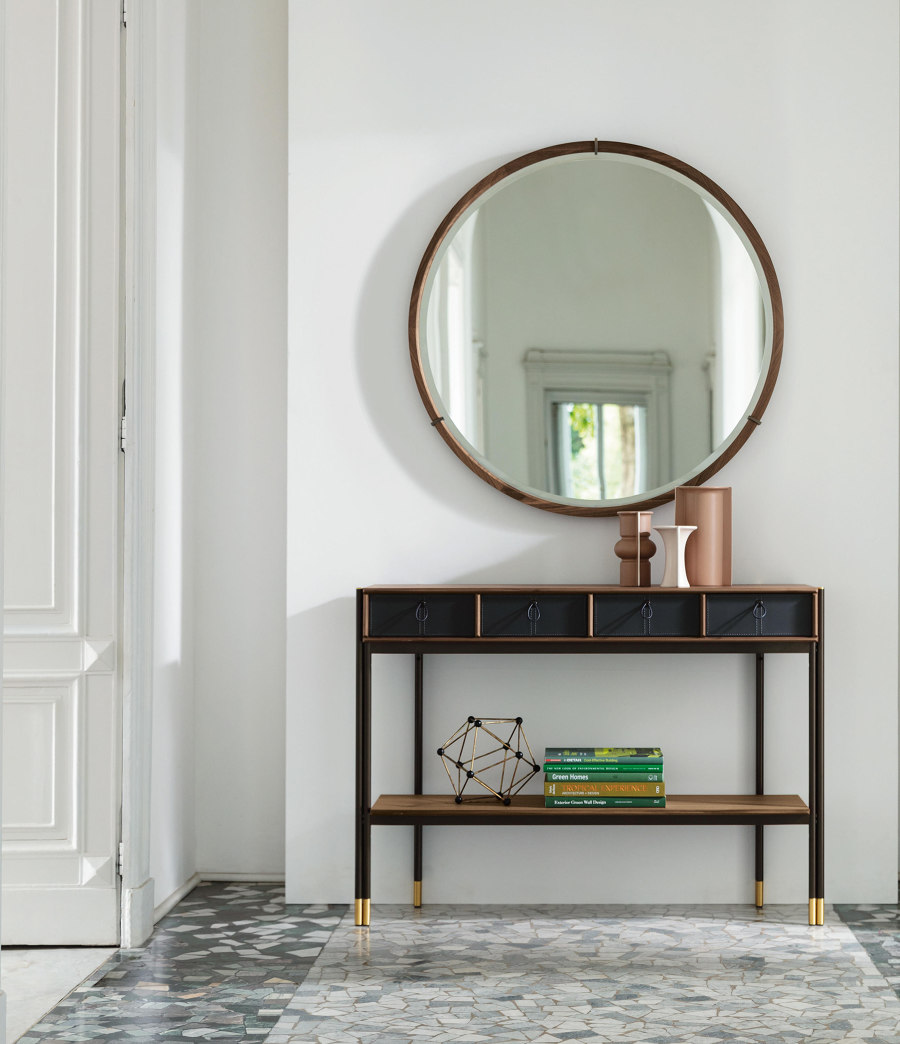
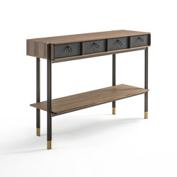
Slim console tables such as Bayus 8 from Porada bring extra storage space to low wall spaces recently vacated by radiators

Slim console tables such as Bayus 8 from Porada bring extra storage space to low wall spaces recently vacated by radiators
×Radiator-replacing console tables
With the way we heat our homes changing rapidly under the sustainable energy revolution, homes without any radiators at all are becoming more common. All of a sudden, we have this bare space we need to decide what to do with. Slim console tables are often the perfect replacement for radiators, especially in narrow spaces like hallways. If you have a little bit of width, however, tables that boost the home’s storage capacity, like Porada’s Bayus 8 console table, are always useful.
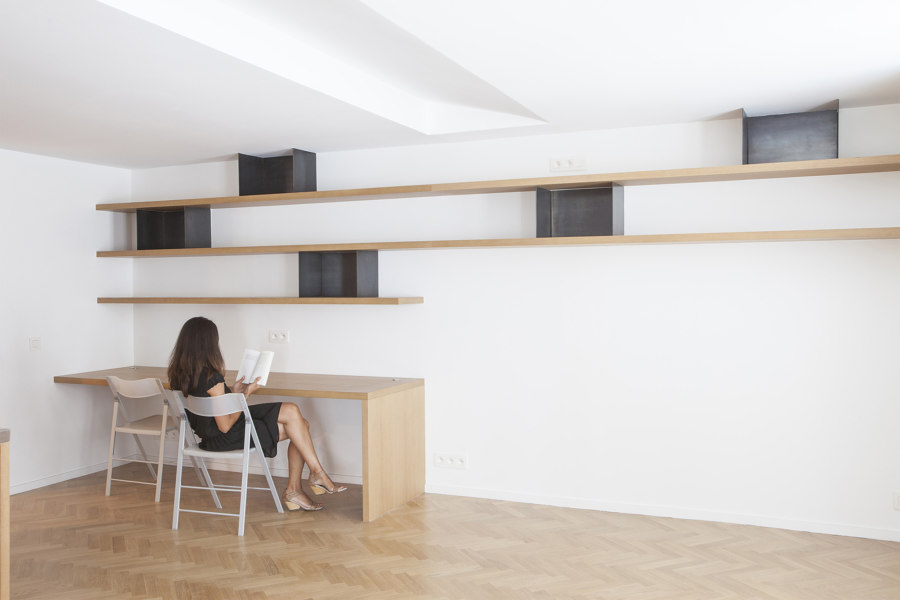
Useful shelving is littered throughout the Flat Renovation For a Photographer project by Alia Bengana, giving the owner freedom to change the decor with ease. Photo: V.Vincenzo

Useful shelving is littered throughout the Flat Renovation For a Photographer project by Alia Bengana, giving the owner freedom to change the decor with ease. Photo: V.Vincenzo
×Open shelves bring customisable decorative opportunities
At the Flat Renovation For a Photographer project by architects Alia Bengana, load-bearing walls connecting the separate rooms made major structural changes an impossibility. But walls also bring opportunity, and in the small two-bedroom Parisian apartment, shelving brought with it extra storage space. By keeping shelves open, fickle or changing residents are able to alter the decor however they wish.
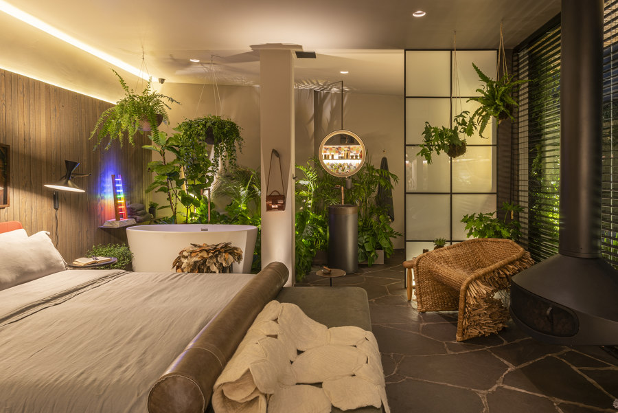
Hanging baskets add depth at the Urban Cabin (top), while The Ryokan Manly House adds meditative greenery (middle, bottom). Photos: Victor Affaro (top), Never Too Small | Nam Tran (middle, bottom)

Hanging baskets add depth at the Urban Cabin (top), while The Ryokan Manly House adds meditative greenery (middle, bottom). Photos: Victor Affaro (top), Never Too Small | Nam Tran (middle, bottom)
×Give plants a place to hang
With an extra flat surface, both open shelving and console tables are perfect homes for house plants to energise walls. But even without a surface to sit on, plant life can still enhance a room. With no standing room required, hanging house plants such as those at the Urban Cabin by Studio Marcio Michaluá are used to add depth to the wall in the humidity of the shared bathroom/bedroom space. While at the Ryokan Manly House by Dform Project, the zero-maintenance living wall and wall-fixed bonsai tree both add a mediative feel without touching the floor.
Even simple graphic prints like these at La Vida Residential Building by Todos Arquitetura can transform the rest of the wall into a complementary frame. Photo: Alexandre Disaro

Even simple graphic prints like these at La Vida Residential Building by Todos Arquitetura can transform the rest of the wall into a complementary frame. Photo: Alexandre Disaro
×Framed artwork frames the space
Filling homes with artwork isn’t only for superrich collectors of Monets and Kandinskys, and it’s not always about the piece of art itself. By using a framed print, a wall can become as colourful and enigmatic as you like, striking all who enter the room and willing them towards it. But even simpler graphic prints like those at La Vida Residential Building by Todos Arquitetura, when sized and framed correctly for the right space, can frame the wall around them.
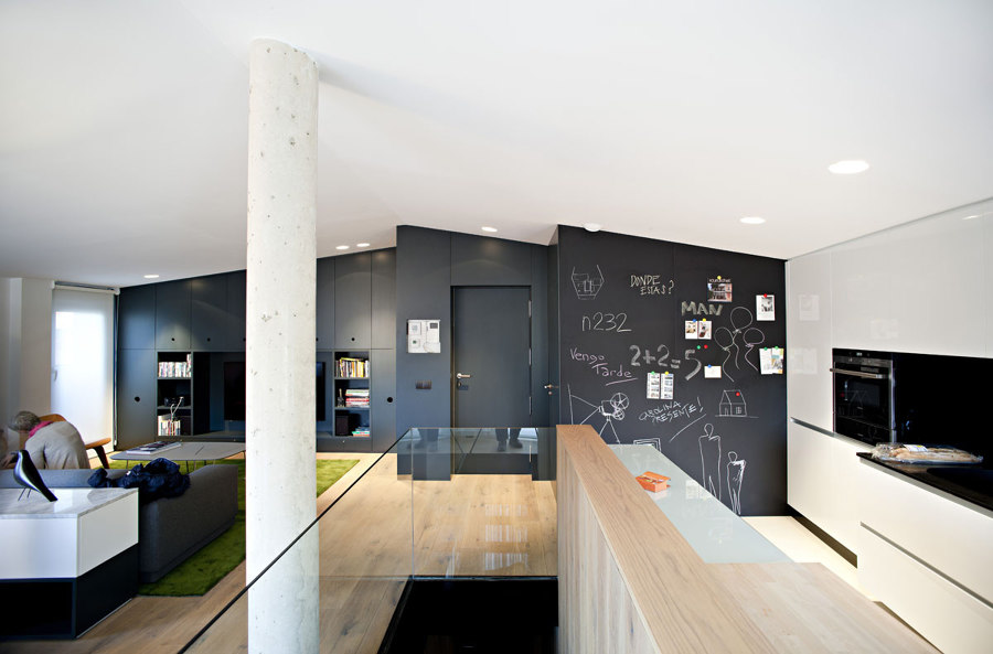
Chalkboard is an extremely simple method of adding personality and interaction to a wall, while providing a functional message board for busy homes. And it’s fun too. Photo: n232 Arquitectura

Chalkboard is an extremely simple method of adding personality and interaction to a wall, while providing a functional message board for busy homes. And it’s fun too. Photo: n232 Arquitectura
×Break the rules and write on the wall
Instead of hanging someone else’s artwork to bring a wall together, however, why not try drawing on the wall yourself? Chalkboard paint is an extremely simple way to add a smart feature wall that begs to be stamped with creativity. As seen at the 0710 Duplex PZG apartment by n232 Arquitectura, a chalkboard wall provides busy households with a functional message board and brings an instant smile by encouraging the childlike nature in all of us to break the rules, and write on the wall.
© Architonic
Head to the Architonic Magazine for more insights on the latest products, trends and practices in architecture and design, or find inspiration in a whole world of projects from around the globe through ArchDaily's architecture catalogue.
