Architonic projects of the year 2022: Hospitality
Text by James Wormald
14.12.22
Here’s a look back at the five most popular new hospitality spaces worth calling the babysitter for in 2022.
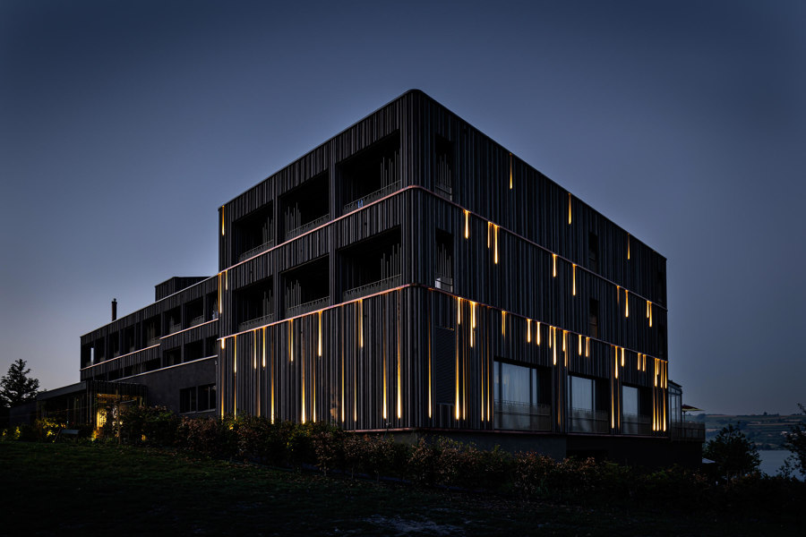
The redesign of the Sonne Seehotel in Eich, Switzerland, is inspired by the wonders of the universe, and features a lit-up facade that echos a meteor shower. Photo: Jochen Splett

The redesign of the Sonne Seehotel in Eich, Switzerland, is inspired by the wonders of the universe, and features a lit-up facade that echos a meteor shower. Photo: Jochen Splett
×It’s that time of year again, time to don the sparkles and sequins, hide the annual bonus spreadsheet print-out and structurally reinforce the photocopier, because it’s office party season. HR teams with more sense, however, may prefer to hold their festive ‘do’ on neutral ground. As thoughts turn to bars, restaurants and other suitable venues for office parties and other annual get-togethers, here’s a look back at some of the most popular new hospitality projects to arrive on the Architonic shores over the past year.
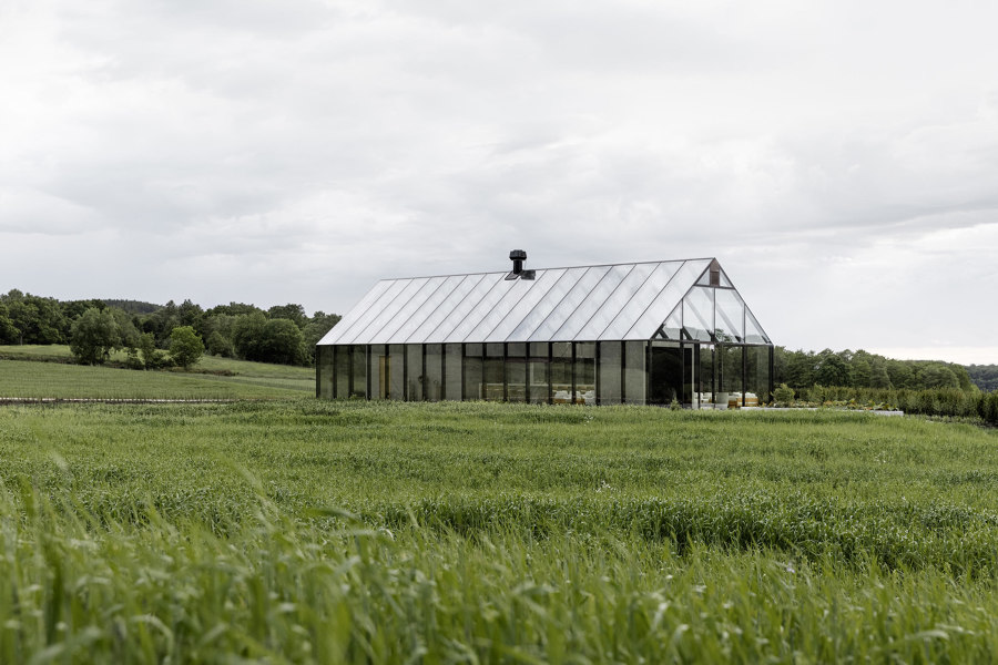
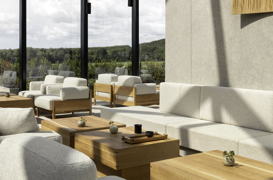
The ÄNG Restaurant puts diners in the centre of an all-glass structure to keep them connected to the world outside, and the origins of their meal. Photos: Norm Architects & Jonas Bjerre-Poulsen

The ÄNG Restaurant puts diners in the centre of an all-glass structure to keep them connected to the world outside, and the origins of their meal. Photos: Norm Architects & Jonas Bjerre-Poulsen
×ÄNG Restaurant in Astad Vingard, Sweden, by Norm Architects
The Michelin-starred ÄNG Restaurant is more than just a dining experience. It’s one that captures the entire body’s senses and takes them on a journey of discovery and wonder. ‘The experience of ÄNG starts even before you step inside,’ explains Norm Architects of the space. ‘Closing in on the glass house, a small herb garden out front discloses the local touch and approach to the culinary experience you’re about to have.’
With a 19-course, haute-cuisine experience to get through, diners can spend 4-5 hours in the space. With solid wood furniture from Karimoku, visitors can enjoy its ‘visible woodworking details and soft upholstery, while still having a feeling of sitting in the middle of the field,’ and also feeling ever more connected to the environment due to the changing light, both inside and out.
_____________________________________
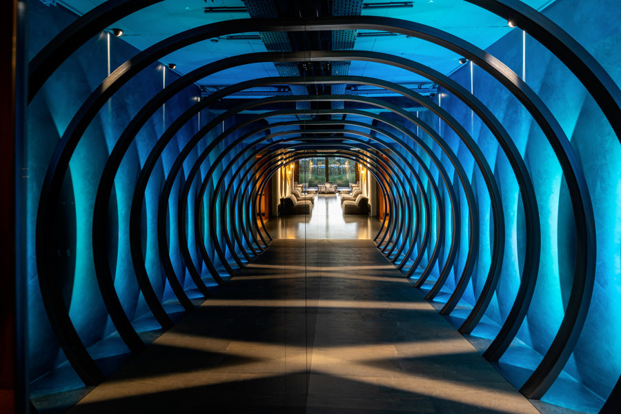
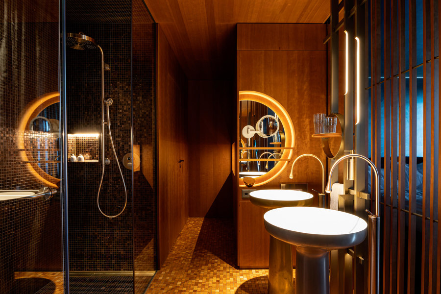
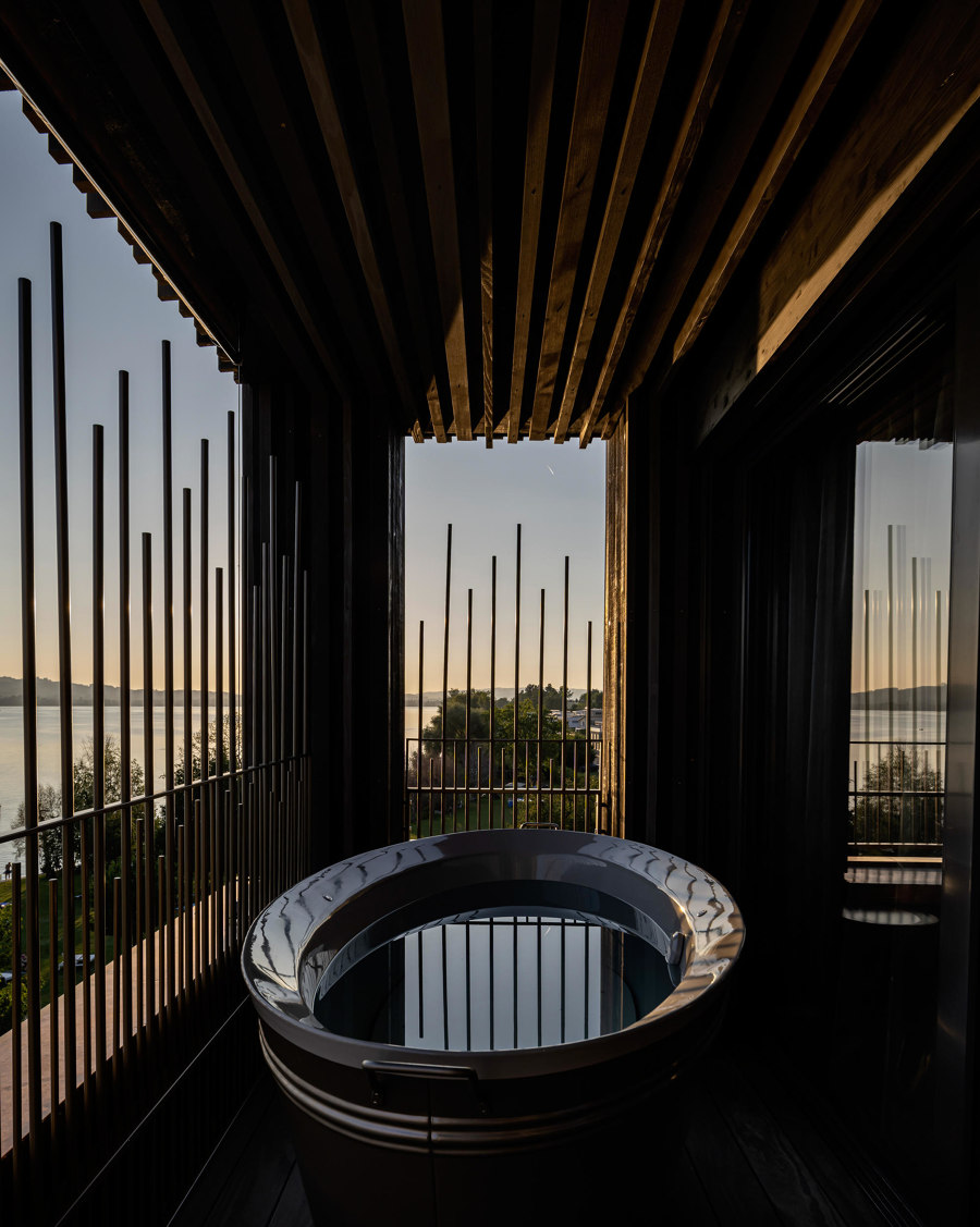
The Sonne Seehotel’s affinity with the artwork of space created a ‘time tunnel’ (top), unique rooms (middle) and private bathrooms overlooking Lake Sempach. Photos: Jochen Splett

The Sonne Seehotel’s affinity with the artwork of space created a ‘time tunnel’ (top), unique rooms (middle) and private bathrooms overlooking Lake Sempach. Photos: Jochen Splett
×Sonne Seehotel in Eich, Switzerland, by Atelier ushitamborriello Innenarchitektur_Szenenbild
Tasked with extending and refurbishing the Sonne Seehotel on the edge of Lake Sempach, Atelier ushitamborriello Innenarchitektur_Szenenbild were inspired firstly by the effect of sunlight on the hotel’s interior. ‘The hotel is bathed in sunlight reflected on the water from sunrise to sunset,’ they explain.
Meanwhile, ‘the client’s vision of expanding the Sonne to its context in the universe opened up new design horizons,’ including ‘shimmering galaxies, floating in a blue-black orbit and letting ourselves drift into new imaginary worlds,’ as the architects put it.
_____________________________________
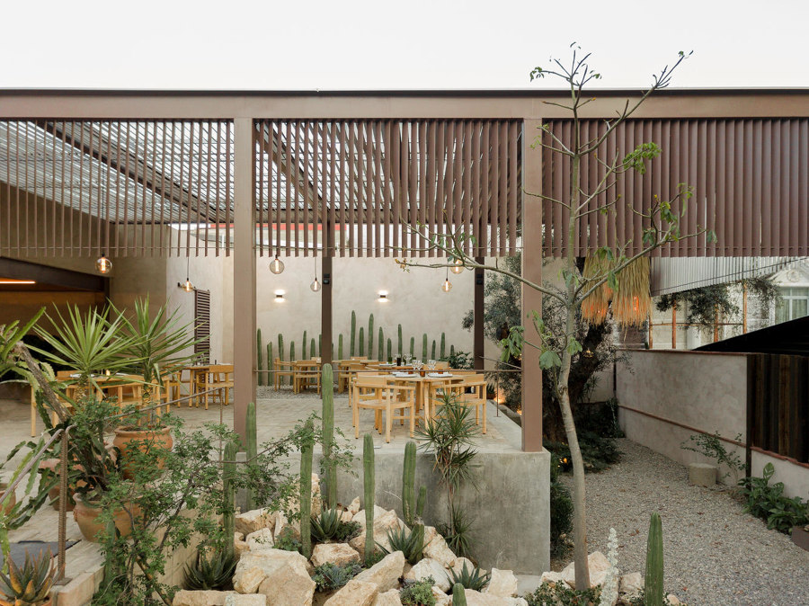
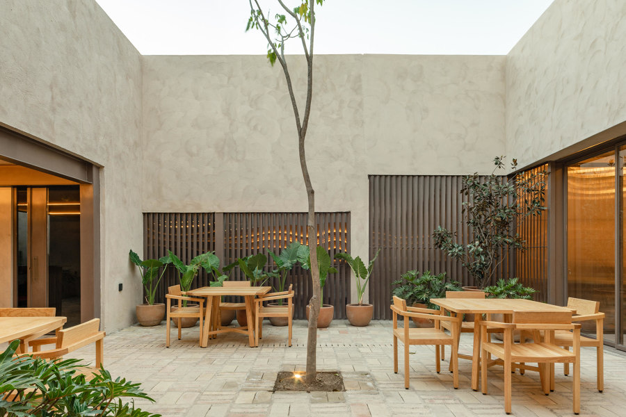
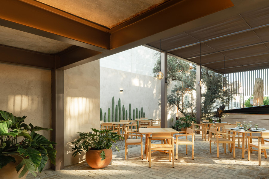
The preservation of traditional Oaxacan architecture at the Moza’be restaurant also saved a 100-year-old olive tree and provided cross-ventilated dining areas, too. Photos: Amy Bello

The preservation of traditional Oaxacan architecture at the Moza’be restaurant also saved a 100-year-old olive tree and provided cross-ventilated dining areas, too. Photos: Amy Bello
×Moza’be restaurant in Oaxaca, Mexico, by Espacio 18 Arquitectura
Considerate redevelopment helped the Moza’be restaurant to successfully transform an upscale old painting factory into a dining experience that makes Oaxaca culture the hero. ‘The property had built spaces that generated a large free area and a central patio, which we kept at the heart of the project since it refers to Oaxacan colonial architecture,’ say project architects Espacio 18 Arquitectura, introducing the concept – a powerful example being a steel roof built around a 100-year-old olive tree. Along with the preservation of architecture and culture, the resulting open spaces that remain ‘help maintain cross ventilation throughout the year, responding to the current world situation.’
________________________________________
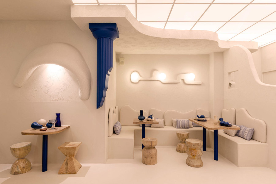
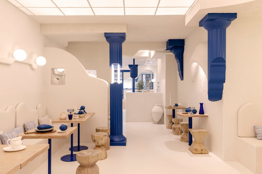
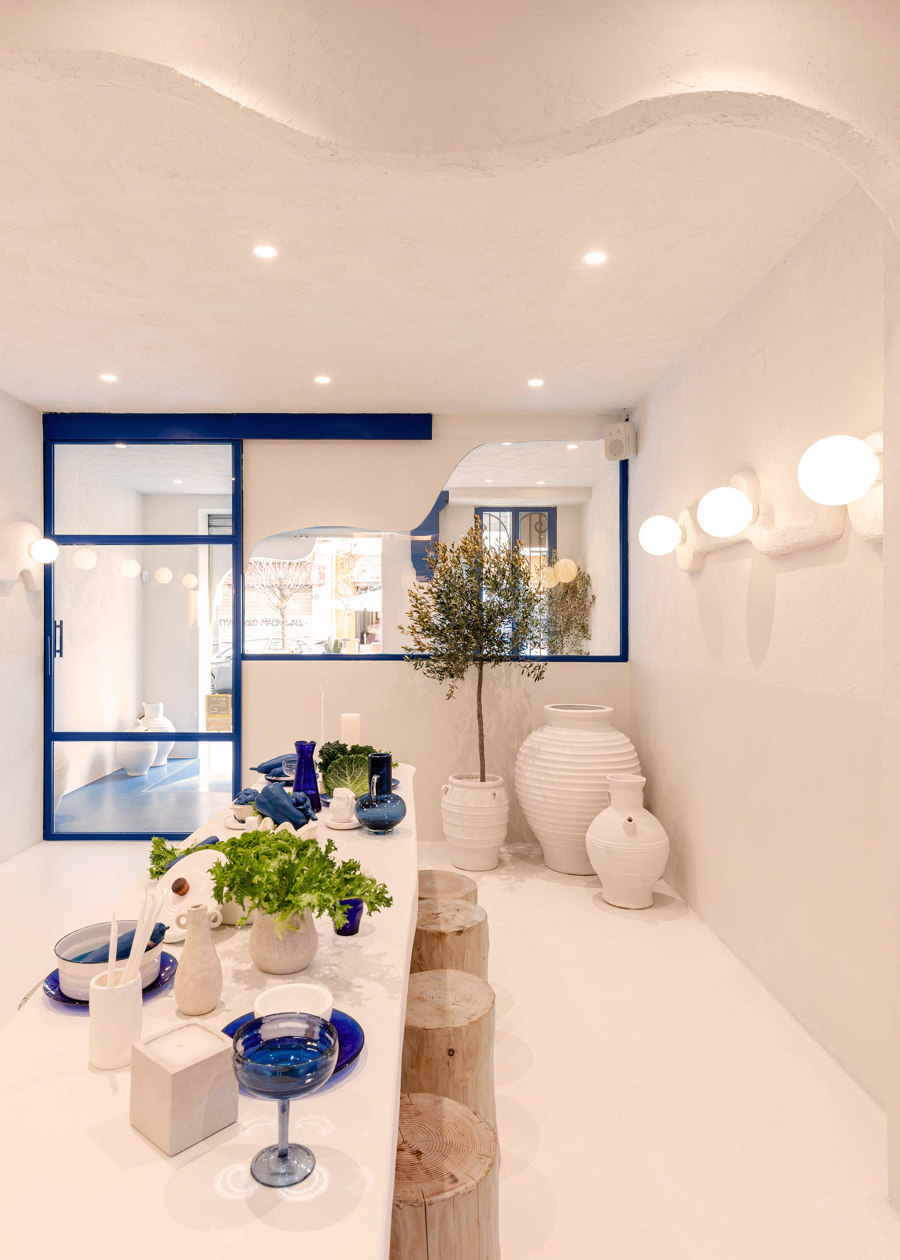
Masquespacio filled the Egeo restaurant’s brief to modernise their Greek identity with contrasting blue and cream interiors, with stylised ancient ruins. Photos: Sebastian Erras

Masquespacio filled the Egeo restaurant’s brief to modernise their Greek identity with contrasting blue and cream interiors, with stylised ancient ruins. Photos: Sebastian Erras
×Egeo in Valencia, Spain, by Masquespacio
Interior design studio Masquespacio was tasked by Egeo, a Greek restaurant brand with a blue-on-white identity, to create their first dining space in Valencia. ‘The most stand-out element of the design,’ as described by the studio, ‘is a series of Greek columns in a deteriorated state, painted in blue.’ The contrasting modern and classical architecture, complemented by the contrasting colour scheme of dark blue columns and door frames alongside textured cream plasterwork, creates a stylised version of ancient Greek ruins. One which represents the essence of Greek architecture.
_____________________________________
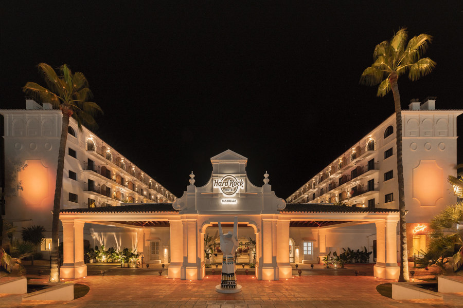
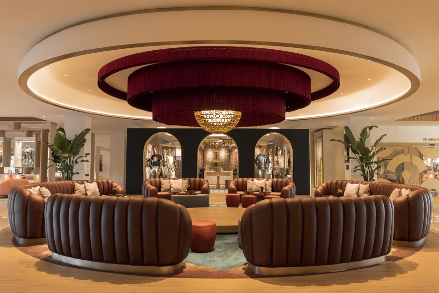
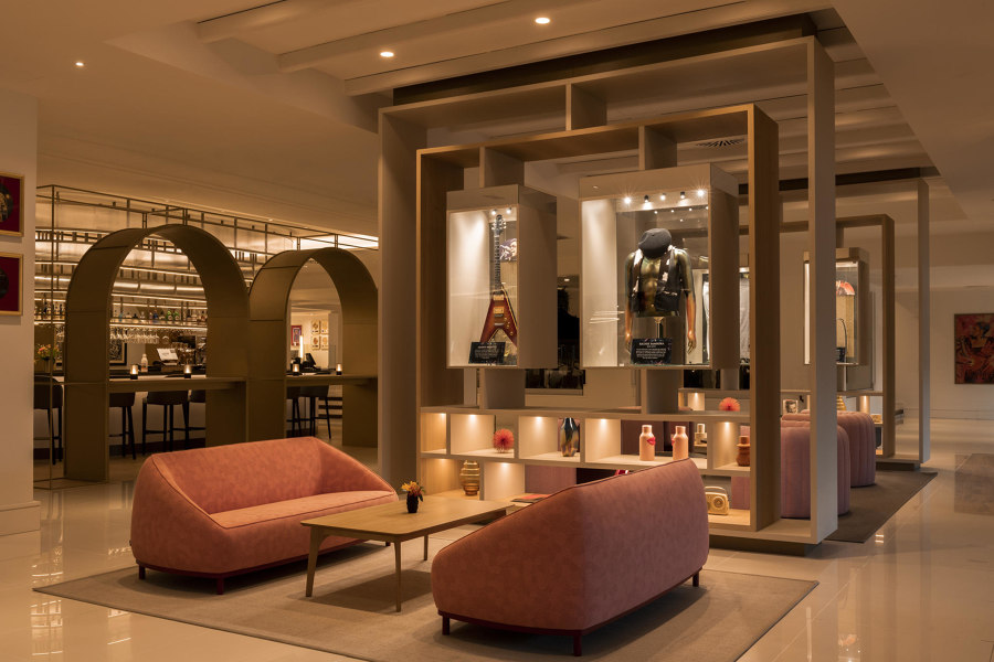
The Hard Rock Hotel Marbella (top) is filled with rock-themed memorabilia and design, including the ‘Unplugged Stage’ (middle) and ‘Box of Rock Curiosities’ lounge (bottom). Photos: Jose Salto

The Hard Rock Hotel Marbella (top) is filled with rock-themed memorabilia and design, including the ‘Unplugged Stage’ (middle) and ‘Box of Rock Curiosities’ lounge (bottom). Photos: Jose Salto
×Hard Rock Hotel Marbella in Malaga, Spain, by Studio Gronda
Mixing a strong sense of southern Spanish culture with the hospitality brand’s customary ‘rock’ theme, the Hard Rock Hotel Marbella combines a decor filled with customary rock industry memorabilia and iconic symbolism with a traditional local material and architectural palette.
‘The design is based on the combination of brand attributes (passionate, irreverent, authentic and unpredictable design) with local and cultural attributes (traditional Andalusian architecture, the works of Picasso, local ceramics and flamenco)’ describe architects Studio Gronda. 'Each space invokes a unique experience through this combination of traditional elements with a modern and contemporary overlay that assists in incorporating the memorabilia, an essential part of the brand.’
______________________________________________
© Architonic
Head to the Architonic Magazine for more insights on the latest products, trends and practices in architecture and design.
