Back to black: dark kitchens that help outline open interiors
Text by James Wormald
16.05.22
The architects of these four projects used monochrome colour and material palettes to clearly define kitchen spaces in open-plan layouts. Here’s how.
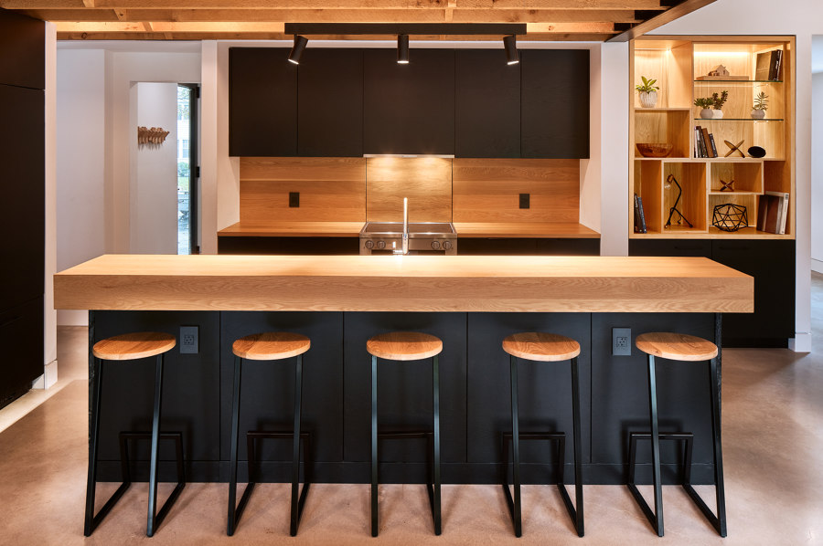
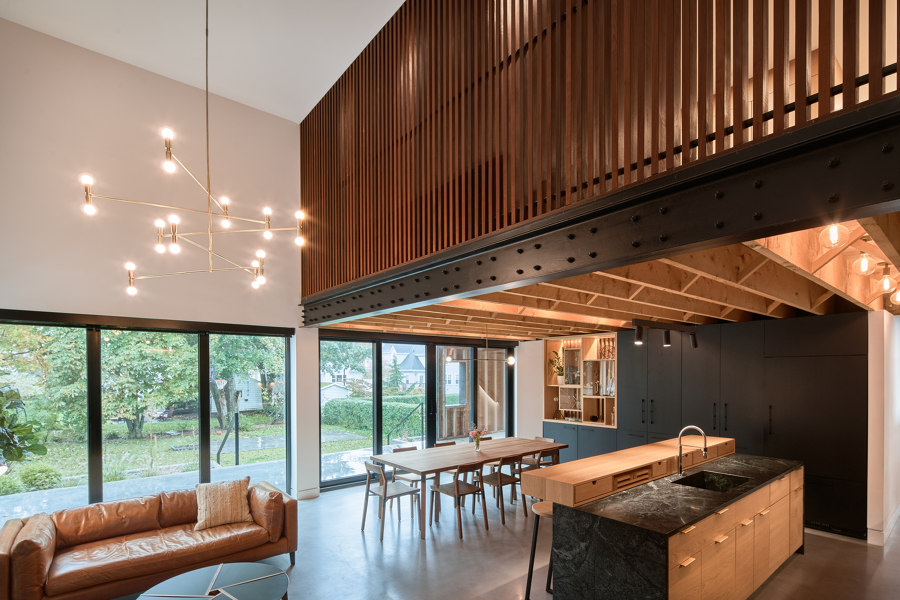
The dark Armcrescent Residence kitchen combines black cabinetry with warm, custom-fabricated wooden elements. Photo: Julian Parkinson

The dark Armcrescent Residence kitchen combines black cabinetry with warm, custom-fabricated wooden elements. Photo: Julian Parkinson
×As a first-choice destination for recently-risen and -returning inhabitants, kitchens are the lifeblood of any home. They’re spaces for communal calendars, incremental to-do lists and possibly-important-key drawers, where all household tasks are, if not completed within its four walls, surveyed and audited. But what if the kitchen doesn’t have four walls?
Kitchens in open interiors have an expanded visual and physical connection with their surroundings
Kitchens in open interiors have an expanded visual and physical connection with their surroundings, but to perform as the home’s organisational epicentre, they must also be properly defined within the layout. By combining natural light and materials with monochrome colour schemes, dark, open kitchen spaces outline and identify the spatial typology while retaining their warmth and attraction.
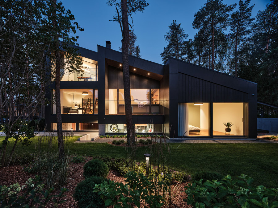
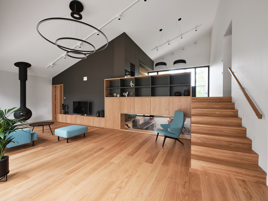
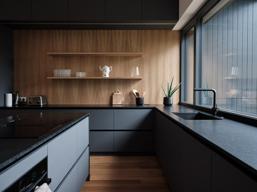
The House for a Family and Bikes is split across five separate levels, keeping the home visually and physically connected to the identifiable dark kitchen (bottom). Photos: Tõnu Tunnel

The House for a Family and Bikes is split across five separate levels, keeping the home visually and physically connected to the identifiable dark kitchen (bottom). Photos: Tõnu Tunnel
×House for a Family and Bikes by AZIA Architektid, Tallinn, Estonia
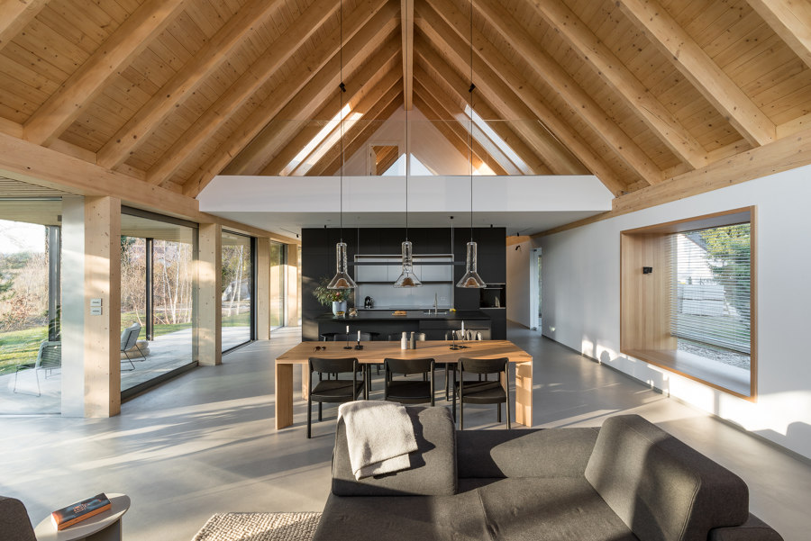
Sitting at the centre of this home’s layout, and the top of its hierarchy, the dark kitchen of House for a Family and Bikes is all-knowing and all-powerful. ‘Elevated from the living room by an airy flight of stairs, one can get a panoramic overview of the garden suburb vibe on one side, and at the same time keep an eye on the happenings in the living room’ explains the architects, AZIA Architektid.
By mixing dark black countertops and cabinetry in the kitchen with a neighbouring black wall in the living space, the kitchen zone itself is centred in the complex architecture of the split-level home. By filling the kitchen with light via a wall-to-wall window on one side and obstruction-free double-height living space on the other, the home’s black kitchen is kept surprisingly light.
The Ode to Nature House’s dark kitchen and stone fireplace wall bookend its cavernous, light-filled central living space. Photos: Przelysław Turlej

The Ode to Nature House’s dark kitchen and stone fireplace wall bookend its cavernous, light-filled central living space. Photos: Przelysław Turlej
×Ode to Nature House by Milwicz Architekci, Poznań, Poland
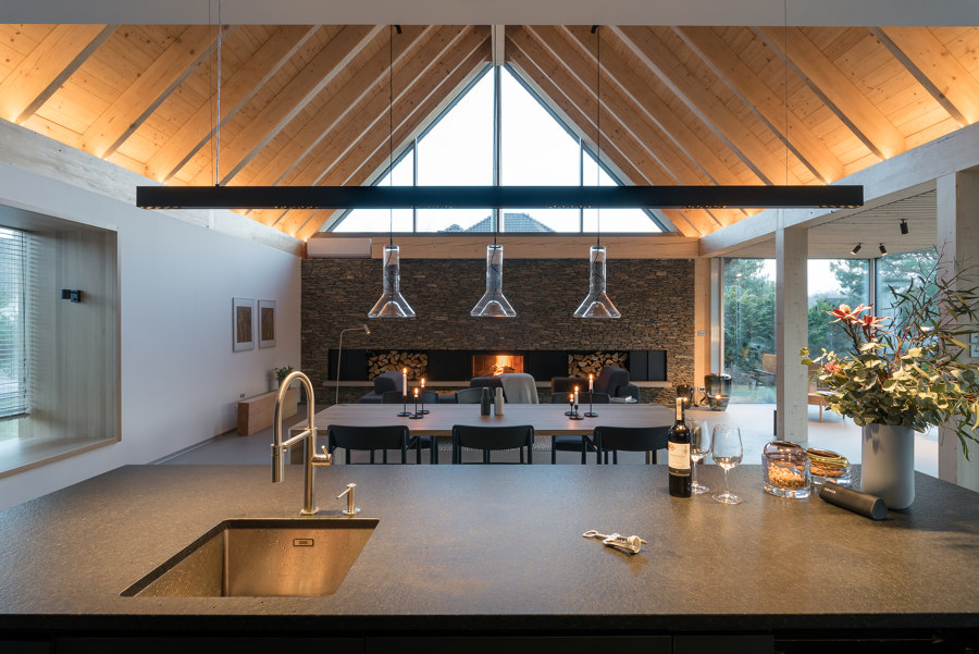
By installing natural light via floor-to-ceiling windows along the building’s entire west side as well as a south-facing glass gable, the visionaries behind the Ode to Nature House, Milwicz Architekci, have given themselves the freedom to also use a monochrome and natural wood colour scheme in the interior.
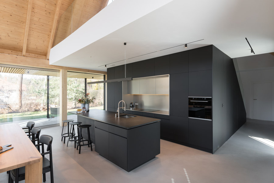
The home’s open living space is covered with a feature arched wood ceiling, illuminated to retain its colourful warmth in the evening, while the home’s central dark kitchen forms a gateway between the open living space and the private bedroom and bathroom areas behind. ‘A kitchen unit closes the box from the living side,’ states Milwicz Architekci, ‘It is consistently kept in dark tonality.’
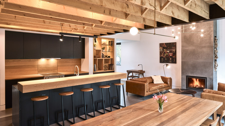
Armcrescent Residence’s contrasting chimney (top), slatted screen and hemlock rafters (middle) and warm feature kitchen (bottom). Photos: Peter Braithwaite (top), Julian Parkinson (middle, bottom)

Armcrescent Residence’s contrasting chimney (top), slatted screen and hemlock rafters (middle) and warm feature kitchen (bottom). Photos: Peter Braithwaite (top), Julian Parkinson (middle, bottom)
×Armcrescent Residence by Peter Braithwaite Studio, Halifax, Canada
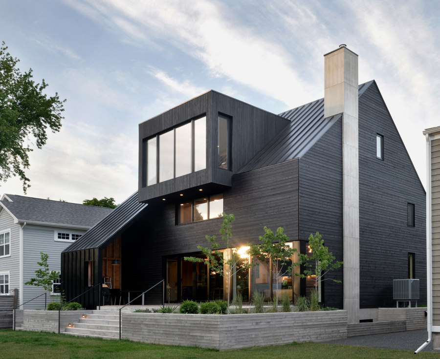
By keeping the majority of its mixed material exterior in dark tonality, meanwhile, Peter Braithwaite Studio’s Armcrescent Residence uses a contrasting concrete chimney to cut a dramatic line through its form, while restricted colour and material palettes similarly combine in the home’s interior with striking results.
Restricted colour and material palettes combine in the home’s interior with striking results
‘Materiality is used to create contrast within every space,’ explains Peter Braithwaite Studio, ‘Feature elements such as a slatted teak screen or cross-bridged rough-sawn hemlock rafters create a dynamic sweet and sour relationship.’ These wooden features frame a dark kitchen that uses the well-lit warmth of natural materials in custom-fabricated countertops and stool seats that invite users to sit, eat and converse together.
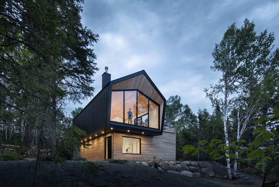
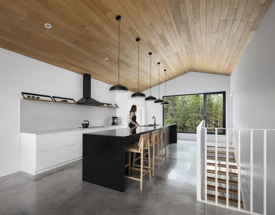
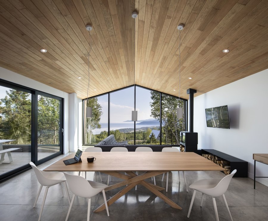
Le Littoral Residence’s well-balanced construction (top) with stand-out black Quebec granite kitchen island (middle) and gabled view from inside (bottom). Photos: Stéphane Brügger

Le Littoral Residence’s well-balanced construction (top) with stand-out black Quebec granite kitchen island (middle) and gabled view from inside (bottom). Photos: Stéphane Brügger
×Le Littoral Residence by Architecture49, La Malbaie, Canada
A neutral colour palette of black, white and natural wood surfaces is also a trademark of Architecture49’s work, the office behind the stunningly off-beat Le Littoral Residence. ‘The building, which is minimalist and easy to understand and live in, leaves plenty of room for users to express themselves.’ says Architecture49.
Each room is brought to life by combining those three tones. A warm wooden ceiling that covers the length of its top level and wooden bed cavities that comfort sleepers below join white blank canvas walls to present the home’s stand-out black features. For example, black window frames surround the epic views of Quebec’s internal shoreline, a black fireplace and log store invite residents to cosy up and a central kitchen island of black Quebec granite leaps away from the wall, encouraging residential gastronomes to perform on a culinary stage underneath black task lighting.
© Architonic
