Interior surfaces inspired by their exterior facades
Text by James Wormald
18.09.23
Continuing the merger of outdoor and indoor space in contemporary interiors, these projects match surfaces and materials inside and out, taking the lead from their own facades and further afield.
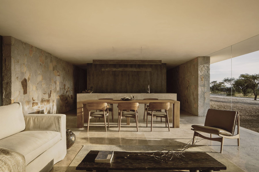
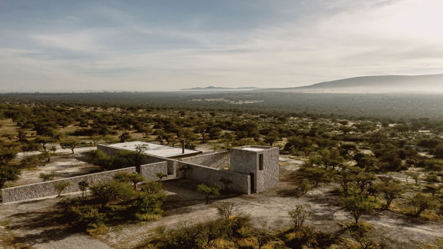
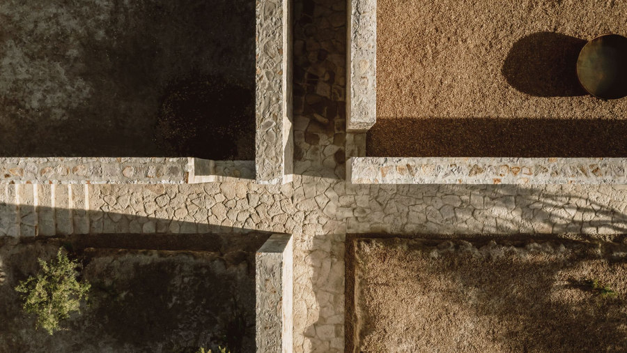
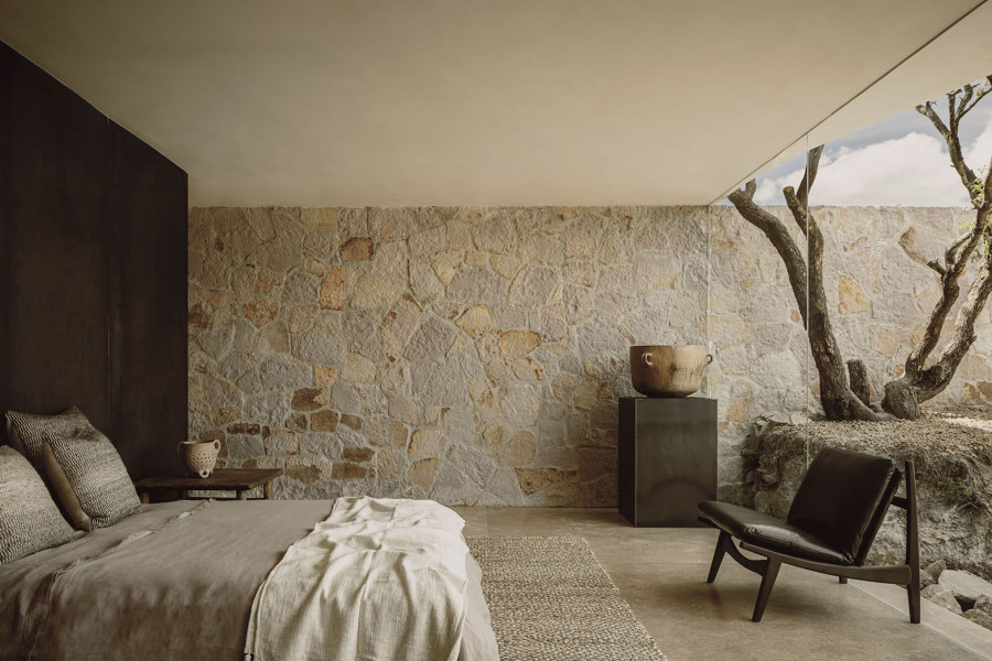
Casa Enso II in Morelia, near Guanajuato, Mexico, takes inspiration from the area’s connection to natural stone, with unchanged exterior walls cutting a path through the interior. Photo: Cesar Bejar

Casa Enso II in Morelia, near Guanajuato, Mexico, takes inspiration from the area’s connection to natural stone, with unchanged exterior walls cutting a path through the interior. Photo: Cesar Bejar
×The priority when it comes to a building’s exterior surface material is durability. Having to literally stand up to the tolls of rainwater, wind, sunlight, temperature fluctuations and many other weather conditions, we demand a lot of them. On the opposite side of the insulated coin, meanwhile, interior surfaces instead tend to prioritise their finish – with the characterful colour, pattern and texture of materials such as paints, ceramic tiles or wood panels.
Our external and internal environments continue to collide
Traditionally, these two worlds, exterior and interior, never need meet. Opposing requirements, it was thought, need opposing surfaces. But as our external and internal environments continue to collide into a singular typology of simply liveable space, more and more projects both large and small, commercial and private, are taking surface design inspiration from the outside world. Dragging the materials, themes and the history of facades inside. Here are four recent projects from the Architonic archive that do just that.
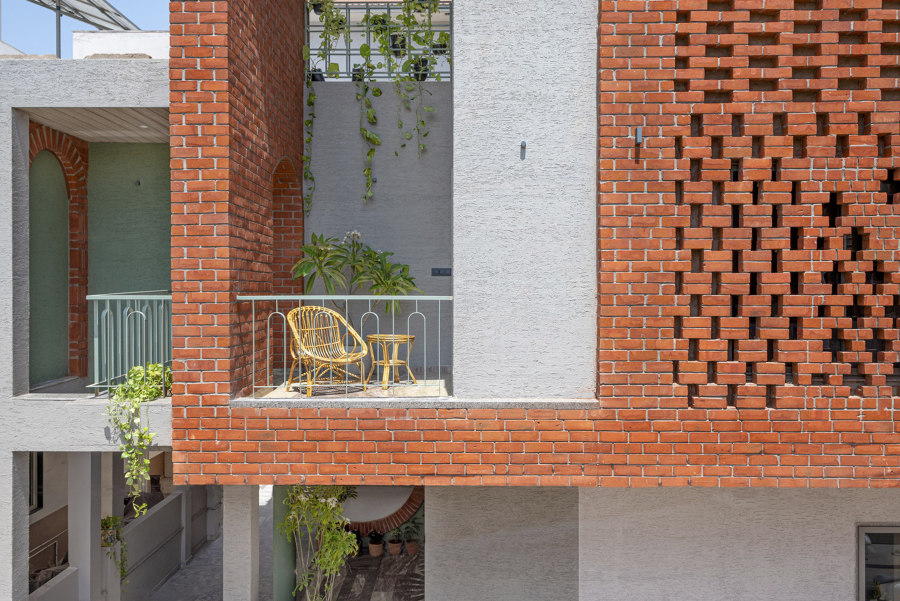
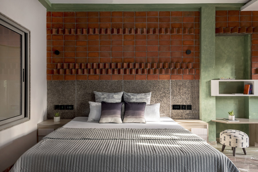
The perforated jali brick facade of this house in Vadodara, India, was so enticing, the client requested varying brickwork patterns to be spread across interior walls, too. Photos: 2613 apertures

The perforated jali brick facade of this house in Vadodara, India, was so enticing, the client requested varying brickwork patterns to be spread across interior walls, too. Photos: 2613 apertures
×Renovation of House in Vadodara, India, by Manoj Patel Design Studio
For the Renovation of this House in Vadodara, India, ‘the design brief had many memories attached from the client’s side,’ inform architects Manoj Patel Design Studio, ‘they wanted to experience contemporary modulations in the same space.’ In answer to this brief, the studio has taken the house’s red-bricked jali facade – the outstanding feature at the front of the property – and translated it into characterful brickwork patterns on many internal surfaces, too.
Using a variety of shapes, cuts and orientations of the standard brick form, the studio has ‘adorned brick craftsmanship with contrasting marble slits as a new way to orient materials for a backdrop,’ explains the architects, unleashing its creativity by pairing different brick patterns with other natural surface materials of wood, marble and concrete to continue the feel of the facade inside.
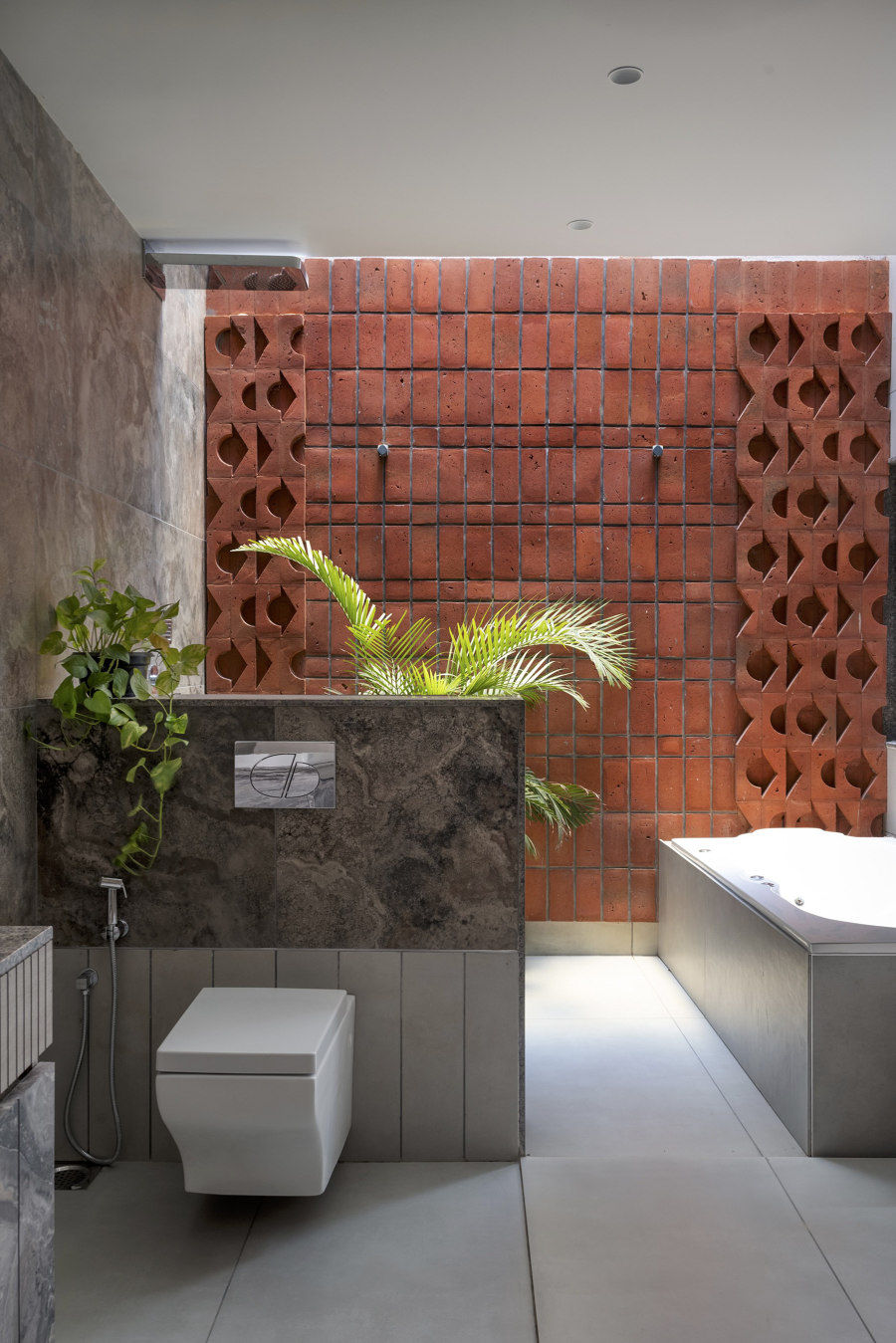
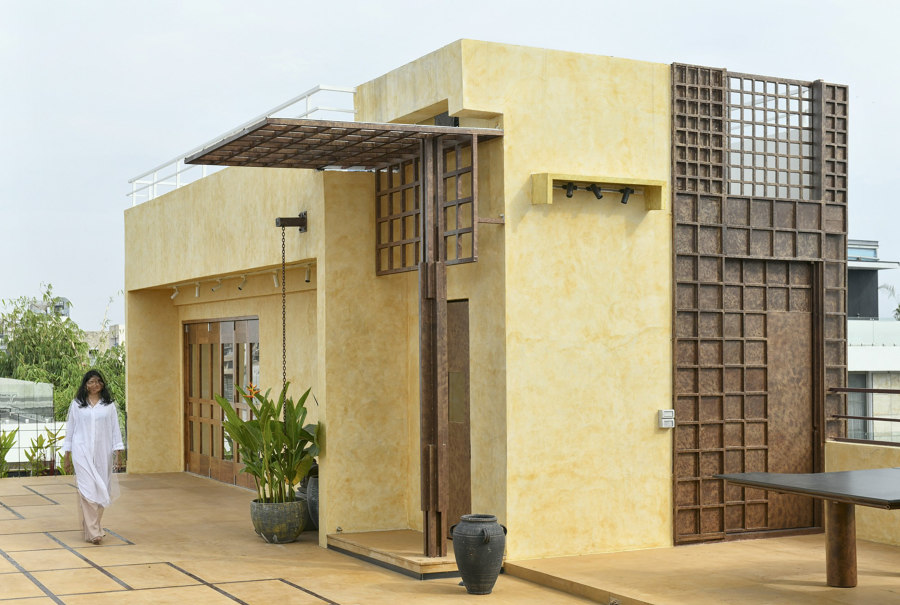
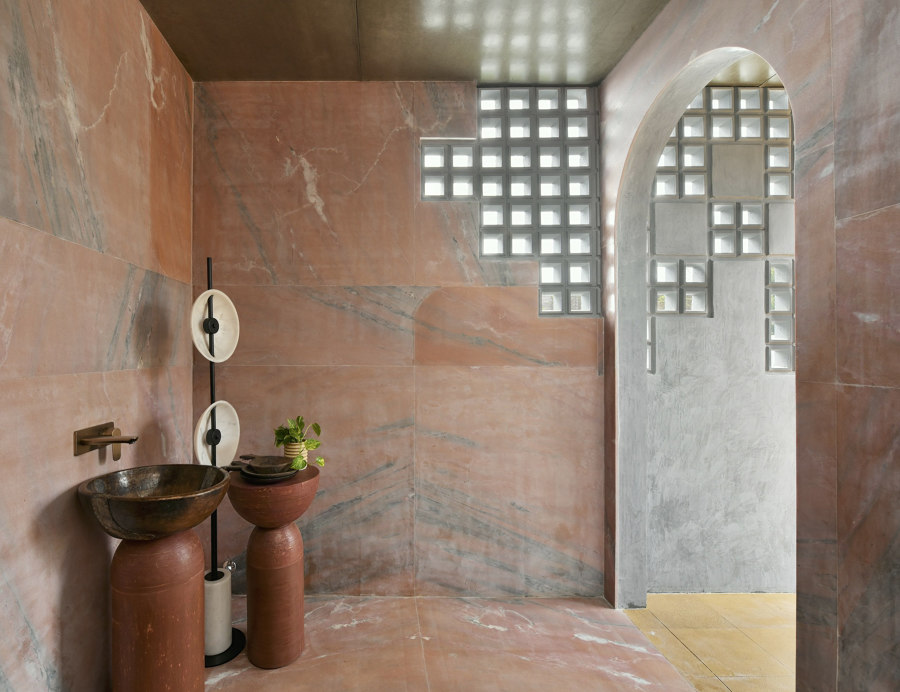
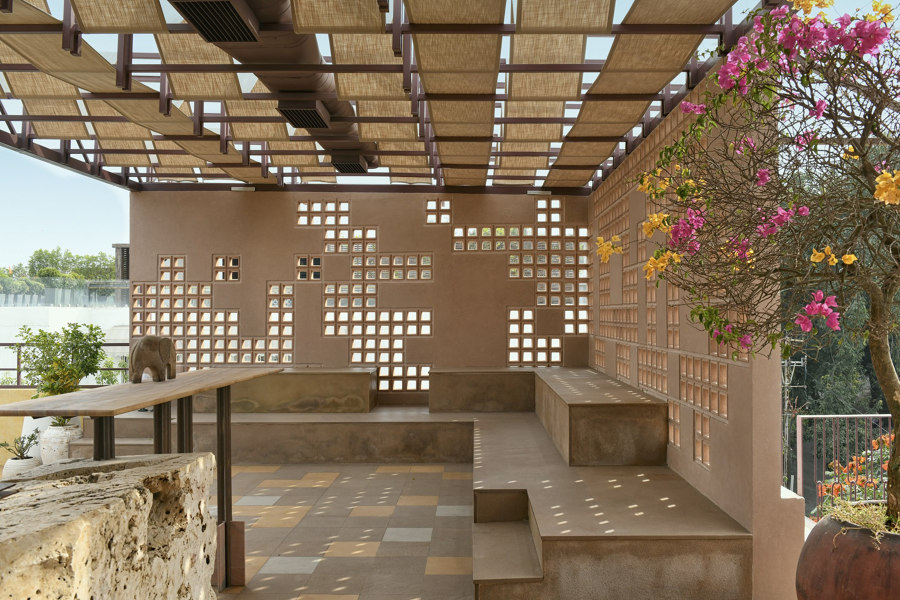
A rich material palette including metal, glass, marble, wood, linen, concrete and cane are all tied together at the Dusk House terrace with a grid pattern motif. Photos: Monika Sathe

A rich material palette including metal, glass, marble, wood, linen, concrete and cane are all tied together at the Dusk House terrace with a grid pattern motif. Photos: Monika Sathe
×Dusk House in Hyderabad, India, by naav studio
As opposed to an exterior facade that informs matching interior surfaces, the Dusk House roof terrace in Hyderabad, India, features continuing storylines of geometric patterning in a journey through the space. ‘The first challenge here,’ explain the architects naav studio, ‘is combining the distinctive design elements of the house and terrace.’
Storylines of geometric patterning continue in a journey through the space
Instead of limiting themselves to just a handful of materials, the studio has handpicked surfaces and finishes from a range of luxurious options including a steel-framed pergola topped with an opaque linen fabric that creates a recurring waffle pattern both high and low. The gridded motif continues on the pergola’s perforated walls and inside the rooftop’s interior spaces, too. The ‘crafted metal bathroom door is reminiscent of the woven design dialogue of the entrance,’ share the architects, as well as the glass block sections that cut into the pink marble bathroom walls, the yoga studio’s handwoven cane ceilings and flooring used throughout.
Two intersecting walls split Casa Enso II into quadrants, while three additional walls replicate their construction finish on the inside of the residence, connecting it to nature. Photos: Cesar Bejar

Two intersecting walls split Casa Enso II into quadrants, while three additional walls replicate their construction finish on the inside of the residence, connecting it to nature. Photos: Cesar Bejar
×Casa Enso II in Morelia, Mexico, by HW-STUDIO
‘In Guanajuato, Mexico,’ as HW-STUDIO introduces the nearby Casa Enso II project, ‘stone is an element deeply rooted in any form of cultural expression.’ And so the material palette chosen for the project was formed on this basis, as well as the depth and quality of locally available labour.
With the project’s land neatly separated by functionality into four quadrants including entrance, parking, residential and office, a cruciform plan of stone walls and pathways was formed both to connect them and keep them apart. Forcing a ‘permanent pilgrimage between,’ explain the architects, the four sections improve ‘contact with the earth, the air and the mountain, framing the landscape and forming a natural part of it.’ With the interior of the household only taking up a small portion of the entire area, the continuation of walls built from local stone makes the interior an important part of the journey.
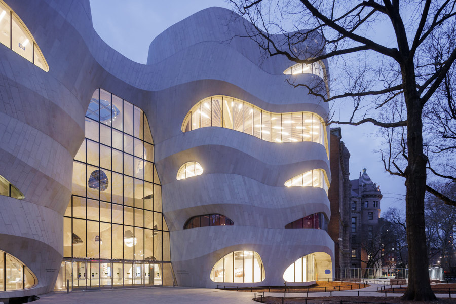
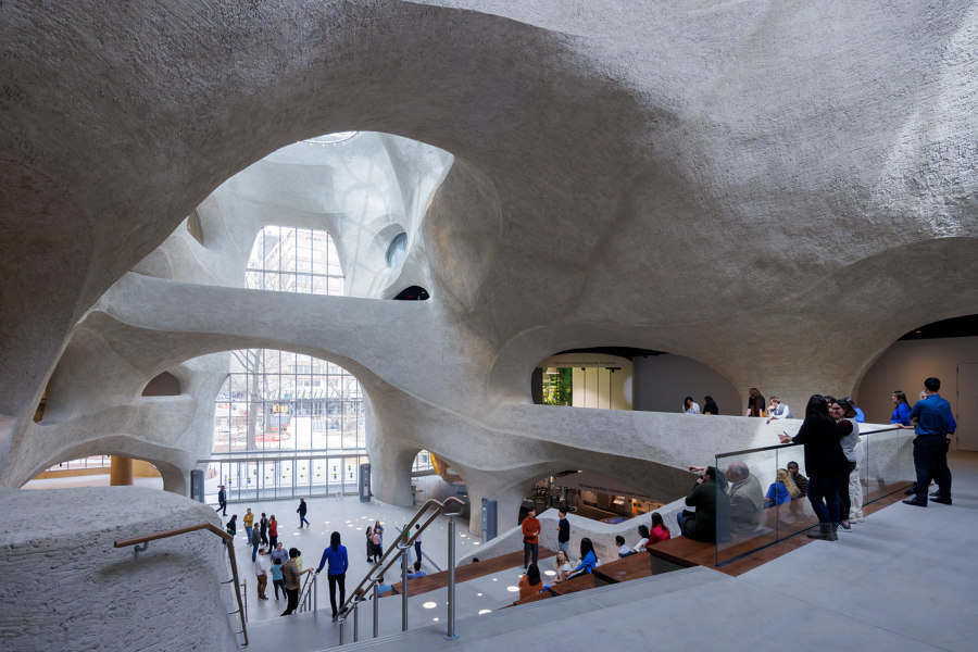
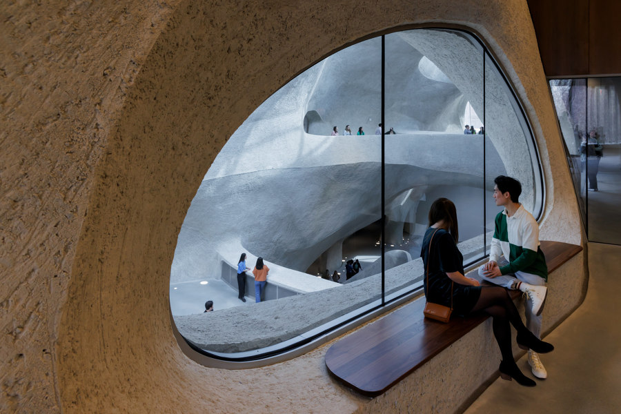
Milford pink granite panels at the new Columbus Ave entrance to the American Museum of Natural History Richard Gilder Center (top) and the shotcrete-formed surfaces that complete the cave-like interior of the Griffin Atrium. Photos: Iwan Baan

Milford pink granite panels at the new Columbus Ave entrance to the American Museum of Natural History Richard Gilder Center (top) and the shotcrete-formed surfaces that complete the cave-like interior of the Griffin Atrium. Photos: Iwan Baan
×American Museum of Natural History Richard Gilder Center for Science, Education and Innovation in New York, US, by Studio Gang
As part of the American Museum of Natural History, the Richard Gilder Center for Science, Education and Innovation is dedicated to the historic geology of the country. The building’s six-storey facade is fittingly influenced by the curves and patterns found in natural rock formations, as well as modern architectural techniques. ‘The diagonal pattern of the Milford pink granite panels,’ introduce architects Studio Gang, references the masonry on the Museum’s 77th Street side while also ‘evoking the phenomenon of geological layering.’
The facade is influenced by the curves and patterns found in natural rock formations
Although ‘the building’s design is informed by the ways in which wind and water carve out landscapes,’ share the architects, ‘as well as the forms that hot water etches into blocks of ice,’ the undulating surfaces inside the five-storey Kenneth C. Griffin Exploration Atrium have, in fact, been formed far quicker than the millennia it takes to cut formations into the rock. Instead, the architects used a method of ‘spraying concrete directly onto rebar without traditional formwork in a technique known as “shotcrete”.’
© Architonic
Head to the Architonic Magazine for more insights on the latest products, trends and practices in architecture and design.
