London Design Festival: Highlights
Text by James Wormald
28.09.22
A sombre London Design Festival reflects on the city’s creative history for design and making, while sharing a positive look into the future.
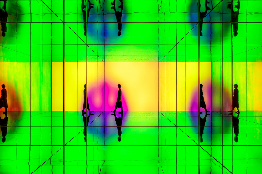
Sony Design’s INTO SIGHT Installation allowed visitors to enter a tunnel of endless audio and visual calm, gently responding to their every movement. Photo: Ed Reeve

Sony Design’s INTO SIGHT Installation allowed visitors to enter a tunnel of endless audio and visual calm, gently responding to their every movement. Photo: Ed Reeve
×The first full-size London Design Festival for three years, and the event’s 20th anniversary year, this was meant to be a celebration. But life, as the saying goes, had other plans. Rocked by the news of HRH Queen Elizabeth II’s passing, the country, and indeed the world, started the London Design Festival in a period of mourning. Having reigned over the densest period of design innovation in human history, however, her majesty was no stranger to change.
With long-running themes like sustainability, materials, economic crises and digital futures never higher in the public’s consciousness, LDF ’22 wasn’t just a professional meet and greet, but a chance to share some much-needed positivity with design enthusiasts, as well as locals, just passing by. Here are the most interesting and talked-about installations and talks from nine days of reflection on the past and hope for the future.
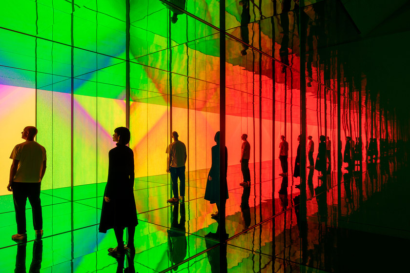
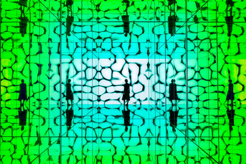
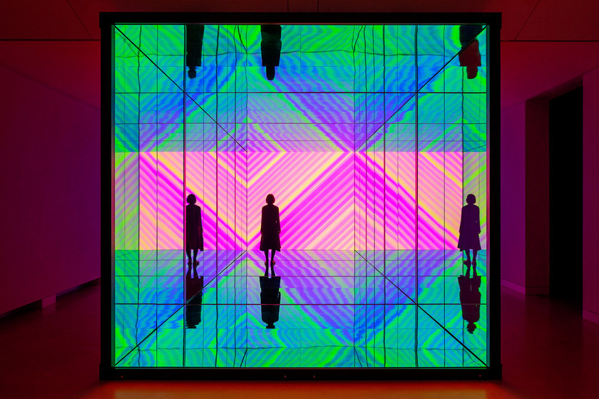
Combining a Sony 220-inch LED display with 3M dichroic film sandwiched between reflective glass walls creates an awe-inspiring kaleidoscopic rainbow of reflection. Photos: Ed Reeve

Combining a Sony 220-inch LED display with 3M dichroic film sandwiched between reflective glass walls creates an awe-inspiring kaleidoscopic rainbow of reflection. Photos: Ed Reeve
×INTO SIGHT by Sony Design
Often misunderstood, art installations can confuse visitors who struggle to relate the weird and wonderful concepts to daily life. But both the power and the purpose behind Sony Design’s INTO SIGHT installation are clear, if a little colourful.
The experience is akin to time spent at a metaversal day spa
A 220-inch Crystal LED screen sits at the end of a reflective corridor, creating an immersive physical representation of a digital world fathoms deep, miles wide and as tall as the stars. Sensory-receptive near-infrared cameras detect the occupants’ movements, which in turn alters AI-generated colours and patterns onscreen in real time, reflected continuously in surrounding glass walls embedded with 3M’s colourful dichroic film.
Inside INTO SIGHT, the experience is akin to time spent at a metaversal day spa, with an ephemeral soundtrack and visuals enforcing calm, without the headset. Aside from the reflective mindfulness, for those struggling to understand and relate to the metaverse, what it is and how far its applications are able to reach, INTO SIGHT opens the trans-dimensional door between worlds, making the digital physical, once again.
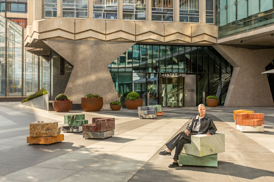
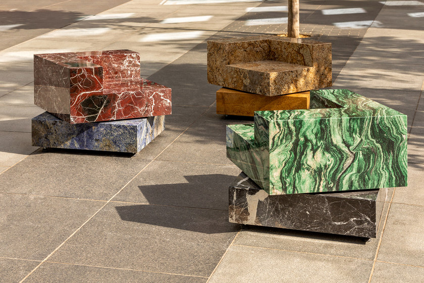
Sabine Marcelis’ natural stone public seating collection, Swivel, brings a touch of colour and joyful movement to the grey surroundings of St. Giles Square. Photo: Ed Reeve

Sabine Marcelis’ natural stone public seating collection, Swivel, brings a touch of colour and joyful movement to the grey surroundings of St. Giles Square. Photo: Ed Reeve
×SWIVEL by Sabine Marcelis
At the drab, grey canvas of St. Giles Square, meanwhile – overshadowed by the dominating brutalism of Centre Point – designer Sabine Marcelis revealed a collection of new permanent public seating works that bring colour and joy, along with material and conversational wealth to the pedestrian intersection. Using geometrical blocks of natural stones such as travertine, quartz and marble, each chair contrasts colour and pattern to fill the formerly greyscale piazza with life.
Each chair contrasts colour and pattern to fill the formerly greyscale piazza with life
‘With Swivel, I’m using a very engineered system, and a material that is normally linked to formal settings – but in a very playful way, making it more accessible to interact with.’ Sitting like a poorly played Tetris game, the seats are naturally grouped into twos, threes or by themselves, but with a stationary base and gently spinning seats, users can combine or disperse as they see fit, while curating their own view of the quickly changing urban landscape.
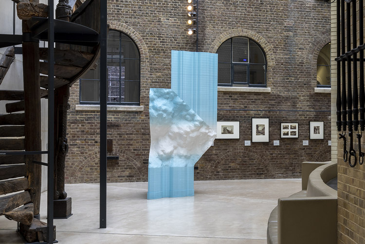
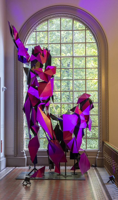
The V&A featured 3D-printed plastic waste in Plasticity (top), digital replication in Not David! (middle) and sentimental broken objects given a second life in R for Repair (bottom). Photos: V&A

The V&A featured 3D-printed plastic waste in Plasticity (top), digital replication in Not David! (middle) and sentimental broken objects given a second life in R for Repair (bottom). Photos: V&A
×V&A Exhibitions
As one of the world’s leading libraries of art and design history, LDF’s official Festival Hub, the Victoria and Albert Museum, housed multiple exhibitions, installations, talks and lectures throughout the week, highlighting such issues as material use and re-use, digital design and production and the changing societal perceptions surrounding design and consumerism.
Standout experiences from the week include a workshop from Make Good on beeswax crayons, using powdered wood as colourants; the 3.6m-tall Plasticity sculpture, 3D-printed with retrieved marine plastic waste; the exploded Not David! sculpture, creating a new style of digital replication and subverting nearby renaissance replications from the V&A’s Sculptures Hall; pairing sentimental but broken items with designers in R for Repair, not only to repair the objects but also to transform them into modern art pieces and the optimistically apocalyptic Regenerative Futures display, presenting a day in a future world where cutting-edge environmental technology like Bee Bricks and robotic dragonflies gathering environmental data are the accepted norm.
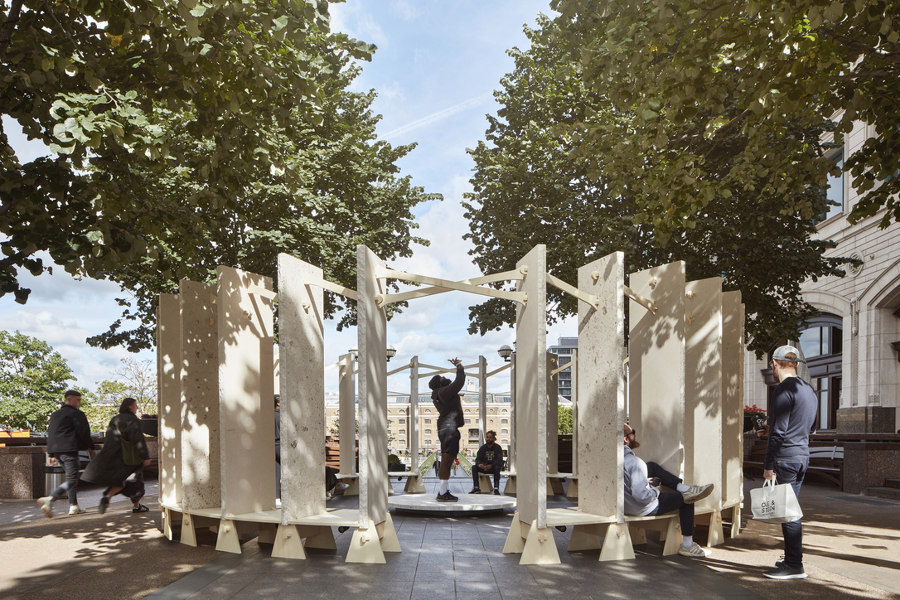
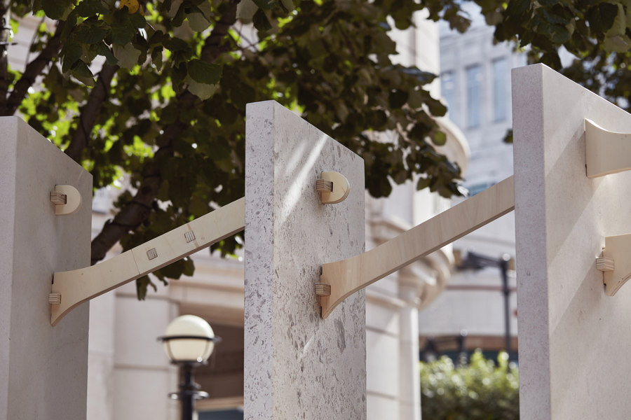
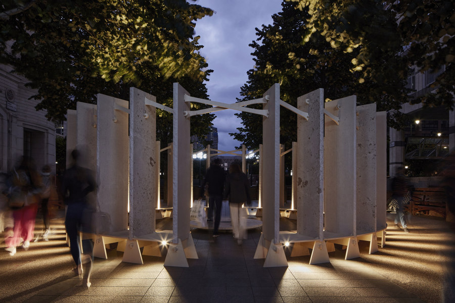
150 million-year-old Jurassic limestone monoliths circle around Canary Wharf’s latest public space, with the changing lighting effects of a modern-day henge. Photos: Mark Cocksedge

150 million-year-old Jurassic limestone monoliths circle around Canary Wharf’s latest public space, with the changing lighting effects of a modern-day henge. Photos: Mark Cocksedge
×Henge by Stanton Williams
The west of the city may be home to London’s high-end design and fashion districts where the money is spent, but head east to Canary Wharf and you’ll find where the money is made. Awash with smartly-dressed bankers, rushing around on a weekday, the area becomes a ghost town on the weekend, void of colour and culture.
Henge, at Wren Landing, Canary Wharf, joins a multitude of mostly ignored sculptures in the vicinity, failing to infiltrate the professional commuter focus. Inspired by Neolithic stone henge sites, the semi-permanent installation acts as a contemplative, interactive gathering place, inviting those rushing past to stop, listen or even give impromptu music and poetry performances, and in doing so, listen to themselves.
© Architonic
Head to the Architonic Magazine for more insights on the latest products, trends and practices in architecture and design.
