The rise and fall of consumerist architecture: ten modern mega-malls
Text by James Wormald
16.02.22
As the online marketplace takes a stranglehold on bricks and mortar retail, these are the destination super retail structures tempting consumers back to market.
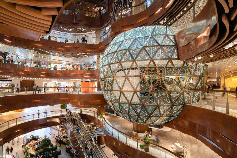
The interior of the K11 Musea mall is a sight of wonder and excitement. Photo: K11 Musea
The shopping mall was an icon of the late 20th-century retail environment. As more consumers took up driving, inadequate city infrastructure meant the surrounding roads couldn’t cope and the out-of-town mall was born.
Nowadays, these multi-functional complexes are entire cultural experiences, where consumers can not only get what they want easily, but make a day of it. As the small town retail landscape diminished, however, consumers became constricted on choice. The idea of popping to the shops and back within the hour became a tale for grandparents to reminisce over to a disbelieving grandchild.
Modern malls are doubling down on what they do best. Size and experience
Shopping trips now require expedition-standard planning, packing and perseverance, so it’s little wonder the online marketplace has found it so easy to similarly usurp the physical mall. In their efforts to turn the tide, however, modern malls are doubling down on what they do best. Size and experience.
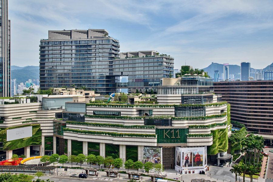
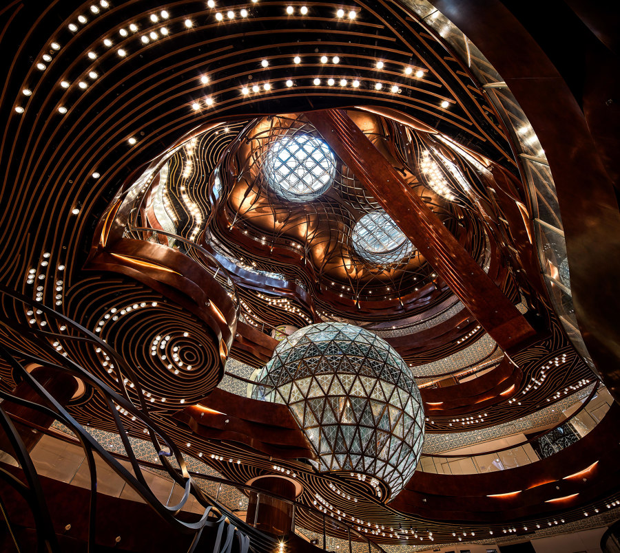
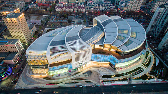
K11 Musea's tiered structure (top) with its Gaudi-esque modernisme interior (middle), and the Olympia 66 Dalian mall's twin carp construction. Photos: K11 Musea (top, middle) and Aedas (bottom)

K11 Musea's tiered structure (top) with its Gaudi-esque modernisme interior (middle), and the Olympia 66 Dalian mall's twin carp construction. Photos: K11 Musea (top, middle) and Aedas (bottom)
×Size
The ten-storey K11 Musea is part of a 28-hectare urban regeneration plan along the Victoria Dockside in Hong Kong. The mall’s arrangement is reminiscent of a luxury cruise liner, with a deep base and eight layers stacked on top like a tiered cake. The outcome is a development with as much opulence outside as in, with miles of harbour views from green terraces and a rooftop garden.
The iconic shape of the colossal 63,400-sqm Olympia 66 Dalian mall in Liaoning, China, meanwhile, is based on the twin carp imagery, symbolic of wealth and abundance in Chinese culture. While the abundance of space inside the mall allows visitors to enjoy the experience, splitting their time between retail, entertainment and relaxation.
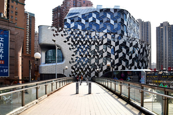
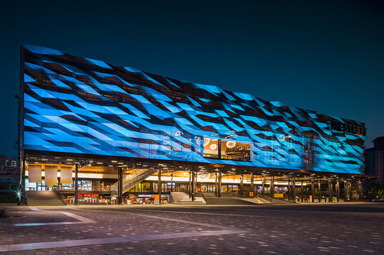
Both the Lane 189 (top) and The Street Ratchada (bottom) malls entice consumers with a shimmering, glittering skin. Photos: Eric Jap (top) and W Workspace (bottom)

Both the Lane 189 (top) and The Street Ratchada (bottom) malls entice consumers with a shimmering, glittering skin. Photos: Eric Jap (top) and W Workspace (bottom)
×Fancy facades
A shopping mall’s exterior is almost as important to its users’ experience as the interior. When the first glance of an approaching structure is one of wonder – like either from the glittering geometric halftone pattern on China’s Lane 189 mall, or the mesmerising light show adorning the extruded diagrid skin of The Street Ratchada in Bangkok, Thailand – it feels like walking towards a spaceship, preparing to take off and experience other worlds. Which, in a way, you are.
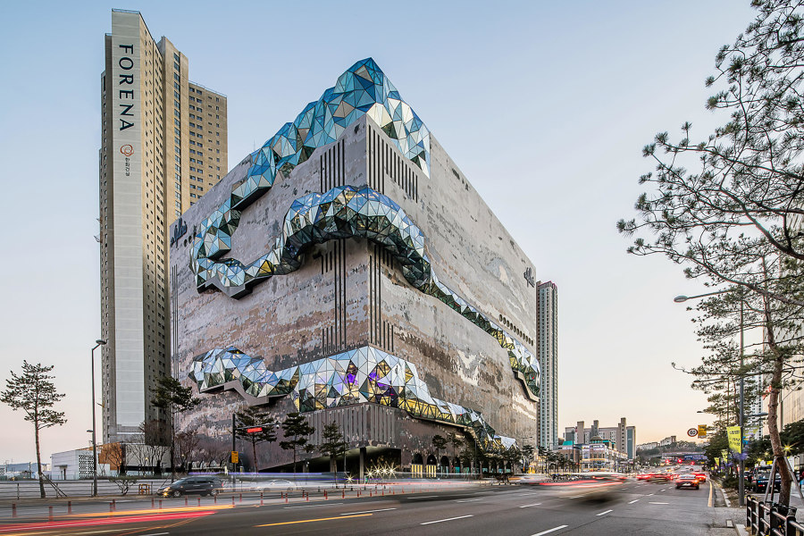
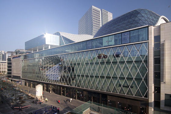
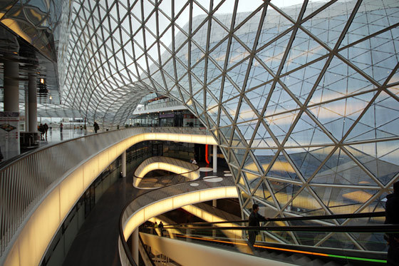
Magical three-dimensional forms can be created with glass, bursting out of stone at Galleria in Gwanggyo (top) or pulled inside by gravitational force at Myzeil (mid, bottom). Photo (top): Hong Sung Jun, OMA

Magical three-dimensional forms can be created with glass, bursting out of stone at Galleria in Gwanggyo (top) or pulled inside by gravitational force at Myzeil (mid, bottom). Photo (top): Hong Sung Jun, OMA
×In Gwanggyo, South Korea, the Galleria mall’s facade combines pixelated mosaic stone with bulging glass forms, bursting from its core. The effect creates the look of unearthed rock, glinting with mineral ore and hinting at the retail treasures to be found within. The Myzeil mall in Frankfurt, Germany, meanwhile, propels the isometric glass pattern covering its facade inward like a gravitational model, into and down through the centre of its interior.
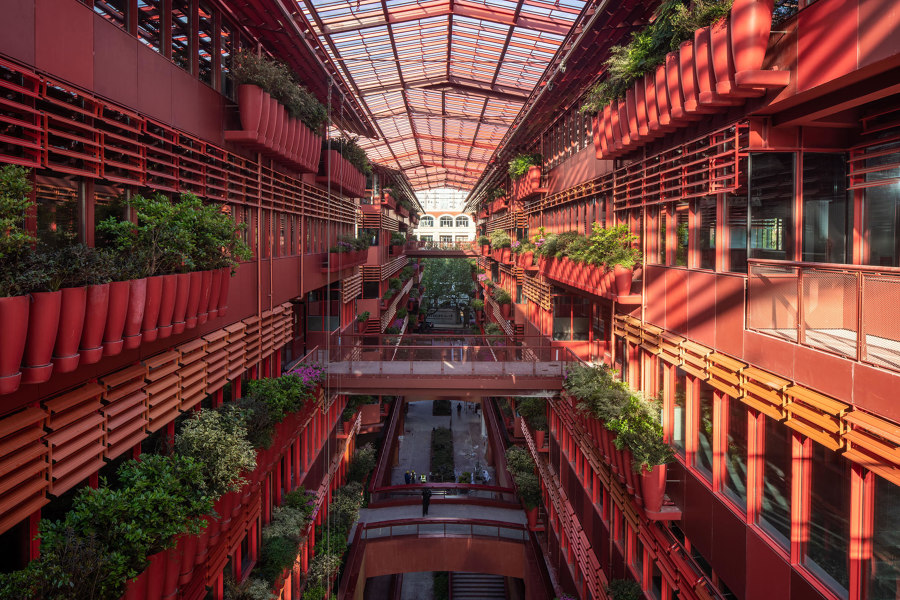
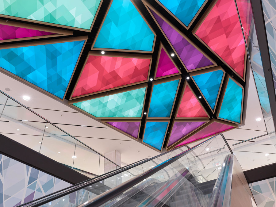
Henderson Cifi Tiandi's balconies and bridges (top) give it an outdoor feel, while the Löhr Centre (bottom) has colourful mood lighting. Photos: 10 Studio (top) and Tom Gundelwein (bottom)

Henderson Cifi Tiandi's balconies and bridges (top) give it an outdoor feel, while the Löhr Centre (bottom) has colourful mood lighting. Photos: 10 Studio (top) and Tom Gundelwein (bottom)
×Interior culture
If large mega malls are to convince consumers to spend their entire day there, shopping, eating and relaxing, they must become rewarding cultural locations, too. The Henderson Cifi Tiandi, for example, in Lu Wan Wu, China, is an open-ended but glass-covered mall experience like few others. The French colonialist features of the interior, with its window box-terraced walkways and bridges, make it a pleasing location to meet, socialise or simply walk through and enjoy.
With a mammoth 32,000 sqm of retail space meanwhile, the Löhr Centre in Koblenz, Germany, prevents consumer claustrophobia in its enclosed spaces with colourful light installations on the ceiling, improving shoppers’ moods by encouraging them to look up and around them.
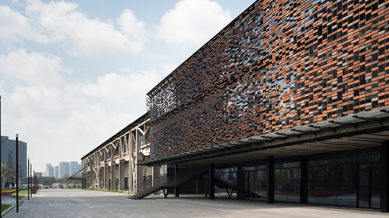
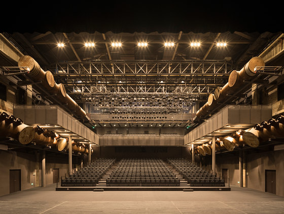
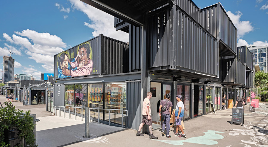
Suspended brick facade (top) and theatre space (middle) at Shipyard 1862, and the pop-up Stackt Market (bottom). Photos: Kano Eiitchi (top, middle) and Industryous Photography (bottom)

Suspended brick facade (top) and theatre space (middle) at Shipyard 1862, and the pop-up Stackt Market (bottom). Photos: Kano Eiitchi (top, middle) and Industryous Photography (bottom)
×Looking to the past
Far from the glitz and glamour of other modern sculptural structures, the theatre, hall and commercial spaces of the Shipyard 1862 complex in Shanghai, China, wears its industrial heritage both on its sleeve – using four shades of red clay brick, suspended with steel cabling to mimic the original wall’s weathered, demolished facade – and in the building’s inner workings, with its rusted iron stairways and columns, oxidised steel panels and aerated concrete.
A completely different example of environmental adaptive re-use retail architecture is present at the Stackt Market in Toronto, Canada. The project recreates the community of a local market using flexible shipping container units to forge pseudo-side-streets and assorted public spaces, while allowing small retailers to experiment with pop-up locations.
© Architonic
