Ruedi Baur: Swiss Graphic Design – Past, Present and Future
Text by Jean-Philippe Peynot
28.08.16
This page has been archived and is no longer updated
There is one country that has contributed more than any other to the history of graphic design, which became an official discipline at the start of the 20th century. The country in question has a multi-faceted identity and is pacifist and rather discreet. INTERVIEW BY JEAN-PHILIPPE PEYNOT
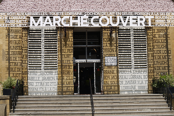
Of course, the country we are talking about is Switzerland. To this day, throughout the world, the term graphic design immediately brings Switzerland to mind. This is true as well when people think about the field’s past and present. Understanding the reasons behind the country’s astounding success may help us to better understand graphic design itself. It might also hold the keys to envisioning how artists, architects and designers worldwide will take on the major challenge of the urban and virtual public space by reinventing graphic design. More than anyone else, Ruedi Baur understands the role of currentday graphic design. The famous designer created the visual identities of the Centre Pompidou and the New School. In several cases, Baur has even created the visual identities of cities such as Lyon, Nancy and Metz. Dessau may join the list some time soon. TLmag spoke with Baur at his Paris studio, Intégral.
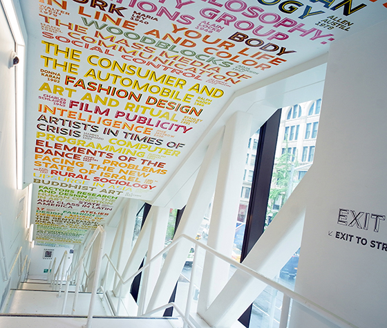
The New School signage. New York, 2014. © Integral
TLmag: Swiss graphic designers make up the lion’s share of the “historic” graphic designers. From Théo Ballmer to Max Bill, Josef Müller-Brockmann, Emil Ruder, Adrian Frutiger, Jean Widmer and Karl Gerstner, the list is endless and the influence of these artists is still palpable throughout the world today. Can you tell us why that is?
R.B.: I believe there really is a Swiss phenomenon in visual communications and I insist on the term “visual communications.” We’ve had to transmit messages in different languages. In Switzerland, people have had to speak at least three different languages so the common denominator, visuals, became more important. Out of the key designers that you mentioned, Karl Gerstner is the one who opened up a whole new dimension of graphic design by introducing the concepts of programmes and systems, which is to say, the movement from single images to coordination between images. Gerstner came up with that theory and made the connection to art and more specifically, to Concrete painting. People like Théo Ballmer, Max Huber, Herbert Leupin, Josef Müller- Brockmann and Carlo Vivarelli were very influenced by Concrete painting. In fact, one important graphic designer and member of this avant-garde movement, Richard Paul Lohse, decided at one point that he was no longer a graphic artist but a Concrete painter instead.
TLmag: If we think for a moment about Max Bill and Johannes Itten, do you see a connection between them and Bauhaus? Johannes Itten directed and taught at the Schweizerische Textilfachschule after teaching at Bauhaus. As for Max Bill, he studied at Bauhaus before spreading the good word of the Concrete art movement as far as Brazil.
R.B.: Many graphic designers came back to Switzerland after the rise of Fascism in the 1930s. A number of foreign intelligentsia also arrived in the country then. For example, Anton Stankowski, who was both a graphic designer and a Concrete painter, spent the entire war in Switzerland. After Bauhaus, people in Switzerland wanted to imagine the future. The whole issue of visual identity became very big there in the post-war period. That provides some context for the work of graphic designers such as Jean Widmer, Ruedi Rüegg, Josef Müller-Brockmann’s circle in Zurich and Armin Hofmann’s circle in Basel. As early as the 1940s, graphic designers – Gerstner in particular – started working with computers and marketing and began thinking of images as systems that can take the form of product ranges, with regard to their visual identity or packaging, for example.
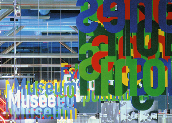
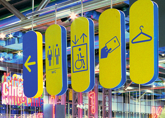
Centre Pompidou’s signage, Paris, 2001. © Integral
TLmag: Is there a specific kind of vision that draws on the Swiss landscape, a kind of rigour that has made it all the way into graphic design? If we can identify a clockwork style of urbanism in La Chaux-de- Fonds, would you say that we can identify a clockwork style of graphic design in Zurich and Basel?
R.B.: It was widely applied to say the least. There was this love of precision and wellmade objects. That was evident in Concrete art and in the effort to use geometry to create something absolute, to represent something that defies the imperfection of this world. Is that because of the landscape? Or because of Protestantism? Around the time when Swiss style came into its own, there was a search for commonality between the French, Italian and German parts of Switzerland, a search for the universal.
TLmag: There was also a universal thrust to Bauhaus, Ulm and all of the other movements that came about with modernity. Do you see that cultural heritage as being a heavy burden to bear when it is no longer tied to a specific place or era?
R.B.: The side of Bauhaus and Ulm that interests me the most is the relationship between the creative act and politics: placing design at the heart of the social debate. As far as I’m concerned, I have a hard time with the aesthetic consequences of those kinds of stances when they create a certain style. The move toward a universal form is problematic for me. When my colleagues tell me, “Helvetica is the only legible font,” or “You have to do it like this, not like that,” then I have to say, “Stop!” It’s the context that counts and the designs should be borne of their contexts and not of something universal.
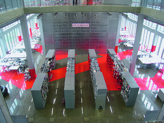
André Malraux Media Library, Strasbourg, 2009. © Integral
TLmag: What is the social role of graphic design as it appears in your work, perhaps specifically with regard to your signage projects? Why place such an emphasis on signage at a time when communication technologies allow us to locate and orient ourselves wherever we happen to be, without any outside assistance?
R.B.: Graphic design doesn’t seem like much – we often underestimate it – yet it has a huge impact on our everyday environment. The Swiss graphic designers we’ve been discussing found the right way to express the design solutions they devised. You have to create distance between the design question and the solution. It’s that distance that is eminently political. Signage is not just a matter of indicating the way and orienting people. It is also an identity issue. It’s a matter of giving visual expression to a place. I am interested in allowing places to express their diversity, their variability, their changing nature and their multiplicity. That expression has to evoke the place in a recognisable way while still allowing for those differences.
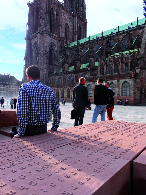
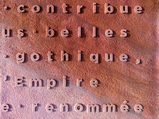
Urban furniture on place du Château, Strasbourg, 2013. © Integral
TLmag: That implies a certain definition of identity.
R.B.: Yes, I believe in plural, complex identities.
TLmag: For me, the signage at the Centre Pompidou is so present that it almost seems to dominate the architecture. The same thing goes for the Cité universitaire and the Maison de la Villette in Paris. Is that still graphic design or is it, in fact, architecture?
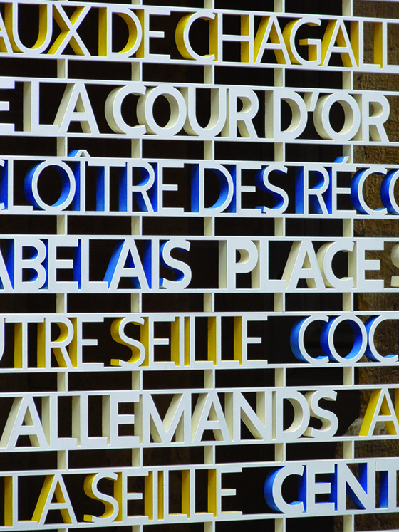
R.B.: Before you arrived, we were actually talking about a signage competition for the city of Dessau. I said, “Either it’s architectural or else it can’t be.” Signage can sometimes have an architectural dimension. At any rate, there is a strong synergy between signage and architecture. In my work, I try to play with architecture, to support it and sometimes even to become one with it. For me, the main issue is that of public space, whether it’s physical or virtual. I directed an institute called Design2Context. I believe that design should be reinvented to reflect the urban and architectural reality. Each place has its own language and should express itself in that language.
TLmag: Can you imagine an information version of urbanism in today’s world? A material architecture of information that would make it possible to rethink cities and connect them to the virtual world?
R.B.: When you design a hyper-functional space like an airport, a train station or a metro, as is the case with the Grand Paris project that we are currently working on, it is the function of the information that defines the space more than anything else. In modern-day cities, even in their unofficial spaces, information is very present and it has to be able to go beyond its function. Cities should develop in the dialectic between information and non-information by bringing the world of information into the real world. That is the biggest challenge of the 20th century.
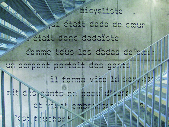
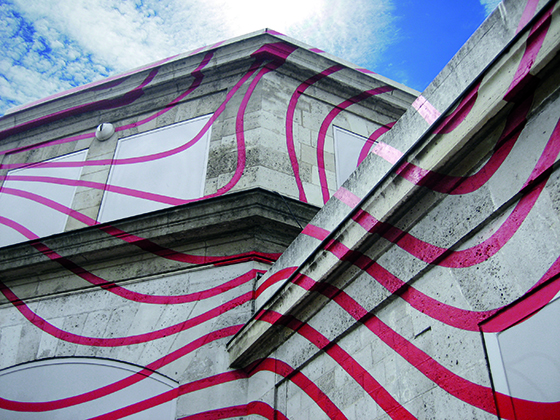
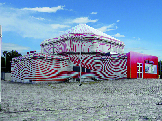
Urban design intervention on Maison de la Villette, Paris, 2010. © Integral
