Flooring: Spaces, Signs and Senses
Text by Orgatec Blog
Germany
09.09.14
India is one of the most stimulating environments I have ever been in. It was in Viluppuram, a small town in the far south-east of India, 40 km west of the Bay of Bengal, that I discovered Rangoli, a symbolic floor art, outside many people’s homes. Rangoli’s ancient symbols are thought to bring good luck and have been passed down through the ages, from one generation to the next, keeping both the art form and the tradition alive and, fortunately for all who visit, creating entrance areas that are both beautiful and meaningful.
Spaces
An entrance area has a vital role in setting the tone of a space. It’s a chance for designers to influence a person’s experience of a whole space by helping the visitor to start out on the right foot.
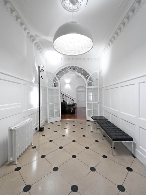
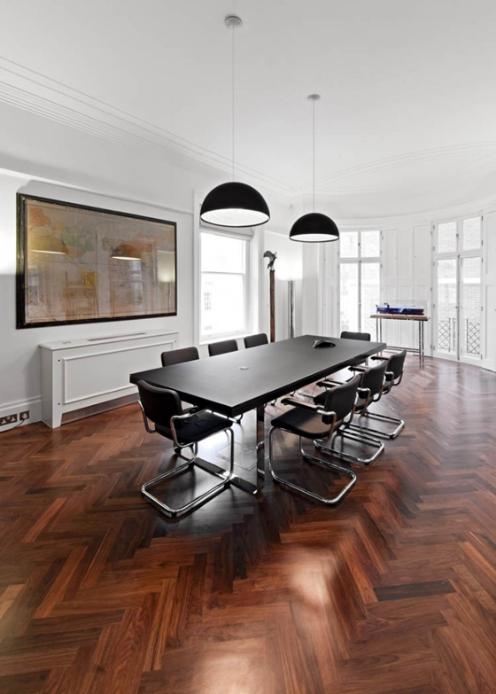
On entering a five-storey early Georgian terrace – respectfully renovated by architects and designers SHH – in the West End of London, the quality of the interior is instantly communicated. Repolished original stone flooring leads through a beautiful set of double doors, continuing the floor quality into the reception space by means of herringbone timber flooring in American black walnut, installed to restore some of the long-lost richness and quality suggested by the original building envelope. Classic features of the building have been reinvigorated throughout, with clean contemporary furniture providing a complementary contrast, turning a dilapidated space into a spacious and dramatic office for an international shipping company.
Herringbone timber flooring in the offices for an international shipping company by SHH
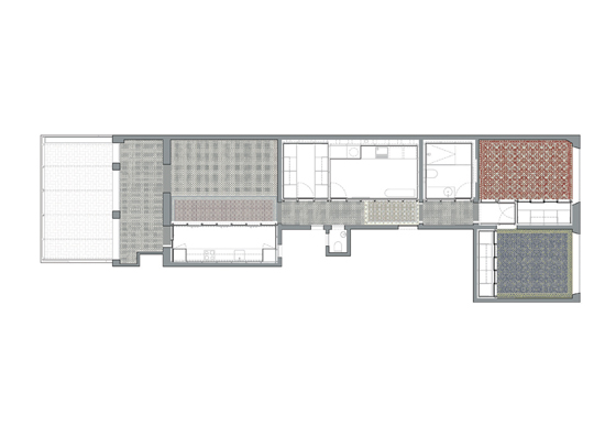
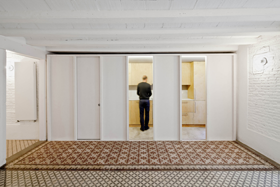
Another reinvigorated building with contrasting design elements – an apartment by local studio Vora Arquitectura featuring polished mosaic floors that reveal the previous floor spaces within the original layout of the building – can be found in Barcelona’s Gràcia neighbourhood. Despite the fact many of the tiles are badly damaged and in need of replacement, the architects, in a bid to ‘make the most of the existing elements’, nonetheless chose to follow the original outlines of the spatial layout, showcasing the space’s heritage in a more contemporary open-plan context.
Renovated apartment in Barcelona, featuring polished mosaic floors that reveal the previous spaces within the original layout of the building

Renovated apartment in Barcelona, featuring polished mosaic floors that reveal the previous spaces within the original layout of the building
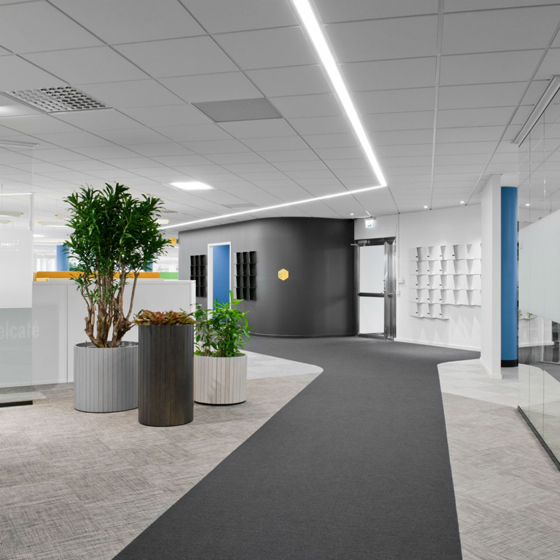
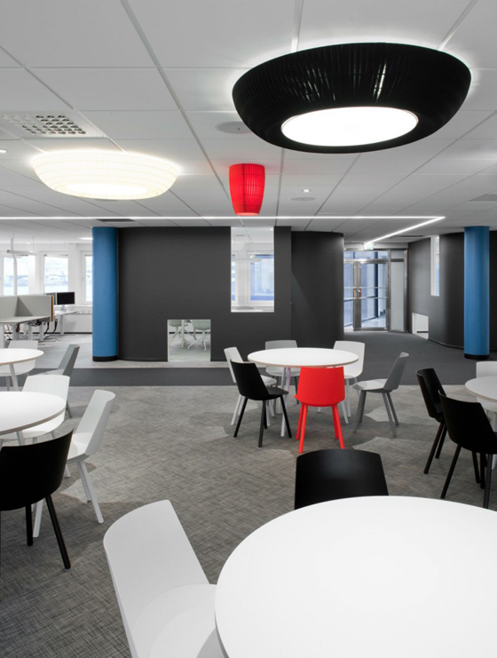
×The open-plan office of Swedish company ATG illustrates the use of carpet as a way to delineate different spaces within a 1,500-square-metre environment. Swedish practice Note Design drew inspiration from aerial photography, ‘with the typical distinct pattern of varied land surfaces connected to each other’. A variety of carpets in different colours and textures is used to create distinct spaces and orientation pathways in the interior landscape, giving the visitor a stimulating journey around the office.
Open-plan office by Note Design illustrating the use of carpet as way to delineate different spaces within a 1,500-square-metre environment

Open-plan office by Note Design illustrating the use of carpet as way to delineate different spaces within a 1,500-square-metre environment
×Signs
Flooring materials can outline and divide spaces and help to guide people through an environment, while the addition of graphics can explicitly communicate features, functions and the intended flow for the visitor.
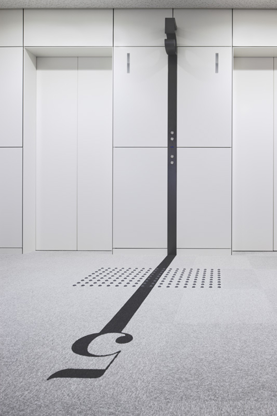
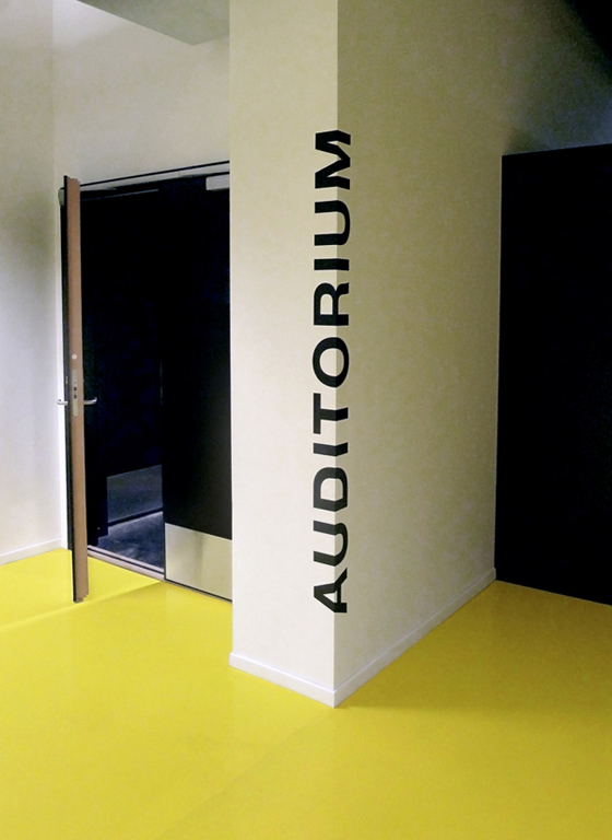
Since 1988, Masaaki Hiromura and his team have built up an award-winning portfolio of graphic design projects that cover identity, advertising, packaging and signage systems, many of which use the floor as a canvas. According to Masaaki: ‘Signage systems do not exist by themselves; therefore they have to be integrated with graphic, interior, architectural, product and fashion design.’ This is exemplified by his office building in Naniwa-ku, Osaka, Japan, which features strong typographical elements that flow seamlessly from architectural features – in this case, a cast metal numeral to indicate the floor number – to graphics on the floor: a design approach that helps to make people more aware of the environment around them.
Office building in Naniwa-ku, Osaka, Japan, featuring strong typographical elements that flow seamlessly from architectural features to graphics on the floor

Office building in Naniwa-ku, Osaka, Japan, featuring strong typographical elements that flow seamlessly from architectural features to graphics on the floor
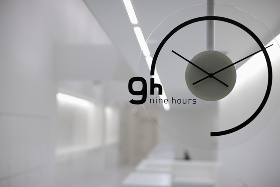
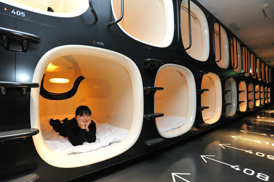
×A second Hiromura project of note is the 9h (Nine Hours) hotel, a collaboration with interior designer Fumie Shibata of Design Studio S. The Nine Hours hotel is a revolution in the capsule hotel concept that looks nothing like its predecessors. The hotel and its system are designed around three key needs for an overnight stay: 1 hour to shower, 7 hours to sleep, 1 hour to rest – making 9 hours in total. The space is clutter-free with only four colours throughout the space, although the pods are predominantly in black and white. Hiromura’s simple bilingual floor signage aims to lead the customers through the system as simply as possible, distilling the hotel experience down to what is essential – nothing more, nothing less – thus making a person’s journey through the hotel as effortless as possible, even if the approach to the amenities and aesthetic may well be too minimal for many outside Japan.
The 9h (Nine Hours) hotel is a revolutionary capsule hotel concept, designed around three key needs for an overnight stay: 1 hour to shower + 7 hours to sleep + 1 hour to rest = 9 hours in total

The 9h (Nine Hours) hotel is a revolutionary capsule hotel concept, designed around three key needs for an overnight stay: 1 hour to shower + 7 hours to sleep + 1 hour to rest = 9 hours in total
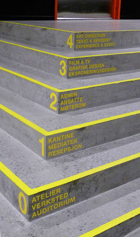
×A more lively approach to floor signage can be seen at the Norwegian communication school Westerdals, ranked as one of the top ten creative schools in the world. The building is characterised by its industrial and rough expression, which became an important factor in the design process, according to designers Marius Holtmon, Mette Landsem and Madeleine Skjelland Eriksen. They retained the building’s existing surroundings, walls and floors in order to maintain the roughness and industrial nature of the building. The signage aims to unite the identity of Westerdals with the architecture of the new building, by adopting elements from the school’s identity, together with the colours used in the buildings.
Wayfinding Westerdals by Marius Holtmon. Lively floor signage integrated into the industrial surroundings of Westerdals, a leading communication school in Norway

Wayfinding Westerdals by Marius Holtmon. Lively floor signage integrated into the industrial surroundings of Westerdals, a leading communication school in Norway
×Senses
As we all know, the sight, smell and touch of materials have a profound impact on our experience of an environment.
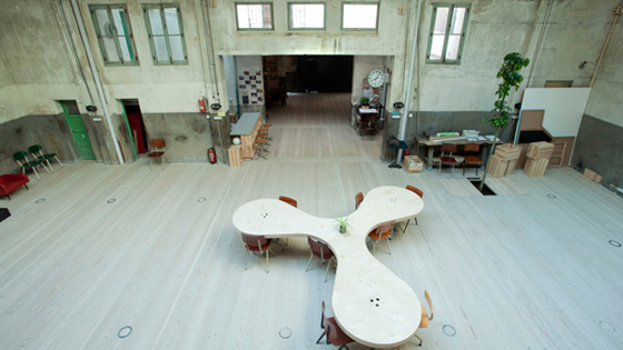
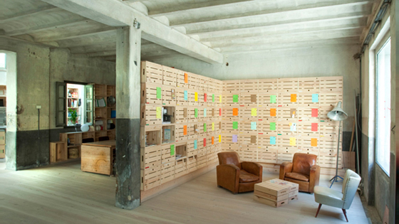
Impact Hub, a co-working space like no other, is a community of more than 20 spaces across six continents – ‘part innovation lab, part business incubator, and part community centre’ and offering members ʻa unique ecosystem of resources, inspiration, and collaboration opportunities to grow impact’. The interior of the Madrid hub, a refurbished garage space by ch+qs arquitectos, is a surprising showcase for timber flooring. The designers decided to keep the garage interior, untouched since the 1940s, as raw as possible, leaving the walls and other interior features in their original state and celebrating the patina that had developed over the years – no doubt with associated budget benefits. It’s clear that no expense was spared on the flooring, whose distinctive planks of Danish wood run the full length of the space, creating a warm and welcoming contrast to the starker interior shell.
Impact Hub Offices in Madrid by ch+qs arquitectos. A co-working space in Madrid with distinctive planks of Danish wood running the full length of the space

Impact Hub Offices in Madrid by ch+qs arquitectos. A co-working space in Madrid with distinctive planks of Danish wood running the full length of the space
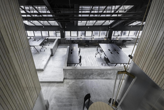
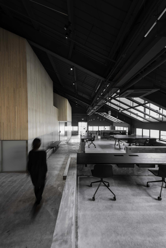
×In contradistinction to the warm wood of the Madrid Impact Hub, the prolific Chinese design duo Lyndon Neri and Rossana Hu opted for a colder concrete direction for the Shanghai offices of Flamingo, a global insight and strategy consultancy, thus creating a striking landscape of concrete platforms and plinths that connect boldly into the polished concrete floor. Contrasting material combinations feature again, with wooden workstations and wall cladding providing warmer accents against the confident concrete palette that dominates the environment – a burgeoning materials trend evident in homeware, furniture and interior design.
In much the same way that we sense our environments, our floors can now sense us too! IBM has been granted a US patent for a multi-touch smart floor that can detect home intruders or even call for an ambulance if you fall down. The smart floor will be all-knowing thanks to an object database and a blanket of sensors – not too dissimilar to the sensors on your touch screen phone – that track the number, weight, shape and location of objects in a room. A telling product-service indicator of the technology trend ‘smart systems’, and a slightly scary thought if applied to office interiors. So tread carefully!
The best design has always had a meaning, from India’s ancient Rangoli symbolism to IBM’s meaningful innovations with technology. In today’s fast-moving context, it is increasingly important to make sense of the vast amounts of information at our daily disposal. But how can we cut through the noise so as to surface what is really meaningful?
Flamingo Shanghai offices by Neri Hu. A striking landscape of concrete platforms and plinths that connect boldly into the polished concrete floor by Chinese design duo Lyndon Neri and Rossana Hu

Flamingo Shanghai offices by Neri Hu. A striking landscape of concrete platforms and plinths that connect boldly into the polished concrete floor by Chinese design duo Lyndon Neri and Rossana Hu
×Trends as tools
When used as tools for strategic direction, trends can help to develop a more meaningful point of view on the future. Often, ʻnew’ trends are simply a fresher indication of an enduring theme that has been around for a number of years. Take a step back for a moment and ask yourself: What are the big themes today making an impact on your business, brand, product or service offering? Were they dramatically different five years ago? Disintermediation? Authenticity? Smart systems? These business, brand and technology dynamics have resonated for years, still resonate today and will continue do so for years to come. Even visually, and at a high level, how different is the reductionist approach of Apple to that of Braun?
Things do change, of course. The trick is to develop sharper trends by identifying the telling patterns of change and by scanning for contemporary indicators that are relevant to your business, brand and consumer context – while at the same time gathering evidence from a variety of sources, industry sectors, disciplines and product-service categories to help you to carry out a more robust and relevant analysis.
There’s no formula for the future, but trends can certainly help to inspire more meaningful solutions for our office environments and beyond.
