Interior acoustics: Innovation inspiration
Text by Orgatec Blog
Germany
03.04.14
Following take-off on a recent flight from Hong Kong to London – and just as I settle into my seat – a baby starts to scream! The commotion is coming from towards the back of the A380. I contemplate an entirely sleepless night flight and then suddenly remember the noise cancelling headphones in my bag. I pop them on, flick the switch and press play. Silence! Ahhh.
In our loud and busy world, a moment of silence is sometimes scarce, particularly in the office environment. Julian Treasure, the chair of the Sound Agency, a firm that advises businesses – office bosses, retailers and hoteliers – on how to use sound, feels that architects should be more mindful of acoustics. In his TED Talk, Treasure explains that ‘sound affects us physiologically, psychologically, cognitively, and behaviourally, all the time.’ In terms of the office environment, he states we are three times less efficient working in an open-plan office space than in a quiet room and suggests the use of headphones as a quick fix for improving concentration. But what else can be done to help?
As we all know, open-plan distractions can come from a variety of sources, with noise from photocopiers, phones, colleagues or computers. For the launch of the 1984 Apple Mackintosh computer, Jobs insisted the design should not include an internal cooling fan, but rely instead on convection cooling to keep it quiet! A small detail with big implications.
On a larger scale, the 1980s was the heyday of the ‘high-tech’ architecture movement, which championed open-plan office layouts. An exemplar was the Lloyds of London building by Richard Rogers, which opened to severe criticism in 1986 due to its ‘inside out’ aesthetic – but with services such as staircases, lifts, electrical-power conduits and water pipes on the exterior, maintenance workers were able to access and fix services from outside of the building, thereby minimising noise for Lloyds staff inside the office. This innovative approach overcame the criticism in the end and led to Grade I-listed status by English Heritage in 2011, the youngest structure ever to achieve this.
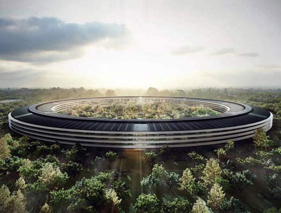
Apple future office by Fosters + Partners Due in 2016, this 280 million square-foot building includes a number of innovations, including a ‘Sound Wall’ around the circular campus to reduce noise from the nearby freeway

Apple future office by Fosters + Partners Due in 2016, this 280 million square-foot building includes a number of innovations, including a ‘Sound Wall’ around the circular campus to reduce noise from the nearby freeway
×In 2009, Steve Jobs made a phone call to the second most notable high-tech ‘starchitect’, Norman Foster. Apparently opening with 'Hi, Norman. I need some help...', the call led to Fosters + Partners designing the future Apple Campus in Cupertino, California. Due for completion in 2016, this 280-million-square-foot building includes a number of innovations, including one of the largest photovoltaic solar arrays and a parking garage for electric cars with over 100 charging stations. The office building’s acoustics are also a key consideration. According to the project description submitted to the Cupertino planning authority, a ‘soundwall’ along the northern side of the I-280 freeway will protect the office from noise pollution from the road.
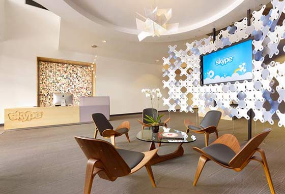
Skype HQ by Design Blitz The layout of Skype’s HQ has acoustic zones for collaboration, contemplation and concentration. Pod micro environments contain collaborative noise, reducing distractions for other workers

Skype HQ by Design Blitz The layout of Skype’s HQ has acoustic zones for collaboration, contemplation and concentration. Pod micro environments contain collaborative noise, reducing distractions for other workers
×Layout and structure
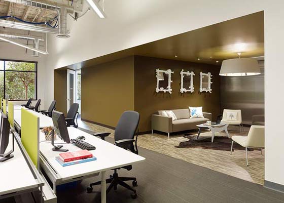
California is home to further acoustically considered offices, such as Skype’s headquarters by architects Design Blitz. The project began with extensive research, with the aim of understanding how Skype operates culturally. The insights gleaned led to the identification of three types of space: collaboration, contemplation and concentration. As a result, Design Blitz located all workstations at the building’s perimeter (concentration). They then worked their way back to the middle by degree of noise and distraction, with the noisiest functions being at the middle of the space (collaboration). Contemplation spaces were interspersed in the form of overlapping casual lounges and ‘pods’ to house meeting and collaboration functions. Each of the pods has a structural roof deck – commonly used in large-span construction – providing a structural diaphragm over them, which gives a high level of acoustic attenuation, whilst functioning as the finished ceiling.
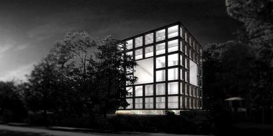
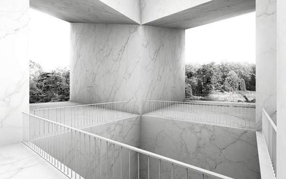
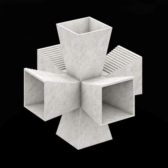
Acoustic Composition hotel by Betillon Dorval-Bory. The hotel’s geometric layout and structure aims to channel and celebrate the sound of the natural environment surrounding the building

Acoustic Composition hotel by Betillon Dorval-Bory. The hotel’s geometric layout and structure aims to channel and celebrate the sound of the natural environment surrounding the building
×Sectors beyond the office environment also provide many inspirational reference points for acoustically considered environment design. The ‘Acoustic Composition’ hotel by Betillon Dorval-Bory has a geometric layout and structure that aims to channel and celebrate the sound of the natural environment surrounding the building. The building’s central void collects external sound, whilst connecting trapezoids tunnels amplify and broadcast the sound through the building. According to the architects, ‘This way, the building is no longer an obstacle to environmental noise, but a distorting lens, reverberating and channelling acoustic waves like a mirror.’
Materials and technology
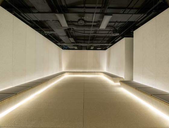
In contrast, London’s retail department store Selfridges celebrated the sound of silence in 2013, with a reincarnation of Harry Gordon Selfridge’s 1909 ‘Silence Room’ – a space for shoppers ‘to retire from the whirl of bargains and the build-up of energy’. Cochrane’s reinterpretation of Mr Selfridge’s vision reduces visual noise, with a minimal look and feel. Materiality plays a key part, with cream felt covering the walls, floor and seats for sound-proofing and comfort, providing surfaces for shoppers to relax on once inside. It’s so relaxing that people have been seen sleeping and meditating in the space.
Selfridges Silence Room by Alex Cochrane Architects A silent sanctuary for shoppers to escape from the hustle and bustle, with a felt cladded interior to minimise sound from the rest of the store

Selfridges Silence Room by Alex Cochrane Architects A silent sanctuary for shoppers to escape from the hustle and bustle, with a felt cladded interior to minimise sound from the rest of the store
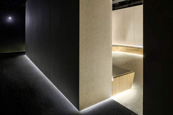
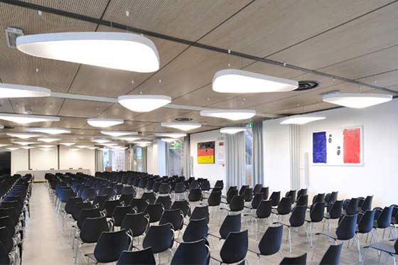
×The use of felt is also present at Rome’s premium food-retail destination, Eataly, designed by Julio Lafuente in partnership with Costa Group, LucePlan and Philips. Of particular acoustic note is the supermarket’s conference room, which features various material and technological innovations. Luminous felt wall panels aid sound proofing whilst providing illumination, with hidden till lit lighting elements. A dedicated computer system drives the display of dynamic images, creating a memorable and evocative atmosphere. The acoustics of the room are further improved with the addition of ceiling lamps with sound-absorbent fixtures that significantly reduce echoes in the space.
Eataly conference room by Julio Lafuente, Sound-absorbent cladding and lighting optimise acoustics for the conference space

Eataly conference room by Julio Lafuente, Sound-absorbent cladding and lighting optimise acoustics for the conference space
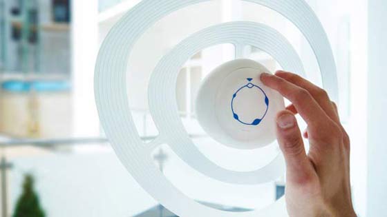
×Rather than just reducing sound, the Sono concept by Industrial Designer Rudolf Stefanich, takes noise cancelling technology – similar to the headphone tech that rescued my night flight – and applies it to an interior design solution. The window-mounted device uses a high-frequency laser microphone to pick up annoying sounds, then sends out sounds of its own, cancelling out the sound before it even reaches your window. Not only does it cancel sound, it enables the user to isolate a sound of preference. So the noise from a major metropolitan road can be eliminated and the serene sounds from the bird singing in the park can be picked out and turned up. The theory behind the device has been successfully tested and led to the product achieving a design finalist position for the 2013 James Dyson Award.
Case studies from parallel sectors – such hospitality, retail and consumer electronics – can provide inspirational insights for office environment innovation. The trick is to take inspiration from case studies that work for your context and needs.
---
For the latest office and contract news:
