Flexible friends: textiles in architecture
Text by Peter Smisek
05.08.20
Across a broad range of projects, whether office, retail space or school, interior designers and architects recognise textiles as a flexible, viable alternative to concrete, plaster and wood.
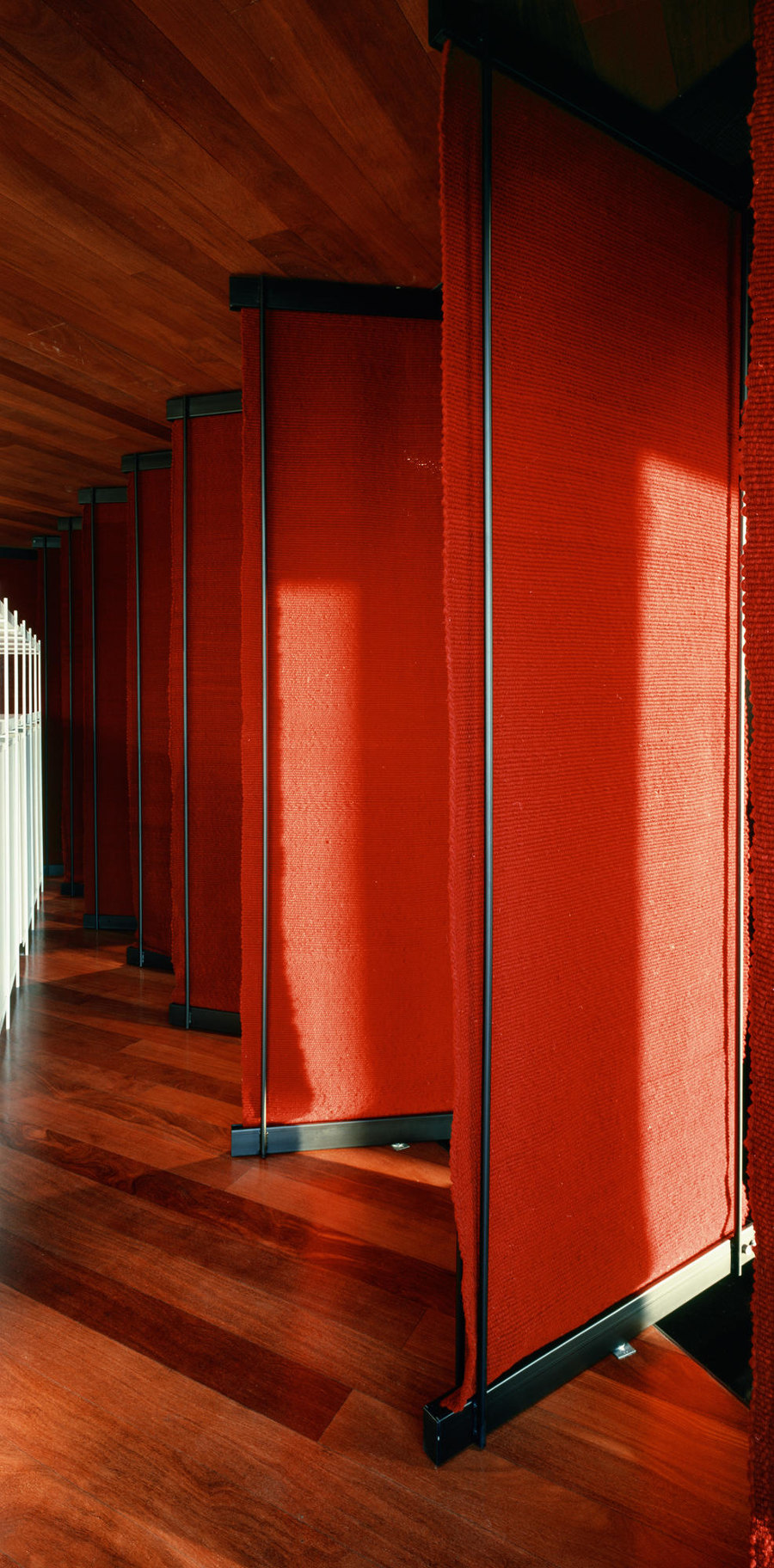
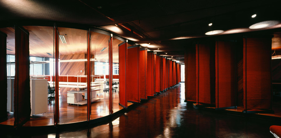
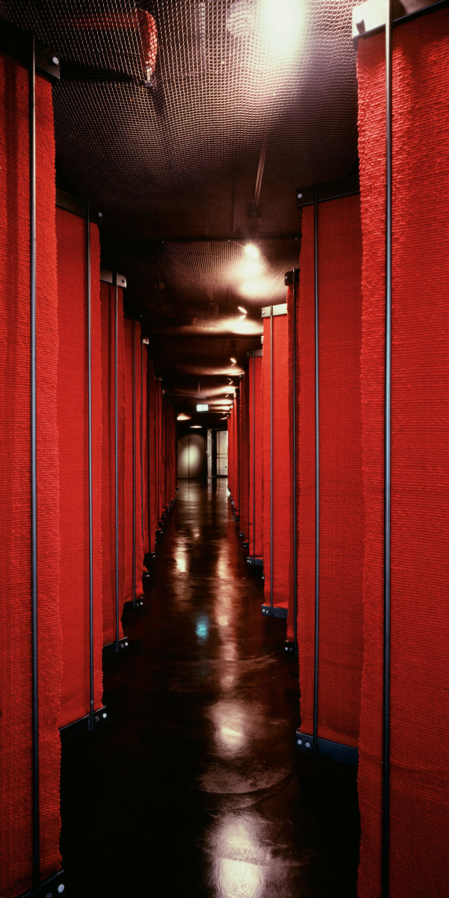
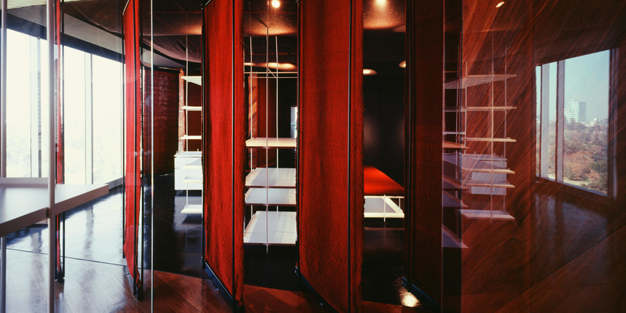
The monochromatic wool tapestries and pivoting metal frames of DBAA – Diego Baraona Arquitectos y Asociados’s Office Space project in Santiago, Chile. Photos: © Erieta Attali

The monochromatic wool tapestries and pivoting metal frames of DBAA – Diego Baraona Arquitectos y Asociados’s Office Space project in Santiago, Chile. Photos: © Erieta Attali
×Architectural textiles never really went away, but in our current era – one that places a renewed emphasis on flexibility and sustainability – architects and interior designers have embraced them with renewed enthusiasm across many different types of spaces.
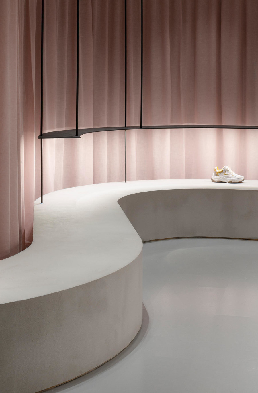
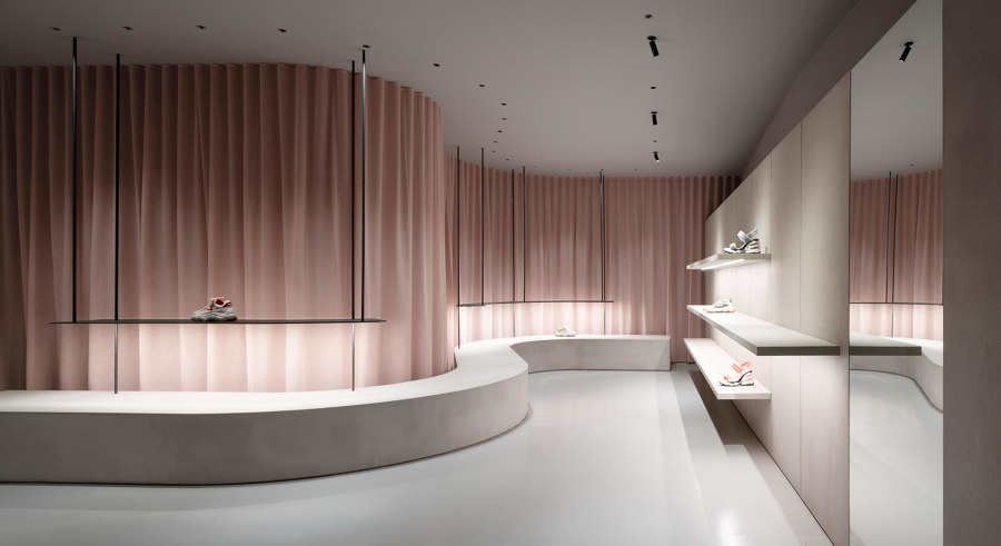
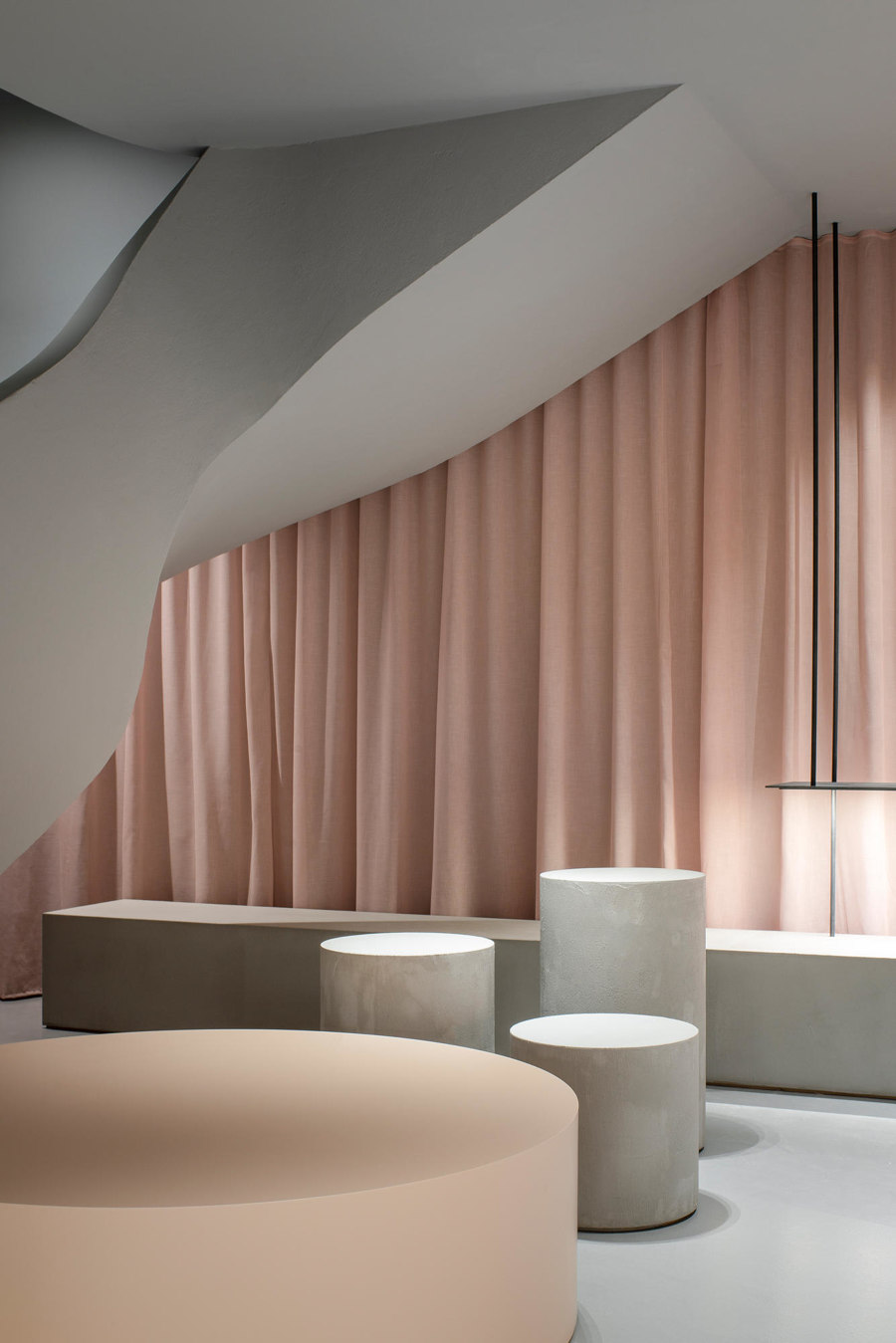
The textile curtain in Francesc Rifé-designed ASH Mallorca creates a sensual nude backdrop for the wares, but also hides the door to the shop's storeroom. Photos: David Zarzoso

The textile curtain in Francesc Rifé-designed ASH Mallorca creates a sensual nude backdrop for the wares, but also hides the door to the shop's storeroom. Photos: David Zarzoso
×Barcelona-based Francesc Rifé, for instance, uses a textile curtain to form a backdrop for the minimalist retail space for shoe brand ASH in Mallorca. Here, the soft, dusky pink sheer curtain contrasts with the hard, light grey concrete floor and slender, suspended metal shelves to create a beguiling store which draws in passers-by, while elevating the products on display.
DBAA – Diego Baraona Arquitectos y Asociados' Office Space uses colourful textile partitions to ensure flexibility, as well as a comfortable space for the employees. Photos: © Erieta Attali

DBAA – Diego Baraona Arquitectos y Asociados' Office Space uses colourful textile partitions to ensure flexibility, as well as a comfortable space for the employees. Photos: © Erieta Attali
×In Santiago, Chile, DBAA – Diego Baraona Arquitectos y Asociados – have designed Office Space, using monochromatic wool tapestries mounted within pivoting metal frames, as a way to separate the meeting rooms from the open-plan desks used by the office workers. The crimson textile louvres act as changeable-semi permeable membranes, allowing views across the office to the outside, while offering the desired degree of visual and acoustic privacy.
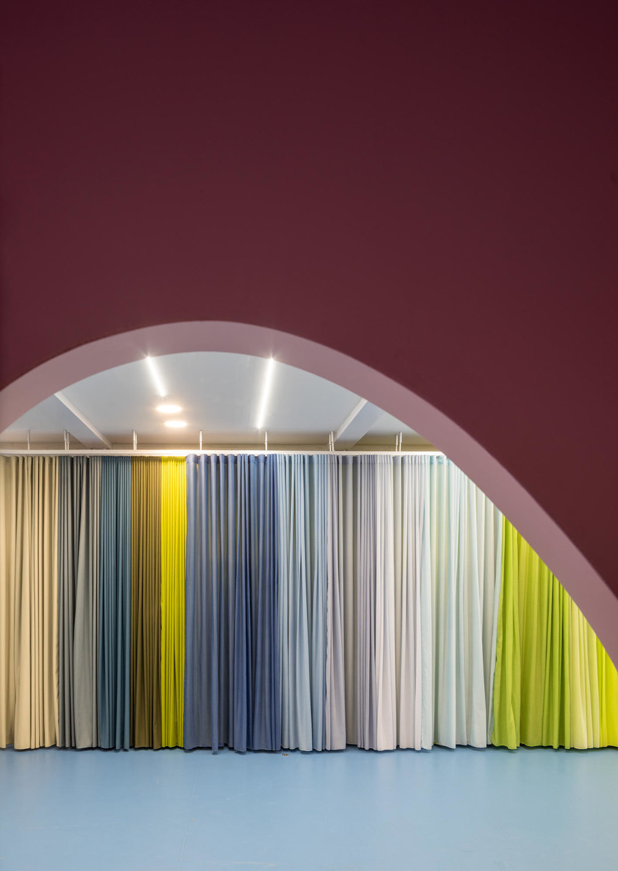
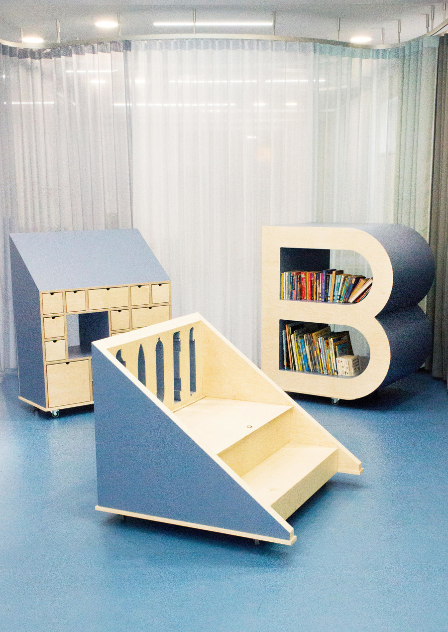
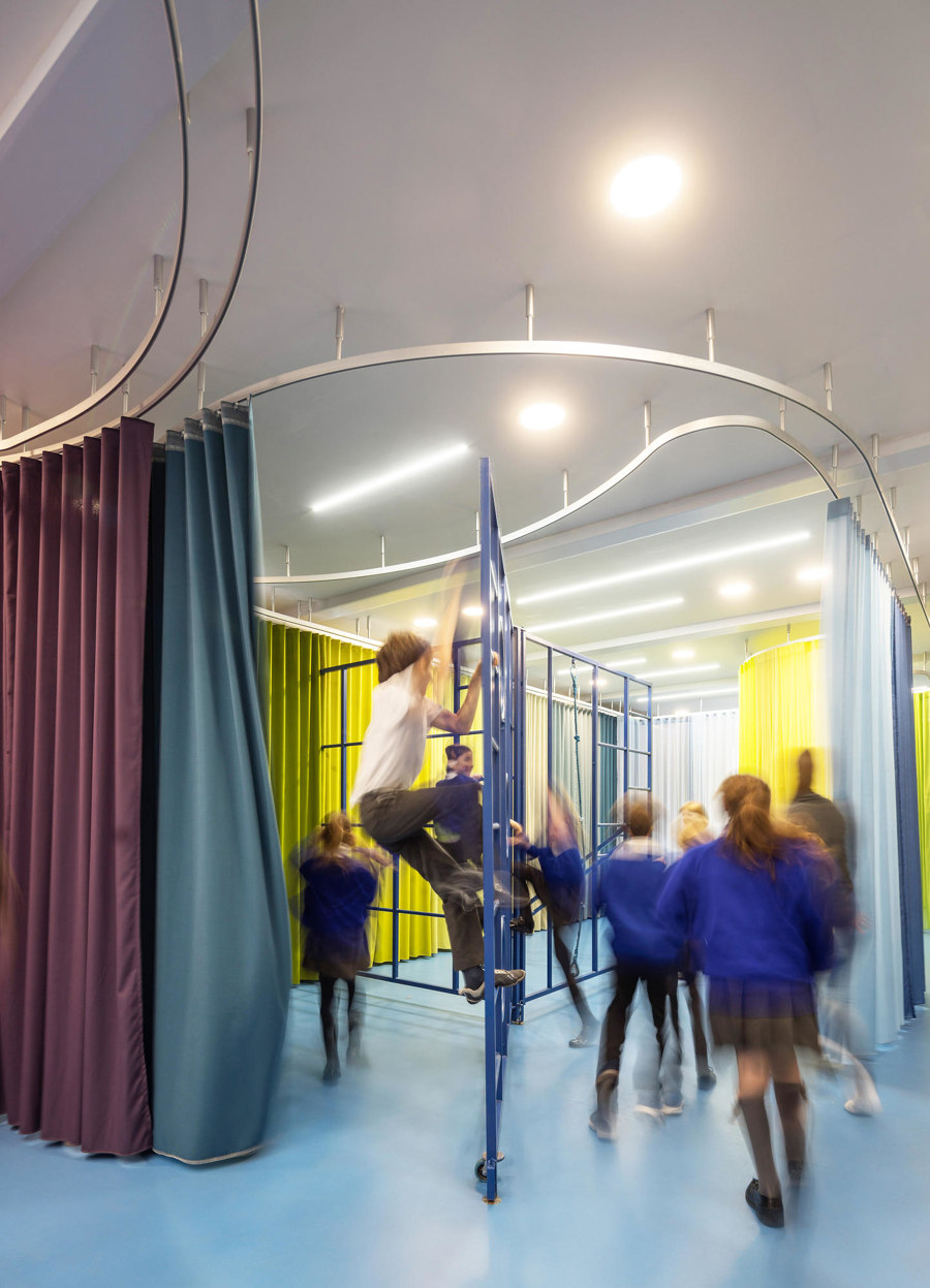
Using brightly coloured textile curtains in their Rosemary Works School, Aberrant Architecture have created a playful, multipurpose space fit for young pupils. Photos: Simon Kennedy

Using brightly coloured textile curtains in their Rosemary Works School, Aberrant Architecture have created a playful, multipurpose space fit for young pupils. Photos: Simon Kennedy
×London's Aberrant Architecture also uses textiles to create a flexible space – this time in Rosemary Works, a local independent elementary school in North London. Situated within an old factory, the architects have designed a series of rails from which they suspended multi-coloured curtains that form a central multi-purpose space. Together with moveable furniture, the hall now acts as a breakfast club, a canteen, as well as a space for assembly, events and indoor PE lessons.
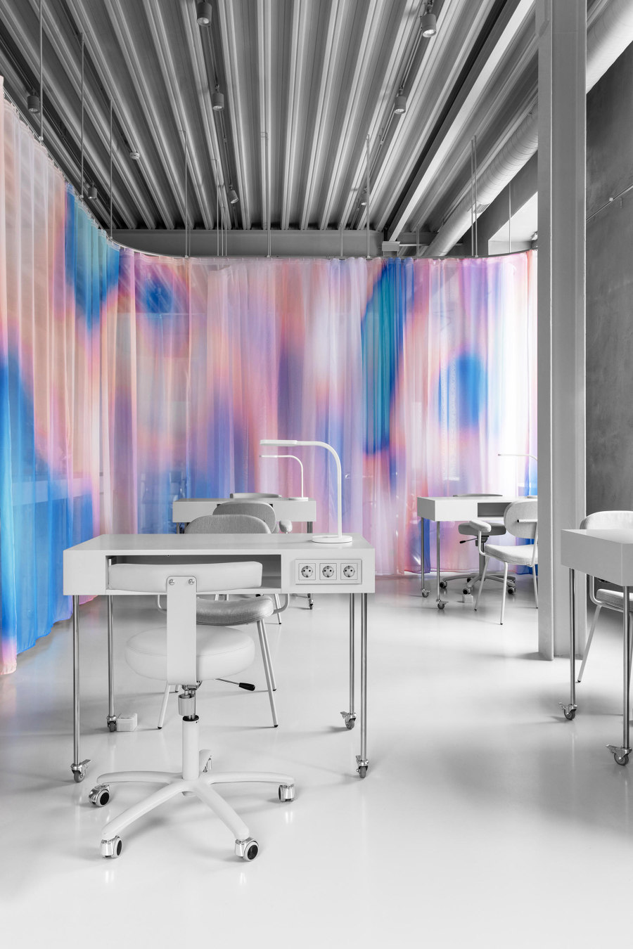
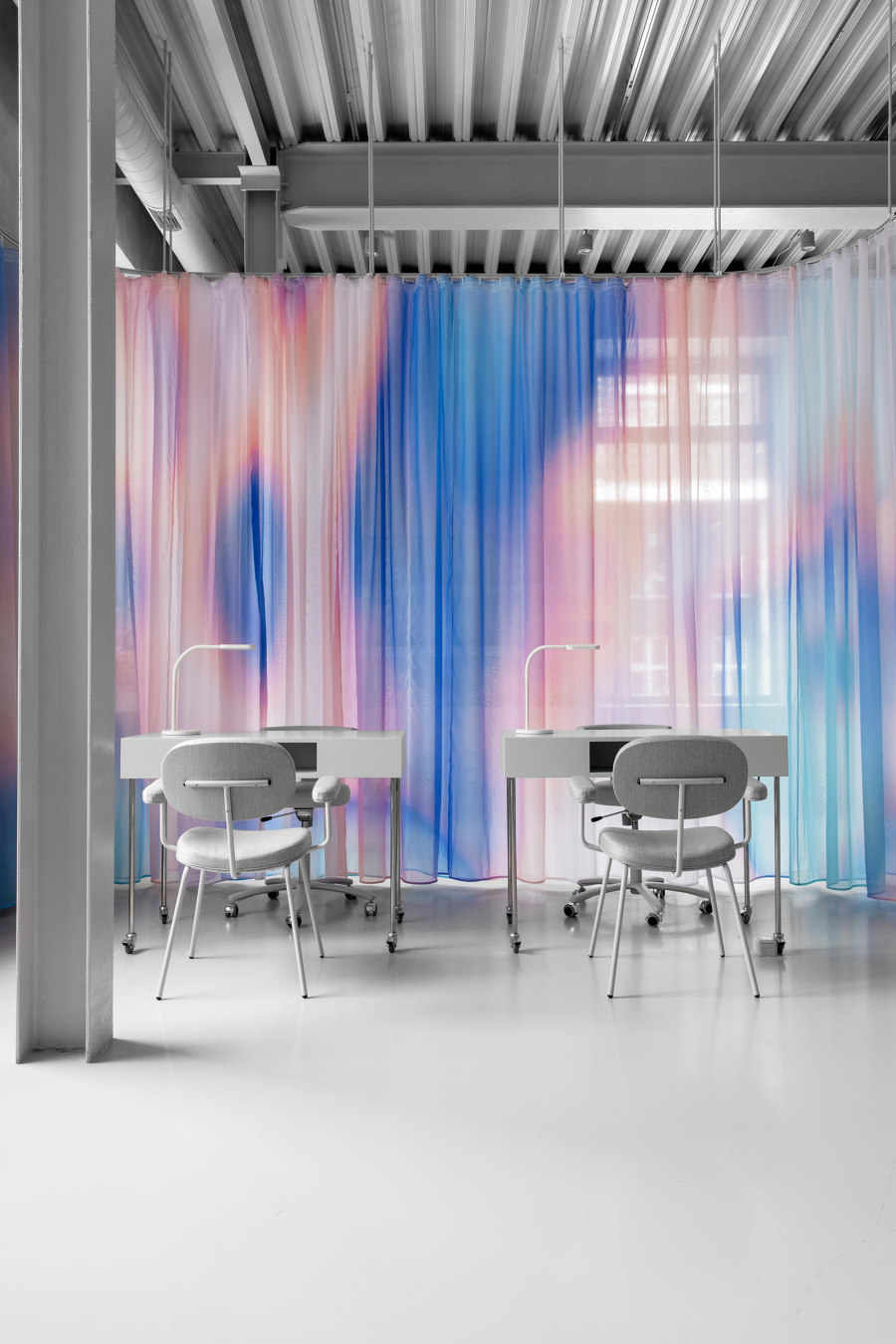
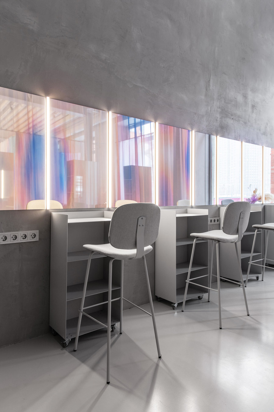
Sphera Beauty Co-Working salon by Eduard Eremchuk uses iridescent textiles to create a new kind of hybrid, shared workspace for beauticians with a penchant for minimalism. Photos: Inna Kablukova

Sphera Beauty Co-Working salon by Eduard Eremchuk uses iridescent textiles to create a new kind of hybrid, shared workspace for beauticians with a penchant for minimalism. Photos: Inna Kablukova
×In Moscow, Eduard Eremchuck used delicate textiles to design Sphera Beauty Co-Working, a shared space for make-up artists and hairdressers that also doubles as a lecture theatre and event space. The walls, floors and even furniture within the space are starkly white, while the movable, translucent curtain that separates the different, professionally equipped workstations feature a shimmering print by artist Katya Pyatitskaya, inspired by heatmaps.
© Architonic
