Good taste: new restaurant design
Text by Peter Smisek
25.09.19
The latest restaurant interiors are as much about the metaphoric consumption of design-led, experience-delivering spaces, as they are the literal consumption of food. Let's order!
The tyranny of minimalism is over and restaurant interiors are once again brimming with colours, textures and tactile details, even if a modicum of restraint in their architectural design persists. But this is no mere whimsy – the new wave of restaurant designs merely reflects the growing diversity and experimental nature of the eateries themselves.
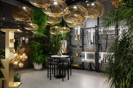
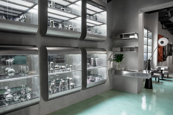
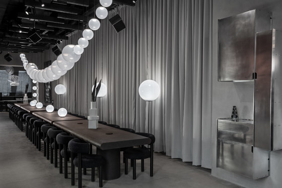
The Manzoni Restaurant combines a restrained spatial design with Tom Dixon's characteristically bold furniture and high-quality Italian materials and craftsmanship. Photos: Peer Lindgreen

The Manzoni Restaurant combines a restrained spatial design with Tom Dixon's characteristically bold furniture and high-quality Italian materials and craftsmanship. Photos: Peer Lindgreen
×The Manzoni in Milan is one such space. Designed by Tom Dixon, this Italian restaurant also doubles as an interactive showcase for the London-based designer's products. The entrance and bar area features a geometric tiled mural and a rough granite counter, while the main, pared-back dining hall is a grey, monochromatic space with a long, robust cork table. The last space, nicknamed 'The Jungle', features a number of Dixon's more exuberant designs set among palms and vines that fill the building's courtyard.
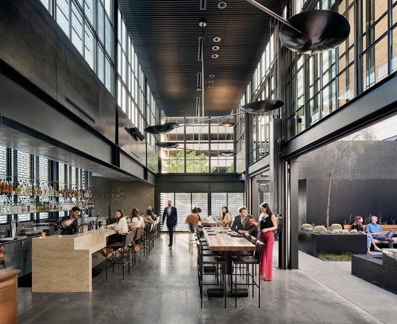
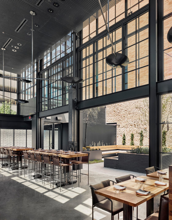
Like many other Olson Kundig projects, Comedor restaurant features custom-made fittings, including furniture, light fixtures and the practice's signature manually-retractable guillotine windows. Photos: Casey Dunn

Like many other Olson Kundig projects, Comedor restaurant features custom-made fittings, including furniture, light fixtures and the practice's signature manually-retractable guillotine windows. Photos: Casey Dunn
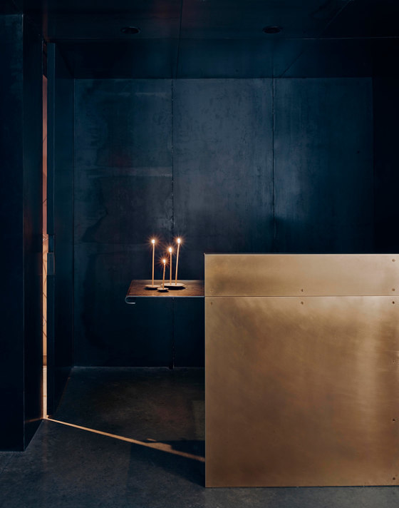
×Located in downtown Austin, Texas, Comedor is a Mexican restaurant designed by architecture practice Olson Kundig. Its entrance is screened off by a glass brick wall which leads to a long, glazed, double height dining space. One side of this space opens onto a large courtyard, taking advantage of the city's warm climate, while the other side features a marble bar. The restrained material and colour palette – think black steel, polished concrete floors, leather and wood – ensure a contemporary, refined look throughout.
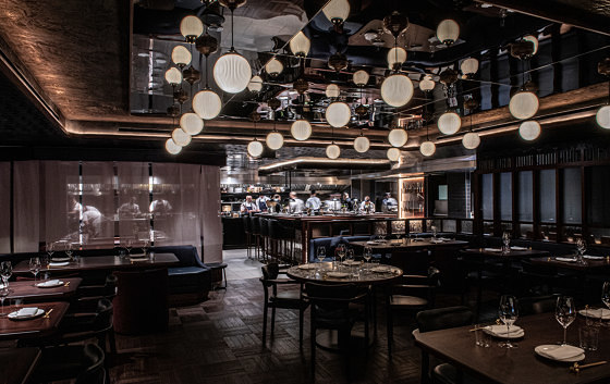
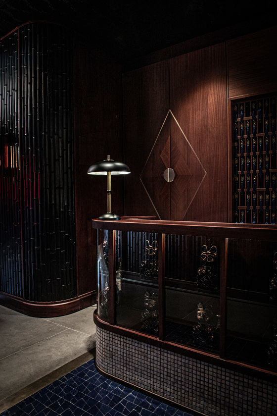
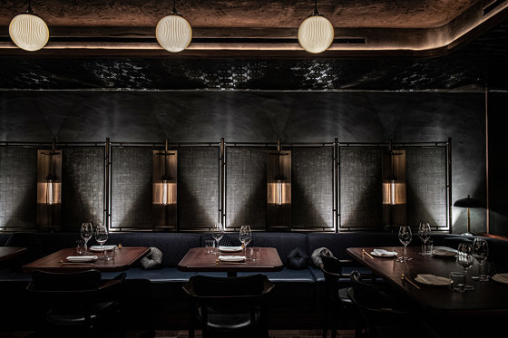
Afroditi Krassa-designed restaurant the Lucky Cat by Gordon Ramsey in London's Mayfair demonstrates how skilled architects can create a themed interior without resorting to cliché. Photos: Sim Canetty-Clarke

Afroditi Krassa-designed restaurant the Lucky Cat by Gordon Ramsey in London's Mayfair demonstrates how skilled architects can create a themed interior without resorting to cliché. Photos: Sim Canetty-Clarke
×An altogether more underground vibe can be found in London's newly opened Lucky Cat by Gordon Ramsay. Designed by Afroditi Krassa, the restaurant's dark, sumptuous interior is inspired by 1930s Tokyo speakeasies. A number of Chef's Tables – where guests can savour the changing tasting menu – are centrally located, while more casual, intimate seating arrangements can be found along the restaurant's perimeter. The colour scheme – dark ceilings and indigo and crimson upholstery – as well as bamboo-relief wall panels and an artwork featuring 300 bespoke ceramic cats, are combined with art deco touches and a display of rare Japanese knives to create a truly unique atmosphere.
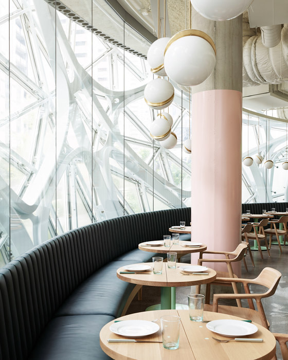
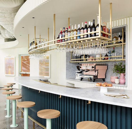
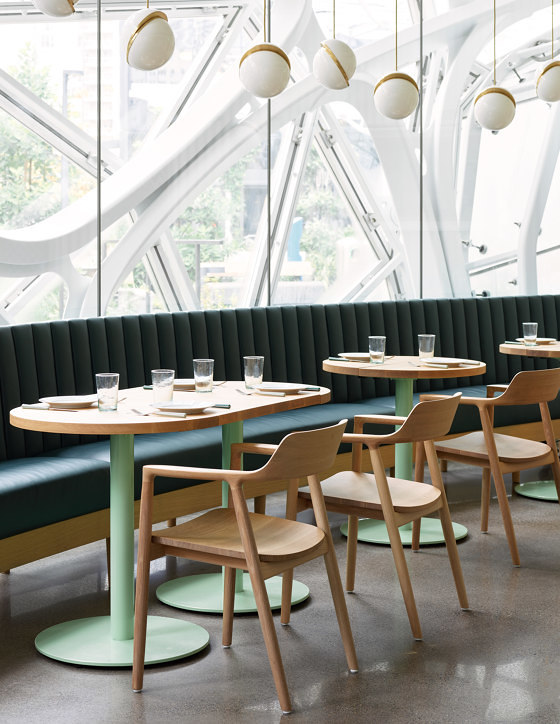
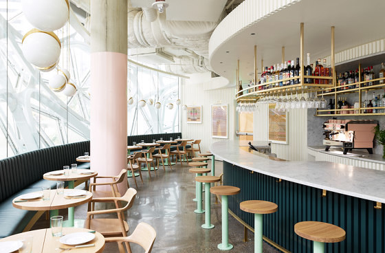
Heliotrope Architects' Willmott's Ghost restaurant is a colourful, informal space situated within a futuristic corporate building. Photos: © Kevin Scott

Heliotrope Architects' Willmott's Ghost restaurant is a colourful, informal space situated within a futuristic corporate building. Photos: © Kevin Scott
×Finally, in Seattle, Willmott's Ghost restaurant successfully tames the futuristic Amazon Headquarters into something altogether more domestic. Designed by Heliotrope Architects, the restaurant is inserted into the building's spherical geometry, but unlike the futuristic, high-tech detailing of the Spheres, the designers have opted for more restrained, familiar forms and materials. The restaurant features wooden chairs and tabletops, a curving marble bar and a navy blue banquette. The interior's informal, homey feel is further achieved with a pastel palette of dusky pink and mint green, and brass fittings.
© Architonic
