Hard work: new office designs that incorporate brick
Text by Peter Smisek
23.02.22
It's not for nothing that the humble brick has remained such a favourite with architects over the centuries, with its robust, versatile and sustainable qualities offering broad scope for creativity.
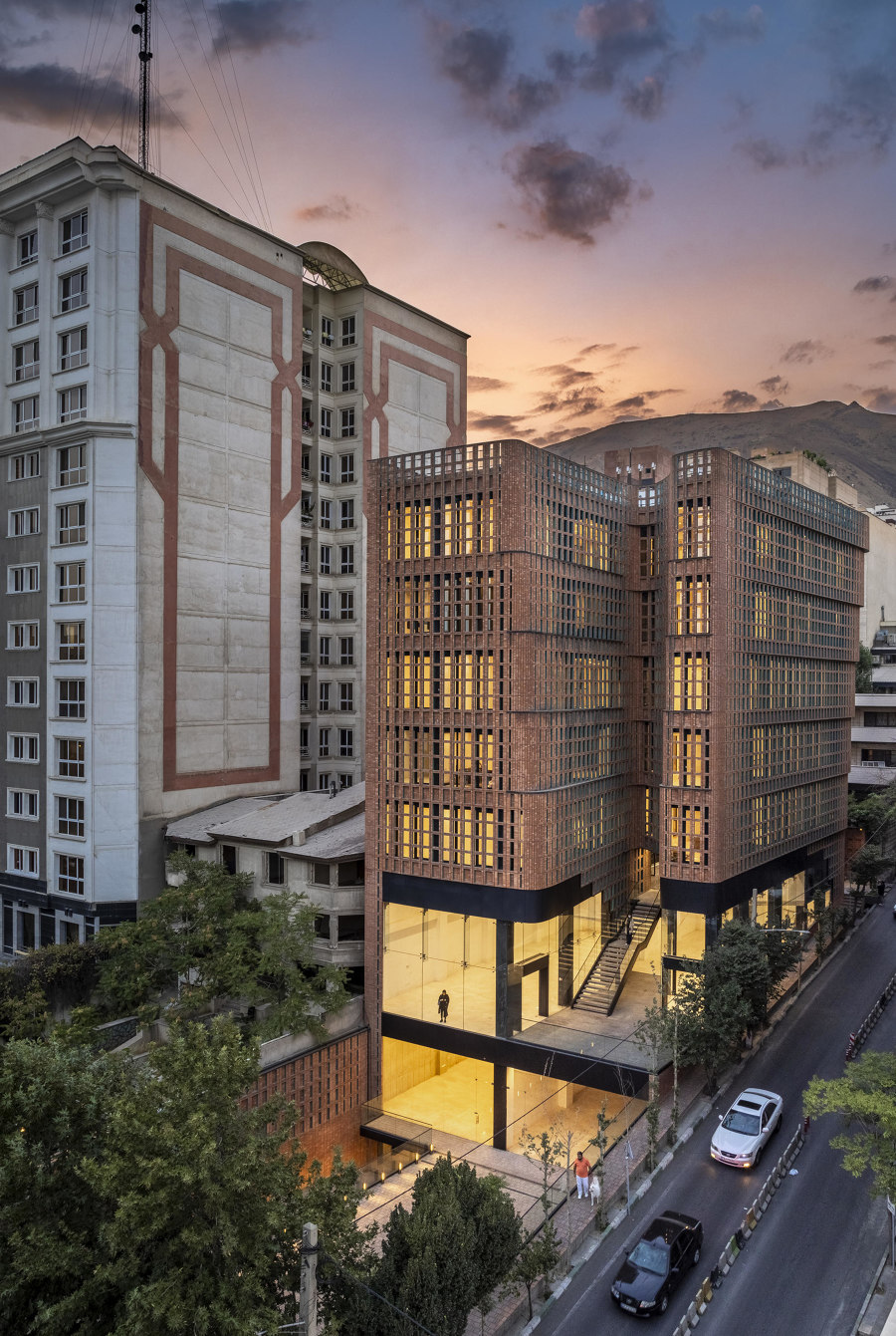
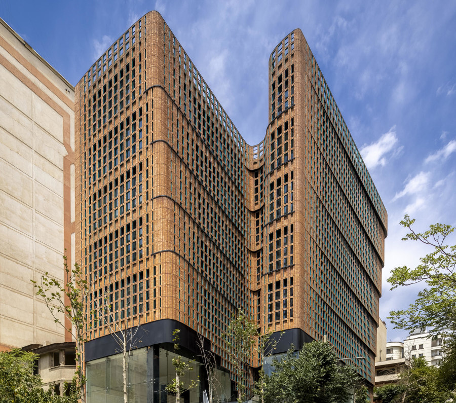
The delicate, undulating, curtain-like brick facade of Hooba Design's Hitra Office & Commercial Building in Tehran. Photo: Parham Taghioff

The delicate, undulating, curtain-like brick facade of Hooba Design's Hitra Office & Commercial Building in Tehran. Photo: Parham Taghioff
×Brick is one of the oldest building materials around, and with the current interest in craft, its popularity with architects, designers, developers and clients is at an all-time high. Often associated with residential architecture, brick is fast becoming the material of choice for statement commercial buildings and offices, too. Made using natural materials, durable, and even potentially reusable, bricks are infinitely versatile, and can be stacked into robust forms, expressive surfaces or even delicate screens.
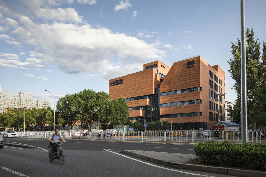
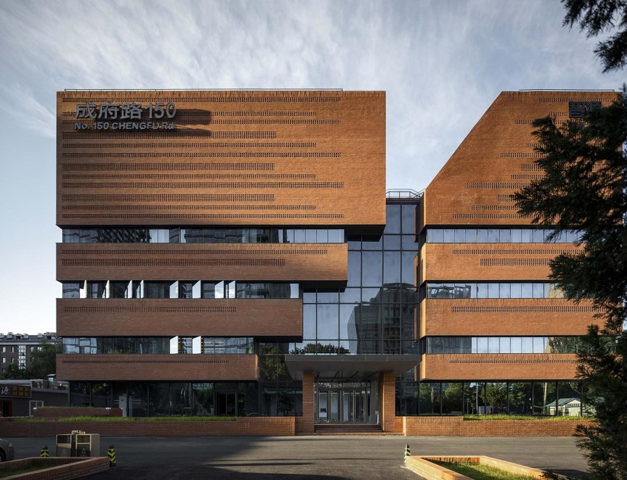
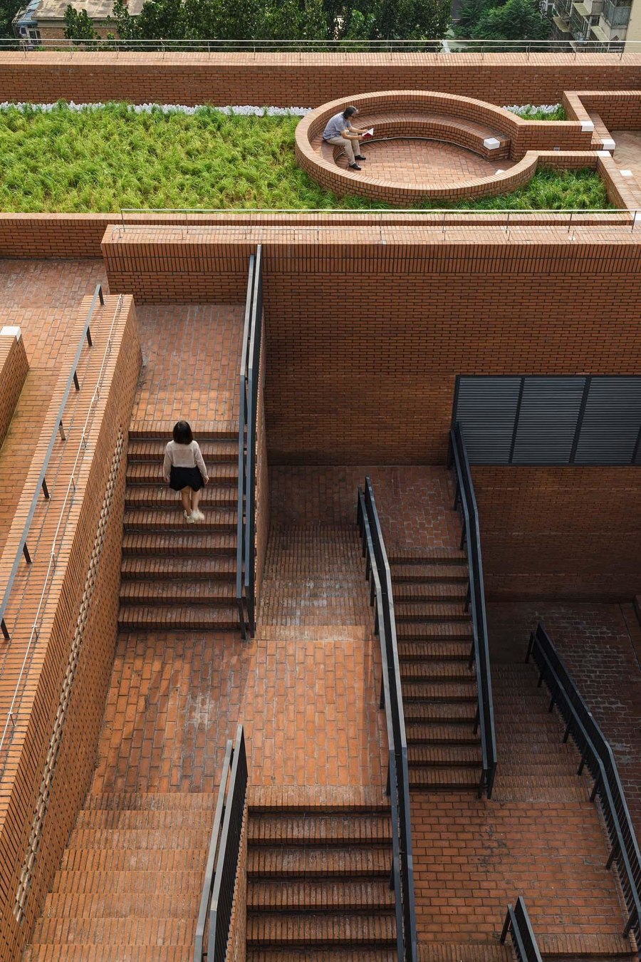
By refurbishing an existing structure with a robust brick exterior, URBANUS-designed No.150 Chengfu Road gains a distinctive presence in Beijing's busy cityscape. Photos: UK Studio

By refurbishing an existing structure with a robust brick exterior, URBANUS-designed No.150 Chengfu Road gains a distinctive presence in Beijing's busy cityscape. Photos: UK Studio
×In Beijing, architecture practice URBANUS have refurbished an existing building at No.150 Chengfu Road using a new brick facade to articulate an external stairway to the shared rooftop garden. By reinforcing the existing structure, the architects were able to clad the building in orange brick, creating a robust exterior, which is enlivened by alternating different bonds and even angling some of the bricks. Expansive windows and a glazed atrium bring light in and create an airy atmosphere, while brick balustrades and internal walls ensure continuity between the inside and outside.
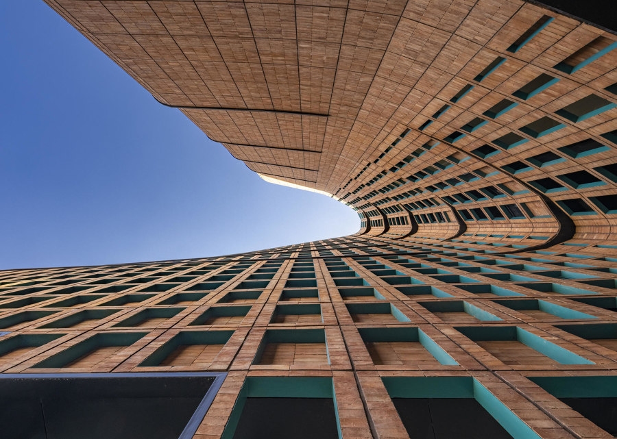
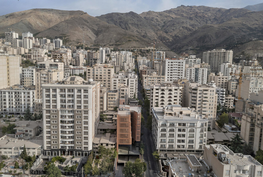
The delicate brick veil in Hooba Design's Hitra Office & Commercial Building helps to create a subtle, alluring, but surprisingly colourful, ensemble. Photos: Parham Taghioff, Deed Studio (bottom)

The delicate brick veil in Hooba Design's Hitra Office & Commercial Building helps to create a subtle, alluring, but surprisingly colourful, ensemble. Photos: Parham Taghioff, Deed Studio (bottom)
×Brick can of course be used to create screen-like surfaces. Hooba Design's Hitra Office & Commercial Building in Tehran features a delicate, undulating, curtain-like brick facade with floor to ceiling glazing behind. This helps to eliminate glare inside and reduce overheating while still providing panoramic views. The beige brick screen features bright turquoise reveals, adding an unexpected dash of colour.
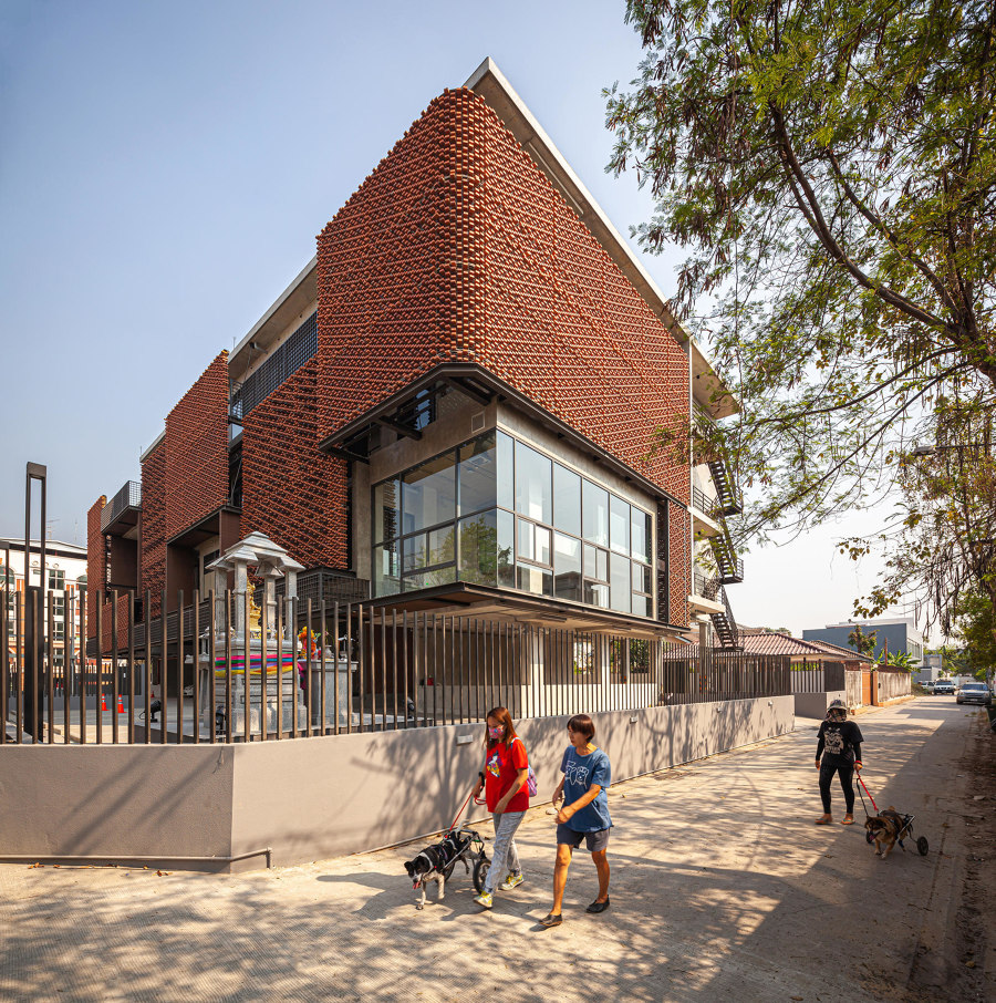
MTL Office building's brick screen, created by Junsekino Architect and Design, is broken up into a number of distinct planes, softening its large scale. Photos: Spaceshift Studio

MTL Office building's brick screen, created by Junsekino Architect and Design, is broken up into a number of distinct planes, softening its large scale. Photos: Spaceshift Studio
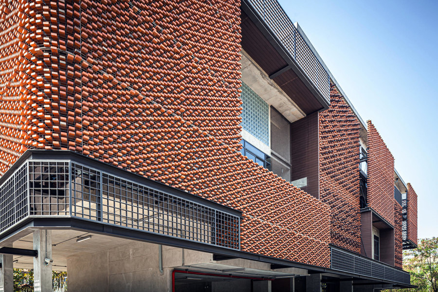
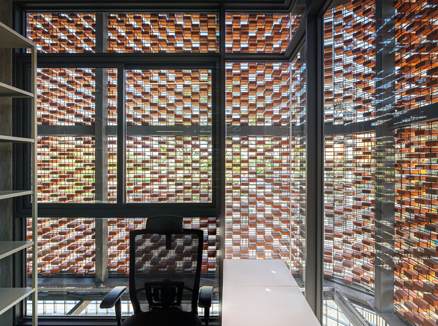
×In Bangkok, Junsekino Architect and Design also used bricks to design a series of screens that cover the facade of their new MTL Office building. The pale red bricks are stacked within a metal frame, creating an intricate set of patterns when viewed from a distance. The dense configuration of bricks helps keep out the tropical sun, forming a dense, yet delicate patterned screen with swathes of dappled shade inside. Using the brick in the interior, alongside exposed concrete, glass partitions and slender metal shelves creates a strong sense of material continuity and unifies the scheme.
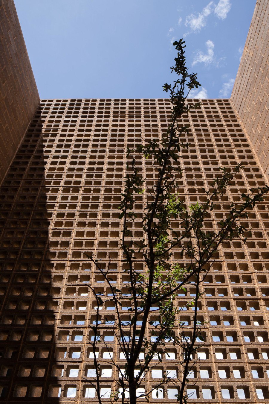
Despite their rougher aesthetic, the brick-like hollow concrete blocks that make up the facade of TorresRomero's Building Envases Microonda can be used to create delicate lace-like screens. Photos: Jorge Succar

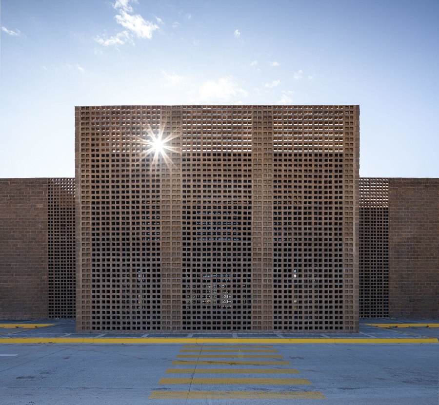
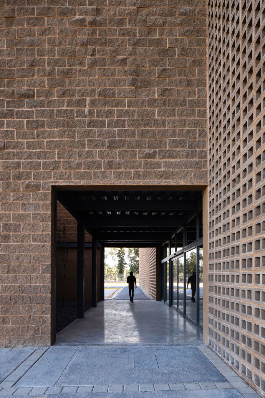
Despite their rougher aesthetic, the brick-like hollow concrete blocks that make up the facade of TorresRomero's Building Envases Microonda can be used to create delicate lace-like screens. Photos: Jorge Succar
×In the central Mexican city of León, the TorresRomero-designed Corporate Building Envases Microonda features a symmetrical, almost classical composition reminiscent of Louis Kahn or Mies van der Rohe, with compact courtyards bringing natural light into the building. The exterior meanwhile, is covered in rough concrete blocks. Similar to bricks, large swathes of these hollow blocks are laid on their side, creating screen-like sections within the building's elevations.
© Architonic
