Re:work – adaptive reuse in office interiors
Text by Peter Smisek
05.02.20
Architects are adding value to the world of work via adapted workspaces that are small on carbon liability and big on creative solutions.
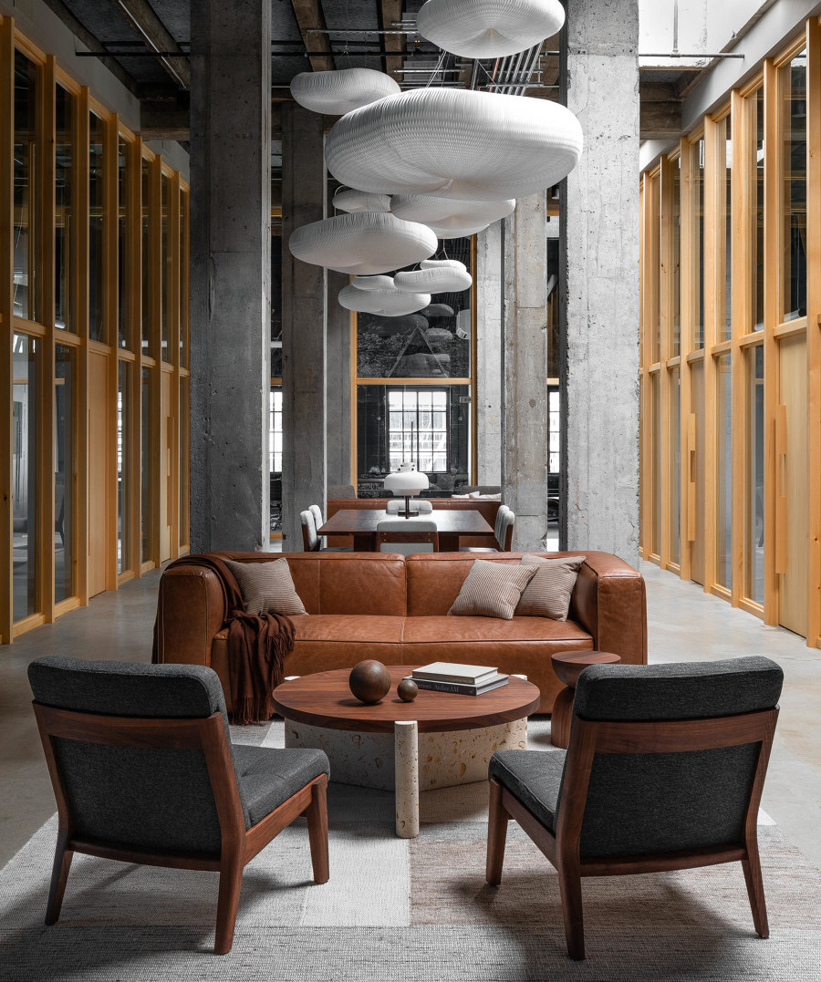
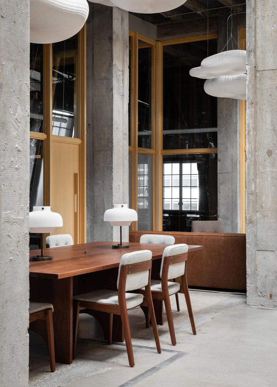
On their Studio Penthouse project in Portland, JHL Design reserved the central space – where the roof is at its highest – for a communal zone full of comfortable lounge chairs and sofas. Photo: Haris Kenjar

On their Studio Penthouse project in Portland, JHL Design reserved the central space – where the roof is at its highest – for a communal zone full of comfortable lounge chairs and sofas. Photo: Haris Kenjar
×The construction industry's carbon footprint is significant, so it makes sense for architects and clients to renovate, convert and extend existing spaces whenever possible, offices included. Although working with existing buildings can pose constraints, truly skilful architects and designers can create original designs that make the best use of the available space, creating unique working environments in the process.
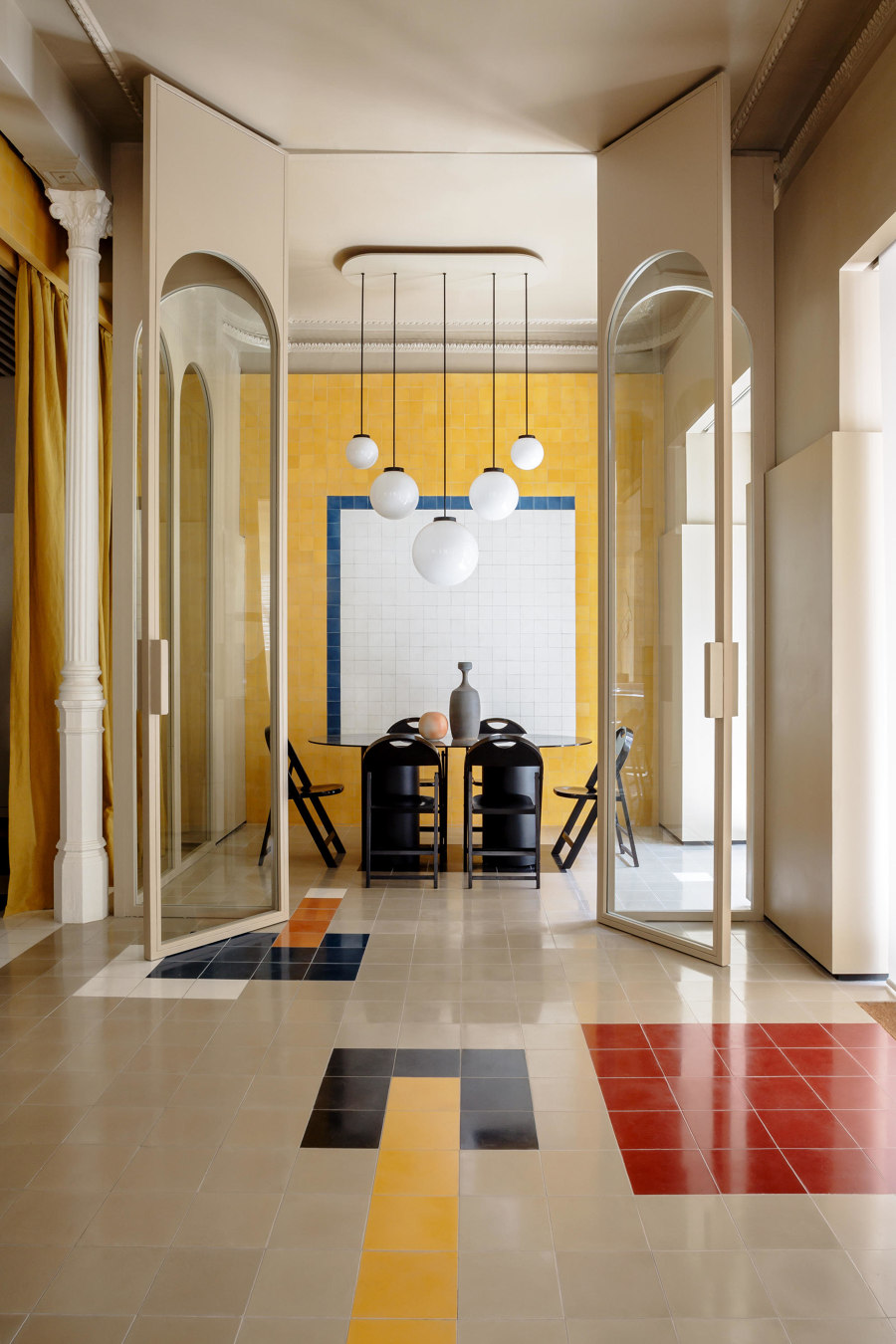
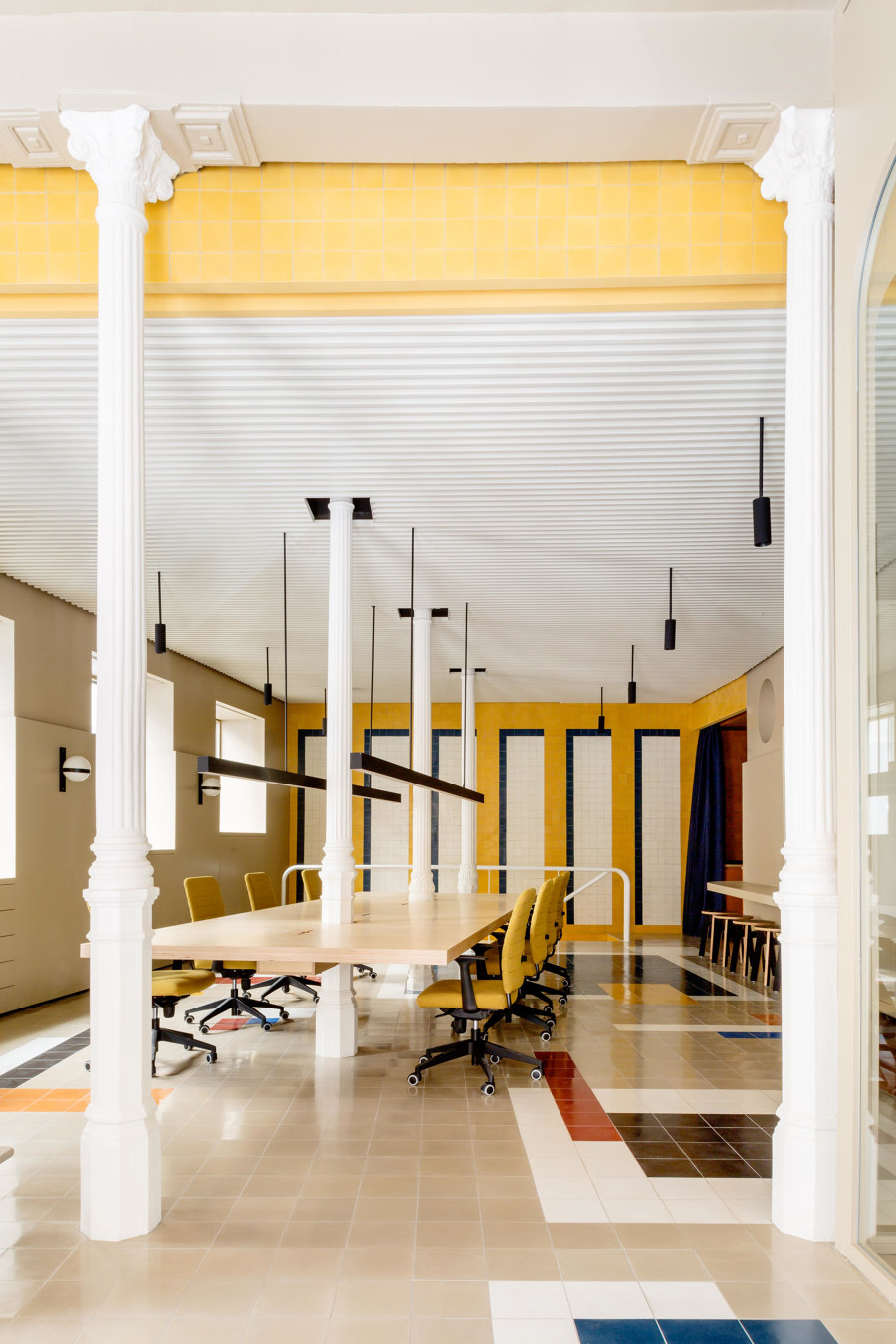
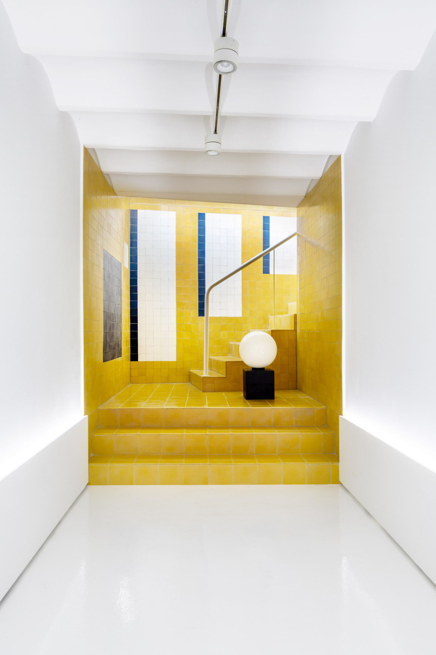
Casa Josephine's design for Agency Madrid office marries a highly flexible layout with idiosyncratic decorative touches and bold colours. Photos: Belen Imaz

Casa Josephine's design for Agency Madrid office marries a highly flexible layout with idiosyncratic decorative touches and bold colours. Photos: Belen Imaz
×In Madrid, studio Casa Josephine has created a new workspace for an advertising agency in an old motorcycle repair shop. Called Agency Madrid, the office consists of a generous ground floor space covered in colourful tiles, and a large communal table suspended between the building's original cast-iron columns. Curtains help separate the directors' office and a small kitchenette from the main space, while the basement is used for client presentations.
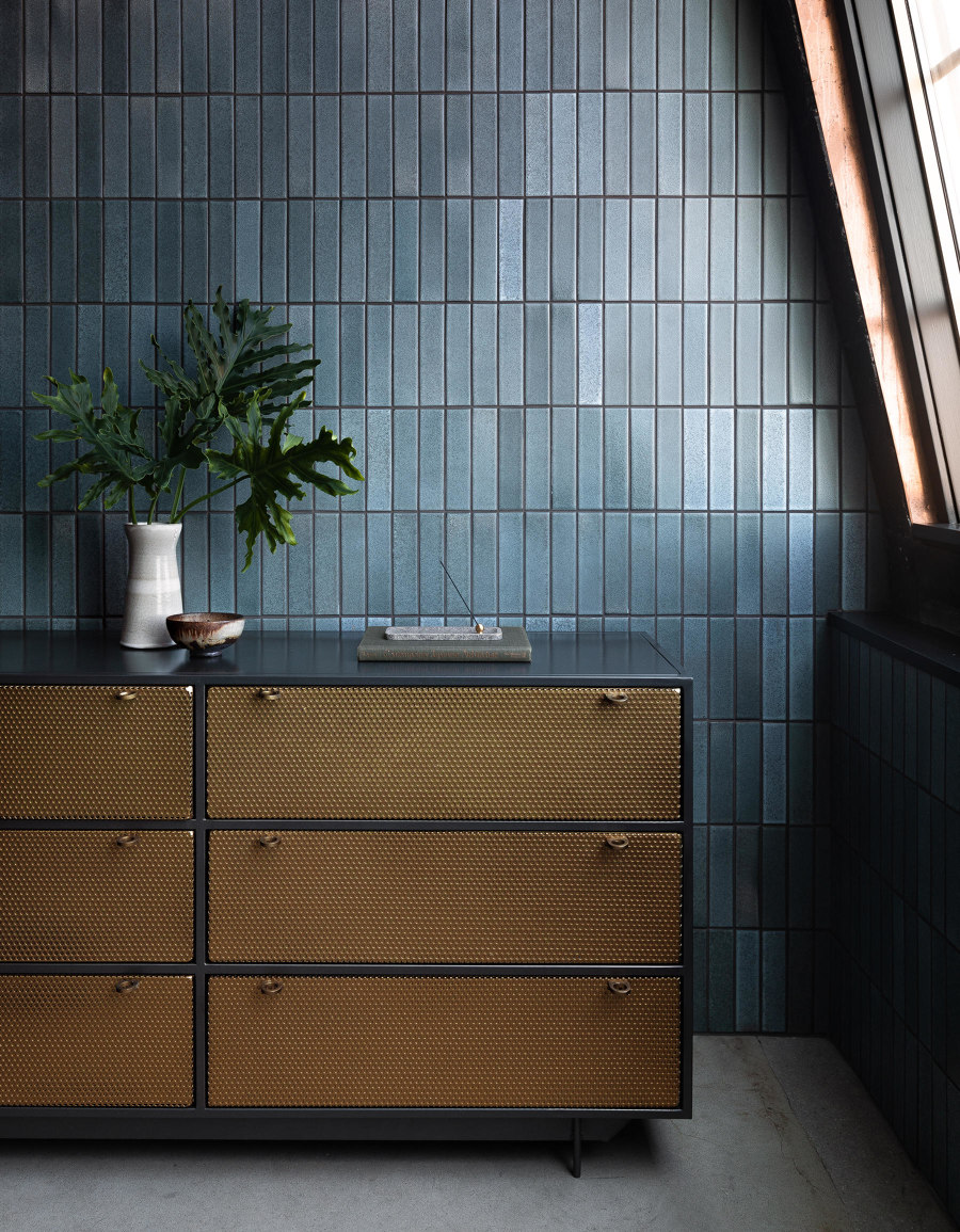
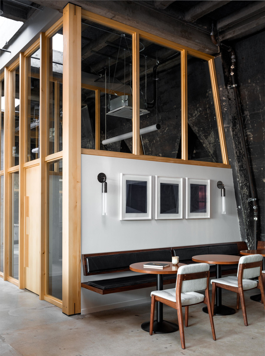
Studio Penthouse, designed by JHL Design, shows how an office conversion can retain the atmosphere of the original structure. Photos: Haris Kenjar

Studio Penthouse, designed by JHL Design, shows how an office conversion can retain the atmosphere of the original structure. Photos: Haris Kenjar
×Another unexpected reuse project is JHL Design's Studio Penthouse in Portland. To preserve the atmosphere of the old loft structure, designers have exposed the concrete and reserved the central space – where the roof is at its highest – for a communal zone full of comfortable lounge chairs and sofas. Office spaces are located along the perimeter, separated by Alaskan yellow cedar partitions, and enjoy city views. Pared-back, crafted furnishings and a simple colour palette of light grey upholstery and dark wood complete the highly evocative interior.
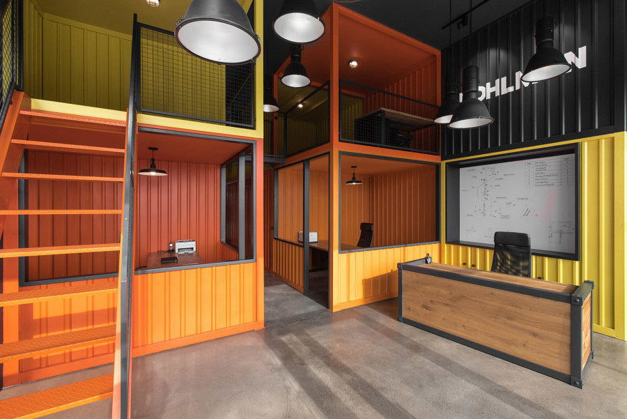
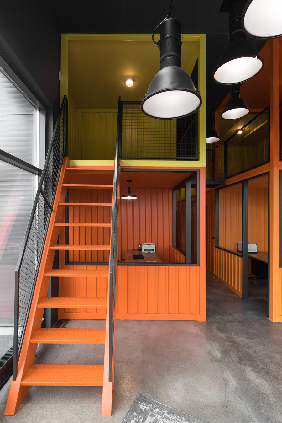
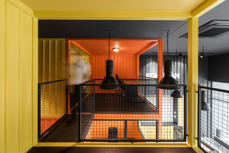
The bright containers created by mode:lina, mean that the KOHLMAN office makes an instant impression on visiting clients. Photos: Patryk Lewiński

The bright containers created by mode:lina, mean that the KOHLMAN office makes an instant impression on visiting clients. Photos: Patryk Lewiński
×But architects are often presented with the opposite problem. The KOHLMAN office near the Polish port city of Gdańsk is located in a rather ordinary building. But mode:lina architects have devised a way to create a more memorable space – as well as more space in general. Taking inspiration from the nearby port, the architects have stacked brightly coloured, container-like pods on top of one another to create a memorable, mezzanine-like office.
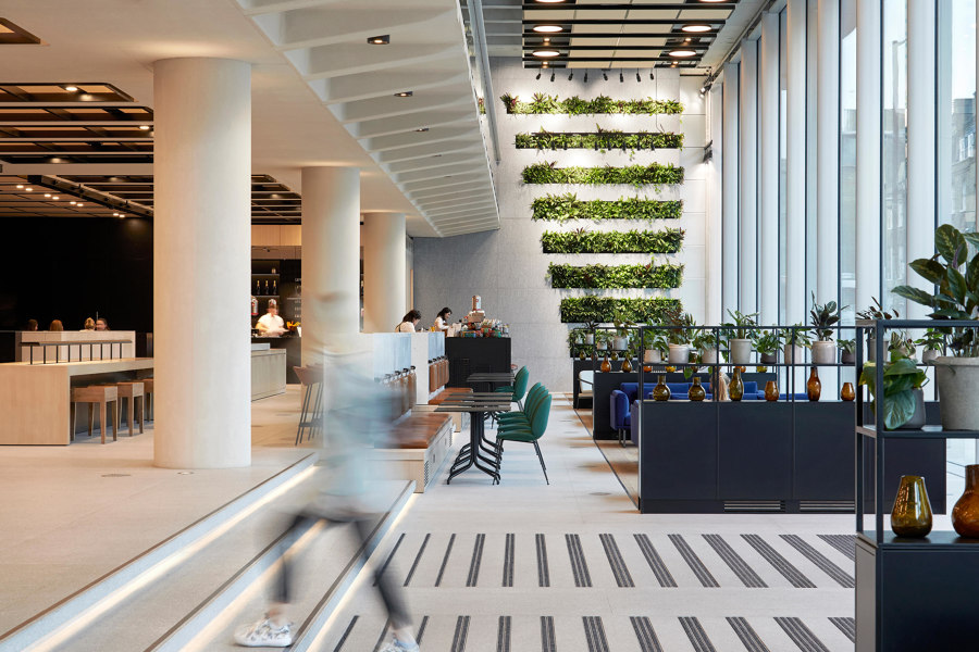
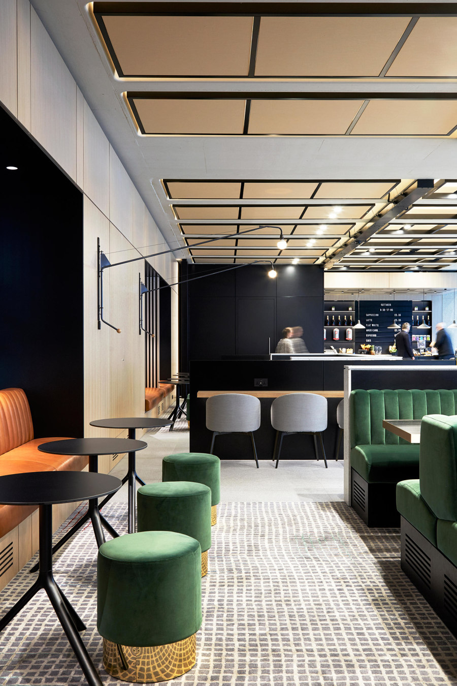
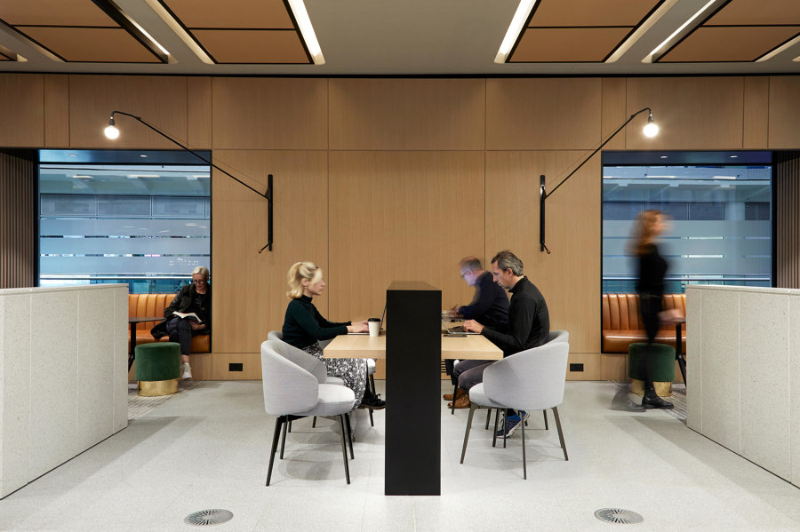
As leisure and work become more intertwined, unconventional office concepts like Conran & Partners' 200 Gray's Inn Road will become more common. Photos: Anna Stathaki

As leisure and work become more intertwined, unconventional office concepts like Conran & Partners' 200 Gray's Inn Road will become more common. Photos: Anna Stathaki
×In London, Conran & Partners have adapted a section of a Norman Foster building at 200 Gray's Inn Road in the city's legal district into a new hybrid space, which combines a reception, café and flexible open office. Extending into a formerly outdoor portico, the airy communal area has been furnished with low, free-standing shelves and comfortable furnishings that help subdivide the space from the cafe, which can be used as an informal meeting space. Muted finishings and jewel tones complement the floor to ceiling views of the street and passers-by.
