Death by Architecture
Text by Simon Keane-Cowell
Zürich, Switzerland
04.03.11
Shuffling off this mortal coil is something we all, sadly, have to do. There's no opting out. But while mortality might be a great leveller, a number of architects have shown recently how designing environments that process death – be it in practical or psychological terms – can be elevated above the uninspired builds that we've been used to, which have all to easily embraced historicism or, perhaps worse, anonymity. Architonic presents a selection of projects that put some life back into designing for the dead.
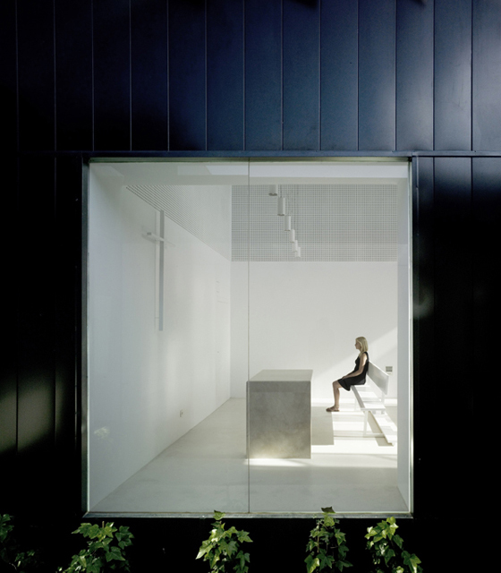
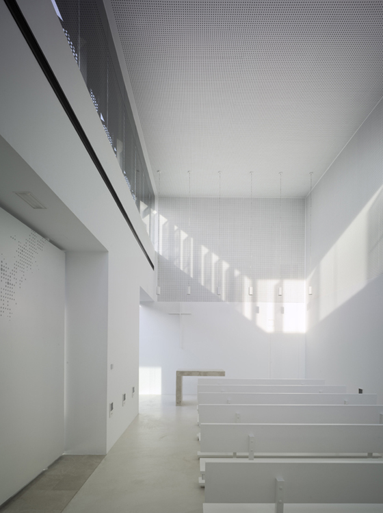
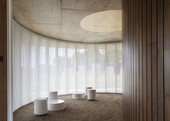
View into the chapel at Spanish architectural practice COR's funeral home and garden in Alicante for the Town Council of Pinoso

View into the chapel at Spanish architectural practice COR's funeral home and garden in Alicante for the Town Council of Pinoso
×If there's one thing that's inevitable in our lives, it's that they are going to come to an end. This we know. Death becomes us, so to speak. Yet we've reached a point, in Western society at least, where a great deal of work is done to disavow our mortality, to repress that knowledge that our time on this earth is limited. Such an undertaking is, as we all know, but choose not to accept, anything but healthy in mental, emotional and spiritual terms. (I wonder if undertakers – often cited as working in a recession-proof industry – are themselves any more philosophical about the finite nature of human existence...)
A rational response by Portuguese architect Pedro Dias's to the Duarte family's brief to design a eight-coffin tomb in the Açor Mountains; photo Pedro Dias

A rational response by Portuguese architect Pedro Dias's to the Duarte family's brief to design a eight-coffin tomb in the Açor Mountains; photo Pedro Dias
×Given the inescapable nature of death, it's only logical that there's a need to build structures that serve, both practically and symbolically, to deal with the business of dying. But, in spite of their necessity, such projects – cemeteries, crematoria and tombs among them – have often received a kind of design treatment that either relies too heavily on historicism or apologises for its presence. While sensitivity will always be an issue, it's heartening to see a number of recent architectural projects relating to the processing of death or the ritualising of loss take a more contemporary, often modernist-derived, approach to giving form and creating space, which, through their thoughtfulness and expressiveness, have a life-affirming effects – even if, ultimately, the end client won't have to say too much about it themselves.
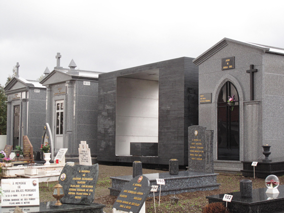
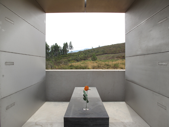
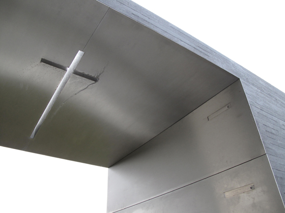
Unlike those adjacent to it, architect Pedro Dias's tomb for the Duarte family features a void at its centre, encouraging visitors to enter it and to contemplate, while also framing views of the surrounding landscape; photos Pedro Dias

Unlike those adjacent to it, architect Pedro Dias's tomb for the Duarte family features a void at its centre, encouraging visitors to enter it and to contemplate, while also framing views of the surrounding landscape; photos Pedro Dias
×In stark contrast to the more traditional structures between which it sits, architect Pedro Dias's family tomb, located in the Portuguese Açor Mountains, privileges openness, both literally and rhetorically. Unlike the closed forms of the adjacent sepulchres, Dias's reduced, rational design, in spite of the Duarte family's brief that it be able to house eight coffins, features a void at its centre, which functions not only as an invitation to experience the space by entering it and sitting on its bench, but also as a visual framing device for the mountain landscape that surrounds it. Visitors to the tomb are thus able to engage both in an inner contemplation and an outer one.
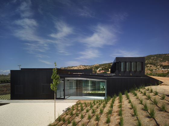
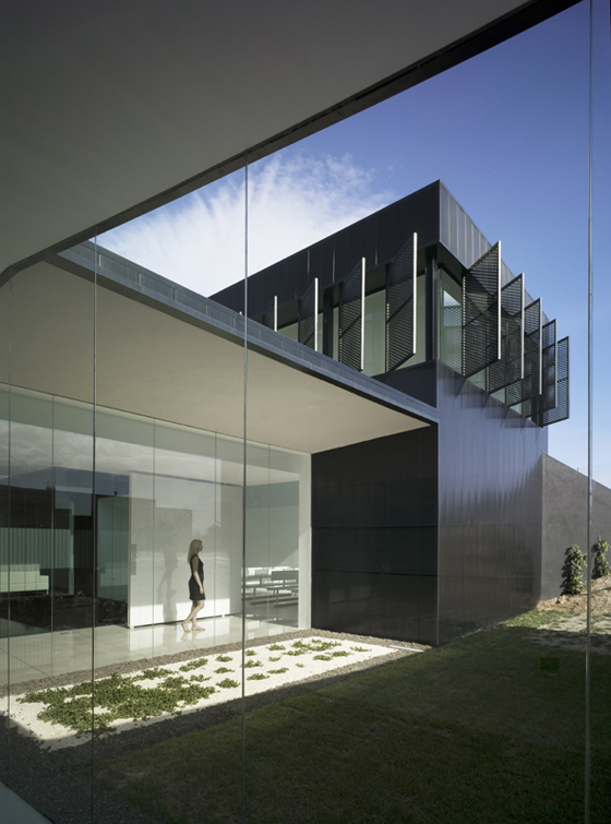
Alicante is the location of Spanish office COR's funeral home and garden for the Town Council of Pinoso. 29 Japanese maples have been planted in front of the building to act as a visual and spatial buffer

Alicante is the location of Spanish office COR's funeral home and garden for the Town Council of Pinoso. 29 Japanese maples have been planted in front of the building to act as a visual and spatial buffer
×In terms of construction, the tomb consists of a prefabricated metal structure, which, having been transported to the site and positioned with the aid of a crane onto a in-situ-built concrete plinth, was then completed with poured-concrete slabs and side walls, and a final stone cladding. It's a pleasing irony that the spatial void at the tomb's heart should speak at once so clearly of absence and loss, and of the possibility of it being filled with the living.
Inside the chapel at COR's funeral home in Alicante. The project was completed for a remarkable budget of just €430,000, welcome news given the current economic climate in Spain

Inside the chapel at COR's funeral home in Alicante. The project was completed for a remarkable budget of just €430,000, welcome news given the current economic climate in Spain
×Alicante in Spain is the location of architectural office COR's funeral home and garden for the Town Council of Pinoso. To say the experience of being in this building has been given some consideration could almost be an understatement. Here, light, sound, temperature and humidity are all the result of conscious design decisions on the part of the architects, which combine to create an environment that treats its users with sensitivity and respect. Located on the edge of town and arranged over 495 square metres, the project is 'buffered' from adjacent buildings through the planting of, what COR describe as, a 'vegetation mattress' – 29 Japanese maples that will provide an increasing amount of spatial and visual separation from the funeral home's immediate context as they grow.
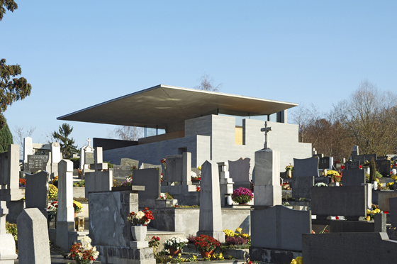
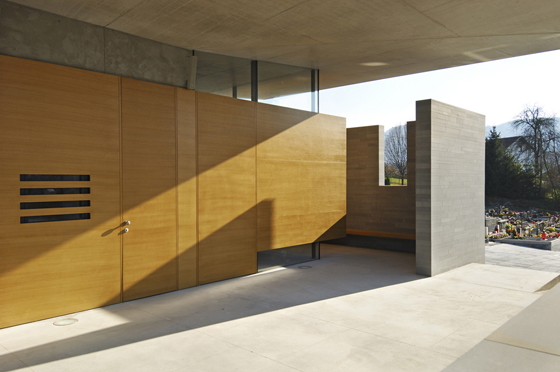
When asked to design a 'Farewell Chapel' in Teharje, Slovenia, Ljubljana-based office Architektura Krušec created a structure that, with its 'floating' roof, choses not to look like a unified composition; photos Miran Kambič

When asked to design a 'Farewell Chapel' in Teharje, Slovenia, Ljubljana-based office Architektura Krušec created a structure that, with its 'floating' roof, choses not to look like a unified composition; photos Miran Kambič
×The notion of a controlled environment is embraced further through the inclusion of six internal courtyards, which means that, thanks to full-height glazing, visitors can connect, while inside, with the outside in a way that has been planned and considered. In short, there'll be no surprises. What's particularly noteworthy about this project is its cost, however. Given Spain's current economic woes, to complete such a scheme for just €430,000 is truly impressive.
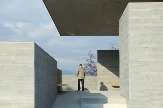
Architektura Krušec's chapel design deliberately directs the gaze of visitors, once inside the chapel, across the striking surrounding landscape, while masking off views of the immediate cemetery's tombstones; photos Miran Kambič

Architektura Krušec's chapel design deliberately directs the gaze of visitors, once inside the chapel, across the striking surrounding landscape, while masking off views of the immediate cemetery's tombstones; photos Miran Kambič
×A stark reduction to the essential planes of floor, walls and roof are central to Ljubljana-based architectural practice Architektura Krušec's design of a 'Farewell Chapel' for the Municipality of Celje in Teharje, Slovenia. Situated at the top of small hill in the centre of the village, its local-sandstone walls of differing heights direct the gaze of visitors, once inside the chapel, across the striking surrounding landscape, while masking off views of the immediate cemetery's tombstones. A special conceit features the carving of the chapel's walls on the inside, meaning that when sunlight enters through the clerestory windows at a certain angle, long shadows are cast across the walls, creating a contemplative air.
The most dramatic element of the chapel is its cantilevered membrane roof, which appears almost to float above the rest of the building, such is the deliberate discontinuous composition of the structure. On a functional level, its presence means that valedictory ceremonies can also take place in bad weather conditions.
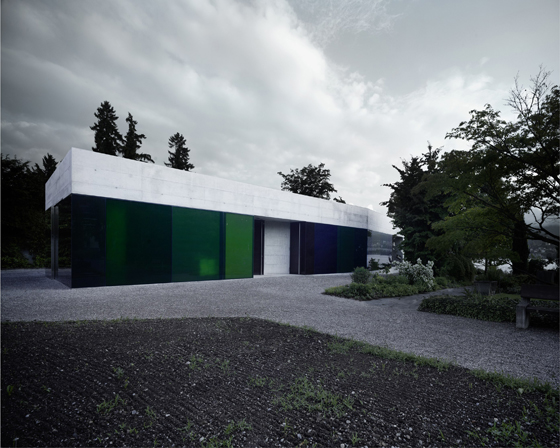
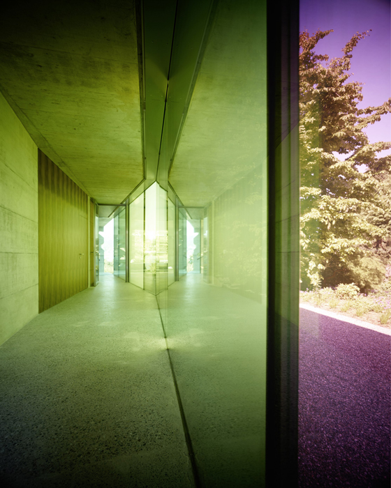
Andreas Fuhrimann and Gabrielle Hächler's Erlenbach cemetery building, situated on the edge of Lake Zurich, Switzerland, was conceived as a pavilion, underscoring the quiet and intimate nature of the cemetery; photo Valentin Jeck

Andreas Fuhrimann and Gabrielle Hächler's Erlenbach cemetery building, situated on the edge of Lake Zurich, Switzerland, was conceived as a pavilion, underscoring the quiet and intimate nature of the cemetery; photo Valentin Jeck
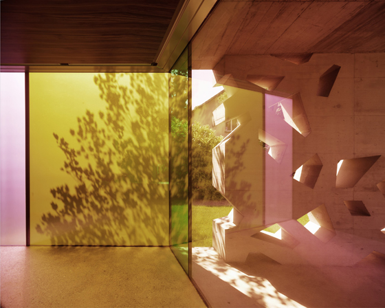
×Built on an existing cemetery that lies on the shores of Lake Zurich in Switzerland, architects Andreas Fuhrimann and Gabrielle Hächler's Erlenbach cemetery building forms a dialogue with the site's church, but has a very different function. Conceived more as a pavilion, it underscores the quiet and intimate nature of the cemetery. Among the building's various internal spaces are a series of chapels of rest, which are accessed by a corridor that looks out on one side through full-height glazing onto the cemetery. Typical of the way that light throughout the project is controlled, coloured opaque glass provides a sense of atmospheric intimacy and while affording a degree of privacy. The architects describe the building's interior as 'introverted', which they see as 'allowing the necessary quiet for grief and saying goodbye'.
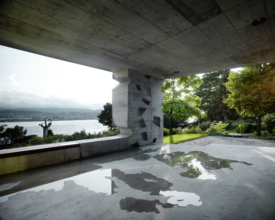
A small outdoor space at the Erlenbach cemetery building features perforated aerated-concrete walls. Inside, coloured opaque glass creates a contemplative air; photos Valentin Jeck

A small outdoor space at the Erlenbach cemetery building features perforated aerated-concrete walls. Inside, coloured opaque glass creates a contemplative air; photos Valentin Jeck
×The visitors' room and a small outdoor space overlook the lake, the latter featuring two perforated ornamental walls that speak of celebration rather than solemnity. These walls, along with the walls of the chapels of rest, support the roof, while the main glazed, coloured façade is not load-bearing. Aerated concrete used throughout the building allows simple and direct detailing, while giving the structure an earthy quality. The overall effect is a building that demonstrates respect for the deceased while providing a space for contemplation and comfort for the living.
Zurich-based architects Andreas Fuhrimann and Gabrielle Hächler describe their Erlenbach cemetery building's interior as 'introverted', which they see as 'allowing the necessary quiet for grief and saying goodbye'; photo Valentin Jeck

Zurich-based architects Andreas Fuhrimann and Gabrielle Hächler describe their Erlenbach cemetery building's interior as 'introverted', which they see as 'allowing the necessary quiet for grief and saying goodbye'; photo Valentin Jeck
×With its relatively recent rise in popularity (if that's the right word) in Western society, cremation hasn't, unlike the act of burial, had enough time truly to develop a ritual around it of the same thoughtfulness and solemnity. The technology of the affair (think small chapel, closing velvet curtains, trundling conveyor belt) often seems to take centre stage. Paris-based design collective Plan 01, according to whom cremation will become the number-one funereal practice in France by 2030, have designed a secular crematorium in Rennes that uses architecture to improve the situation, bringing more dignity to the ceremony and allowing a more suitable space for mourning.
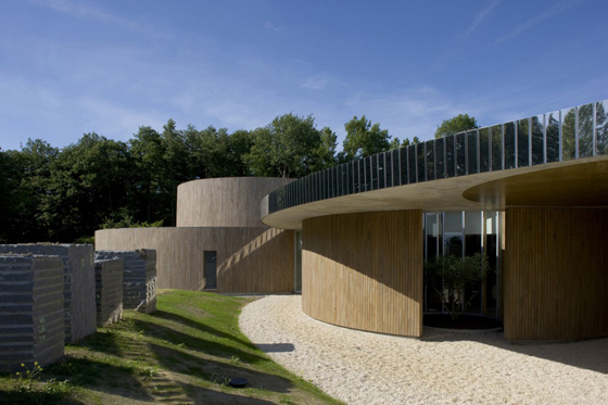
With their secular crematorium in Rennes, France, Paris-based architectural collective Plan 01 have attempted to introduce more dignity to ceremonies and provide a more suitable space for mourning; photo Stéphane Chalmeau

With their secular crematorium in Rennes, France, Paris-based architectural collective Plan 01 have attempted to introduce more dignity to ceremonies and provide a more suitable space for mourning; photo Stéphane Chalmeau
×The architects took the symbolism of the circle – the idea of life everlasting – and elaborated it literally throughout their design, using it to define the shape of spaces, both in terms of interior rooms and of the exterior landscape. The result is a 1,100-square-metre, low-level structure that appears highly integrated into its physical context, and which consciously eschews the monumental in favour of the accessible and welcoming. A greater sense of the building's setting is afforded by the fact that visitors park their cars in the adjacent wooded area and walk the rest of the way to the crematorium along a number of different paths, gradually making the transition from the everyday to this special, more mediative environment.
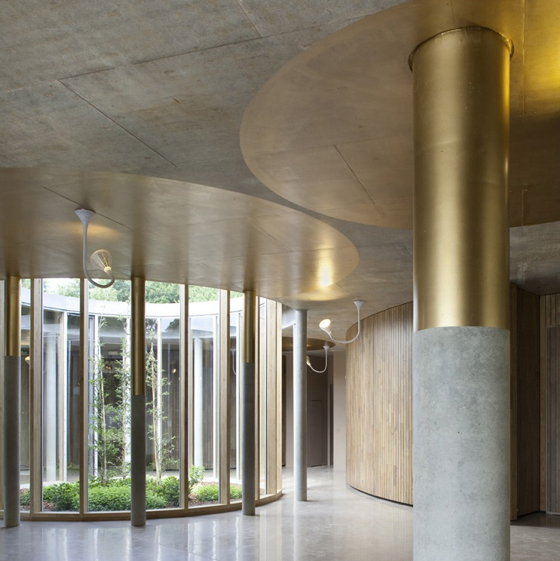
Once inside, a central hall plays a key role in terms of the system of circulation, which avoids corridors in favour of spaces that flow into each other. Smaller waiting rooms lead to larger ceremonial spaces, the latter replete with outdoor patios. Natural, but controllable, light abounds throughout the project.
With a circulation system where spaces flow into other spaces, without the need for corridors, Plan 01's crematorium in Rennes is, in plan, a repeated elaboration of a highly symbolic single shape – the circle; photos Luc Boegly

With a circulation system where spaces flow into other spaces, without the need for corridors, Plan 01's crematorium in Rennes is, in plan, a repeated elaboration of a highly symbolic single shape – the circle; photos Luc Boegly
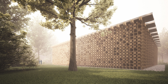
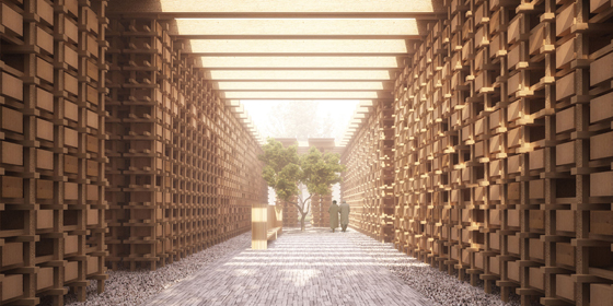
×When you're laid to rest, usually that's it. But in the case of the beautiful 150-year-old cemetery at Orthen, Netherlands, overdue maintenance meant that 9,000 graves needed to be emptied and their residents' bones moved elsewhere. In response to an architectural competition to design a place for their storage, Buijsenpennock Architects, one of a number entrants, proposed a building type not commonly found in the Netherlands, or, indeed, many parts of Europe – the ossuary. Housing, so to speak, the remains of 12,000 of the deceased at full capacity, the project uses rough-sawn oak columns and beams to create a mesh-like structure, into whose voids more neatly finished oak boxes, which contain the bones, can be placed. Think of it a bit like an architectural game of Connect Four (with no winners or losers): over time, the holes in ossuary's framework are filled in, as the walls are transformed into solid elevations. Branding on the oak boxes identifies their occupants.
Buijsenpennock Architects' proposal for an ossuary in Orthen, Netherlands, features a mesh-like oak structure, whose walls gradually become filled in with oak boxes, containing the bones of up to 12,000 of those who have passed on

Buijsenpennock Architects' proposal for an ossuary in Orthen, Netherlands, features a mesh-like oak structure, whose walls gradually become filled in with oak boxes, containing the bones of up to 12,000 of those who have passed on
×A glass roof allows daylight into the building, illuminating its narrow, high corridors and working with the texture of the knotted wood to create a play of shadows. Outside, a courtyard, planted with a tree, provides a space for reflection.
Strong on concept, but sadly not selected to be built, Buijsenpennock Architects' proposal, with its literal filling in of negative space over time, acts as a metaphor for deathly architecture as a whole. If the end of our mortal lives is imagined by so many of us as a form loss, of absence, then buildings constructed to process death, either in practical or psychological terms, might themselves be regarded as fetish objects, whose very presence, very materiality, comes to stand in for that perceived and often heart-felt loss. This is architecture as life.
.....
Related feature:
.....
