Poetic Shopping: Aesop designs the retail experience
Text by Simon Keane-Cowell
Zürich, Switzerland
30.08.16
When it comes to creating unique, design-led retail experiences, skincare brand Aesop has it in the bag.
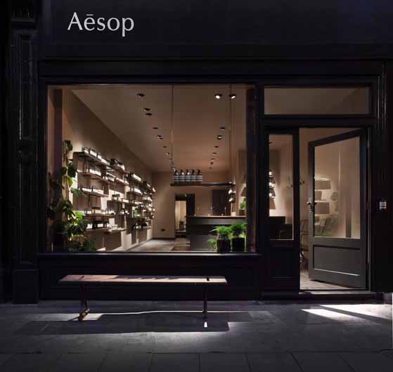
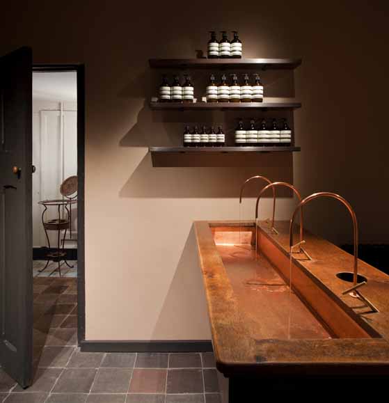
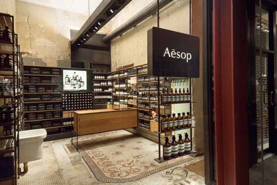
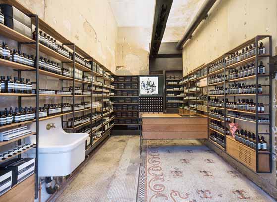
Aesop Store Lamb's Conduit Street, London, England; designed by James Plumb
Against a backdrop of the indomitable rise of e-commerce and eschewing the received wisdom that a successful brand identity is one that adheres uncompromisingly to the tenets of sameness and consistency, skincare label Aesop has taken a confident creative and commercial stand by creating, worldwide, a portfolio of unique and poetic physical retail spaces – each the result of an open-brief collaboration with some of the leading lights in architecture and design.
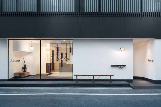
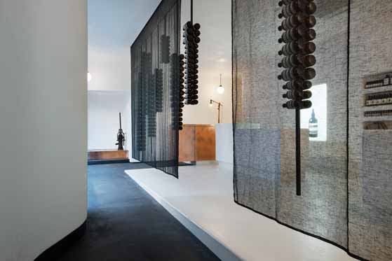
Aesop Store Kyoto, Japan; designed by Shinichiro Ogata, SIMPLICITY
From Snøhetta and Paulo Mendes da Rocha to Ilse Crawford and Ciguë, a raft of original-thinking creatives have been commissioned to produce one-off store experiences that marry bold concepts with strong material consideration and quality craftsmanship. The result are stores, which, more akin to stage-sets than shops, make purchasing an event rather than an everyday activity.
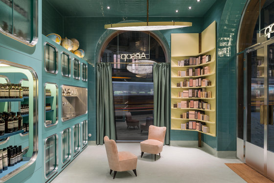
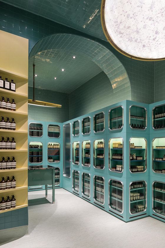
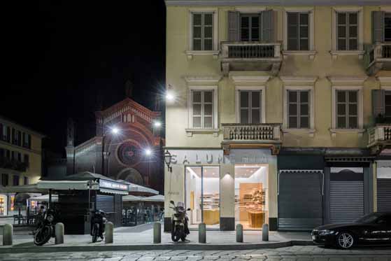
Aesop Store Corso Magenta, Milan, Italy; designed by Dimorestudio
Architonic talks to Marsha Meredith, Aesop’s Creative Director, about the company’s brand-building through creative building...
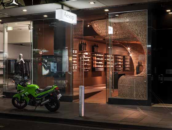
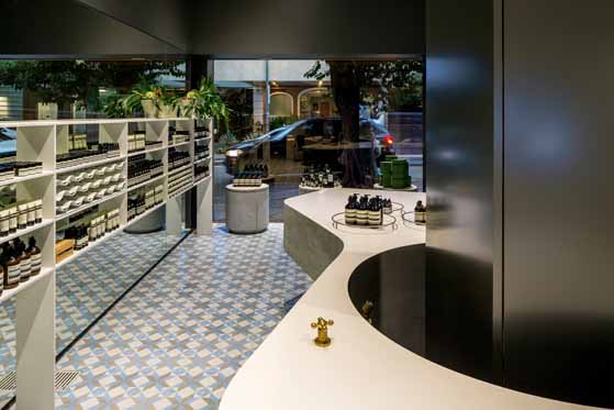
Aesop Store Flinders Lane, Melbourne, Australia; designed by Aesop Design Department
Aesop Store Oscar Freire, Sao Paulo; designed by Paulo Mendes da Rocha and Martin Corullon (Metro Arquitetos)

Aesop Store Oscar Freire, Sao Paulo; designed by Paulo Mendes da Rocha and Martin Corullon (Metro Arquitetos)
×….
How do you choose which architects and designers to collaborate with on the design of your stores?
As we always aim to work with what is already in place, our first consideration is the individual character of each project. With this understanding, we then try to match the architect with the unique possibilities each site offers. Where possible, we engage local architects with an intimate knowledge of the area, or those who have a particular connection to the location.
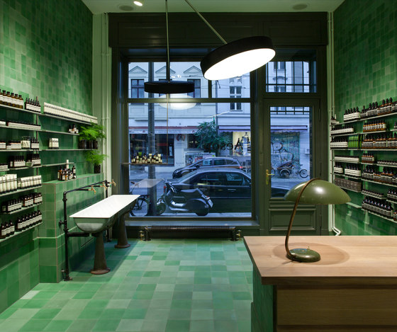
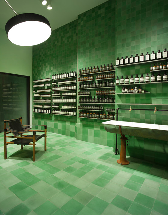
Aesop Store Berlin Mitte, Berlin, Germany; designed by Weiss-heiten
How open is the brief each time? And, conversely, what's common to each brief?
It depends on our relationship with the architect; if we have a good understanding, for example, it might be a more conceptual image or object that sets the tone in a poetic rather than functional way. With others we may suggest materials, tones or genres. Every brief is also accompanied by guidance on operational and functional requirements. We aim to impose as little as possible, allowing architects to express their ideas freely.
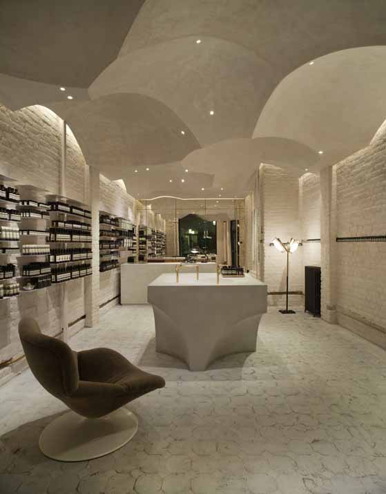
Aesop Store Brera, Milan, Italy; designed by Vincenzo De Cotiis Architects
Aesop Store Prinsensgate, Oslo, Norway; designed by Snøhetta
How do you ensure the Aesop brand is expressed and experienced via such differing in-store environments? What's the sameness amidst the difference?
There are several Aesop codes that permeate all stores and extend to all regions; the simplest and most essential being quality, thoughtful design, and, yes, embracing difference and non-conformity. This is partly achieved by working with people who are attuned to these qualities, those who understand the atmospheric nature of architecture, and can appreciate subtlety, materiality and craftsmanship. And it is eventually expressed through our retail teams, who bring each space to life daily. Our consistent intention is to reduce the noise and clutter we’re all exposed to everyday, and by doing so, create a moment of calm for all the senses.
Aesop Store Madison Avenue, New York, USA; designed by Architecture Outfit
To what extent are your store designs location-specific, in terms of their dialogue with the existing physical space, the store's immediate architectural context and the wider urban landscape?
We absolutely design with local context in mind. Treading lightly, we try to work with local architects and materials, preserving original features and facades where possible.
A recent example is Aesop Stockbridge, Edinburgh, where we worked with a Scottish team of makers called Method to create bespoke shelving and furniture from a single Sycamore tree (selected from the route of the carpenter’s morning walk with his dog). Meanwhile, in Sapporo, Japan, the main material is a stone with many traditional uses, cut from the local mountain. And in Brera, Milan, Vincenzo de Cotis uses reclaimed materials to create exceptional furniture.
Sometimes, we may also reference the history of the community through the design. Aesop Le Marais by Ciguë, for example, features 427 oxidised steel pipe caps – the same as those used throughout the city’s drains – to furnish small individual display shelves, or Prisensgate in Oslo designed by Snøhetta, where the forms are borrowed from the roofs of Eastern Orthodox churches. In London, at the Lamb’s Conduit store, James and Hannah from James Plumb studio have created copper shelving supporting a stream of water through the store, along with a sculptural installation that references the rich history of the street.
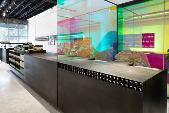
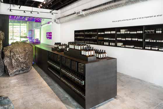
Aesop Store Wynwood, Miami, USA; designed by Frida Escobedo
Which architectural offices or design studios are on your wish list in terms of future collaborations?
We are interested in collaborating with a variety of talented architects and original thinkers, exploring ideas and the poetic in buildable form. We keep a close eye on emerging talent, but ultimately it’s about connecting with like-minded spirits in a meaningful design dialogue.
Aesop Creative Director Marsha Meredith: "We aim to impose as little as possible, allowing architects to express their ideas freely"

Aesop Creative Director Marsha Meredith: "We aim to impose as little as possible, allowing architects to express their ideas freely"
ש Architonic
