Knowledge Bases - Library architecture from antiquity to the digital age
Text by Susanne Fritz
Switzerland
16.10.11
The development of writing in ancient Egypt also gave rise to the first libraries as places of storage for these witnesses to a new, revolutionary cultural technology. Using the following examples as a basis Architonic here highlights the range and diversity of libraries which are currently in existence, showing how buildings of this kind bring together the very latest technology and history.
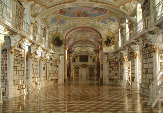
Library of the Benedictine monastery Admont, baroque era
Cultures like that of the Romans, for example, valued not just the scientific but also the educational and entertainment aspects of literature. As a result, having your own library was a status symbol for Roman citizens, and public libraries also arose in ancient Rome for the use of the people. Knowledge is power – and this saying has generally been reflected in the typical architecture of libraries as a temple of knowledge.
NAfter the decline of the Roman Empire it was above all the monasteries which preserved the treasures of ancient writings and saved them for the present day. One such monastery is the Benedictine monastery of Admont in Styria, where there is little sign of monastic asceticism in the elaborate gold decorations. The monks, who in contrast to the general population were able to read and write, copied the historical texts in order to save them from decay. However, the monastery was not just a place of conservation for ancient knowledge but also a place of science. In the monastic schools such knowledge, of subjects like agriculture, botany and medicine, was also passed on to future generations.
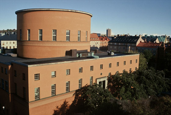
Stadsbiblioteket Stockholm by Gunnar Asplund, 1928, photo by Olle Norberg
Nowadays we have a highly diversified library landscape, with libraries often divided into municipal (for educational and entertainment purposes) and scientific libraries (for teaching and research purposes). A large number of special libraries are also aimed at specific user groups, such as, for example, young people's libraries, libraries of music, libraries of art and libraries for the blind.
The unbelievable numbers of publications which have to be absorbed by libraries at the present time have also made new archiving systems necessary. The internet has made it possible to network major libraries and the introduction of joint catalogues, enabling users to make a search across libraries and to order books from other libraries.
The organisation and the level of accessibility of a library are also determined by its architecture. In addition to the general section, which is freely accessible and whose books can be borrowed, libraries also contain works which are only found in a reference section which is often linked to the reading room. Such works of reference cannot be borrowed, although often more than one copy is available. Further stocks of books are kept in store rooms. Libraries for a restricted group of users or with a private character are equipped differently to public libraries. The structure of the facilities, their heating, ventilation and lighting as well as the way the collections are arranged are determined by the need to provide quiet surroundings for those studying, by the nature and fragility of the books or their representational character. Using the following examples as a basis Architonic here highlights the range and diversity of libraries which are currently in existence, showing how buildings of this kind bring together the very latest technology and history.
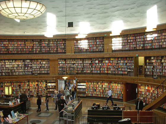
Stadsbiblioteket Stockholm by Gunnar Asplund, 1928
Stadsbiblioteket Stockholm by Gunnar Asplund, 1928
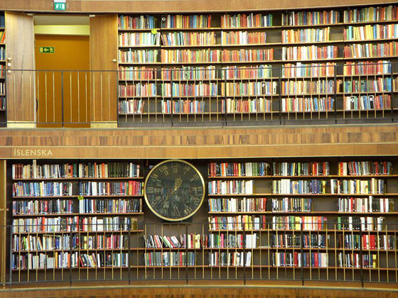
The Stockholm municipal library was opened in 1928 as the first public library with open access to its books. The Swedish architect Gunnar Asplund, a representative of Scandinavian neoclassicism, designed a symmetrical building with four wings and a centrally located rotunda which towers above the other storeys. In addition to the monumental external impact which it gives to this fairly small building, in the interior of the library users feel that they are surrounded by books, while the perspective creates an impression of apparently endless shelving. These architectural resources enabled Asplund to make the library and its stock of books seem larger than they actually are – thus highlighting their value as a representative treasure house of knowledge.
Library of University of Zurich, Faculty of Law by Santiago Calatrava, 2005 © Ralph Richter/archenova

Library of University of Zurich, Faculty of Law by Santiago Calatrava, 2005 © Ralph Richter/archenova
×Library of University of Zurich, Faculty of Law by Santiago Calatrava, 2005 © Ralph Richter/archenova

Library of University of Zurich, Faculty of Law by Santiago Calatrava, 2005 © Ralph Richter/archenova
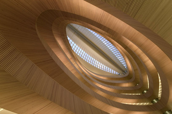
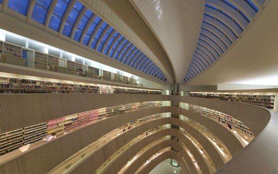
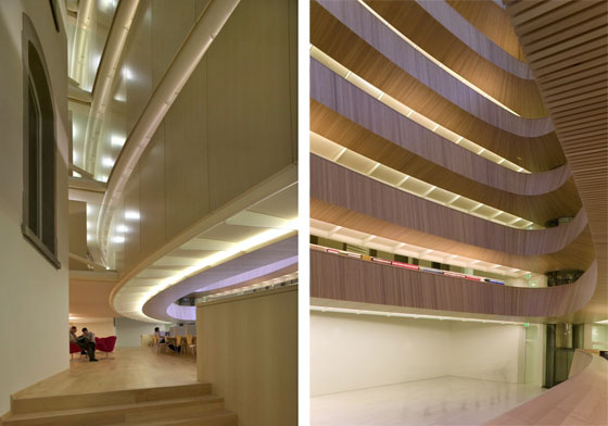
×In contrast to Asplund's rotunda the elliptical atrium of the library of Zurich's Institute of Legal Studies was added later. The original chemistry building which was created 100 years ago on the initiative of Nobel prize winner Alfred Werner was converted by the Spanish architect Santiago Calatrava, who covered the previously open courtyard, which is surrounded by the four wings of the building, by an oval glass cupola. The lens-shaped surrounding galleries enable the light to penetrate right to the floor of the six-storey construction. The courtyard, above which the library seems to float, appears to be a miracle of statics. However, it only seems to float, because there are in fact eight support points for the spectacular superstructure, which for visitors looking upwards appears to rise into the heavens – suggesting a stairway leading to the academic heights.
Library of University of Zurich, Faculty of Law by Santiago Calatrava, 2005 © Ralph Richter/archenova

Library of University of Zurich, Faculty of Law by Santiago Calatrava, 2005 © Ralph Richter/archenova
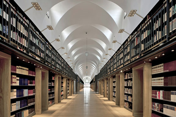
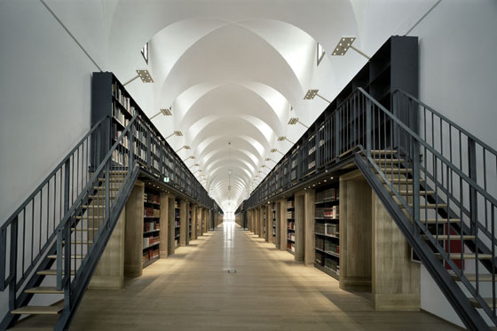
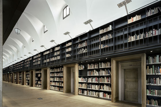
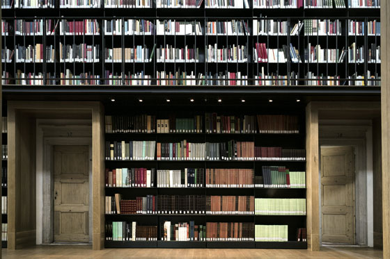
×The conversion created for the Fondazione Giorgio Cini by the Italian architect Michele De Lucchi also plays with perspective. The Manica Lunga was built in the fifteenth century by Giovanni Buora and served as the dormitory of the Benedictine order on the Venetian island of San Giorgio. The entrances to the cells where the monks used to sleep were accentuated by the massive doorframes which jut outwards into the corridor and whose regular pattern highlights the alignment of the long, narrow central corridor of the Manica Lunga. In addition the doorframes have a load-bearing function in that they support the gallery above them, along whose walls there are further bookshelves.
Manica Lunga library remodelling by Michele De Lucchi, photo Alessandra Chemollo, © Fondazione Giorgio Cini

Manica Lunga library remodelling by Michele De Lucchi, photo Alessandra Chemollo, © Fondazione Giorgio Cini
×Manica Lunga library remodelling by Michele De Lucchi, photo Alessandra Chemollo, © Fondazione Giorgio Cini

Manica Lunga library remodelling by Michele De Lucchi, photo Alessandra Chemollo, © Fondazione Giorgio Cini
×The central corridor is fitted with plain, solid wood furniture by the firm of Modular which also acts as a reminder of the Spartan furnishings of the former cloister. De Lucchi has been equally restrained in the lighting of the library, a challenging task in the light of the high level of brightness required for reading. On the lower level the LED lamps are integrated into the shelves themselves. The gallery is lit by overhanging spotlights, whose white colour enables them to blend into the arched ceiling. The individual reading stations are lit by table lamps, with all the lighting equipment supplied by the Italian firm of iGuzzini.
Manica Lunga library remodelling by Michele De Lucchi, photo Alessandra Chemollo, © Fondazione Giorgio Cini

Manica Lunga library remodelling by Michele De Lucchi, photo Alessandra Chemollo, © Fondazione Giorgio Cini
×Manica Lunga library remodelling by Michele De Lucchi, photo Alessandra Chemollo, © Fondazione Giorgio Cini

Manica Lunga library remodelling by Michele De Lucchi, photo Alessandra Chemollo, © Fondazione Giorgio Cini
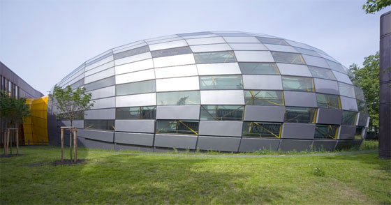
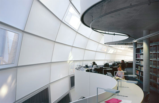
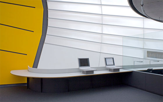
×"Flexible use, energy efficiency, the largest possible interior space with the smallest possible exterior area, lightweight walls and cladding together with the use of natural light and natural lighting”, is how the British architect Sir Norman Foster described his new building for the Philological Library of the Free University of Berlin. The students also appreciate this and the library has become the most popular in the city – so popular in fact that during busy periods university staff have had to make checks at the entrance to ensure that students of the Free University receive preferential treatment over the students from other institutions.
Philological Library, FU Berlin by Norman Foster; photo © Reinhard Görner
Philological Library, FU Berlin by Norman Foster; photo © Reinhard Görner
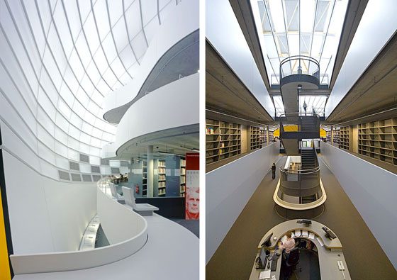
The cupola with its opaque and transparent elements allows the daylight to penetrate, but the introvert character of a library is preserved and external stimuli are filtered out. The facade stretches like a balloon over the interior before connecting with the old building which has been nicknamed "Rostlaube" (rustbucket), a structure clad in COR-TEN steel which was built in 1967-79 under the architectural direction of Candilis, Josic, Woods and Schiedhelm.
In the interior this connection to the rust-red steel of the "Rostlaube“ is emphasised by an orange, cone-shaped portal. The reading stations, bookshelves and work areas are located within two three-storey, free-standing ship-like structures with galleries superimposed on one another.
Philological Library, FU Berlin by Norman Foster; photo © Reinhard Görner
Philological Library, FU Berlin by Norman Foster; photo © Reinhard Görner
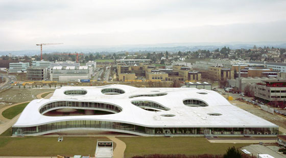
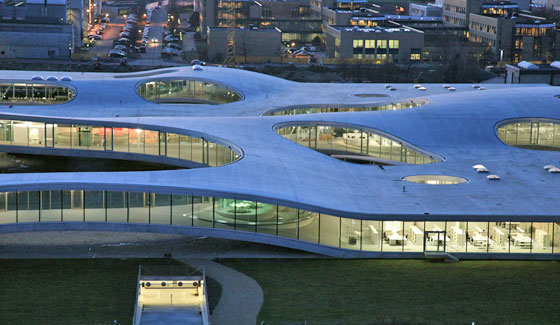
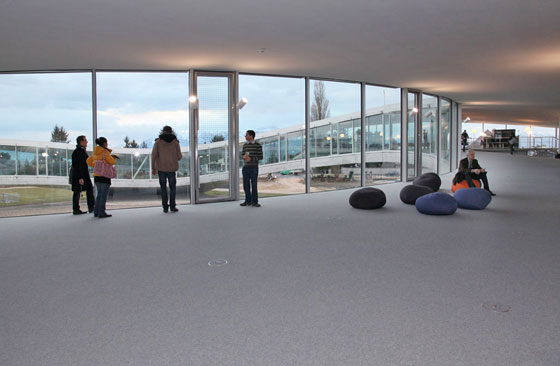
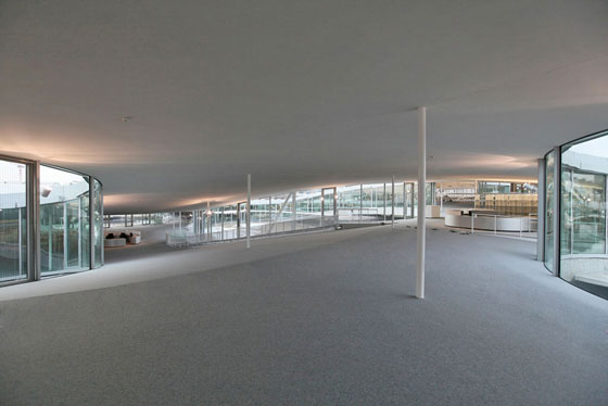
The Rolex Learning Center has probably become just as popular with students. This revolutionary structure was created by the Japanese firm of architects SAANA. The right-angled building covers an area of 88,000 square metres. In the interior of the building the outlines of the structure are hidden by the hills and valleys and plateaus created by its wavy design, and there are neither physical nor visual divisions between the individual areas. Gentle slopes and terraces replace steps and stairways, and visitors stroll along the gentle curves or use the "horizontal lifts" which were designed especially for the Rolex Learning Center, elegant glass enclosures which use the technology of the normal lift. From the upper zones visitors have a view not just of the campus but also of the nearby Lake Geneva and the Alps.
Aerial view of Rolex Learning Centers, Ecole Polytechnique Fédérale de Lausanne by Sanaa
Rolex Learning Centers, Ecole Polytechnique Fédérale de Lausanne by Sanaa
In addition to the various social areas and the impressive auditorium there are quiet zones intended for individual study, while small groups can work or hold meetings in the "Bubbles" which are insulated by glass partitions or walls. In a glass case the futuristic building contains a number of books which have written history –valuable historical scientific works, among them rare editions of the works of Newton and Galileo. It is not just the architecture of the Rolex Learning Center, which with its over 500,000 volumes has one of the largest collections of scientific literature in Europe, that is groundbreaking but also the concept behind its use.
Rolex Learning Centers, Ecole Polytechnique Fédérale de Lausanne by Sanaa
CRAFT is the research centre which provides support for learning and for the related technologies. The laboratory takes an avant-garde approach to the optimisation of learning techniques. The learning techniques developed by CRAFT include such things as interactive furniture, paper–computer interfaces and devices which respond to eye movements. Thanks to RFID (Radio Frequency IDentification) library users can borrow an entire stack of books and return them as they wish by placing them together with their membership card on an electronic shelf. With advances in technology it will soon be possible to find a book on the shelves with the aid of a smart phone app. However, in at least one respect the Rolex Learning Center is no different from any other library in the world: if the (smart) phone isn't set to 'mute' the user can expect some angry looks from all directions.
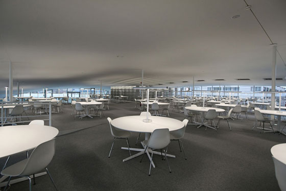
Rolex Learning Centers, Ecole Polytechnique Fédérale de Lausanne by Sanaa
Cafeteria dRolex Learning Centers, Ecole Polytechnique Fédérale de Lausanne by Sanaa
