Picnic, plants, architecture - the fascinating world of Junya Ishigami
Text by Susanne Fritz
Switzerland
25.09.10
One of today's most outstanding architects has been selected as the guest of honour at this year's "Interieur" trade fair in Kortrijk (Belgium). Junya Ishigami, a pupil of Kazuyo Sejima, is the founder of junya.ishigami+associates, lecturer at the Tokyo University of Science, publisher of a number of books and creator of artistic marvels which fascinate with their wealth of fantasy and devotion to detail.
An impressive feature of the Japanese pavilion at the 2008 architectural biennale in Venice was the work "Extreme Nature: Landscape of Ambiguous Spaces", consisting of wall installations on the inside and greenhouses on the outside of the pavilion, which was created by Junya Ishigami, an architect who was only 33 at the time.
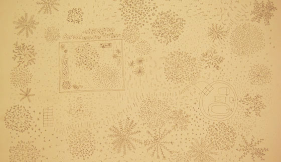
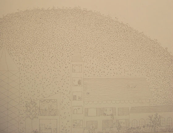
The first impression generated by the countless filigree pencil strokes of the wonderful expansive drawings on the whitewashed walls of the pavilion was of a highly delicate aesthetic, the product of almost superhuman industry and painstaking effort. From a distance the drawings merged like a pointillist work into one large image.
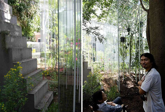
Greenhouses on the outside of the Japanese pavilion of 2008 architectural biennale in Venice created by Junya Ishigami

Greenhouses on the outside of the Japanese pavilion of 2008 architectural biennale in Venice created by Junya Ishigami
×This large-scale illustration was not just a work of art in itself, it was also the coda for countless concepts and ideas. Abstract botanical illustrations formed an undimensional cartographic display. In part the lines were given a third dimension by raising the floor plan and generating isometric displays and perspectives.
Imaginary plans showed buildings in park landscapes featuring lakes, hills and valleys. With its density and height the vegetation formed surfaces, spaces and boundaries.
The concepts played with dimension, as in "Forest City", in which gigantic trees tower over miniature buildings, as well as with height and depth.
Floor-plan of the greenhouses installation by Junya Ishigami in the Venetian Giardini of 2008 architectural biennale in Venice

Floor-plan of the greenhouses installation by Junya Ishigami in the Venetian Giardini of 2008 architectural biennale in Venice
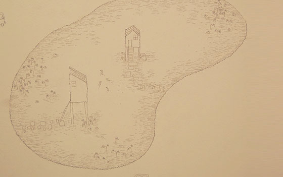
×In "Mountain City" buildings and hills have equal significance and determine the landscape on an alternating basis, while in the imaginary settlement of "Small Valleys" every house is placed in a small crater of its own. The theme of "Pond City" and "Garden City" is the relationships between areas of land, areas of water and areas of vegetation. In "Pond City" the buildings are not, as would be logical, placed on the land area among the lakes but right in the middle of the lake, like small moated castles which can only be accessed by bridges.
"The formula architecture + landscape generally makes people think of a building which is located within specific surroundings. I have deliberately decided that I wish to treat both as equally important," is how Ishigami describes his designs.
The greenhouses surrounding the Japanese pavilion were an expression of this dictum of Ishigami's in that they were not simply decorative surroundings but landscapes and accommodation for the plants which form the landscape. The proportions of the eight cube-shaped greenhouses and the positioning of their supports were in line with the activities in and around the greenhouses, whose filigree construction and thin panes of glass gave them an immaterial character.
The density of the vegetation within the greenhouses was selected in such a way that the plants themselves formed a space and their glass shell formed a second space, with both spaces interacting with the existing surroundings of the 'giardini'.
Filigree drawing of Ishigami's phantastic visions
The way the plants were selected and arranged within the greenhouses was based on the art of ikebana, in which decorative character is only a side effect: ikebana creates harmony by means of linear structure. The three lines of shin, soe and tai (heaven, earth, humanity) and the integration of rhythm and colour bring nature into human living space and within this context represent the relationship of the designer to nature and to his feelings.
Ishigami deliberately uses only Japanese plants, which would not survive in a European climate without the protection of their glass shell.
In "Pond City" the buildings are placed right in the middle of the lake, like small moated castles which can only be accessed by bridges

In "Pond City" the buildings are placed right in the middle of the lake, like small moated castles which can only be accessed by bridges
×The table plays an important role in many of Ishigami's installations. It serves not just as a presentation surface for the objects displayed on it – on the contrary, Ishigami seems to regard it as an architectural archetype with the top acting as a metaphor for the roof and the legs as the supports.
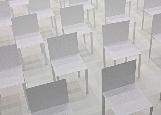
Paper Chairs printed with Ishigami's drawings at the Canon Neoreal exhibition, Design Week Milan 2008

Paper Chairs printed with Ishigami's drawings at the Canon Neoreal exhibition, Design Week Milan 2008
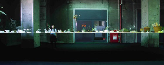
×Because of its dramatic spread the only 3mm thick table top for the installation "Table", which was initially created in 2005 for a gallery in Tokyo and was later to be seen in a different form at Art Basle, seems to float. It is as delicate as a sheet of paper, so thin that it begins to vibrate when touched. Ishigami regards the frequency of this vibration, the almost imperceptible wave movement of the table top, as the visual transition from solid to liquid. The table top is transformed into an area of water bearing countless small objects which swim on it like island-shaped landscapes. The arrangement of these landscapes is by no means random because a precise plan determines the position of the objects on a grid and places them in relation to one another.
As Junya Ishigami expresses it: "I built this extremely large table as I would a small building. There it is in the room, as if it were the most ordinary thing, a table in a normally impossible scale. On top, an assortment of everyday still objects are arranged as if to form a landscape. You can touch, and watch a slow undulation like a wave in a body of water. It is like liquid."
"Table" installation by Junya ishigami, Tokyo 2005
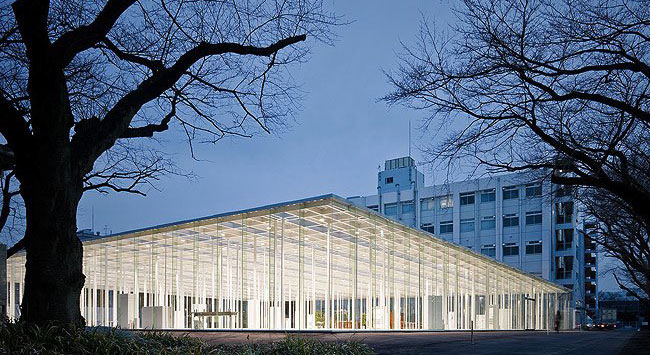
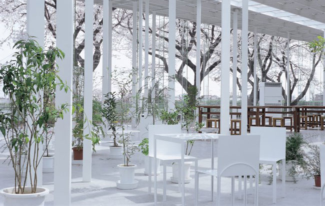
The "KAIT Workshop" project was designed in connection with the re-development of the Kanagawa Institute of Technology. As in most of Ishigami's works the integration of landscape and architecture plays a major part in both a physical and metaphorical sense: the supports of the building symbolise tree trunks and the low plants in pots represent a lower level of vegetation, the undergrowth so to speak.
„KAIT Workshop“ by Junya Ishigami for Kanagawa Institute of Technology; photo © Iwan Baan
The 305 supports are placed in a strict static pattern, but the proportion and angle of each one has been individually determined. The result is that the arrangement appears to be without specific plan, like the random distribution of trees, but this apparently chaotic principle conceals highly precise planning. The roof lights are intended to give visitors to the KAIT Workshop the feeling that they are walking through a forest in which the sunlight penetrates through the treetops from above.
The 305 supports of the "KAIT Workshop“ building are placed in a strict static pattern, but the proportion and angle of each one has been individually determined

The 305 supports of the "KAIT Workshop“ building are placed in a strict static pattern, but the proportion and angle of each one has been individually determined
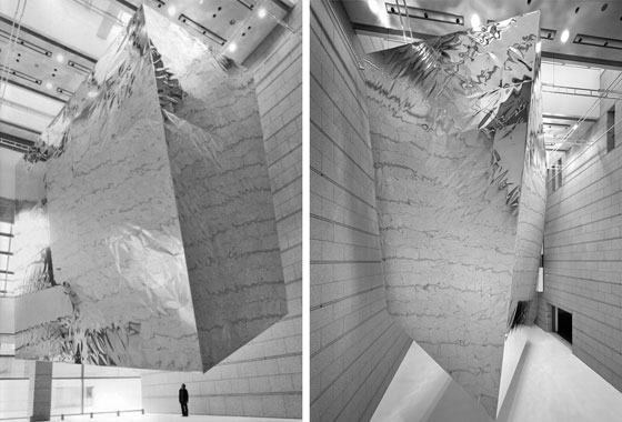
×Ishigami has imagination and a talent for converting surrealist dream worlds into concrete reality and making them accessible to other people. In his book "small images" he describes his installation "Balloon" in the atrium of the Museum for Contemporary Art in Tokyo, which was created in 2007 as part of the "Space for your Future" exhibition, as follows: "I think I had in mind the idea to express, as a space, something like a gentle, very slow moving flow. The kind of flow like an enormous, slow-moving cloud, that has completely obscured a magnificent mountain from view without your noticing it, or fog creeping into a scene of trees and greenery, transforming it into a world of white." The likeness of a cloud and the massive stone weight of the mountain have been combined by Ishigami into an aluminium object weighing at least a tonne. It has the shape of a slightly warped cube or more accurately a parallelotope, with sides measuring 7m x 13m x 14m. Filled with helium and as if it has to decide from one second to the next between gravitation and weightlessness, it floats entirely free without any support within the atrium, calmly and at the same time slightly unnervingly.
However, Ishigami was interested not just in this fascinating object in itself but also in the change in the space which was almost completely filled by the parallelotope. The result was a space within a space and for the duration of the installation visitors moved within the constantly changing intermediate space between these two volumes.
Floating aluminium parallelotope, weighing at least a tonne, filled with helium in the atrium of Museum for Contemporary Art in Tokyo, installation by Junya Ishigami

Floating aluminium parallelotope, weighing at least a tonne, filled with helium in the atrium of Museum for Contemporary Art in Tokyo, installation by Junya Ishigami
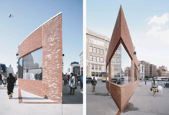
×The filigree character of Ishigami's work and the reference to the never-ending transformations of nature give his projects a transitory feel. This theme was also picked up by the Yohji Yamamoto Gansevoort Street Store in the Meat Packing District of New York, an area which is constantly reinventing itself. The original contours of the building were retained in the floor as a kind of inlay. The project, the redevelopment of a single-storey brick building from the Nineteen Fifties, employed spectacularly acute angles which, seen from a particular perspective, gave the impression that the building had no depth and that the observer was standing in front of a stage set.
Spectacularly acute angles: Yohji Yamamoto Gansevoort Street Store, New York
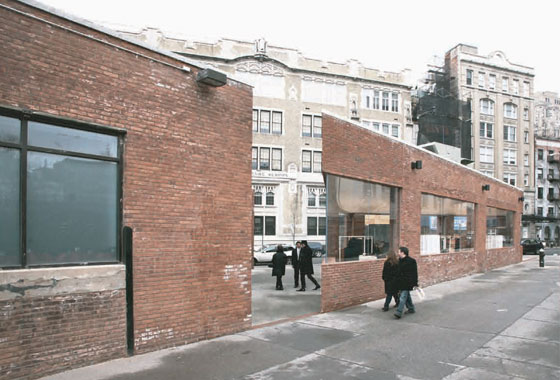
This illusion was made perfect by a break in the facade, which exposed new views of the structure behind the building. Change and decay, renewal and demolition: it is their mutability that makes the natural landscape and the urban landscape fascinating. The Yamamoto Street Store, too, unfortunately became a victim to the constant change of the Meat Packing District and has since been demolished.
Break in the facade of Yamamoto Street Store which exposed new views of the structure behind the building

Break in the facade of Yamamoto Street Store which exposed new views of the structure behind the building
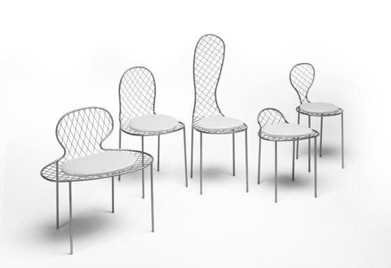
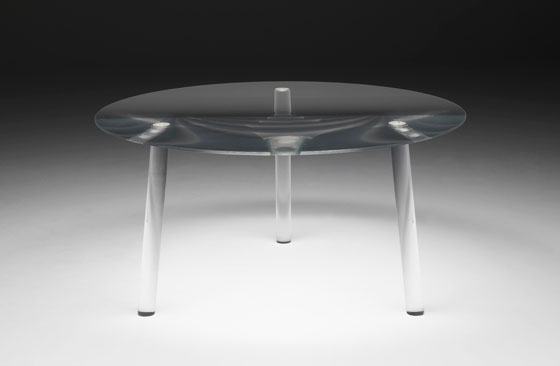
×At this year's Salone del Mobile 2010 Ishigami made his debut as a furniture designer. His collection for Living Divani consists of Drop, a plexiglass table with a trompe l'oeil effect, the "Family", a group of amorphously formed tubular steel chairs and the "Garden Plate" side table whose surface represents a miniature landscape.
Ishigami's Picnic Family Chairs for Living Divani
At the INTERIEUR 2010 design biennale in Kortrijk Junya Ishigami will be presenting his PICNIC installation, of which he has so far only revealed the following:
"A number of different chairs with various kinds of upholstery and dressing, create a background for people, friends or family to come together and celebrate. Chairs embrace or turn away from each other, or form a line and hold hands. They may even form a circle around the garden. Distorted chairs around the table look like a family talking to each other and enjoying the table… Table and chairs are installed in the space as if to create a scene of nature, or crowds of people.
Usually, furniture is considered a tool for people, and it can become no more than a background within the space.
Here, I want to propose celebratory furniture that blends in with the activity of people and into the surrounding environment. It will be a joyful furniture picnic."
Portrait of Junya Ishigami, Guest of Honour Interieur Kortrijk 2010
