How to maximise facades in wall-to-wall architecture
Text by Valentina Diaz
05.02.24
Even within tighter than usual confines, these structures prove that a building situated between two existing ones doesn't have to result in an unremarkable design. Featuring Ahmed Hossman Saafan, Notan Office, Pepe Ramirez and Iterare Arquitectura.
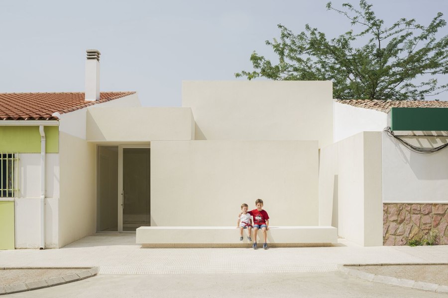
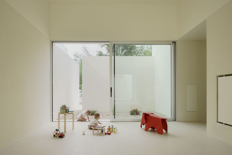
Projects like Iterare arquitectos’ Kindergarten in Aguas Nuevas stand as examples of redefining the limitations imposed by building between walls, illustrating new possibilities in architectural composition. Photo: David Zarzoso

Projects like Iterare arquitectos’ Kindergarten in Aguas Nuevas stand as examples of redefining the limitations imposed by building between walls, illustrating new possibilities in architectural composition. Photo: David Zarzoso
×Whether due to urban regulations, typologies, land use or even informality in urban development, building between adjacent structures limits the number of faces of a new architectural volume. This reduction typically results in a building with only two facades at the front and back and also presents a spatial challenge in terms of achieving adequate illumination and ventilation along an apparent single horizontal axis.
The compression caused by surrounding structures, however, can also lead to the exploration of new relationships between elements such as full and empty spaces, light and shadow as well as permeable and impermeable surfaces. In addition, the roof of the volume can be understood as a third face or facade to serve as another axis, a vertical current. These four projects illuminate only a few of the possibilities for maximising facades in the context of wall-to-wall architecture.
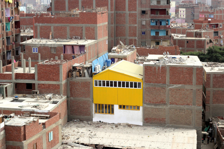
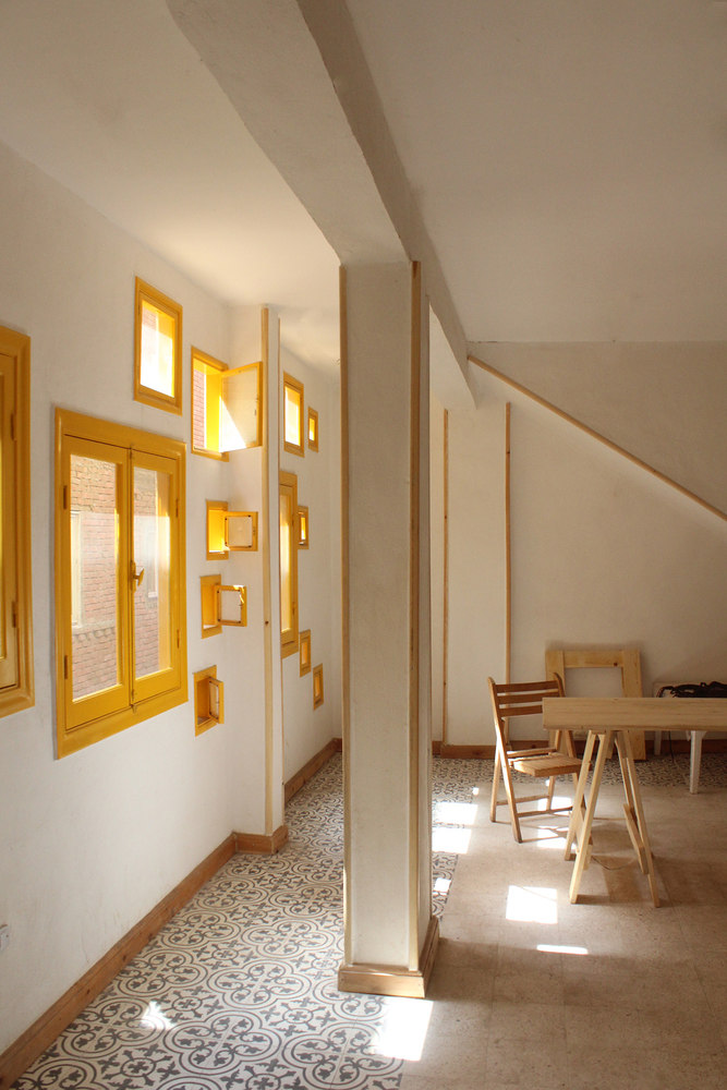
The vibrant yellow hue in the facade of Dawar El Ezba Cultural Center optimises sunlight reflection, illuminating the interior given the narrowness of its urban setting. Photos: Ahmed Hossam Saafan

The vibrant yellow hue in the facade of Dawar El Ezba Cultural Center optimises sunlight reflection, illuminating the interior given the narrowness of its urban setting. Photos: Ahmed Hossam Saafan
×Dawar El Ezba Cultural Center in Fustat, Egypt, by Ahmed Hossam Saafan
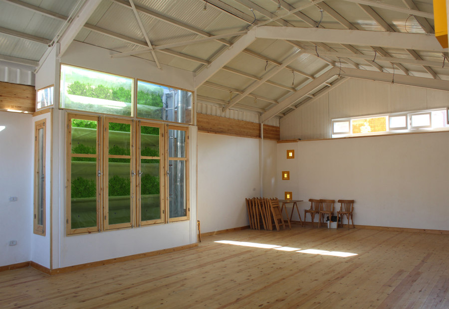
Being the community heart of an overpopulated center in the middle of Cairo, the Dawar El Ezba Cultural Center by architect Ahmed Hossam Saafan stands out in this informal settlement. It intervenes with an architecture that aims to ‘change the deteriorated architectural malpractice and showcase the possibility of using existing resources to imply a more aesthetic and functional value’, but most importantly, added to the conscious community design strategies through sustainable processes, it projects a building which maintains a cooled and well-illuminated interior, achieved uniquely from three sides.
Through an array of small windows of various sizes, privacy is maintained while casting diverse shadows throughout the day. In terms of volume, the architect strategically subtracts a section, creating room for a vertical garden. This gesture not only allows natural light to penetrate from the sky but also invites refreshing air to counteract the high contamination prevalent in the area.
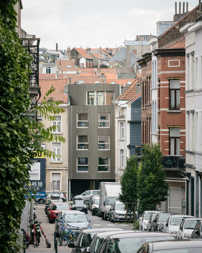
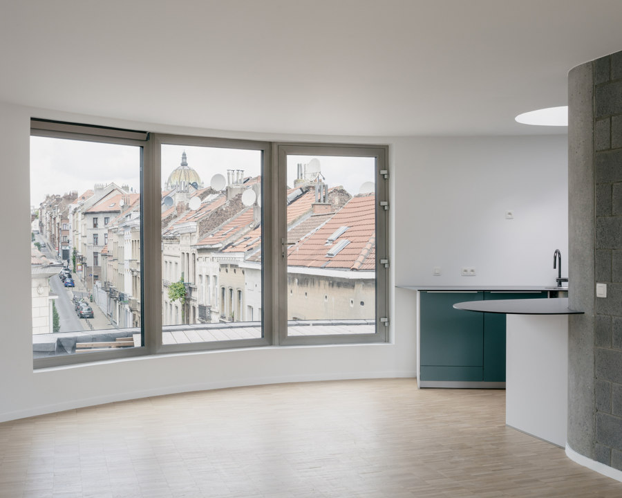
Koto has a variety of housing enclosures, single bedrooms, double bedrooms and office spaces all naturally luminated and offering scenic views. Photos: Stijn Bollaert

Koto has a variety of housing enclosures, single bedrooms, double bedrooms and office spaces all naturally luminated and offering scenic views. Photos: Stijn Bollaert
×Koto in Brussels, Belgium, by Notan Office
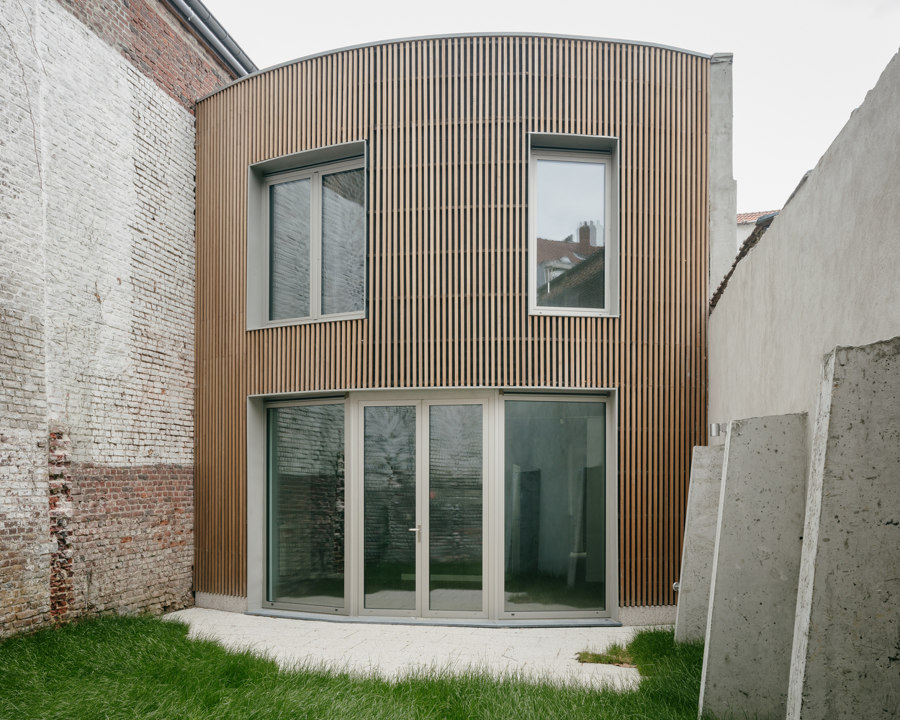
In an eclectic aesthetic neighbourhood, in a parcel that was once a street-fronting garage, Koto emerges with two distinct volumes that subtly resist the surrounding walls that confine them. The street-facing volume features a semi-open first floor, providing direct access to the second volume. By introducing a communal patio nestled between the structures, Notan Office's design multiplies its perspectives, unveiling interior facades.
The rounded facade shapes enhance spatial perspectives both within and beyond the building
The decision to split a singular mass into two, flanked by walls, results in an interior courtyard. This space, with its width and open connection to the sky, dismantles the feeling of enclosure between walls. The rounded facade shapes enhance spatial perspectives both within and beyond the building. Unlike a straight line, the curvature elongates the gap between walls and notably expands the field of vision towards the city or the patio.
Despite the neighbouring buildings having only one floor, and the front not being particularly narrow, the Kindergarten in Aguas Nuevas has a sense of lightness through its spatial composition. Photos: David Zarzoso

Despite the neighbouring buildings having only one floor, and the front not being particularly narrow, the Kindergarten in Aguas Nuevas has a sense of lightness through its spatial composition. Photos: David Zarzoso
×Kindergarten in Aguas Nuevas, Spain, by Iterare arquitectos
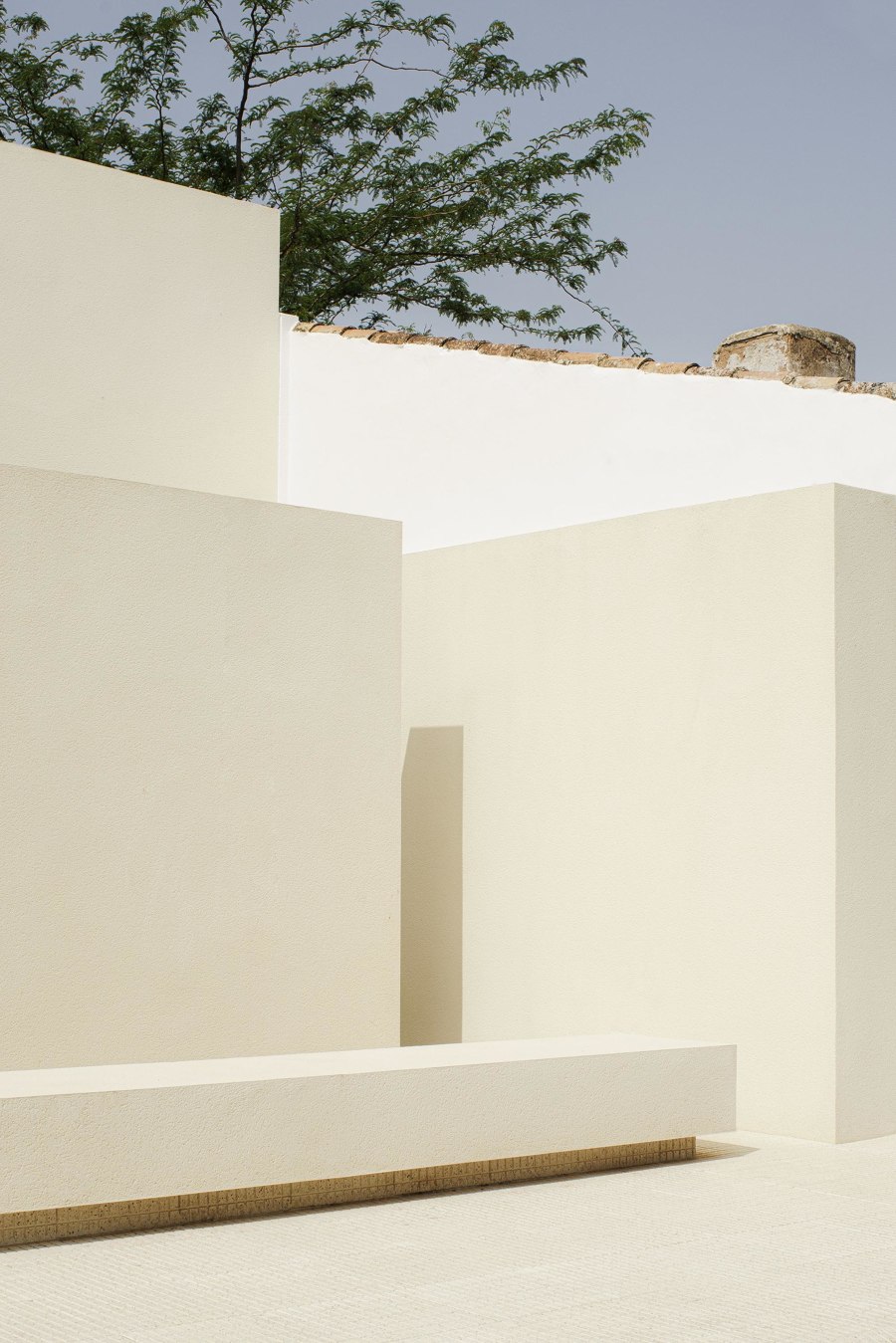
Rather than relying on conventional facade windows, Iterare arquitectos rely on window doors that allow light to enter without being overtly visible. A semi-loose foreground in Kindergarten in Aguas Nuevas serves a dual purpose: protecting the windows from direct exposure to the street while creating an air chamber with a patio function. This not only privatises the school's front but also avoids enclosing it.
Architecturally, the design recesses the surface through which light enters, illuminating the building's interior from a secondary plane. Capturing light in this manner imparts a soft form of illumination which spreads an intimate atmosphere in relation to the interior patios. The arrangement of solid walls at different heights creates a play of shadows and light which injects movement into the educational and recreational spaces, enhancing children's perceptions.
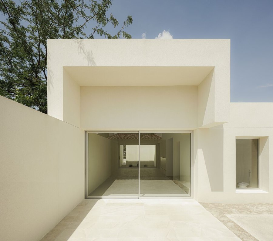
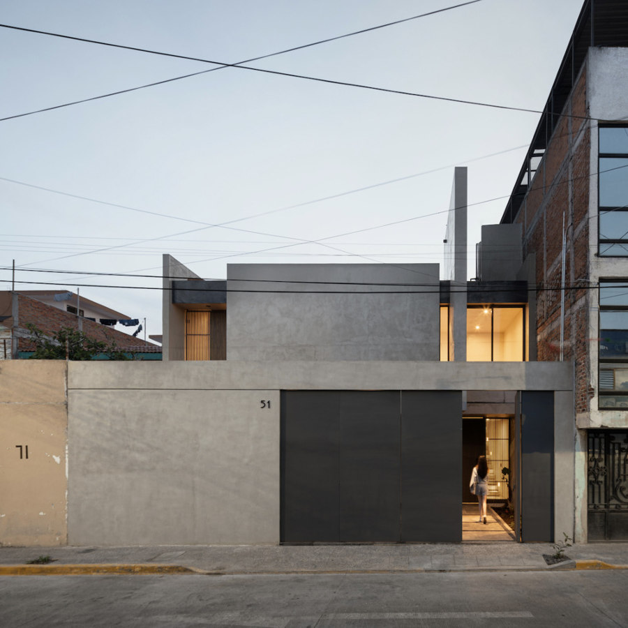
Casa Eréndira, custom-designed for a mother and daughter, stands within a residential neighbourhood surrounded by adjacent buildings. Photos: Cesar Belio

Casa Eréndira, custom-designed for a mother and daughter, stands within a residential neighbourhood surrounded by adjacent buildings. Photos: Cesar Belio
×Casa Eréndira in Morelia, Mexico, by Pepe Ramirez
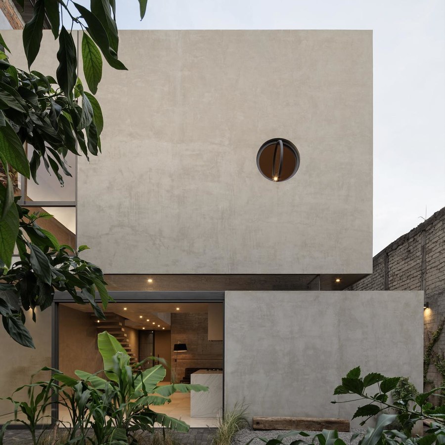
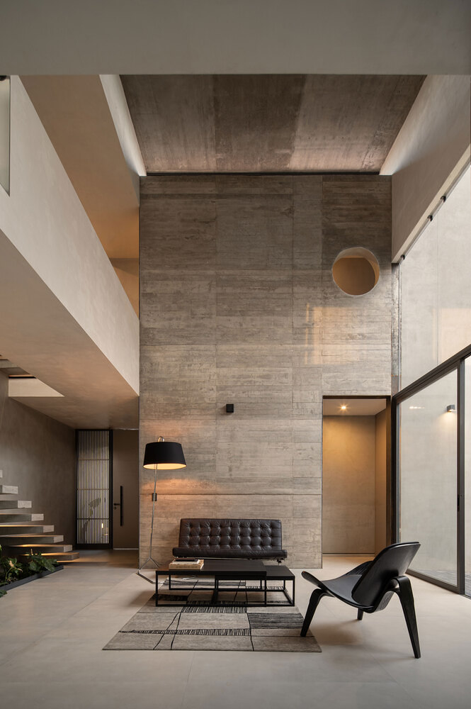
Architect Pepe Ramírez employs a play of subtracting mass at Casa Eréndira, carving out voids that are filled with vegetation. This approach fractures the otherwise rectangular space, introducing a diverse array of enclosures with varying heights and lending a three-dimensionality to the interior. The roof treatment allows natural light to filter through cautiously placed skylights.
Subverting conventional placement, Ramírez positions select skylights at the upper portions of the facades where the walls reach their peak. These facilitate the entry of indirect and dynamic light throughout the day, casting an interplay of lights and shadows within the living spaces and supporting the strength of the quiet facade's volumetry, otherwise blended with its context.
© Architonic
Head to the Architonic Magazine for more insights on the latest products, trends and practices in architecture and design.
